Demo page
Introduction
This Plugin allows you to add up to 5 different "on Hover" effects for your Button elements, allowing you to craft a more interactive and user-friendly app.
Features
The following 5 animation effects are included:
- Shrink on hover
- Grow on hover
- Swing on hover
- Opacity change on hover
- Rotate on hover
How to Setup
In order to use this Plugin, you will have to enable the option to add an ID attribute to your HTML elements.
To do this, go to Settings-> General and check the box next to "Expose the option to add an ID attribute to HTML elements". See a short guide here: https://docs.rapidevelopers.com/how-to-assign-an-id-to-the-element
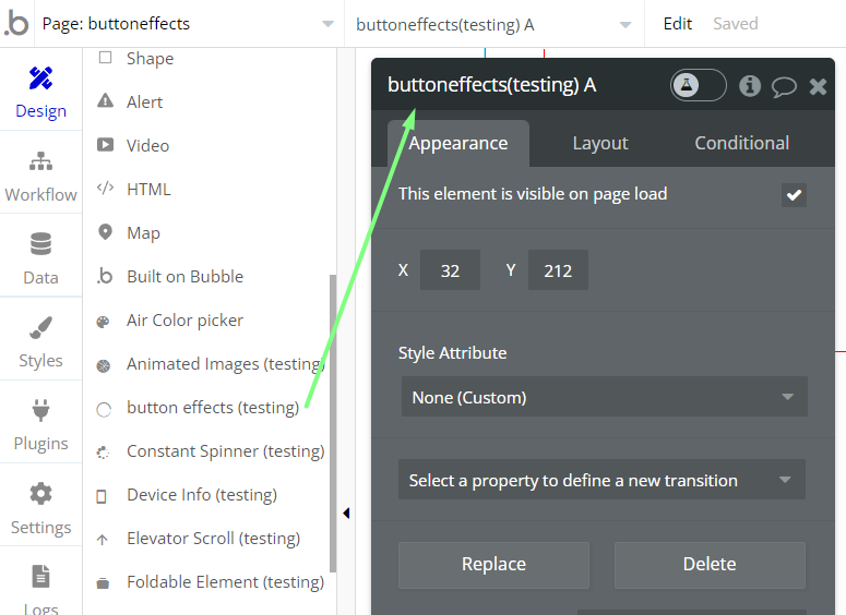
Next you simply have to drag the "button effects" onto the page you want to use the effects. You will find the button effects on the left side of your Bubble editor within the list of usable elements.

In order to add an animation on hover effect to one of your buttons, you simply have to add one of the ID attributes below to the button you want to apply the effect on.
Here is the list of ID attributes:
- shrinkbutton
- swingbutton
- growbutton
- opacitybutton
- rotatebutton
Frequently Asked Questions
Have a question, or suggestion, or encountered an issue? 🤷♂️
Please contact us by sending an email to: support@rapidevelopers.com
Want to report a bug? Please follow this guideline!