This section states the purpose of each reusable element.
✏️ Introduction
Reusable Element - an element that contains other elements, like a group, that can be used in more than one place. This is useful when reusing the same elements often.
Tip: See Bubble Reference for details https://manual.bubble.io/core-resources/elements/reusable-elements 🙂
Reusable Elements
Footer
The footer reusable element is located at the bottom of a page. It provides an example of how it can include external links, such as the company's social media, navigation, and copyright notices.
A great website footer design keeps people engaged and moving through the website. The workflows included with this element are pretty straightforward to follow.
This reusable element is customizable, so it is possible to change the styles and content of elements while keeping workflows or using them as inspiration for your own.
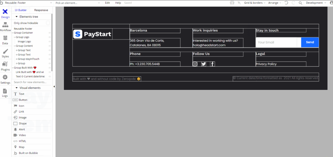
This reusable element is designed to be used on certain page - index. It contains the main "Group Container" and the second "Group Built with ♥️ " used to hold other group elements as containers for elements like the inputs, text, image and buttons used for actions.
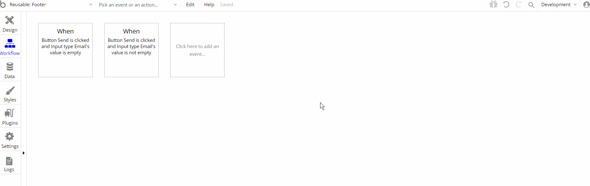
The workflow actions for this reusable element are showing and hiding different elements within the reusable element and resetting data source for a group.
Header
The header reusable element sits at the top of each page and serves a few very important purposes. It does provide a place for the company's logo, navigation, and page title which are part of a consistent user experience that all good websites share.
Other common header features are - search, shopping cart (for eCommerce), login/logout, user profile, and notifications (if applicable). The workflows included with this element are pretty straightforward to follow.
This reusable element is customizable, so it is possible to change the styles and content of the element while keeping workflows or using it as inspiration for your own.
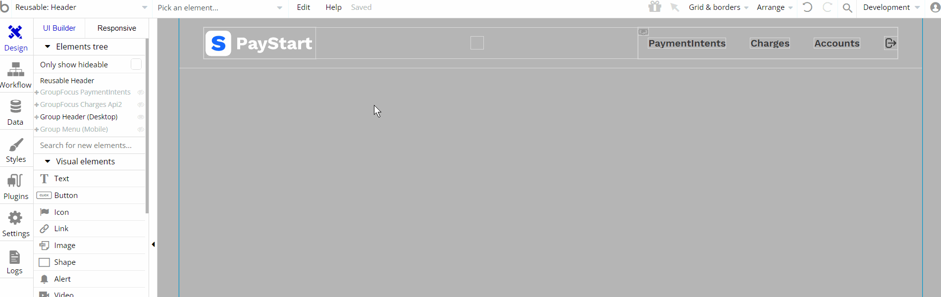
This reusable element is designed to be used on certain page - index. It contains the main group "Group Header (Desktop)" and the second one "Group Menu (Mobile) " which is hidden on page load but visible on mobile under conditional value. These groups are used to hold other group elements as containers for elements like the inputs, text, and image.
Additionally, there are Group Focus elements that are not visible, but when clicked on a certain element they'll become visible.
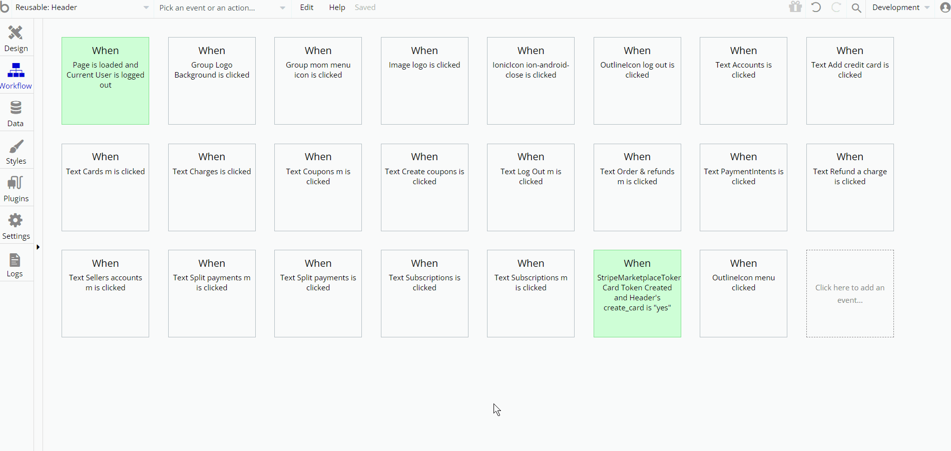
The workflow actions on this page are showing and hiding different elements on-page. More present are the Go to page navigational actions, additionally, some of the actions are working with data, by saving, modifying, values inside
Customer, User database types.Since this reusable element is used for accounts manipulation, here will be present Stripe Marketplace plugin actions and/or calls.
more-menu[cards]
This reusable element is used for the mobile responsive view as a mobile menu option to delete or make a card default.
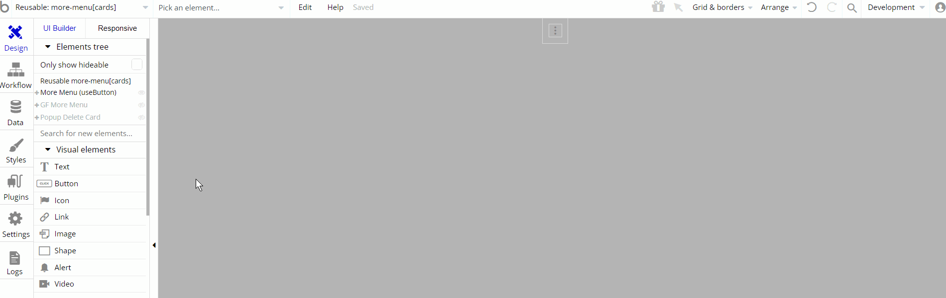
This reusable element is designed to be used on certain page - cards. It contains main group "More Menu (useButton)" and a group focus "Group Focus More Menu" that holds all of the elements inside like texts and groups.
Additionally, there is Popup "Delete Card" element which comes with buttons for confirming or denying an action
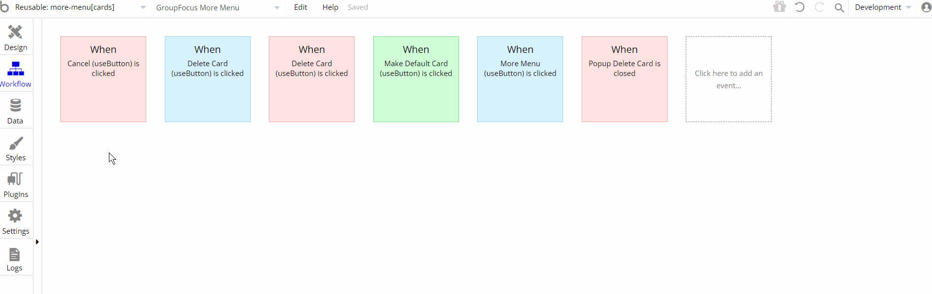
The workflow actions on this page are showing and hiding different elements on-page. Other actions like set state to set a value to an element are seen, additionally, some of the actions are working with data, by saving, modifying, values inside
User database types.Since this reusable element is used for accounts manipulation, here will be present Stripe Marketplace plugin actions and/or calls.
Steps Description
This reusable element is used for half a dozen of pages including cards, coupons, orders, custom_account, split payments, and subscriptions.
The main usage of this reusable element is to show dynamically the information on the left side with details for the respective page
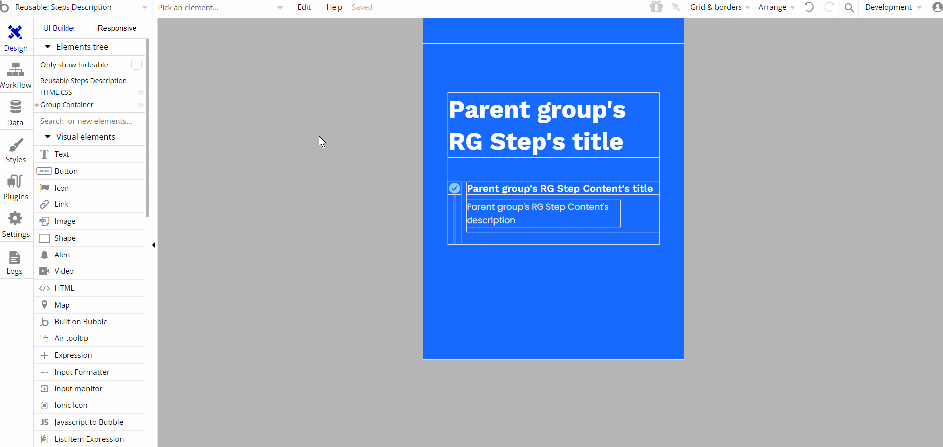
This reusable element is designed to be used on certain pages as described in the paragraph above. It contains the main group "Group Container" which holds all of the elements inside like texts, icons, and groups/rgs.
There are no element workflows for this page.