This section states the purpose of each page.
Introduction
In this summary, we will describe each page and its content. The Page Element is the fundamental one that contains all the other elements.
Tip: See Bubble Reference for more information about Pages element https://bubble.io/reference#Elements.Page 🙂
Pages
index
This is the main page typically encountered first on the web app that usually contains links to the other pages of the site. A homepage includes a variety of menus that make it easy for users to find the information they need.
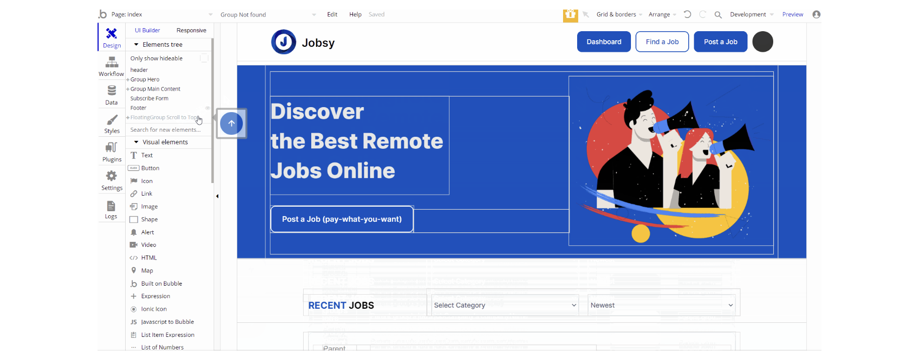
The design of this page consists of two important groups Group "Hero" and Group "Main Content", additionally there is the Subscribe Form reusable element designed as a floating group.
Group "Main Content" holds the elements on the page to display the dropdowns, job details texts, images, and others. Group "Hero" is designed to show the hero image, the CTA, and the title.
The Footer and header reusable elements are also part of the design page.

The workflow actions on this page are related to set state values for displaying group with all job listing on page load, also the scroll to an element action and navigation to page action are used.
A different approach of navigation is done through Toolbox plugin's action Run javascript - used for opening a new browser window via custom js action.
Note: This page contains custom code. For more details check the Custom Code section on the Things to Note page.
company
This page displays information about a company and all the jobs posted by this particular company
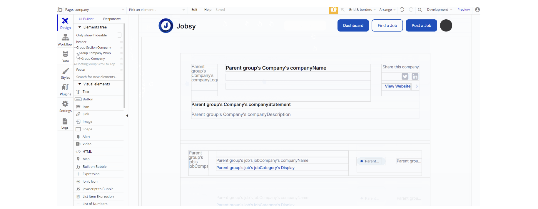
The design of this page consists of one main group "Section Company" which holds all elements on the page (groups, repeating group, texts, links, etc).
The floating element "Scroll to Top" is a hidden element and is visible on conditional when the current page scrolling position is > 600px.

The workflow actions on this page are mostly for navigation and are done through the Toolbox plugin's action Run javascript - used for opening a new browser window through custom js action.
Other actions are - set state values on page load to show a group and scroll to an element for going back to the top.
create-job
This page is used for the creation and posting of a job. It is divided into three sections which are visible depending on the current step the user is at.
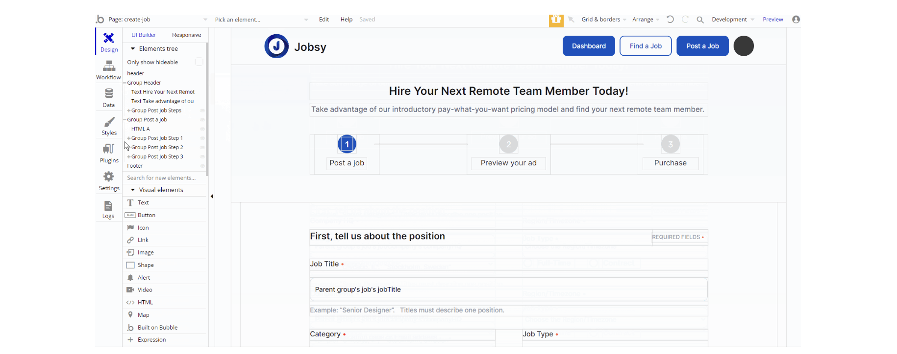
The design of this page consists of the two groups: Group "Header" which holds the elements placed on the top side and Group "Post Job Steps" which holds elements, mostly inputs, texts, buttons wrapped in groups that display content for each step.
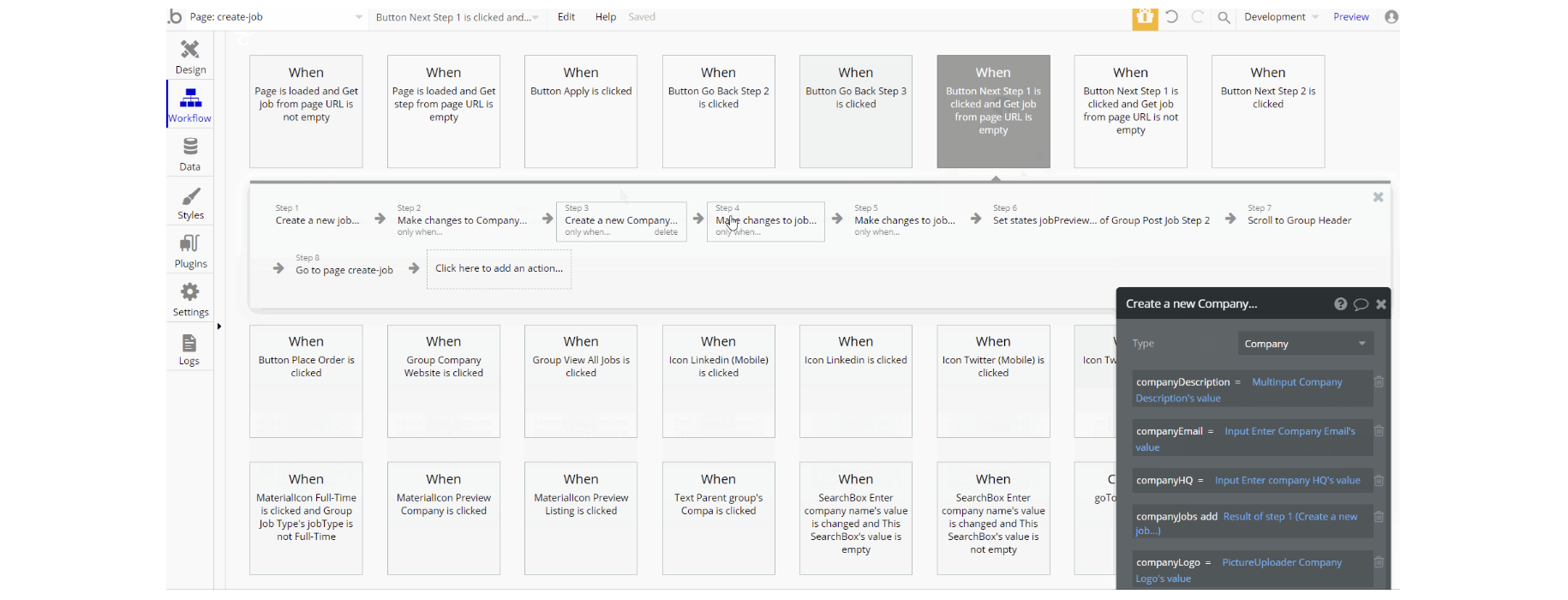
The workflow actions used on this page are set state values to display different views of the steps, working with the database by making changes to a thing and create new a thing for
Company, Order, and Job data types.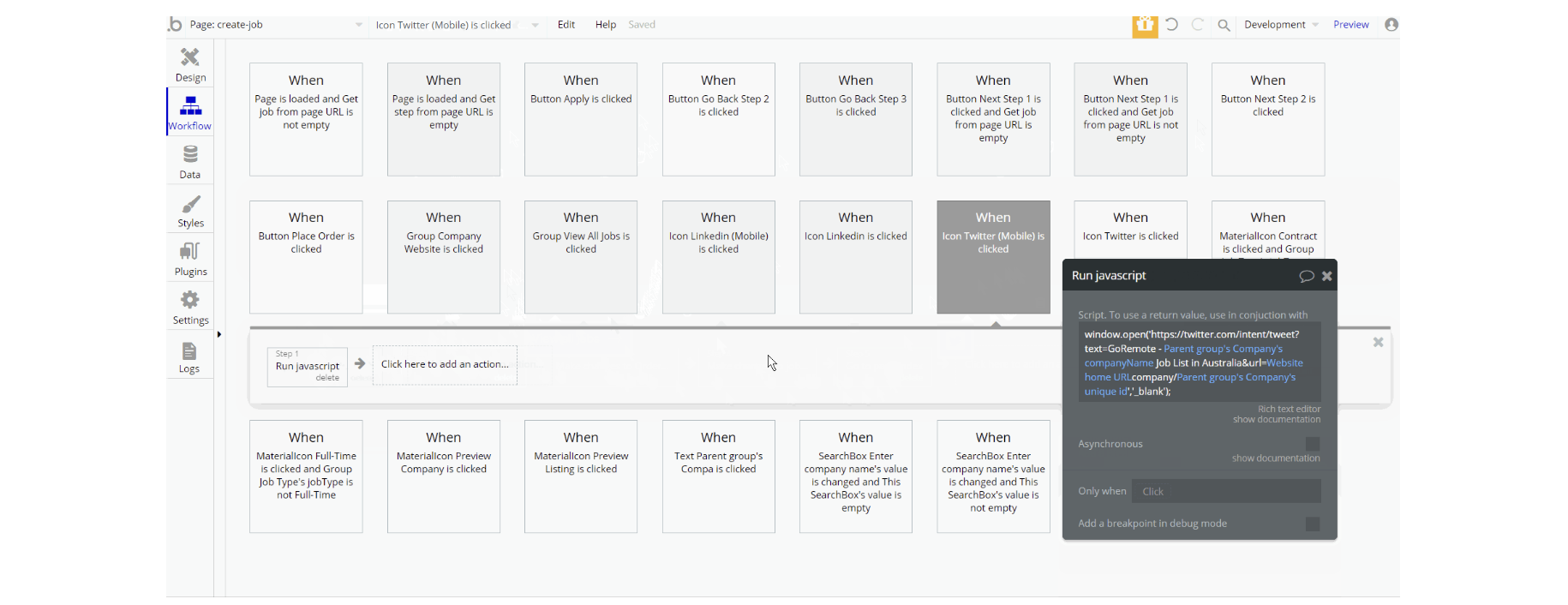
Other actions are which can be seen are navigation to page while sending parameters to the page, action that runs through Toolbox plugin's action Run javascript - used for opening a new browser window, charge the current user and for user experience scroll to an element.
Note: This page contains custom code. For more details check the Custom Code section on the Things to Note page.
dashboard
This page is designed to manage jobs. Only users with admin rights are able to access this page (in read-only mode), and those users who have access rights can edit or delete anything here.
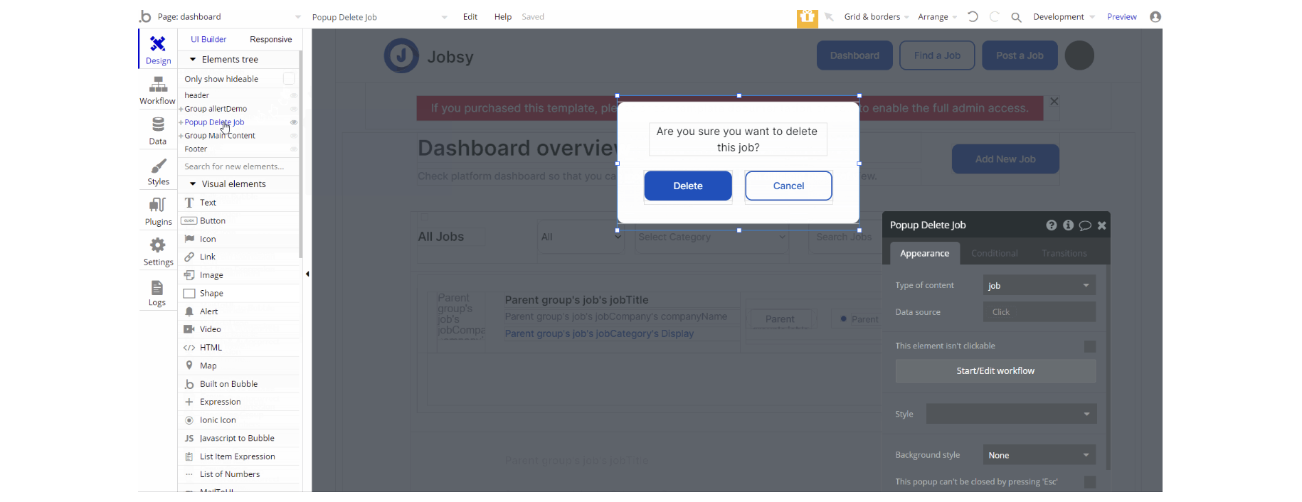
The design of this page consists of the group "Main Content" which is the main container and holds all elements (texts, buttons, dropdowns, inputs, etc) to display the content. Group "allertDemo" is the one group that holds the warning message.
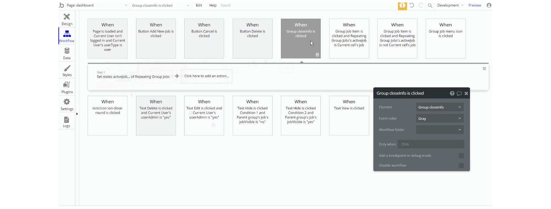
The workflow actions for this page are mostly set state values for visibility of elements, show and hide an element, make changes to a thing - job of type yes/no and navigation to page by sending parameters.
job
This page displays information about the job the user can apply to.
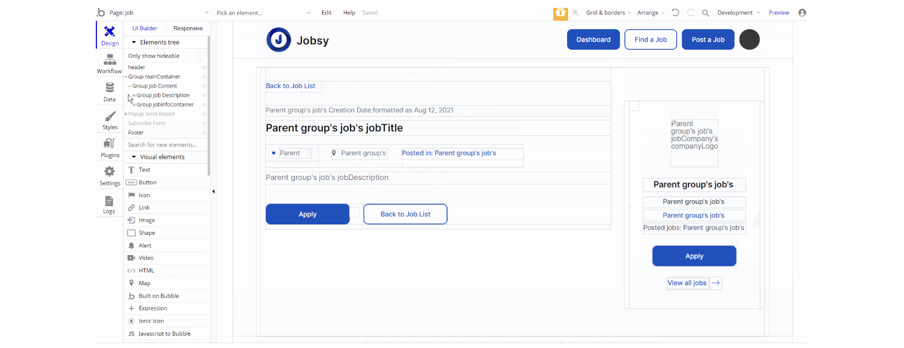
The design of this page consists of the main container Group "mainContainer" which holds the elements (texts, buttons, groups, and links) to show job details. Additionally, there is the Subscribe Form reusable element designed as a floating group.

The workflows for this page are mostly navigation to page using default action, also using Run javascript through Toolbox plugin's action - for opening a new browser window. Other actions encountered are, hide an element and send email.
Note: This page contains custom code. For more details check the Custom Code section on the Things to Note page.
login
This page is used for creating an account or logging in to an existing one. To access it, users will click on “Signin” button in the header.
On this page, users are offered a demo user to log in and test all the template features. For detailed information on how to remove the button for demo login, see the Remove Demo Login section.
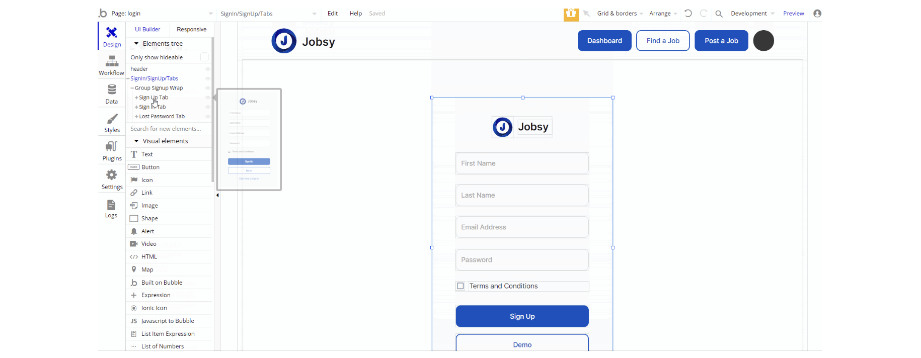
The design of this page consists of the main group "SignIn/SignUp/Tabs" which holds all the elements (image, text, inputs, and buttons) of the input forms and the header reusable element.
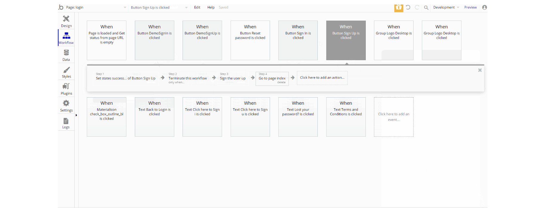
The workflows seen on the page are: assign a temp password to a user for Demo Logins, as well as Login the user in and Sign the user up for both demo and regular type of actions.
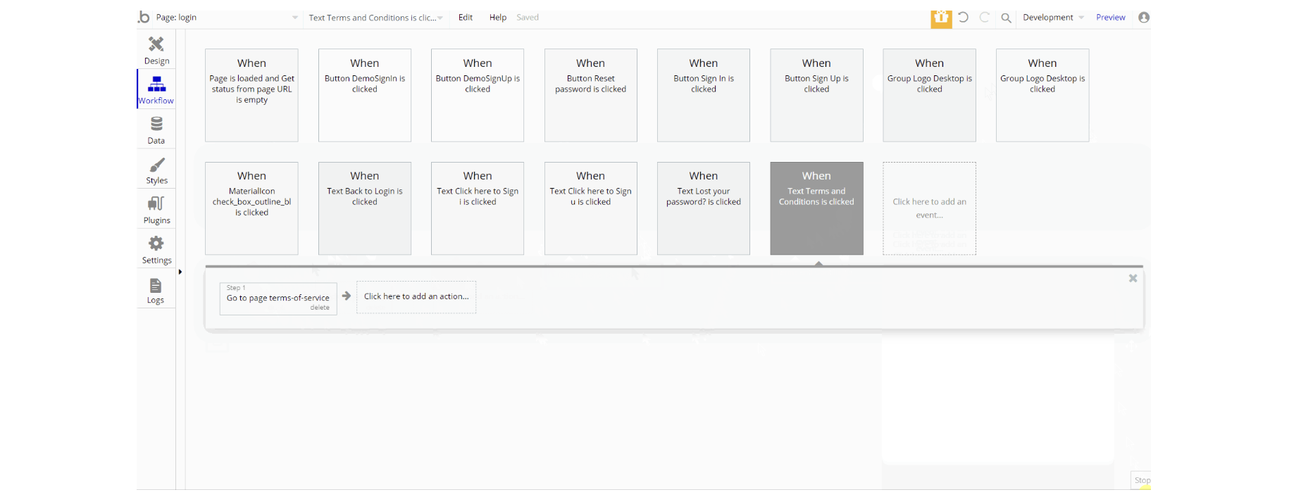
Other actions used are mostly the navigation to page actions that send parameters alongside navigation and set state values for the element visibility.
privacy-policy
This is the page where users see the legal statement that specifies how the company manages the collected user data
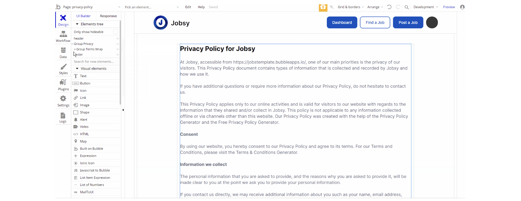
The design of this page is pretty simple which has one main group "Privacy" which contains the wrapped group around the text element.
There are no element workflows for this page.
Tip: The text on this page is a placeholder and should be modified according to your own privacy policy.
Tip: Also, make sure you have Terms page in your app. This will help you go through App Store and Google Play approval procedures, in case you decide to convert your Bubble app into native iOS and Android apps. These links are also important for Facebook login.
profile
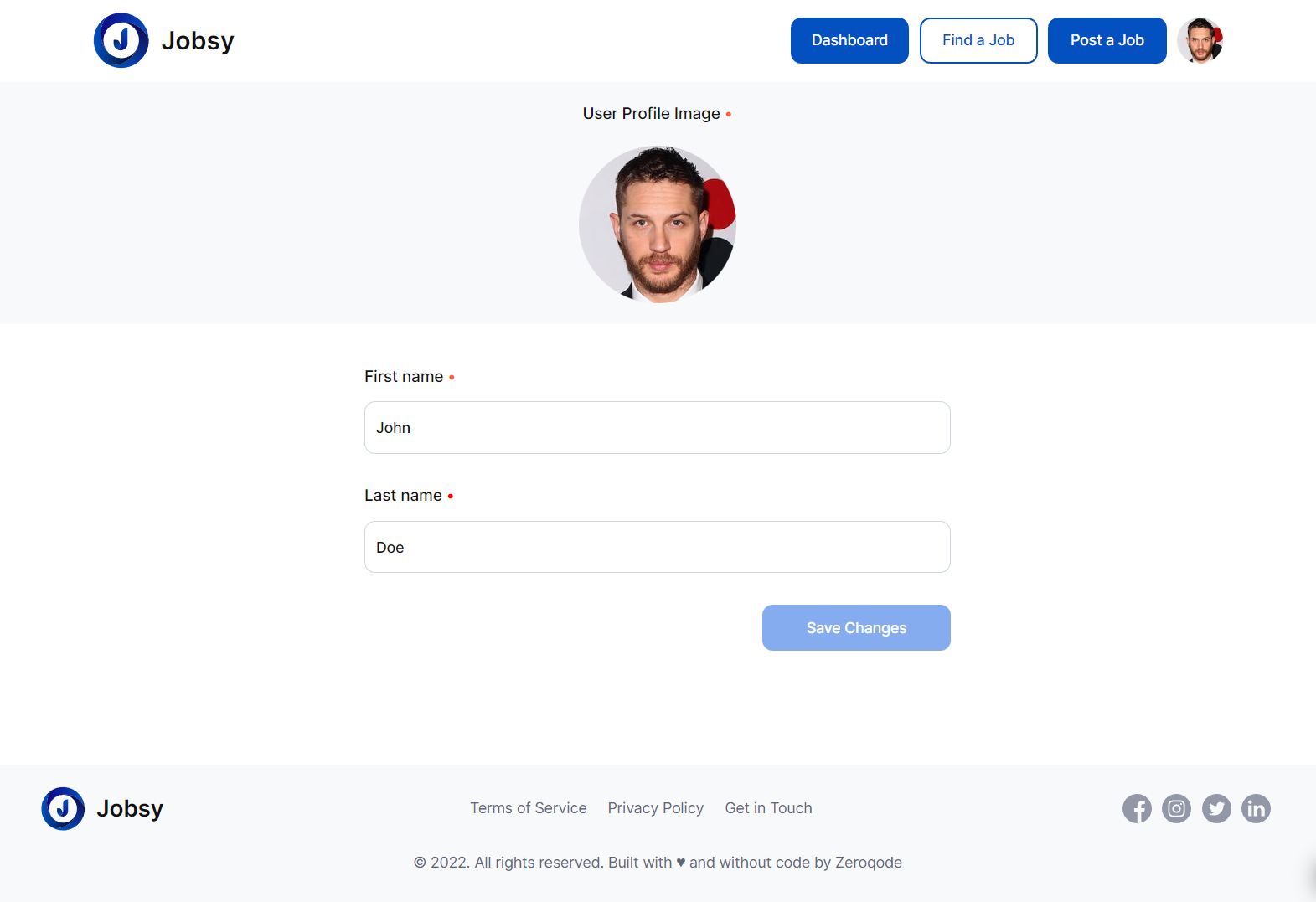
This is user's personal page with a minimalistic functionality, where they can see and edit their personal information.
terms-of-service
This is the page where users see the agreement act between both sides: the company that has the web application and users who access the web application.
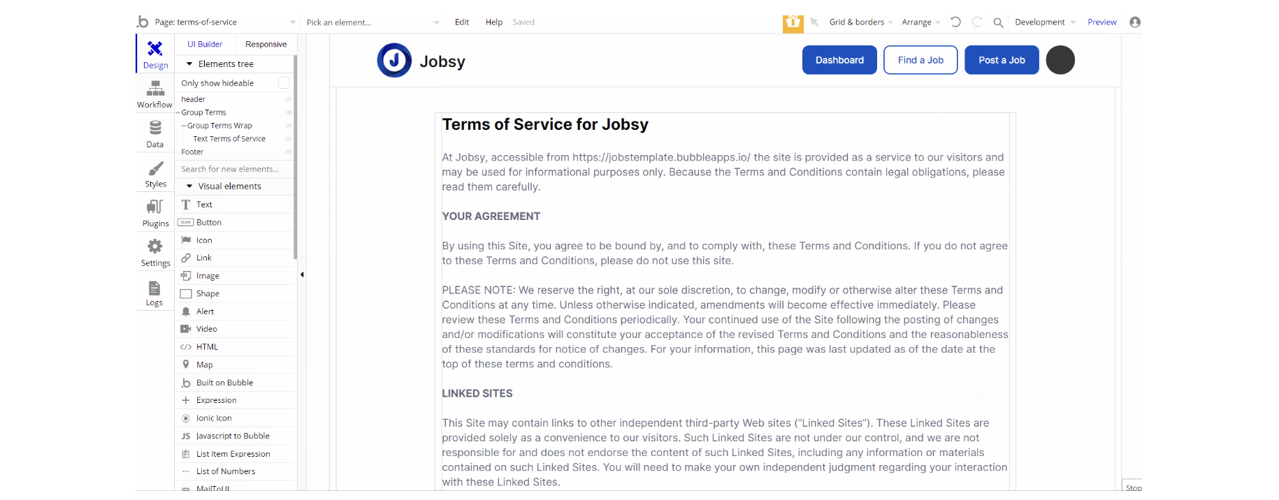
The design of this page is pretty simple which has one main group "Terms" which contains the wrapped group around the text element. There are no element workflows for this page.
Tip: The text on this page is a placeholder and should be modified according to your own terms of service.
Tip: Also, make sure you have Privacy page in your app. This will help you go through App Store and Google Play approval procedures, in case you decide to convert your Bubble app into native iOS and Android apps. These links are also important for Facebook login.
reset_pw
This page is used for resetting the password
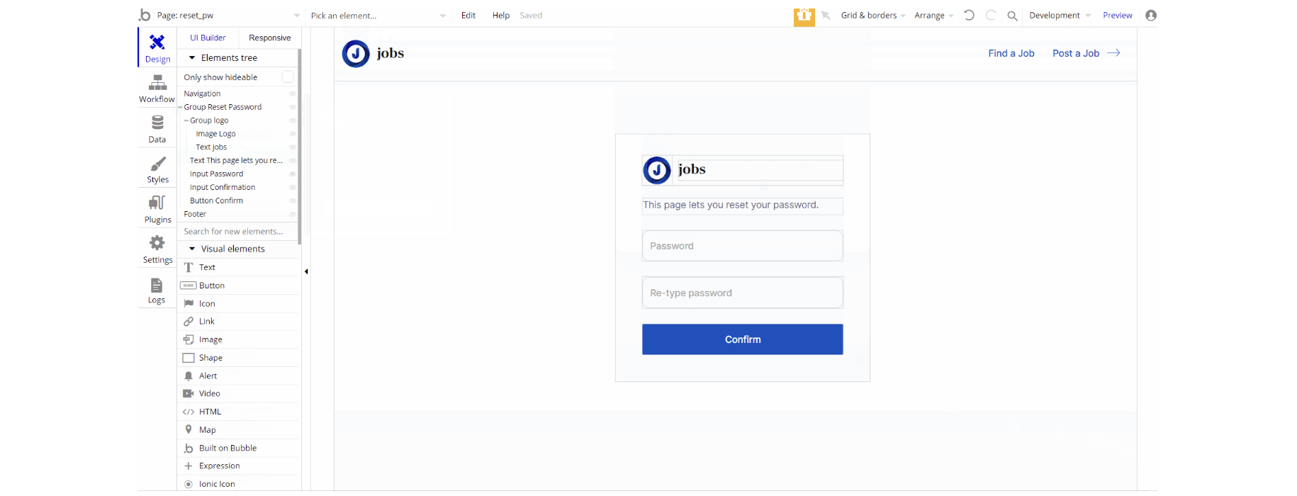
The design of this page consists of the main group container "Reset password" which holds all elements on the page (groups, text, image, and inputs) for the form.

The workflows on this page are quite straightforward Reset password and navigation to page.
404
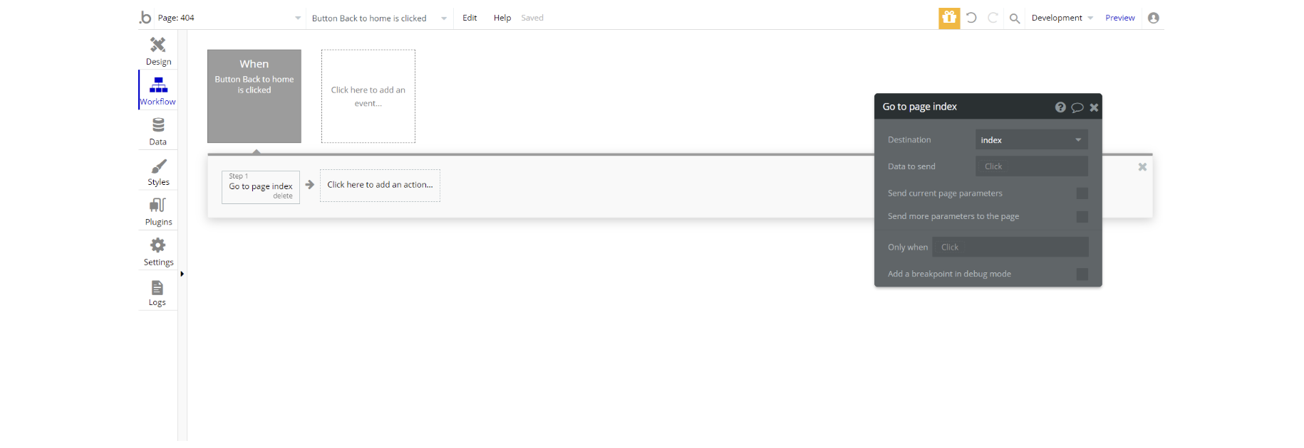
This is a custom-designed page for 404 redirect errors, informing a user that the requested web page cannot be found, or it doesn't exist.
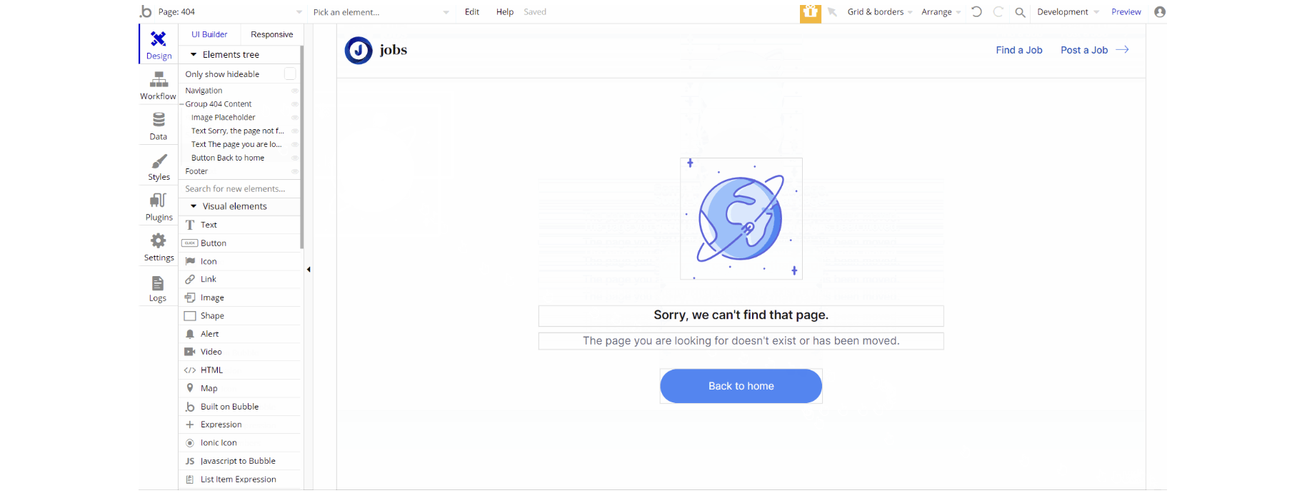
The design of this page consists of the main group container "404 Content" which holds all elements on the page (groups, text, image, and inputs) for the form.
