Demo page
Introduction
This is a simple plugin that determines if the current user is using your application via a mobile device or a desktop/tablet device.
This plugin makes use of the Windows "max-width" property and therefore determines the current width of the window and not if the user is actually using a mobile device.
Resizing the window on a desktop to a mobile width will trigger a detected mobile device. In most scenarios, this should not be the case.
Features
This plugin uses NO external libraries and therefore only has a minimal (almost no) impact on performance.
How to Setup
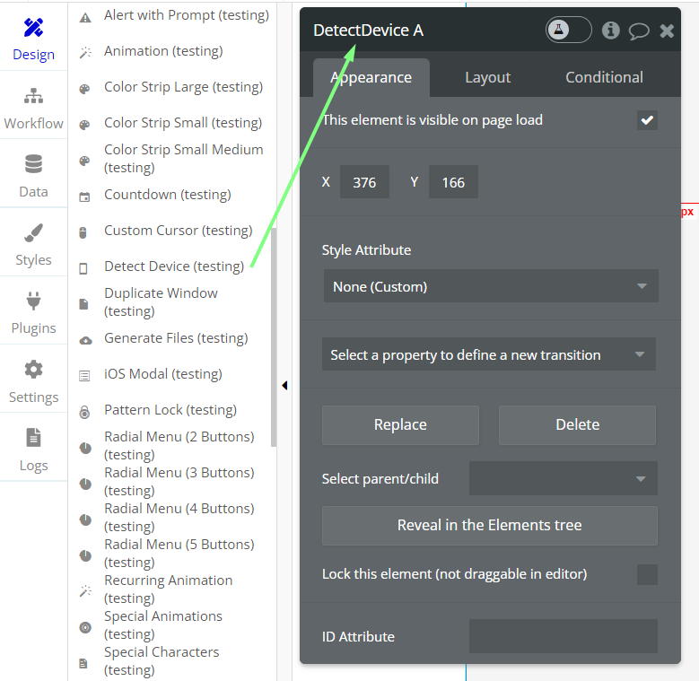
After installing the Plugin, drag the "Detect Device" Element onto your page.
On page load either the "Mobile Device Detected" or "Tablet/Desktop Device Detected" is triggered, according to the screen width of the current device.
You can then trigger subsequent workflows within the workflows tab of your application.
Frequently Asked Questions
Have a question, or suggestion, or encountered an issue? 🤷♂️
Please contact us by sending an email to: support@rapidevelopers.com
Want to report a bug? Please follow this guideline!