Dedicated forum thread:
Demo page
Bubble Editor:
Live Demo:
Introduction
The plugin allows you to add an item to the page to select the date and time.
Features:
- Date
- Date + Time
- Date + Time + Time
- Date + Time / Date + Time
- Time zone + difference
- Specify time intervals
- Start date and time
- Сalendar - week start day, language, background color selection, fonts and colors of the current day
- Add your custom icons
- Appearance settings - sizes, colors, rounding corners
- Saving to database
- Action when the date or time has changed
How to setup
- Add Elements
- Drag and drop the three elements of the plugin onto your test page:
- DatepickerControl
- TimepickerControl
- TimezoneControl
- Adjust the appearance settings of each element to explore customization options.
- Add Elements to Your Page
- Drag and drop the DatepickerControl, TimepickerControl, and TimezoneControl elements onto your page in the Bubble editor.
- Customize the Elements
- Adjust colors, borders, icons, and fonts in each element's property panel.
- Configure:
- Time Zone: Enter the time zone code in the Local Time Zone or Local Zone field (e.g.,
UTC,America/Sao_Paulo). - Display Format:
- Use the Format field to define the format for dates and times (e.g.,
Lfor local dates,LTfor local times).
- Set Up Workflows
- Use the available events and actions:
- Events:
- "A DatepickerControl Update" or "A TimepickerControl Update" to capture user selections.
- Actions:
- "SetDate A DatepickerControl" to programmatically set a date.
Plugin Element Properties
DatepickerControl
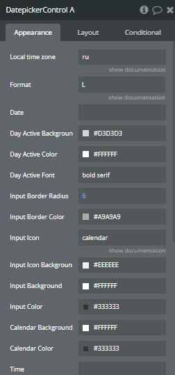
Element properties.
Fields:
Title | Description | Type |
Locale | Moment.js locale | Text |
Format | Moment.js format | Text |
Date | The default date to be displayed in the input field. Can be in various formats, depending on the selected locale. | Text (optional) |
Dayactivebackground | Background color of the selected day in the datepicker. | Text |
Dayactivecolor | Text color of the selected day in the datepicker. | Text |
Dayactivefont | Font style for the selected day in the datepicker (e.g., "bold", "italic"). | Text |
Inputborderradius | The radius of the input field's border, allowing you to round the corners (e.g., "5px"). | Number |
Inputbordercolor | The color of the border surrounding the input field. | Text |
Inputicon | Glyphicon- or url | Text |
Inputiconbackground | Background color of the icon inside the input field. | Text |
Inputbackground | Background color of the input field where the date will be shown. | Text |
Inputcolor | Text color inside the input field. | Text |
Background | Background color of the entire datepicker control. | Text |
Color | The text color used throughout the datepicker control (e.g., for dates, headers). | Text |
Element Actions
- setDate - This action allows you to set a specific date in the datepicker control programmatically.
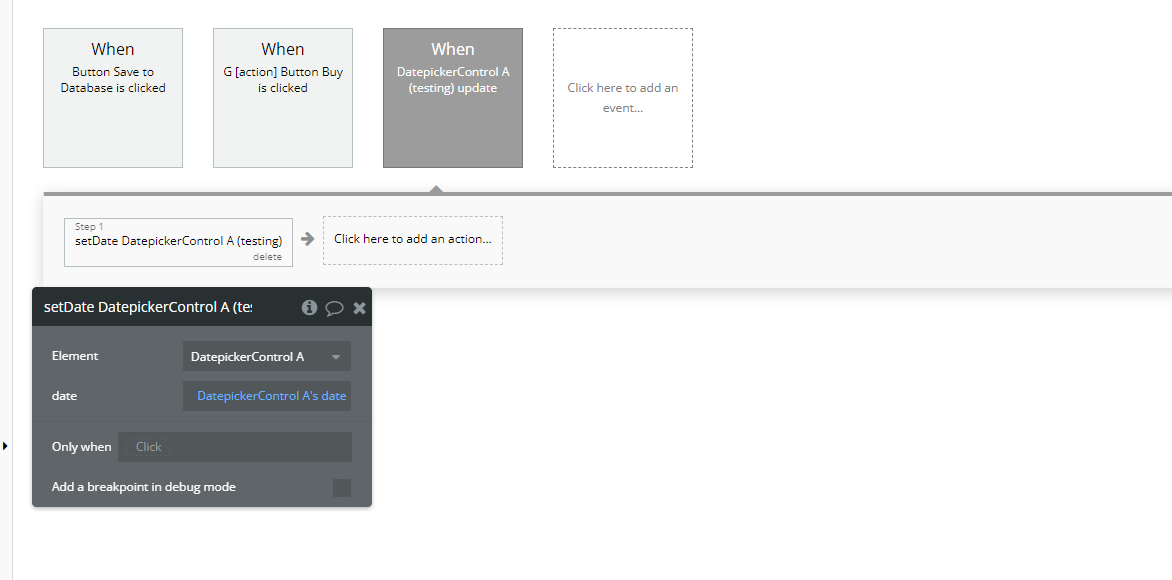
Workflow action.
Title | Description | Type |
Date | The date to be set in the datepicker. Should be in the format defined by the Format property or a valid date string. | Text |
Exposed states
Title | Description | Type |
Date | The currently selected date in the Datepicker control. The value is formatted according to the format set in the Format property. | Text |
Element Events
Title | Description |
update | Triggered when the date is updated or selected in the Datepicker control. This event fires whenever the user selects a new date, and it can be used to capture the updated value for further processing.
Triggered when the date is updated or selected in the Datepicker control. This event fires whenever the user selects a new date, and it can be used to capture the updated value for further processing. |
TimezoneControl
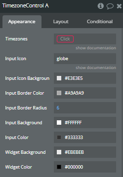
Element properties
Fields:
Title | Description | Type |
Timezones | Name-Value pairs | Any Thing |
Inputicon | Glyphicon- or url | Text |
Inputiconbackground | Background color for the input icon. | Text |
Inputbordercolor | Color for the border of the input field. | Text |
Inputborderradius | Border radius for the input field, to make it rounded. | Number |
Inputbackground | Background color of the input field. | Text |
Inputcolor | Text color inside the input field. | Text |
Background | Background color for the timezone control element. | Text |
Color | Text color for the displayed timezone name. | Text |
Exposed states
Title | Description | Type |
Timezone | The currently selected timezone value. | Text |
TimepickerControl
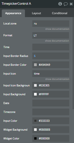
Element properties.
Fields:
Title | Description | Type |
Locale | Moment.js locale | Text |
Format | Moment.js format | Text |
Time | The time to be displayed in the input field. | Text (optional) |
Inputborderradius | The border radius for the input field. | Number |
Inputbordercolor | The color of the border around the input field. | Text |
Inputicon | Glyphicon- or url | Text |
Inputiconbackground | The background color of the input field's icon. | Text |
Inputbackground | The background color of the input field. | Text |
Date | The date associated with the time. | Text (optional) |
Timezone | The timezone to be used for the time input. | Text (optional) |
Inputcolor | The color of the text in the input field. | Text |
Background | The background color of the entire control. | Text |
Color | The general text color of the control. | Text |
Exposed states
Title | Description | Type |
Time | The selected time as a string in the format specified by the Format field. | Text |
Datetime | The selected date and time combined into a single Date object. | Date |
Element Events
Title | Description |
update | Triggered whenever the time is updated in the input field. Can be used to execute workflows based on user input changes. |
Changelogs
Update 29.01.25 - Version 1.15.0
- Updated description.
Update 11.09.24 - Version 1.14.0
- Minor update (Marketing update).
Update 20.07.24 - Version 1.13.0
- Minor update.
Update 13.06.24 - Version 1.12.0
- Updated demo/service links.
Update 06.06.24 - Version 1.11.0
- Minor update.
Update 30.05.24 - Version 1.10.0
- minor update.
Update 03.02.24 - Version 1.9.0
- Minor fixes.
Update 19.10.23 - Version 1.8.0
- Updated description.
Update 15.09.23 - Version 1.7.0
- updated description.
Update 12.09.23 - Version 1.6.0
- minor updates.
Update 12.09.23 - Version 1.5.0
- updated description.
Update 06.09.23 - Version 1.4.0
- Obfuscation.
Update 04.09.23 - Version 1.3.0
- updated description.
Update 12.07.23 - Version 1.2.0
- updated description.
Update 07.07.23 - Version 1.1.0
- updated logo.
Update 15.06.20 - Version 1.0.0
- version 1.0.
Frequently Asked Questions
Have a question, or suggestion, or encountered an issue? 🤷♂️
Don't hesitate to get in touch with us by sending an email to: support@rapidevelopers.com
Want to report a bug? Please follow this guideline!