This section states the purpose of each reusable element.
Introduction
Reusable Element - an element that contains other elements, like a group, that can be used in more than one place. This is useful when reusing the same elements often.
Tip: See Bubble Reference for details https://manual.bubble.io/core-resources/elements/reusable-elements 🙂
Reusable Elements
department
This reusable element is the left menu where all
Department Types are listed, so customers can filter the products. It is used on the following pages: store and stores.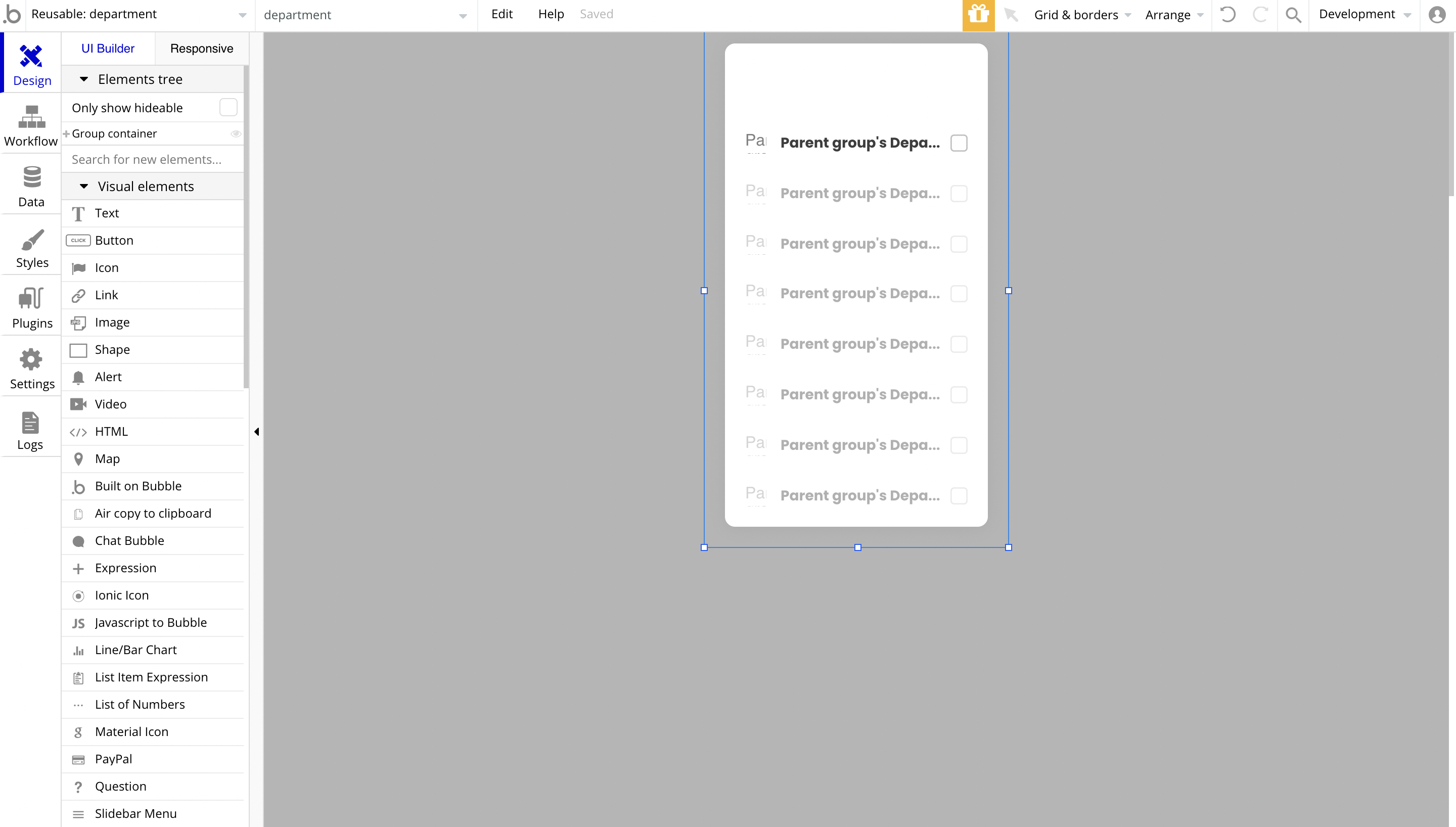
When the whole department group is clicked, the
departmentSelected state's value is changed, so different content is being displayed on the page.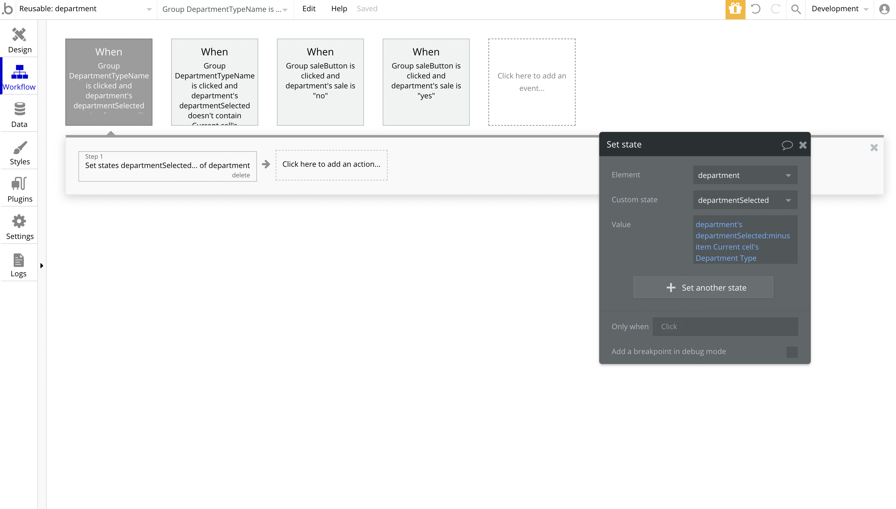
Footer 2.0
The footer reusable element is located at the bottom of a page. It provides an example of how it can include external links, such as company's social media, navigation and copyright notices.
A great website footer design keeps people engaged and moving through the website. The workflows included with this element are pretty straightforward to follow.
This reusable element is customizable, so it is possible to change styles and content of element while keeping workflows or using as inspiration for your own.
Here, users can easily access quick links such as Account, Order History, About Us, Privacy policy, etc.
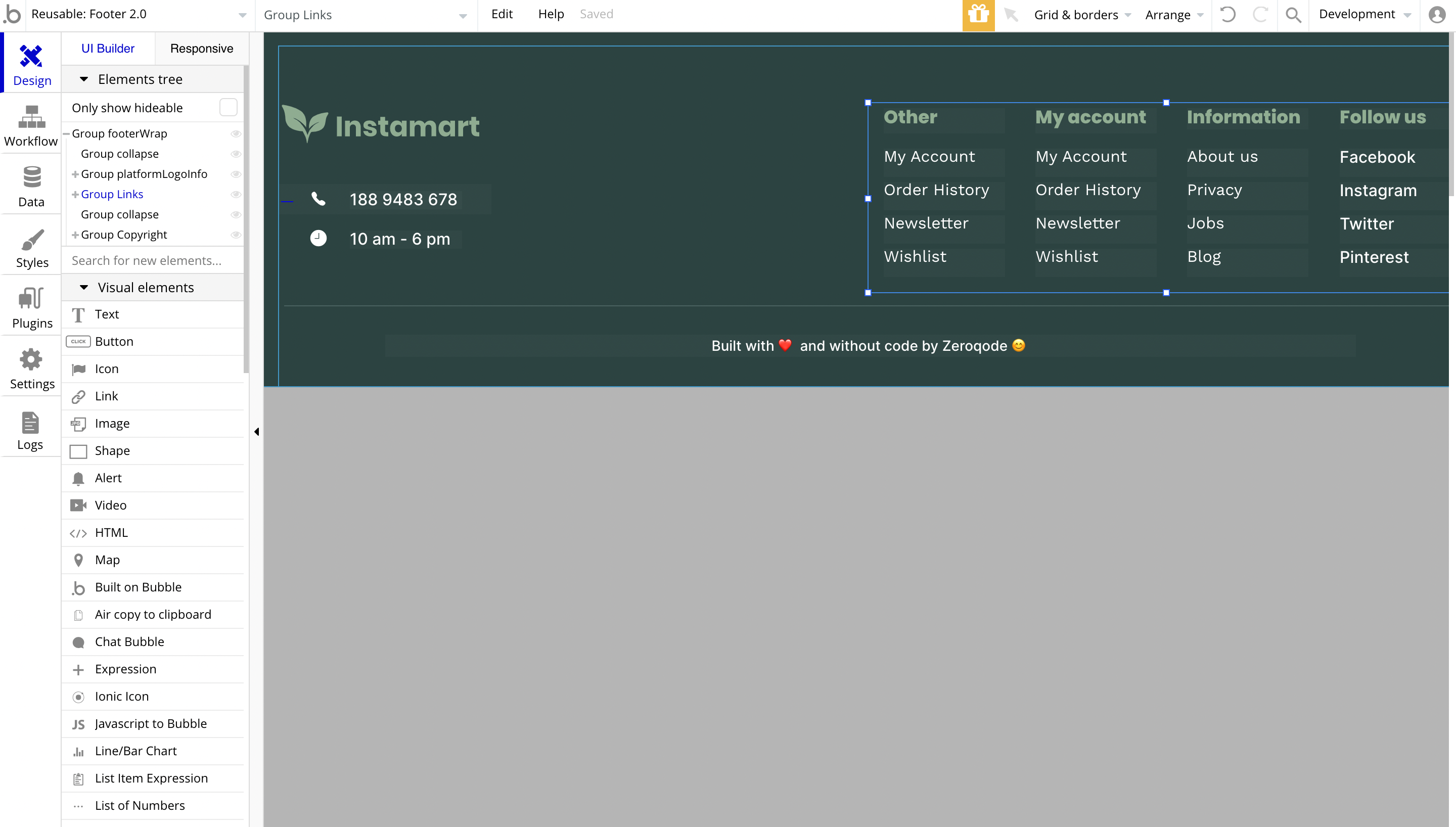
Tip: Add Privacy and Terms page links here, as well as create separate pages for these links. It will help you go through App Store and Google Play approval procedures, in case you convert your Bubble app into native iOS and Android apps. These links are also important for Facebook login.
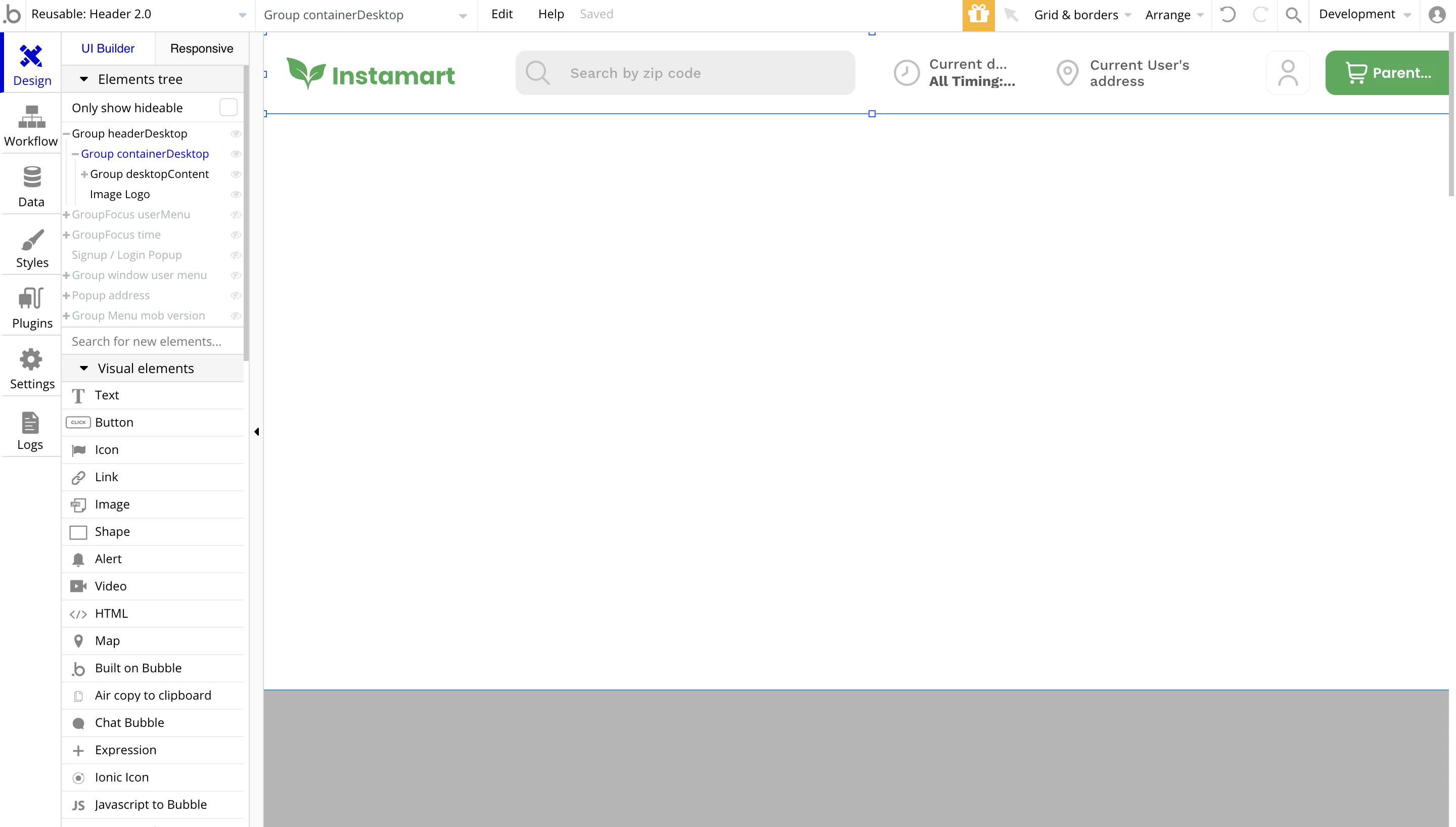
Header 2.0
The header reusable element sits at the top of each page and serves a few very important purposes. It does provide a place for company's logo, navigation and page title which are part of a consistent user experience that all good websites share.
Other common header features are, search, shopping cart (for ecommerce), login/logout, user profile and notifications (if applicable). The workflows included with this element are pretty straightforward to follow.
This reusable element is customizable, so it is possible to change styles and content of element while keeping workflows or using as inspiration for your own.
Here, users can search for a store based on ZIP code, add the current address, navigate to profile, go to the shopping cart, etc.
Tip: This page comes with demo logins that have been placed for testing purposes. They may be removed from your app.
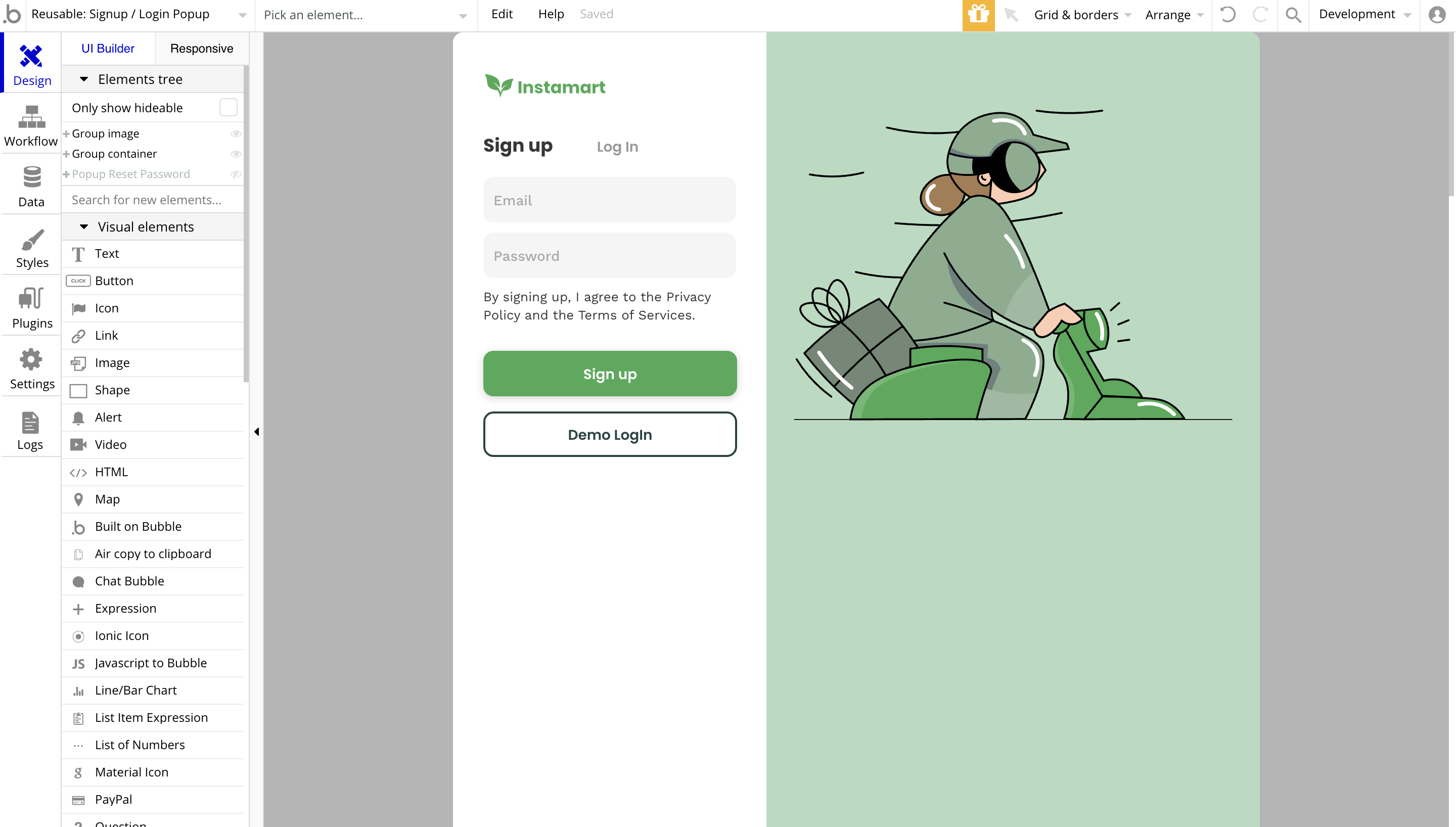
Signup / Login Popup
Here, users can sign up or log in, as well as use a demo login account in order to quickly test the Instamart template.
Tip: This page comes with demo logins that have been placed for testing purposes. They may be removed from your app.