This section states the purpose of each reusable element.
Introduction
Reusable Element - an element that contains other elements, like a group, that can be used in more than one place. This is useful when reusing the same elements often.
Tip: See Bubble Reference for details https://manual.bubble.io/core-resources/elements/reusable-elements 🙂
Reusable Elements
dashboardheader
Dashboard header is a customized header for our dashboard page. Within this reusable element, there is another reusable one called headermenu element.
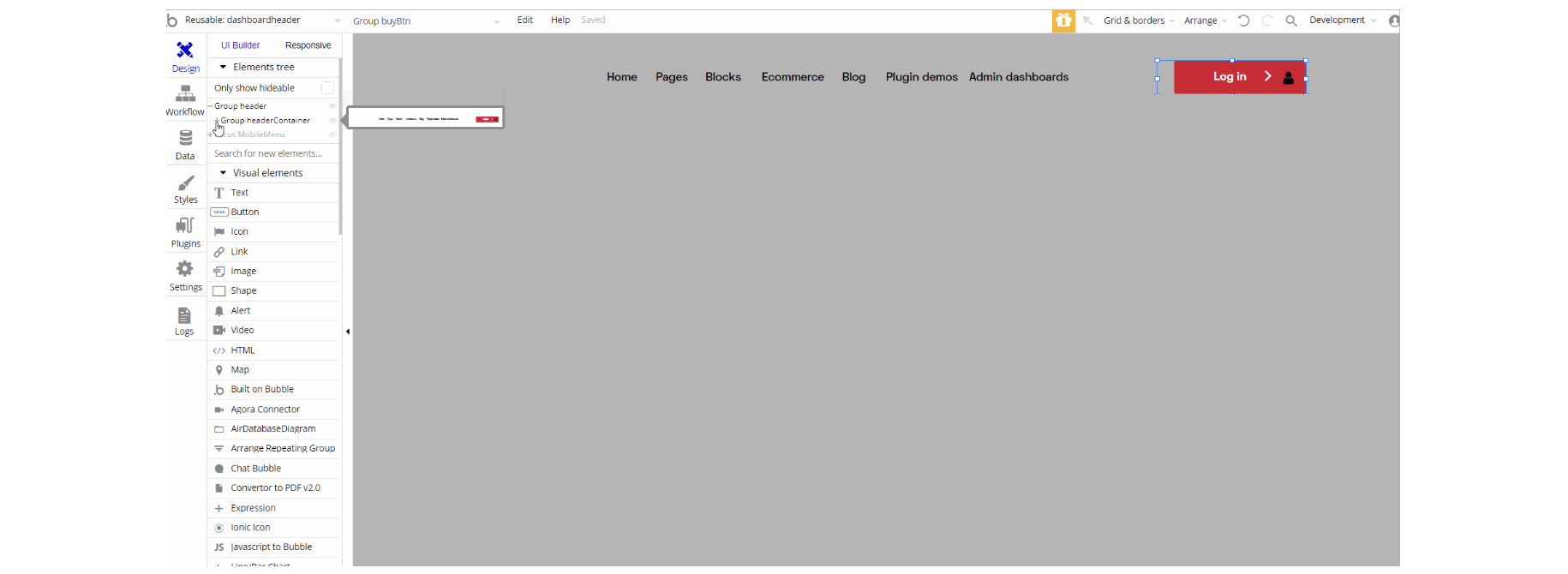
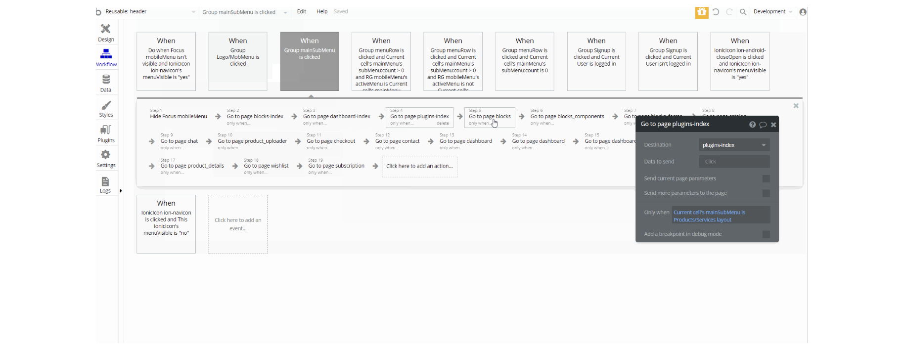
This reusable element is designed to be used as a header for admin_dashboards, blocks, blocks_componenets blocks_forms, and dashboard pages, which contains the main "Group header" and a hidden "Focus Group MobileMenu".
The main "Group header holds" the "Group headerContainer" which is the top hierarchy for "Group leftMargin" , "Group buyBtn" and "Group Headermenu" hidden element which contains another reusable headermenu element. "Focus Group MobileMenu" references "Group header", and in the hierarchy will be headermenu to dynamically dataobilemenuin the reusable element.
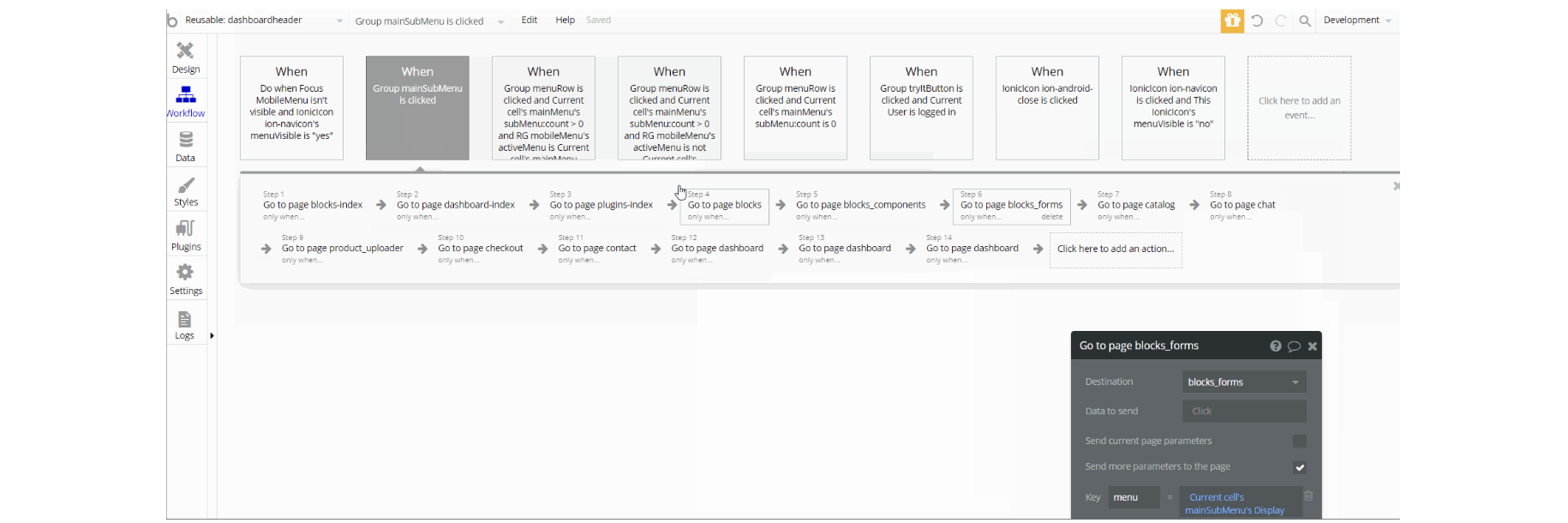
The workflows on this element are mostly of navigation actions to different pages, setting state values for showing and hiding elements inside the reusable(i.e groups).
footer 1
This reusable element holds the first design option for the footer element. It can be used both on mobile and desktop apps since it is totally responsive. It has links to social media and a couple of menus that can be changed.
This is a perfect footer in case you need to have some contrast at the end of your page because of its size and color.
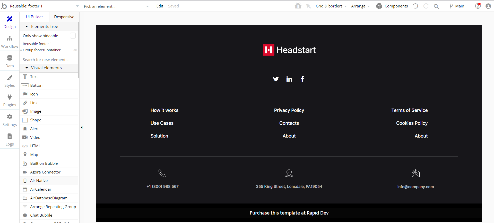
This reusable element is designed to be used as a footer element for the profile page and as a part of the demonstration of header_footer on-page, which contains the main "Group footerContainer" and "Group withLove".
Both groups hold elements on the page inside of inner group containers texts, images, and logos.
There are no element workflows for this reusable.
footer 2
This reusable element holds the second design option for the footer element. It can be used both on mobile and desktop apps since it is totally responsive. This is a tinier footer, used for cases when you don't want to attract a lot of attention to it.
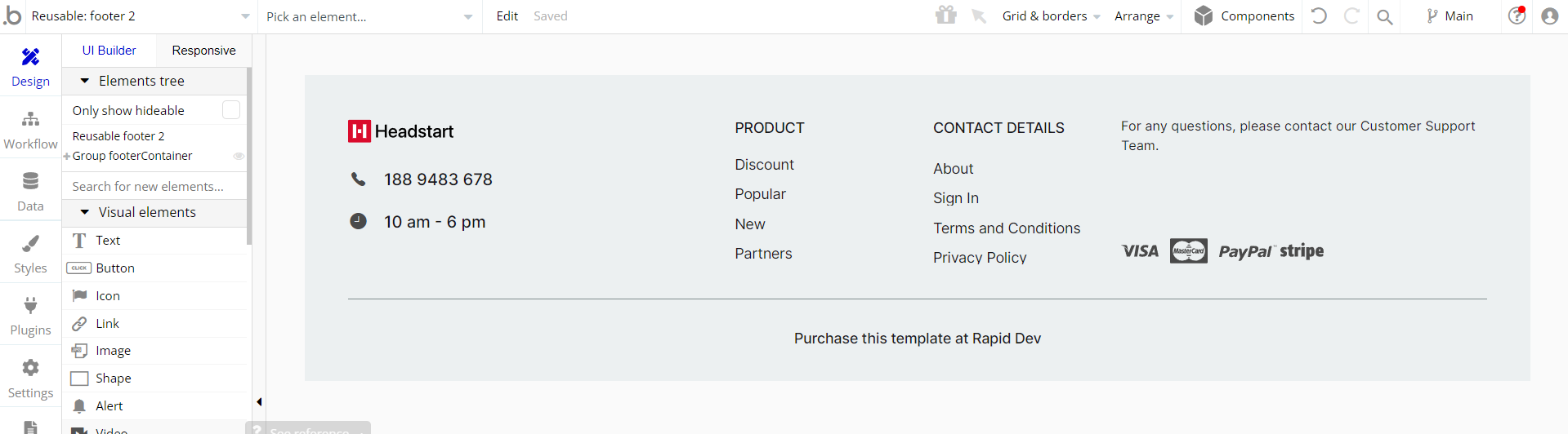
This reusable element is designed to be used as a part of the demonstration on the header_footer page, and contains the main "Group footerContainer" .
This is the one container that holds all other elements on the page like "Group cardsContainer", "Group Links", "Group platforminfo" and "Group Copyright".There are no element workflows for this reusable.
footer 3
This reusable element holds the third design option for the footer element. It can be used both on mobile and desktop apps since it is totally responsive. This is a more contrasty footer, used for cases when you need to catch some attention to it.
It has social media icons as well as an input that can collect emails of customers that are interested in a particular service you can provide.
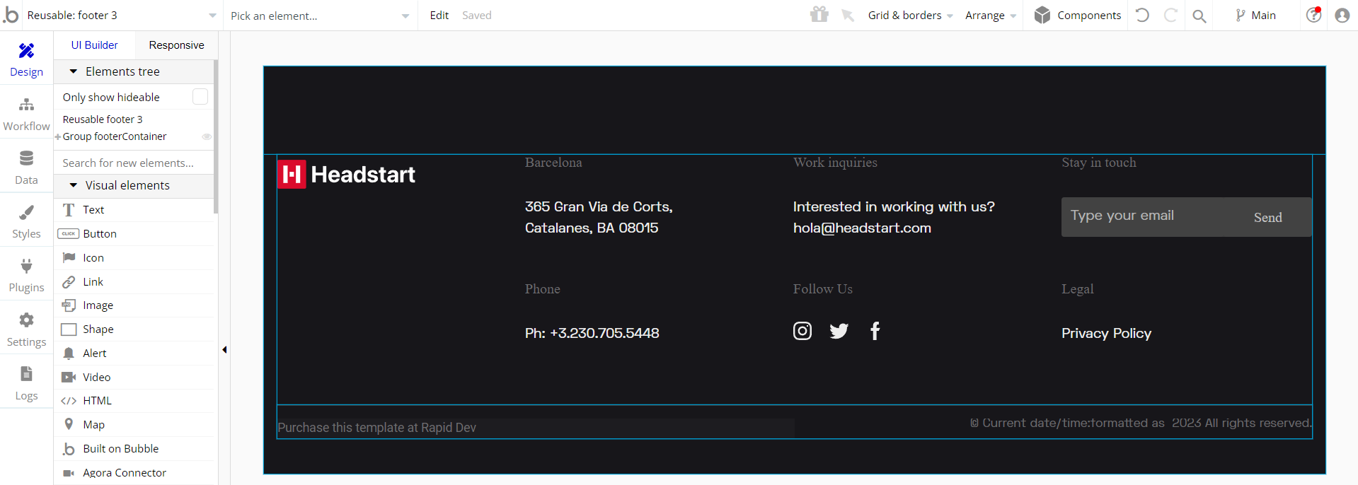
This reusable element is designed to be used as a part of the demonstration on the header_footer page, and contains the main "Group footerContainer". It is used for all other group elements which hold the content inside. There are no element workflows for this reusable.
footer-new
The footer reusable element is located at the bottom of a page. It provides an example of how it can include external links, such as the company's social media, navigation, and copyright notices.
A great website footer design keeps people engaged and moving through the website.
The workflows included with this element are pretty straightforward to follow.
This reusable element is customizable, so it is possible to change the styles and content of elements while keeping workflows or using as inspiration for your own.
This is the reusable element used on most of the pages. It's the main footer used for this template.
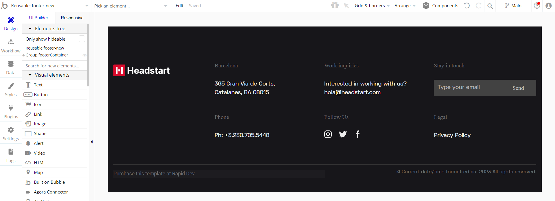
This reusable element is designed to be used on most pages, and contains the main "Group footerContainer". The "Group footerContainer" is used for all other group elements which hold the content inside.
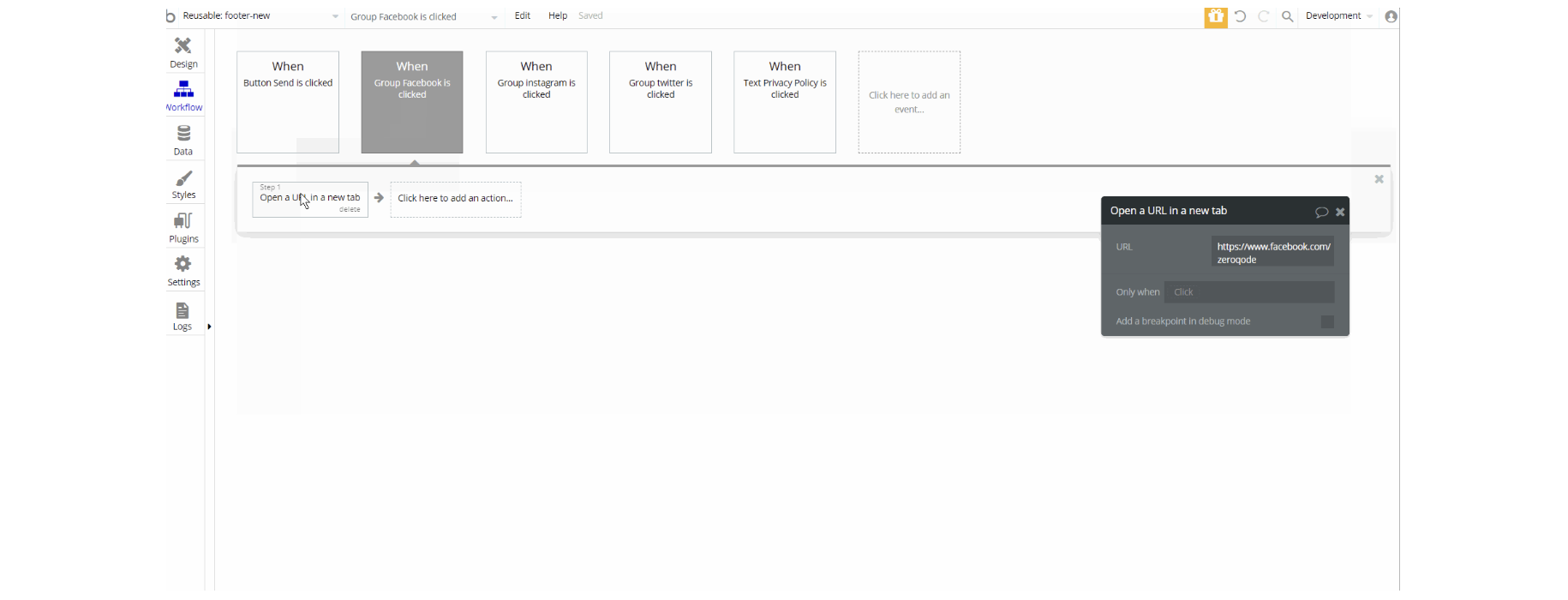
The workflows on this element are mostly of actions navigation to open external pages and all page links can be changed.
Tip: Make sure you have Privacy and Terms links in the footer, as well as create these separate pages. It will help you go through App Store and Google Play approval procedures, in case you convert your Bubble app into native iOS and Android apps. These links are also important for Facebook login.
header
This reusable is a generic header that will be used on most of the pages. Its core is also the headermenu reusable element. You can navigate all over the template using the menus within headermenu the reusable element.
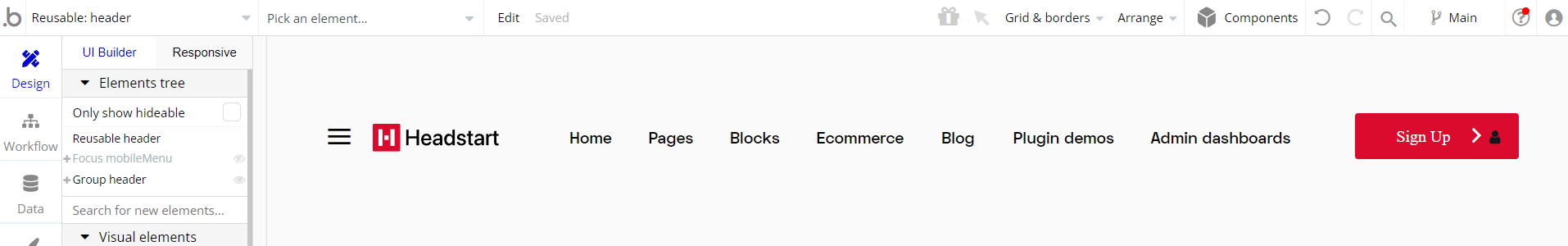
This reusable element is designed to be used on most pages, and contains the main "Group header".
The "Group header" is used for all other group elements which hold the content inside it. There is a "Focus Group mobileMenu" with reference to the main "Group header" which displays the data in "GroupmobMenuContainer"
The workflows on this element are mostly of navigation actions to different pages from the side menu, setting state values for showing and hiding elements inside the reusable (i.e groups).
header 1
This reusable element holds the first design option for the header element. This header is oriented more towards a fashion store, but it can be restyled and used in a lot of different variations.
It can be used both on mobile and desktop apps since it is totally responsive.
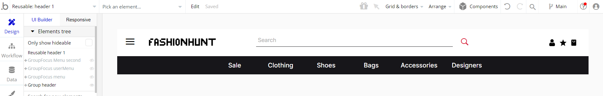
This reusable element contains the main "Group header". The "Group header" is used for all other group elements which hold the content inside it.
There are 3 different Group Focus groups: "Focus mobileMenu", "GroupFocus userMenu" and "GroupFocus menu". These groups reference different group elements, which can be found in the reusable element.
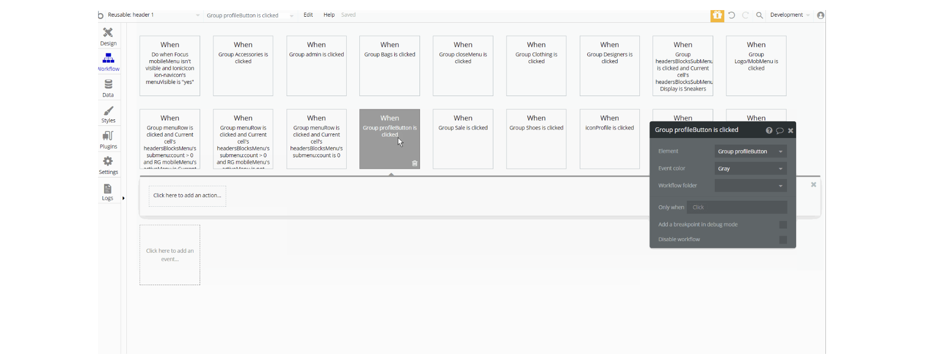
The workflows on this element are mostly of setting state values and showing and hiding elements inside the reusable (i.e groups) and couple navigation actions to different pages.
header 2
This reusable element holds the second design option for the header element. This header is oriented more towards an electronics store, but it can be restyled and used in a lot of different variations. It can be used both on mobile and desktop apps since it is totally responsive.
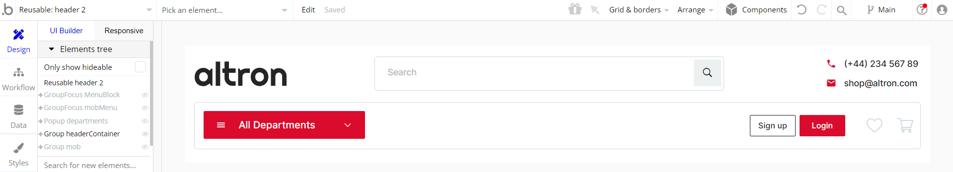
This reusable element contains the main "Group headerContainer". The "Group headerContainer" is used for all other group elements which hold the content inside it.
The reusable also contains 2 Group Focus groups: "Focus mobMenu" and "GroupFocus MenuBlock" with group reference different elements, which can be found in the reusable element.
There is also the pop-up element "Popup departments" and a "Group mob" container that holds the mobile menu elements designed for mobiles.
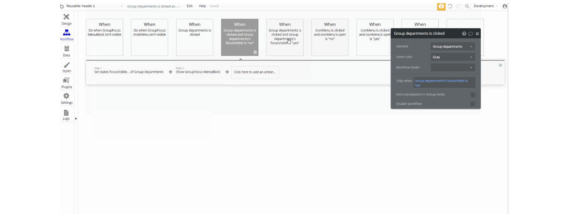
The workflows on this element are only for setting state values and showing and hiding elements inside the reusable (i.e groups, pop-ups, etc)
header 3
This reusable element holds the third design option for the header element. This header can be primarily used for a tech web page, but it can be restyled and used in a lot of different variations. It can be used both on mobile and desktop apps since it is totally responsive.
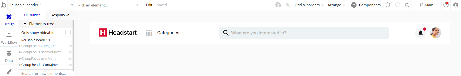
This reusable element contains the main "Group headerContainer". The "Group headerContainer" is used for all other group elements which hold the content inside it.
The reusable also contains 3 Group Focus groups: "Focus Categories", "GroupFocus userNotifications" and "GroupFocus userMenu" with group reference different group elements.
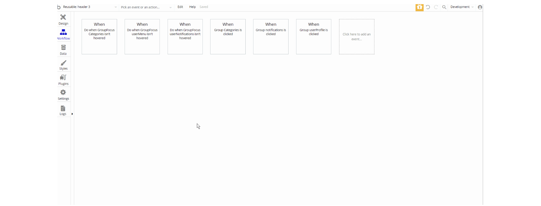
The workflows on this element are only for showing and hiding elements inside the reusable (i.e focus groups)
headermenu
This reusable element was created to be the core of other reusable header elements.
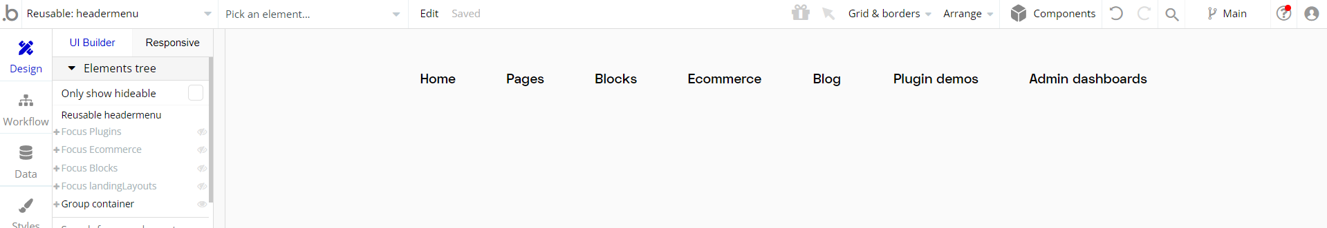
This reusable element contains the main "Group container". The "Group container" is used for all other group elements which hold the content inside it like "Group Admin", "Group Plugins", "Group Blog", "Group eCommerce" etc which are used for navigational purposes.
The reusable also contains 4 Group Focus groups: "Focus landingLayouts", "Focus Blocks", "Focus Ecommerce" and "Focus Plugins" with group reference different group elements.
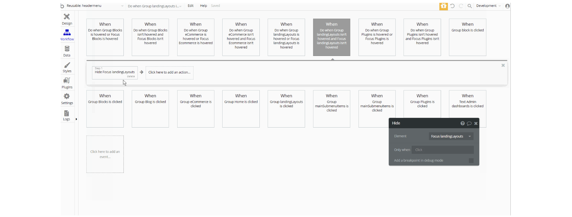
The workflows on this element are mostly of navigation actions to different pages from the top container, and showing and hiding elements inside the reusable (i.e groups).
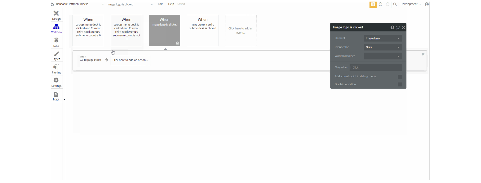
leftmenublocks
This reusable element was created for navigation between a couple of pages: blocks page blocks_components page, blocks_form page.
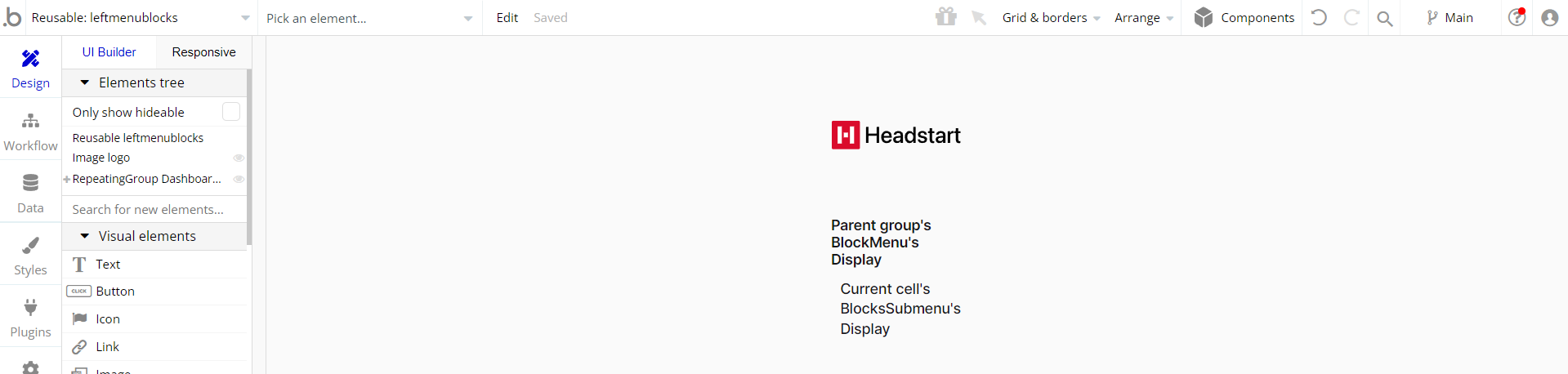
This reusable element contains an "Image logo" and "RepeatingGroup Dashboard Menu". The "RepeatingGroup Dashaboard Menu" holds "Group menu desk" and "Group submenuLeft" and has a type of content data source BlockMenu values pulled from database Option Sets used for navigational purposes.
profile_menu
This reusable element is basically an icon and a menu that comes up whenever you click on it. Because it's such a generic option, it was created as a reusable element so that we can use it on multiple pages within the template
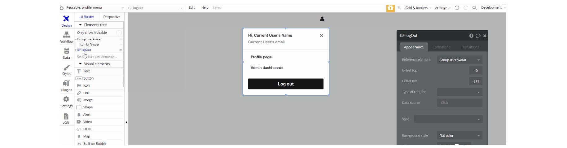
This reusable element contains a "Group userAvatar" and a hidden "GroupFoucs LogOut" with a group reference of different group elements. The group elements are mostly for navigation and hiding/showing elements on-page.
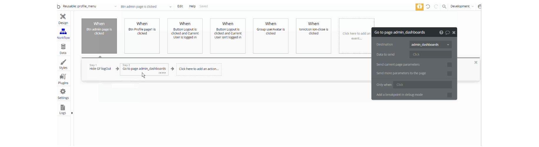
The workflows on this element are mostly of navigation actions to different pages, and showing and hiding elements inside the reusable.
storeHeader
This reusable element was created so that it can be used on pages that are related to the e-commerce part of the template. Its core is another reusable used in other headers called headermenu a reusable element.
Besides that, what makes it so specific, are the wishlist and cart icons. It is used on catalog, checkout, product_details, and wishlist pages.
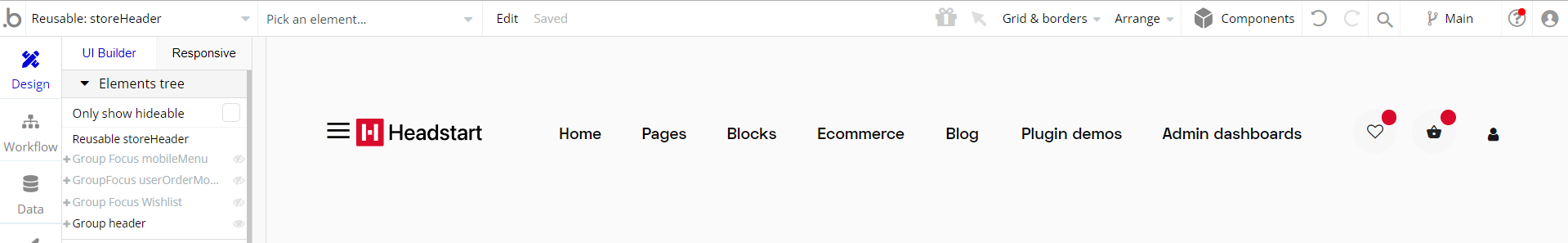
This reusable element contains the main "Group header". The "Group header" is used for all other group elements which hold the content inside it.
The reusable also contains 3 hidden Group Focus groups: "GroupFocus mobileMenu", "GroupFocus userOrderMobile", and "GroupFocus Wishlist" with group reference different group elements.
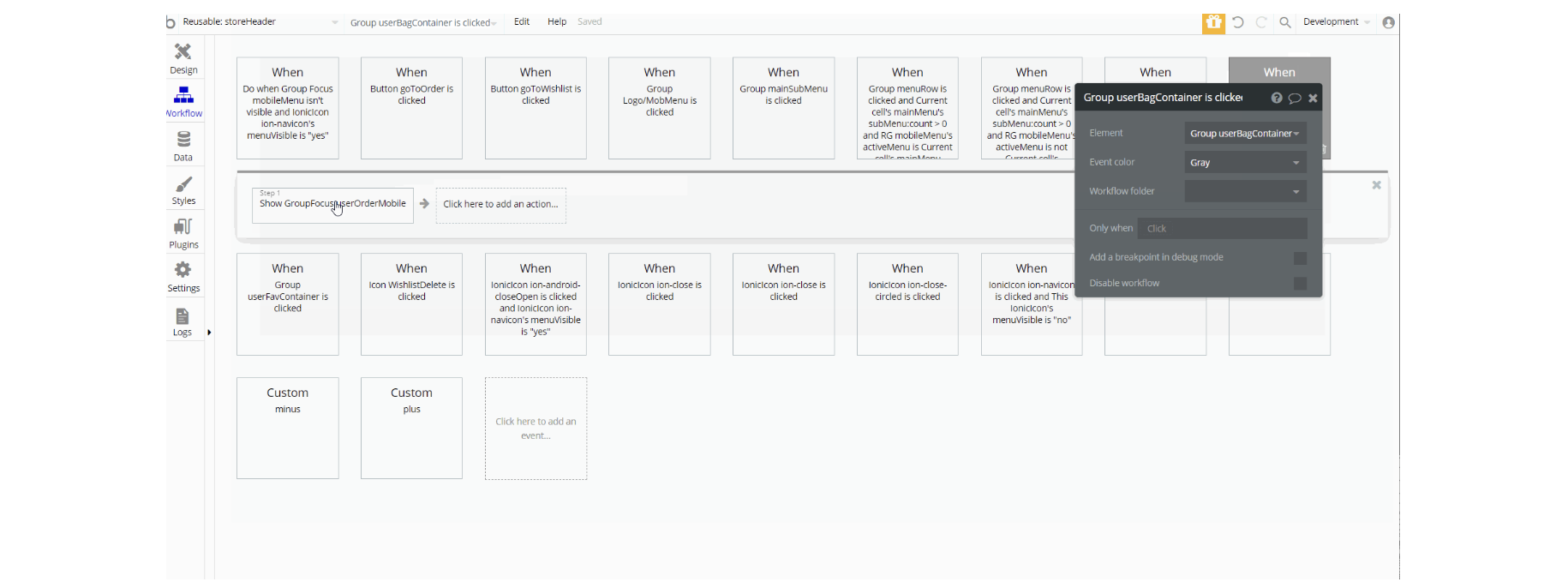
The workflows on this element are mostly of setting state values and showing and hiding elements on the page (i.e groups) and navigation actions to different pages. There are also actions that manipulate database values using Make Changes and Delete respective values.