This section states the purpose of each page.
Introduction
In this summary, we will describe each page and its content. The Page Element is the fundamental one that contains all the other elements.
Tip: See Bubble Reference for more information about Pages element https://bubble.io/reference#Elements.Page 🙂
Pages
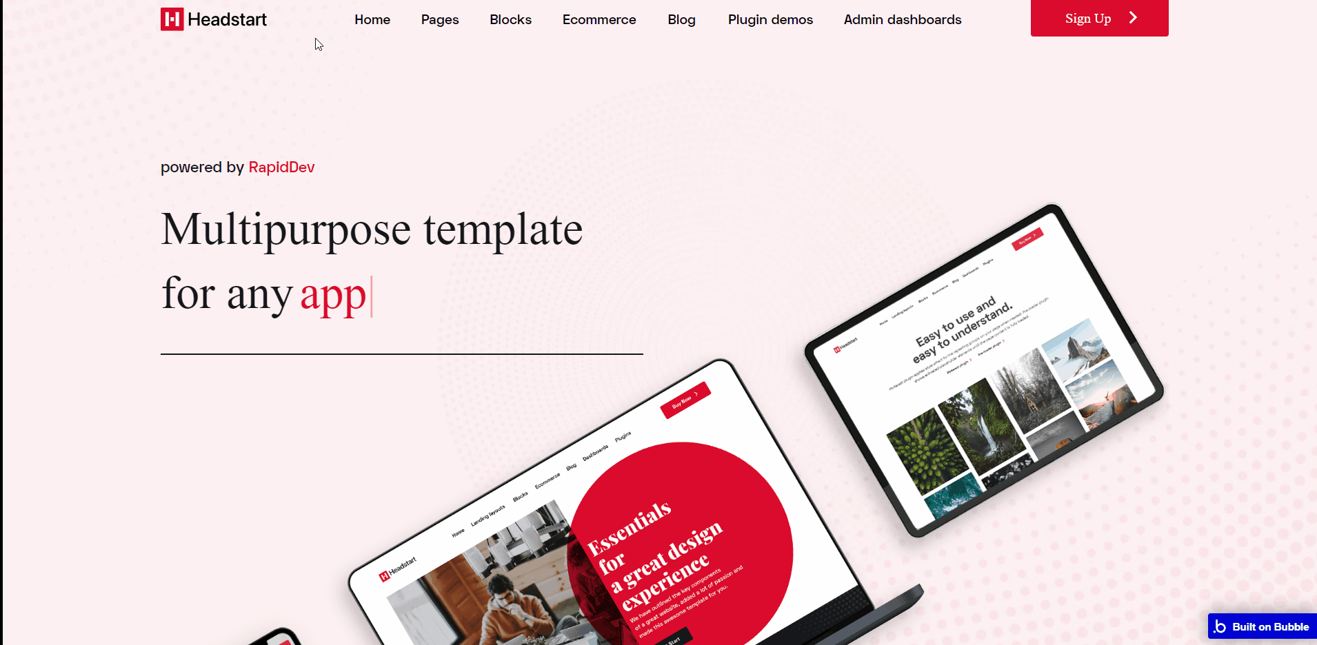
index
This is the main page typically encountered first on the web app that usually contains links to the other pages of the site. A homepage includes a variety of menus that make it easy for users to find the information they need.
On this page, small previews of what the template's got, as well as a list of features available on the template.
The design of this page consists of main hierarchy Group containers with branches in Elements tree for each container with different groups and elements inside.
Some of the elements are hidden from loading on page load, yet through Conditional setup when the condition is true these elements will be visible on-page.
Tip: Be sure to check elements in both UI Builder and Responsive sub-menus to see the in-depth conditions setup 🙂
Most of the workflow actions on this page are related to navigation to different pages and another set of actions are related set state values for showing different groups elements on-page.
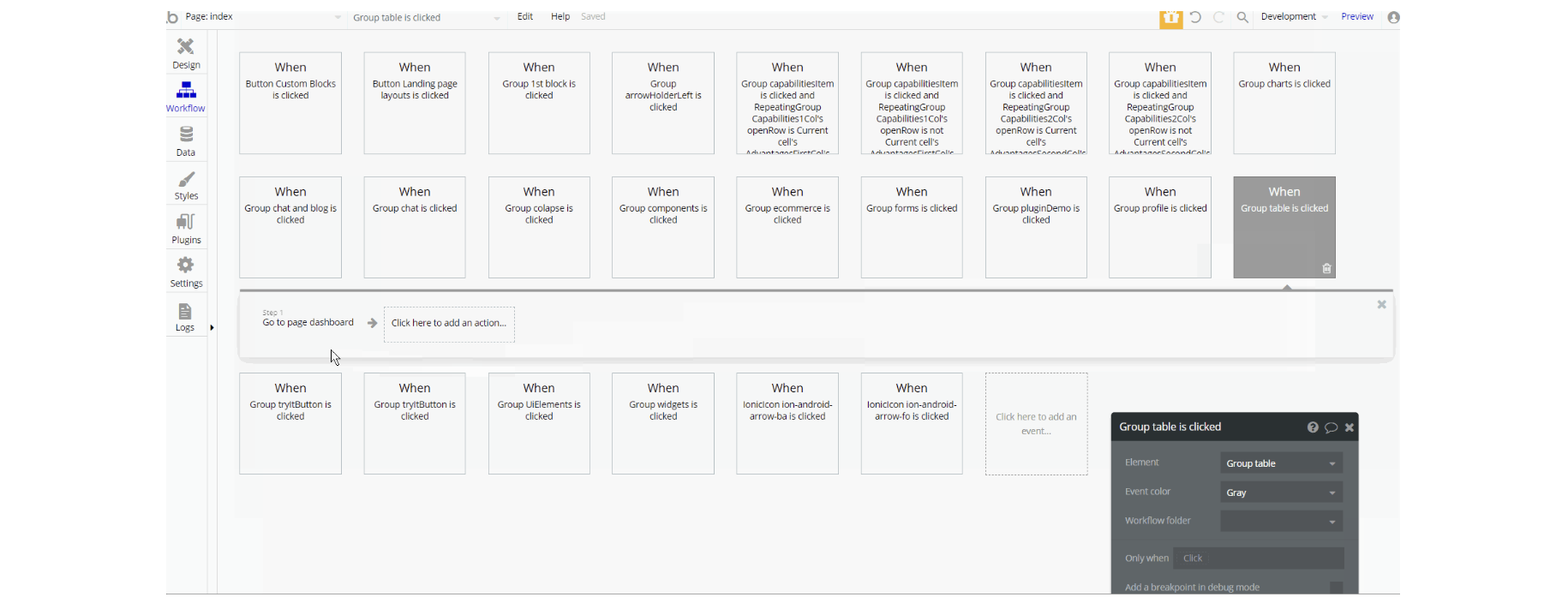
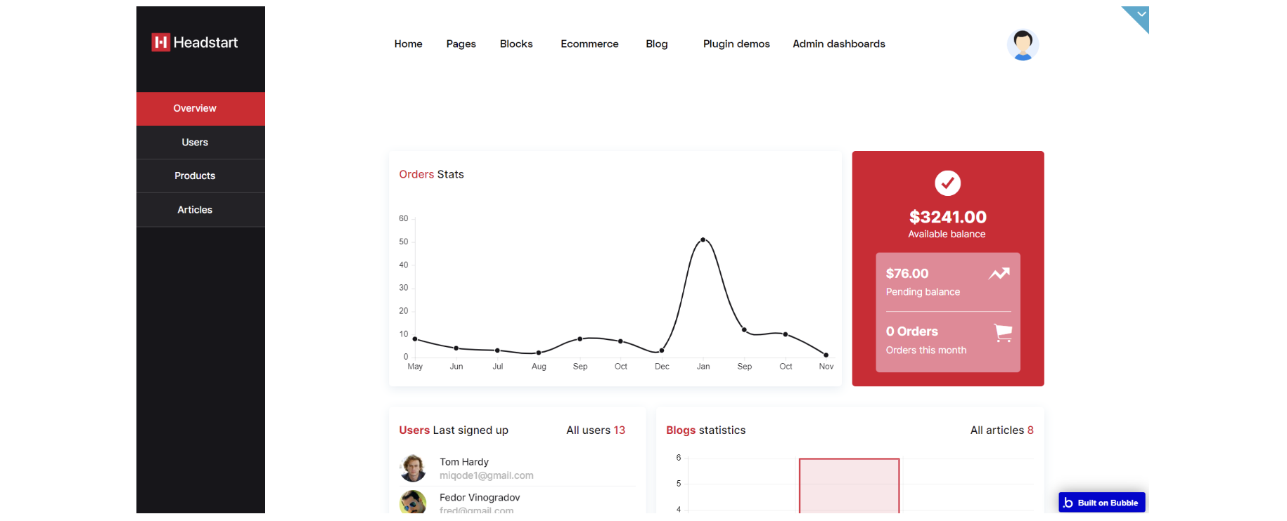
admin_dashboards
This page is designed to manage platform data, e.g. Users, Items, Payments… and others. Only users with admin rights are able to access this page (in read-only mode), and those users who have access rights can edit or delete anything here.
The admin panel is divided into 3 sections. When you enter the admin panel, you will automatically see a list of users that are registered on the platform.
Here you can either delete a user's information or edit it. You also have the possibility of setting a temporary password for a user in case he forgot the account password.
Products tab🛒is related to the product marketplace. Here you will see a list of existing products. You can either edit or delete a certain product, or you can create one. You can also publish or hide the products that are published using a checkbox in the initial table.
In the Articles tab📃, you can manage the articles. You can either delete or edit an article, or you can create a new one.
The design consists of the main "Group container", alongside a Floating group for the left menu. The pop-up elements are all hidden on page load.
The main container is branched into other different group elements and hidden group containers designed to hold tabs values (i.e: "Group Users", "Group Products", etc).
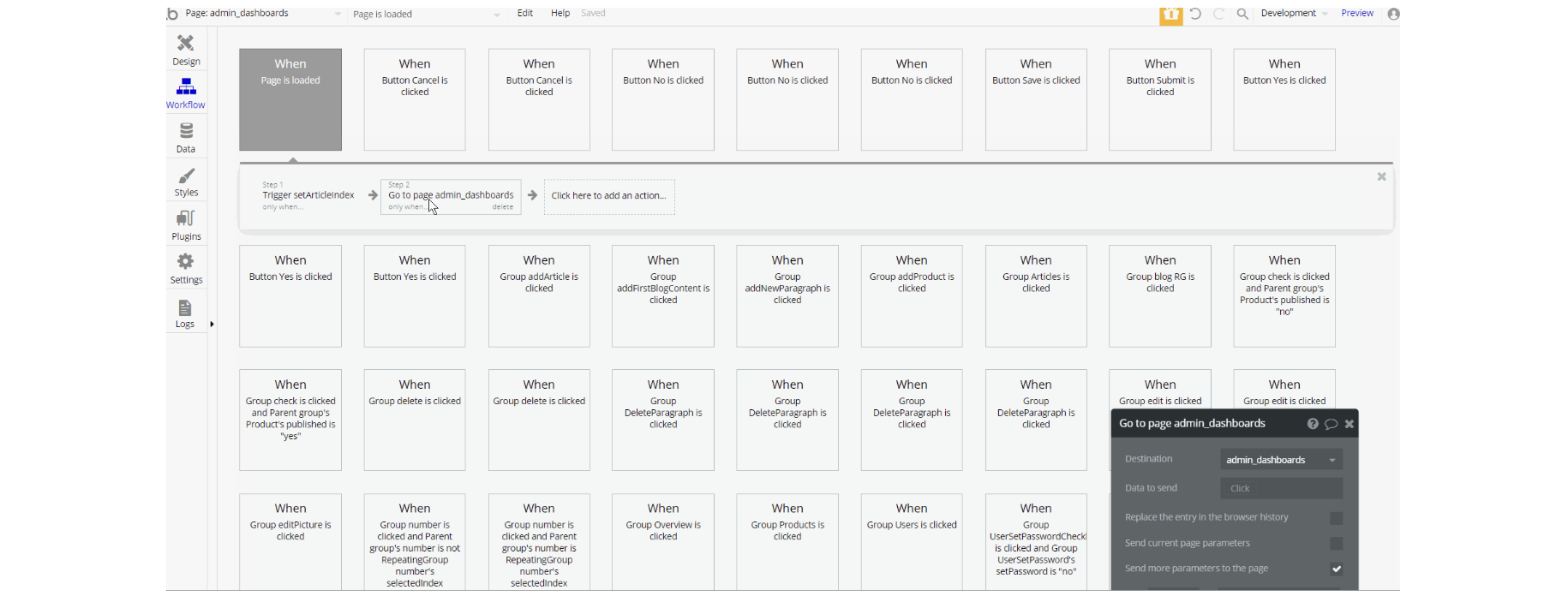
The workflows on this page are a combination of navigation actions to different pages, setting state values for showing different elements on the page (i.e groups, pop-ups, RG, etc.).
This page also combines actions working with data, by modifying and saving different values inside database types like Product, User, Blogand makes use of custom events to hide and unhide elements on-page.
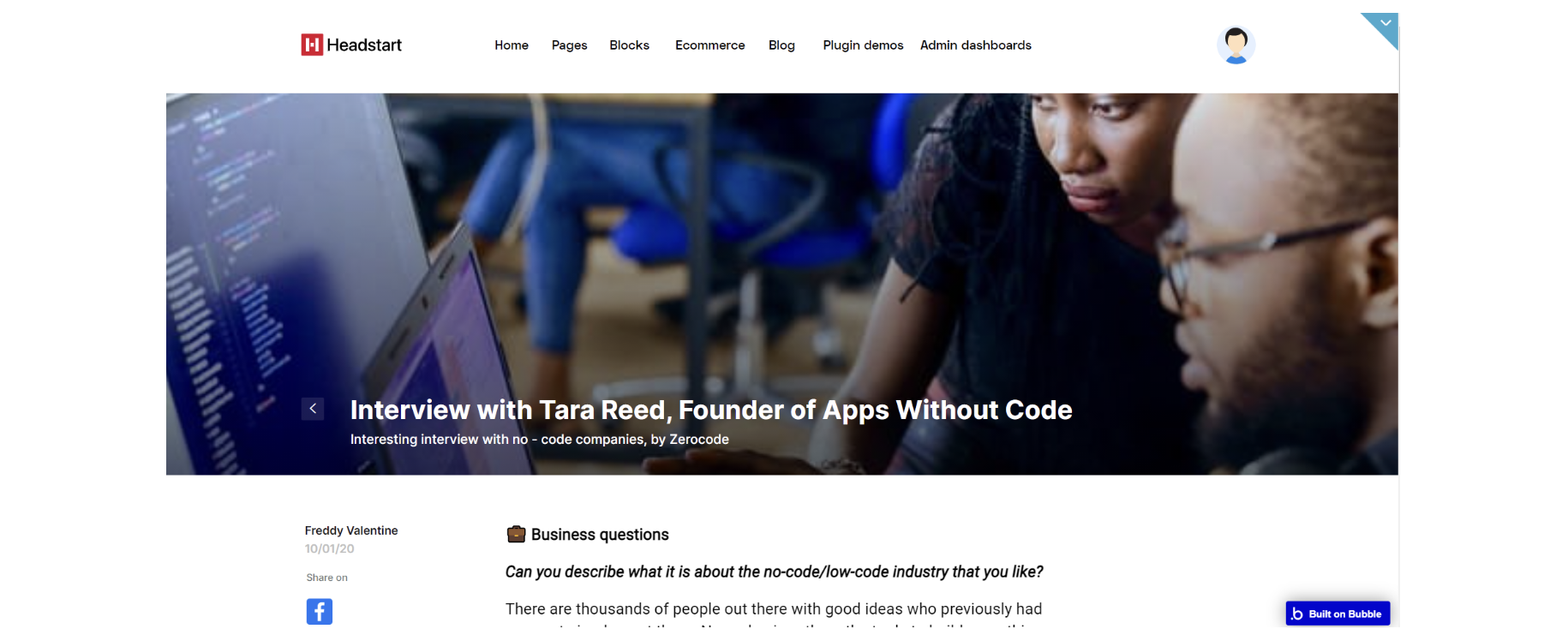
article
On the article page, you can read the article itself, also you have the possibility to leave a comment on the article and share it on social media.
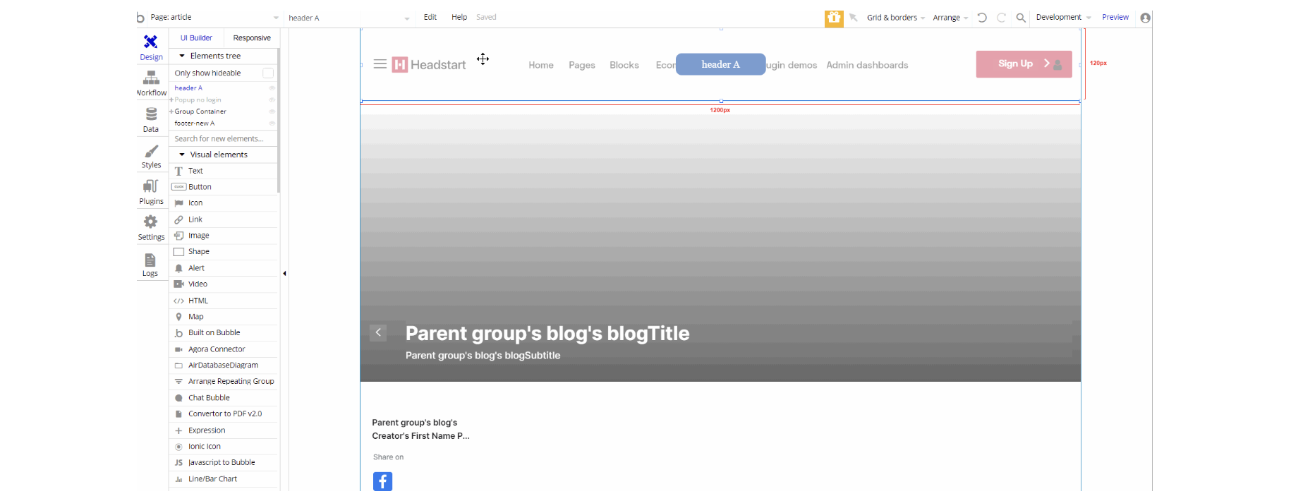
The design consists of the main "Group container", alongside a pop-up element hidden on load with header A and footer-new A reusable elements.
The main container is branched into other different group elements and group containers designed to display the content of the article including: "Group article image", "Group article text" and "Group comments".
Inside these groups, there is the content itself wrapped in special groups for wrapping out and providing responsive design on-page.
The workflows on this page are designed in a simple way. It consists of navigation action to different pages, hiding and showing different elements on the page (i.e groups, pop-ups, etc.).
This page also combines actions working with data, modifying the values of database types like Comment, Discussion and Blog
blocks
The Block components page holds UI Components that contain 3 options of every block type.
It has Profiles, Pricing blocks, Login and Register examples, headers & footers. Every design presented there is unique and can fit a whole range of styles and use cases.
The design consists of the main "Group container", alongside "Group menuBar" which hold the other components with dashbaordheader A reusable element on-page.
The main "Group container" is branched into other different group elements and group containers designed to display the content of the article including: "Group pages_RegisterPage", "Group pages_LoginPage", "Group blockUserProfiles", "Group pricing", "Group Tables", "Group widgets" and "Group charts".
A hidden group element is part of the main container "Group mobileMenu" with a "Group containerLeftMargin" for responsive alignment with respective page conditional.
"Group menuBar" is used for left tabbing using leftmenublocks reusable element.
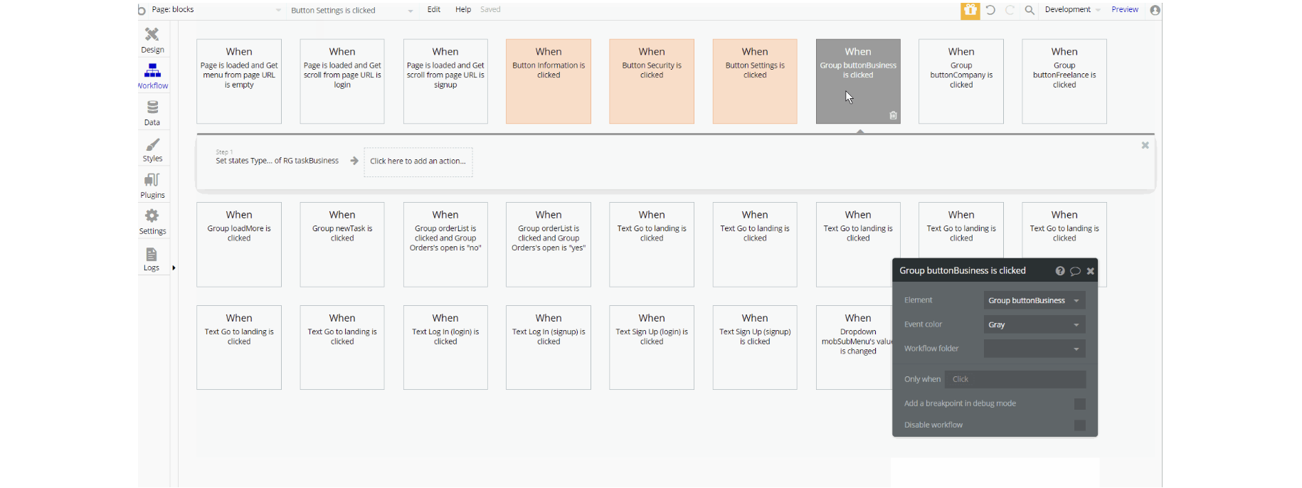
The workflows on this page are a combination of navigation actions to different pages, setting state values for showing different elements on the page (i.e groups, RG, etc.).
Also on page load conditions in events when value is true, is used to scroll to respective element on-page which is useful for navigation.
blocks-index
This page is one of three landing layouts we're offering with this template. Here we have previews of custom blocks you can see in more detail on the blocks page.
This page can be remade as per your preferences and used as a landing page for your project.
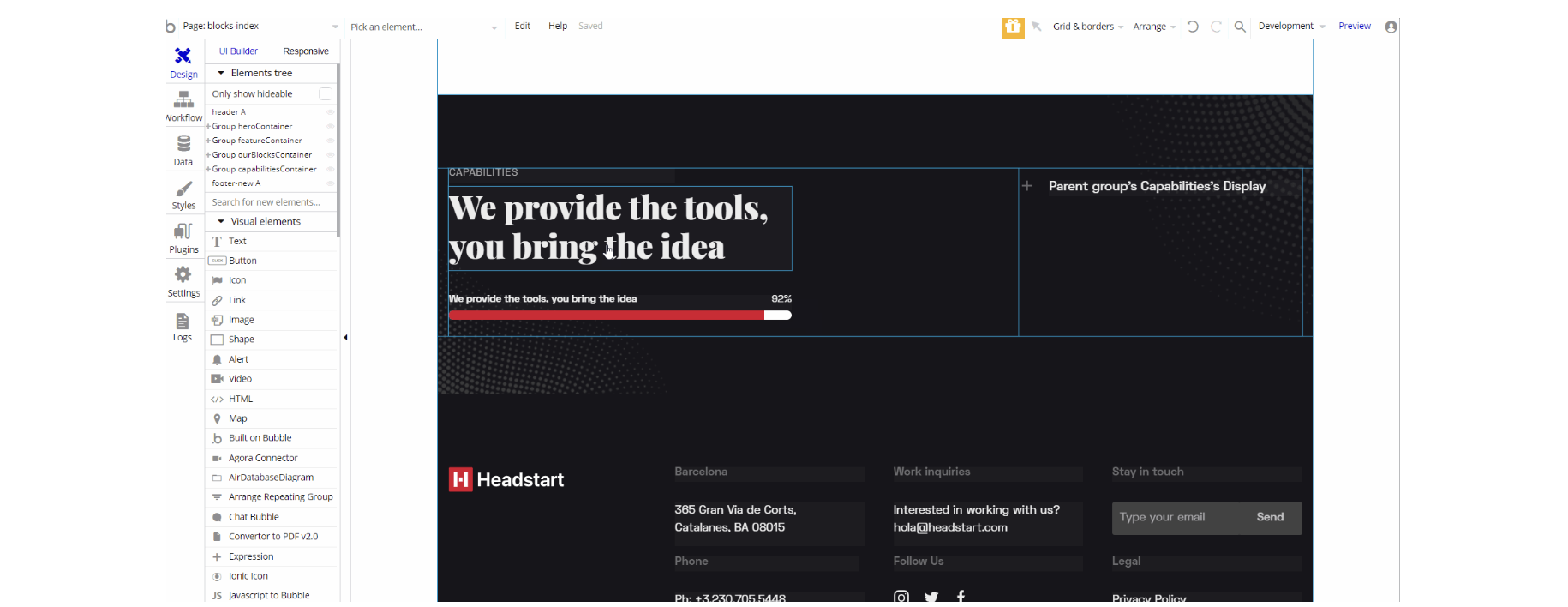
The design for this page consists a couple of main Group containers ("Group heroContainer", "Group featureContainer", "Group ourBlocksContainer" and "Group capabilitiesContainer"), alongside components header A and footer_new A reusable elements on-page.
These main Group containers are branched into different group elements and group containers designed to display the content of the blocks including: "Group featureInner x2", "Group capabilitiesInner", "Group left", and "Group circle" holding images, texts, and a variety of description.
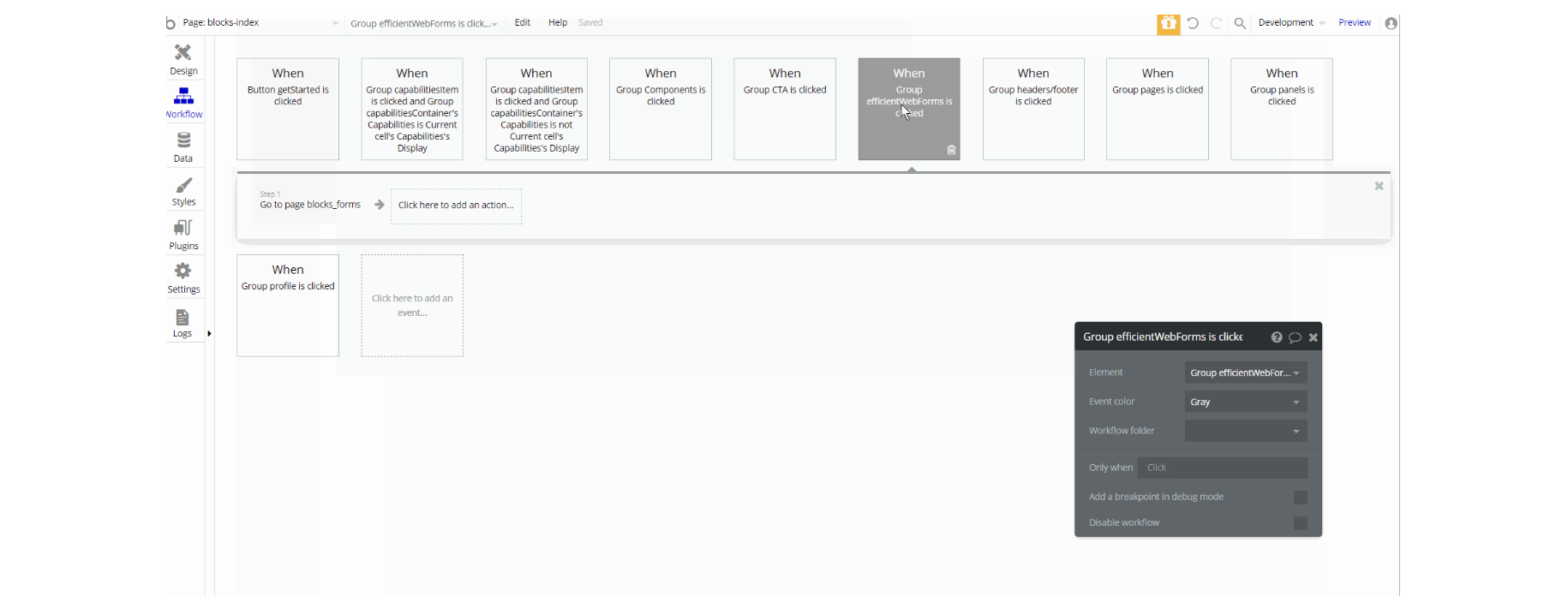
The workflows on this page are a combination of navigation actions to different pages, setting state values for showing elements on the page (i.e groups).
blocks_components
Blocks page has a wide range of UI elements that you can use in your project. They are fully responsive and ready-to-use, you'll have to do is to connect the logic behind every action you require.
Note: Components on-page may require additional workflow logic to be created.
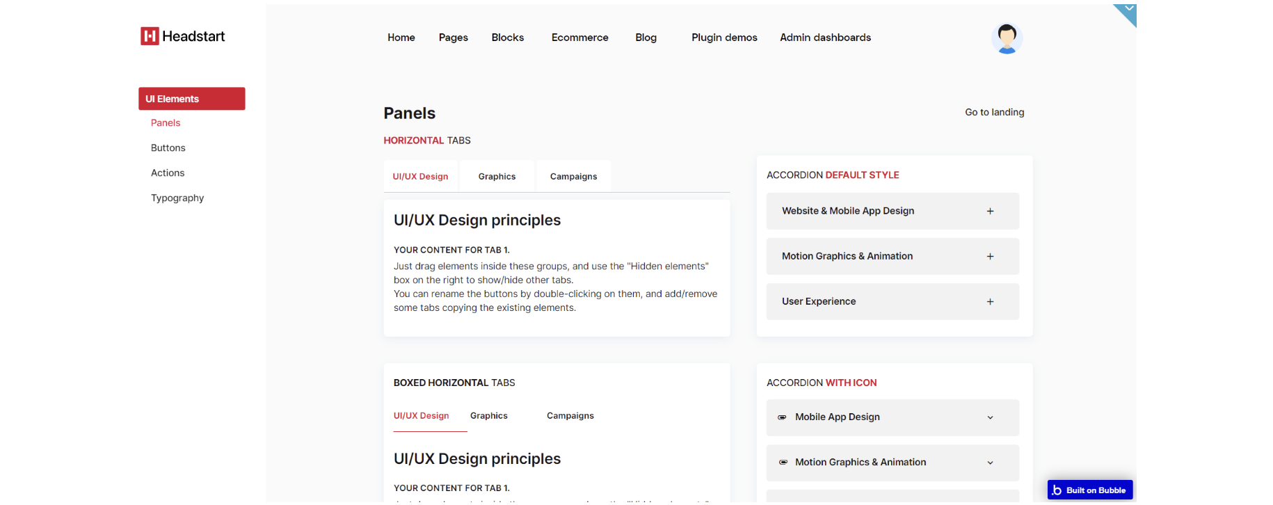
UI elements tab has different kinds of panels, a variety of buttons of different shapes and colors, and pagination examples. Next comes the Actions tab contains two Call to action blocks and notification alerts.
The design for this page consists of the main "Group container", alongside "Group menuBar" which hold the other components with dashbaordheader Aon-page.
The main "Group container" is branched into other different group elements and group containers designed to display the content of the blocks including: "Group componentsButtons", "Group componentsPanels", "Group componentsTypogrophy" and "Group componentsNotifications".
A hidden group element is part of the main container "Group mobileMenu" with a "Group containerLeftMargin" for responsive alignment with respective page width conditional.
"Group menuBar" is used for left tabbing using leftMenuBlocks reusable element.
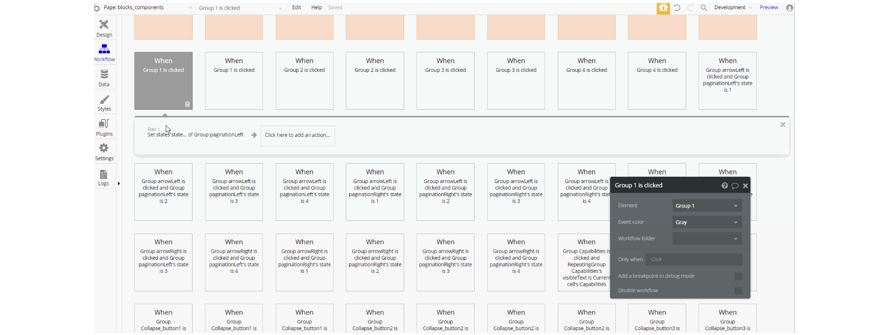
The workflows on this page are a combination of navigation actions to different pages, setting state values for showing elements on the page (i.e groups, texts, etc) and animating different group elements.
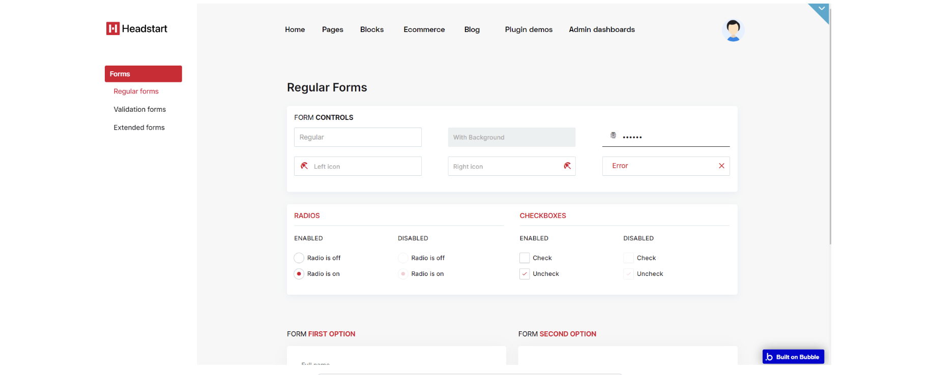
blocks_forms
This page has 3 components which are Regular forms, Validation forms, and Extended forms. They are fully responsive. All you have to do is just connect the logic behind every action you need.
The design for this page consists of the main "Group container", alongside "Group menuBar" which hold the other components, with dashbaordheader A reusable element on the page.
The main "Group container" is branched into other different group elements and group containers designed to display the content of the blocks including: "Group regularForms", "Group Forms_Validation forms", "Group Forms_Extended".
A hidden group element is a part of the main container "Group mobileMenu" with a "dropdown mobMenu" and "mobSubMenu" inside the main container.
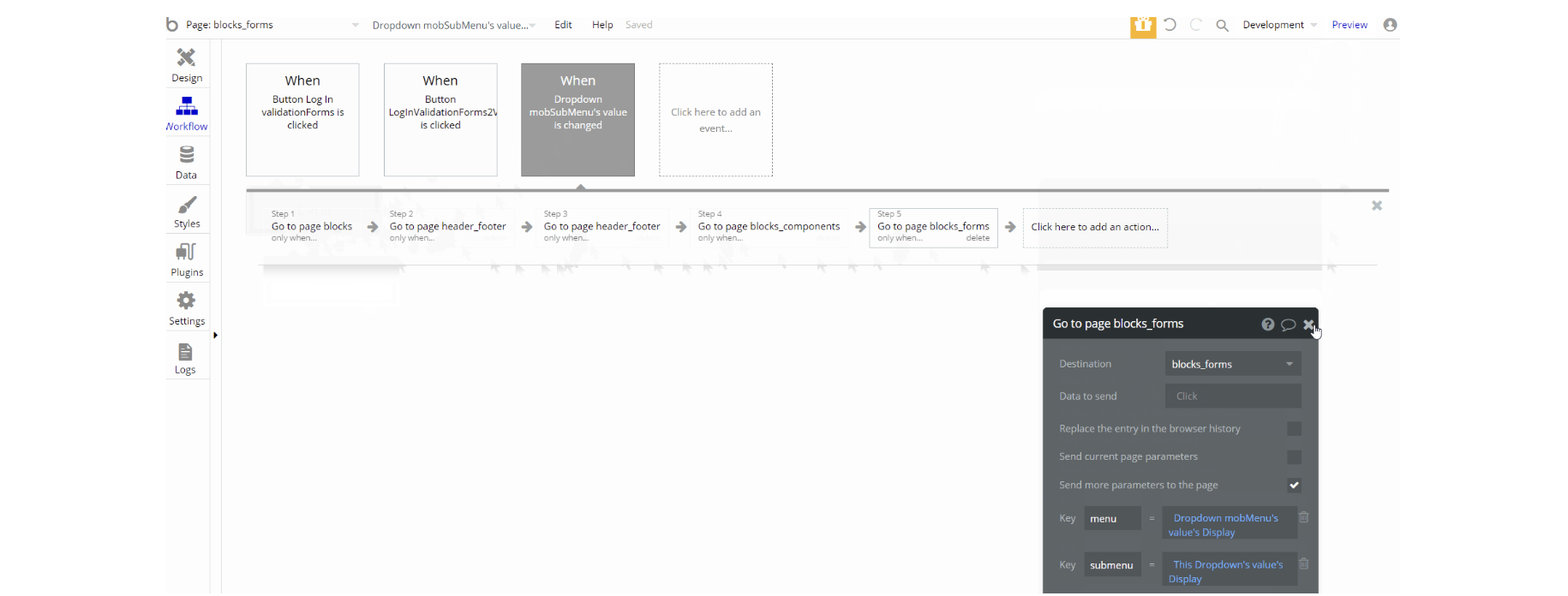
The workflows on this page are mostly navigation actions to different pages, with few events to set state with the elements to show from one for the forms.
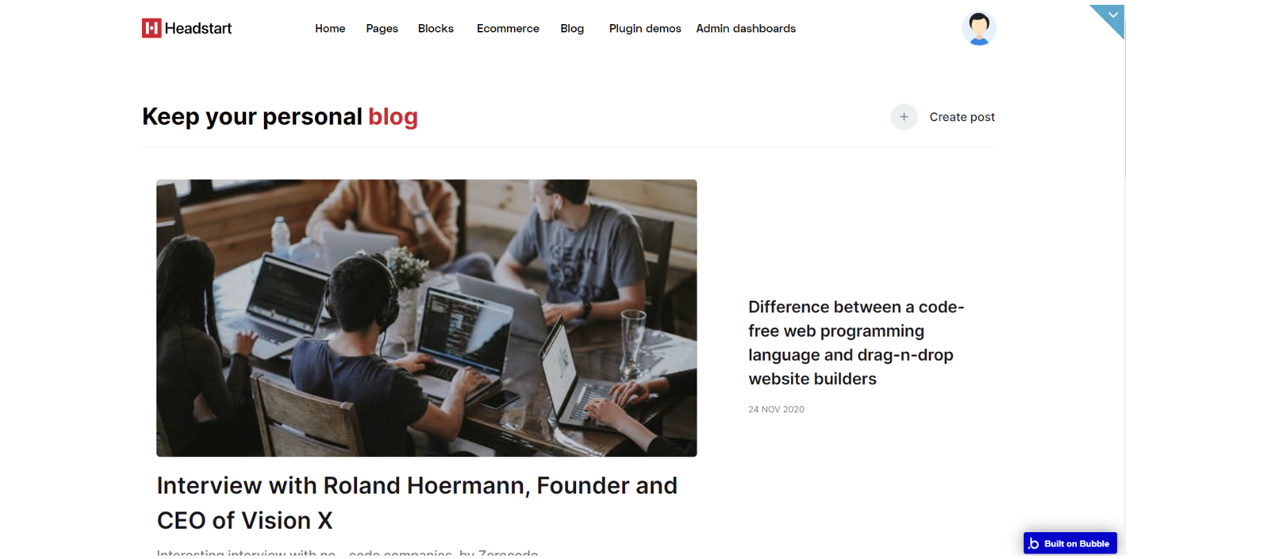
blog
This is the place where you'll have an overview of all the articles created on your web page. There are two sections: one with all the articles together, and the other one with the latest posts. On this page, there is a "Create a post" button.
The design for this page consists of the main "Group container", with footer_new A and header A reusable elements.
The main "Group container" is branched into other different group elements and group containers designed to display the content of the blocks including: "Group regularForms", "Group Forms_Validation forms", "Group Forms_Extended".
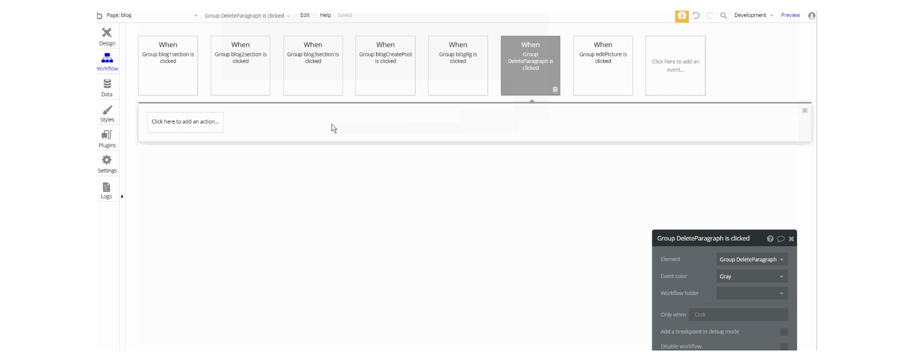
The workflows on this page are mostly navigation actions to different pages, most of them are navigation to the article page. This page also combines actions working with data, modifying the values of the database type Blog.
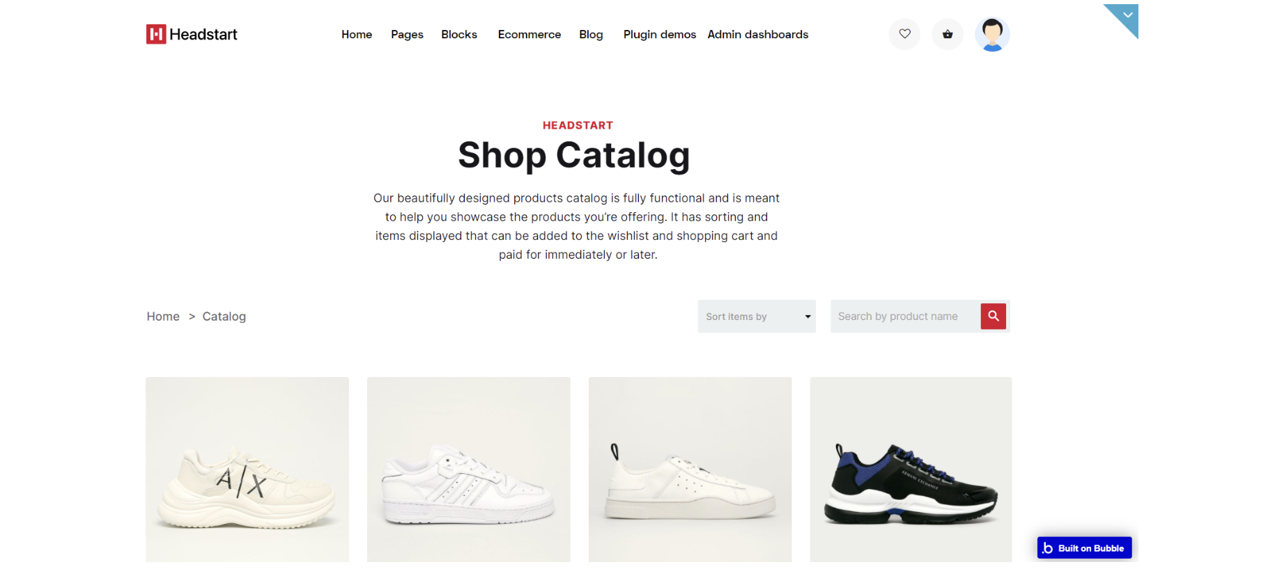
catalog
The catalog page displays all the products you've published. Users can sort them by the highest and lowest price and by the latest arrivals. Right next to the sorting dropdown you will see a search box that enables searching through the products available on the page.
The design for this page consists of the main "Group container" a hidden "pop-up productAdded" which displays Product datatype, with footer_new A and storeHeaderA reusable elements.
The main "Group container" is branched into other different group elements and group containers designed to display the content of the catalog including: "Group spacing" used for page making, "Group headHolder", "Group search/sort", "Group productList" and "Group banners".
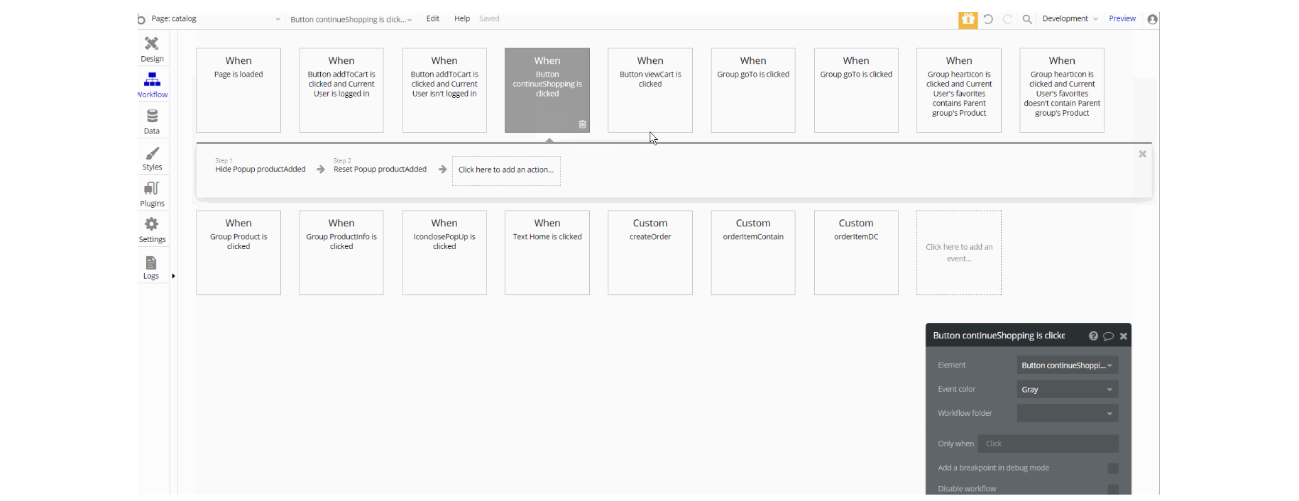
The workflows on this page are mostly navigation actions to a couple of pages while having to open new browser tabs.
This page also combines actions working with data, modifying the values of the database typeOrder OrderItem and User, as well as setting state values for showing and displaying elements on the page.
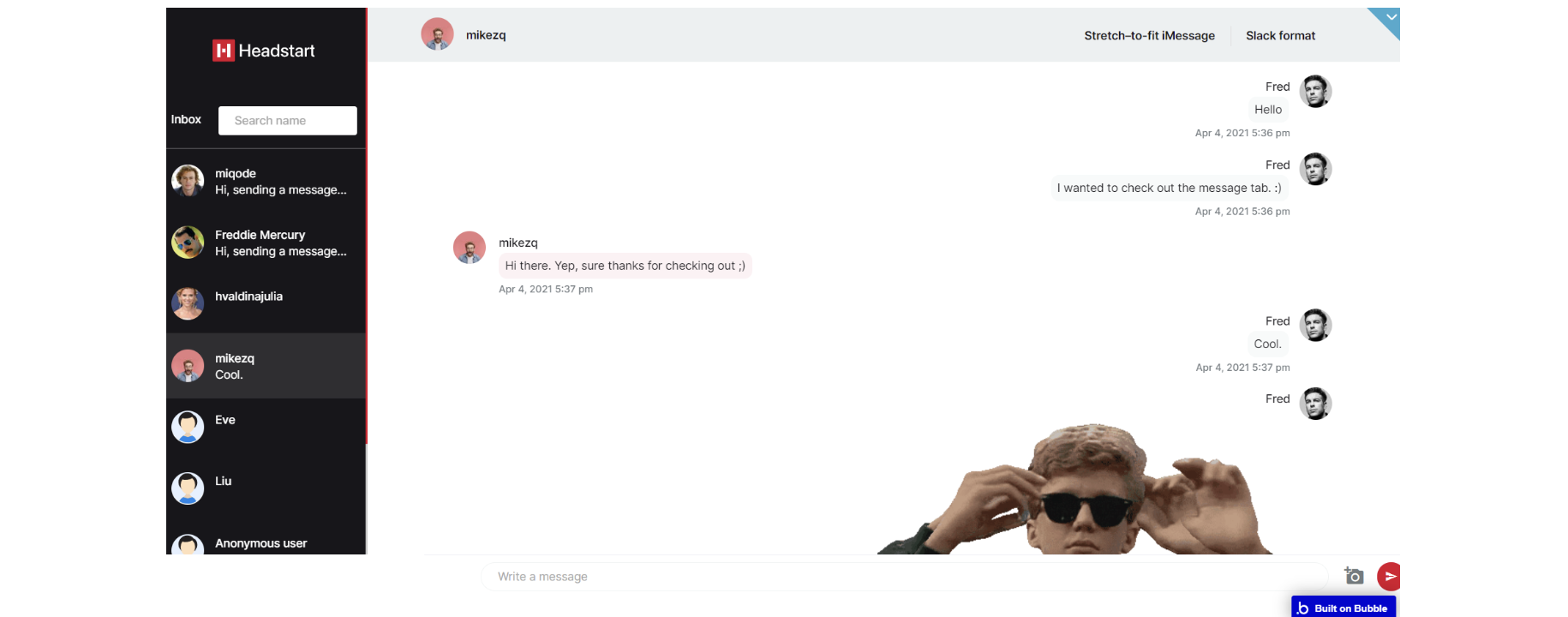
chat
The chat page consists of two active zones. The left side is a list of users you've initiated a conversation with, and the right side is the window where you're actually having a conversation.
On the left side, you have a search box that can help find a certain user. You can also visualize this chat in two different formats, slack-like and stretch-to-fit view modes. This chat supports image attachments.
The design for this page consists of 4 floating groups : "FloatingGroup inboxMob", "FloatingGroup userName", "FloatingGroup Inbox" and "FloatingGroup chatInput" with "Group conversationsContainer" - main Group container for conversations.
Each of the Floating groups holds data about User, Conversation indifferent group containers to display it. The "Group conversationsContainer" displays data about Message and User, inside the container.
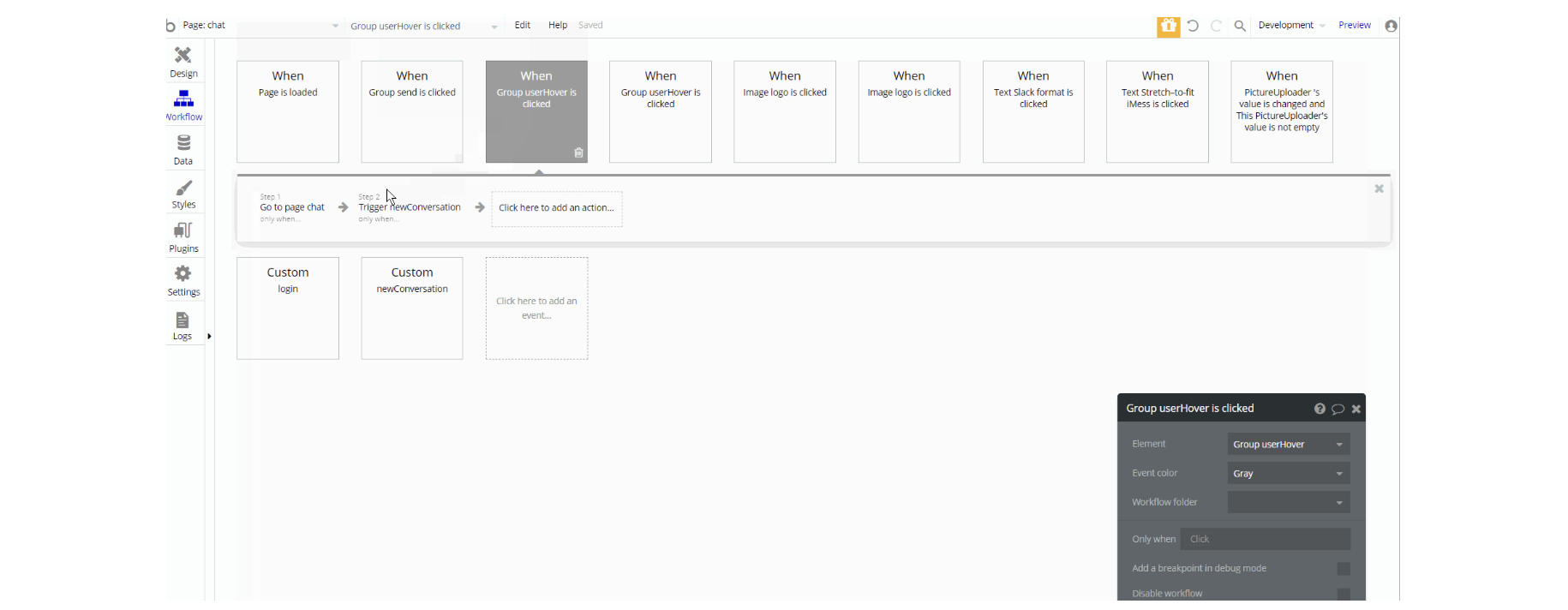
The workflows on this page consist of navigation actions to a couple of pages. This page also combines actions working with data, modifying the values of the database type Conversation ConversationsList and Message, as well as setting state values for showing elements on the page.
checkout
On this page, there is a form that collects information about the customer's billing details. On the right side, you have information about the order and a "Place order" button which will lead you to payment. The payment system that is configured in the app is Stripe.
The design for this page consists of the main "Group container" which displays Order datatype, a hidden "pop-up Thanks" element, with footer_new A and storeHeader A reusable elements.
The main "Group container" is branched into other different group elements and group containers designed to display content for the checkout including: "Group bannerTitle", "Group crumbleHolder", "Group items" and a hidden "Group emptyCart" with conditional when order's count is 0 the group is visible.
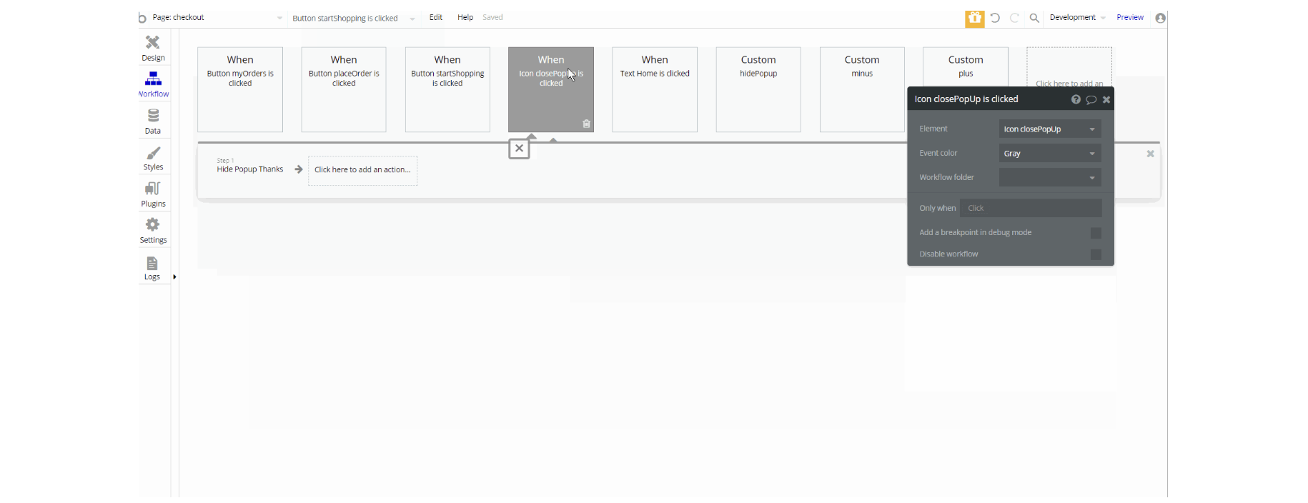
The workflows on this page consist of navigation actions to a couple of pages. This page also combines actions working with data, modifying the values of the database type Order OrderItem, as well as hiding pop-up elements on the page.
Also on the page, there is a charge CC action set in workflow after the user places the order.
contact
Contact page gives users the opportunity to connect with the platform using a special form. It sends the user's message to the admin's email.
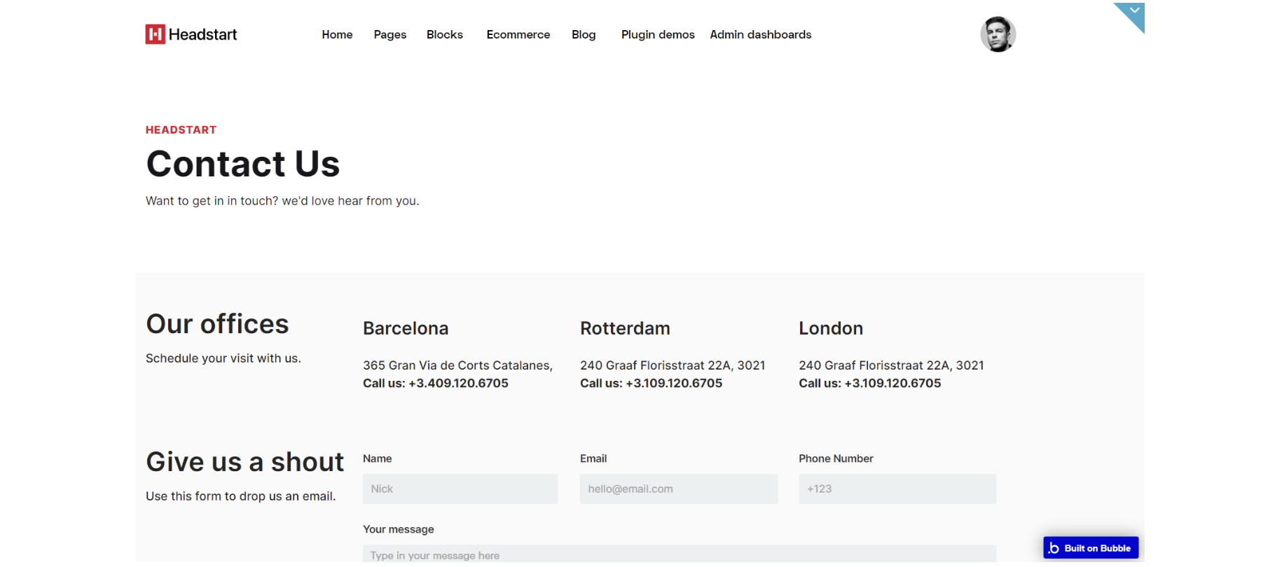
The design for this page consists of the main "Group container," a hidden "pop-up message" element which displays a text message, with footer_new A and header Areusable elements.
The main "Group container" is branched into other different group elements and group containers designed to display content for the page including: "Group bannerTitle" and "Group bg information" all the data static for this group with 3 inputs for sending an email.
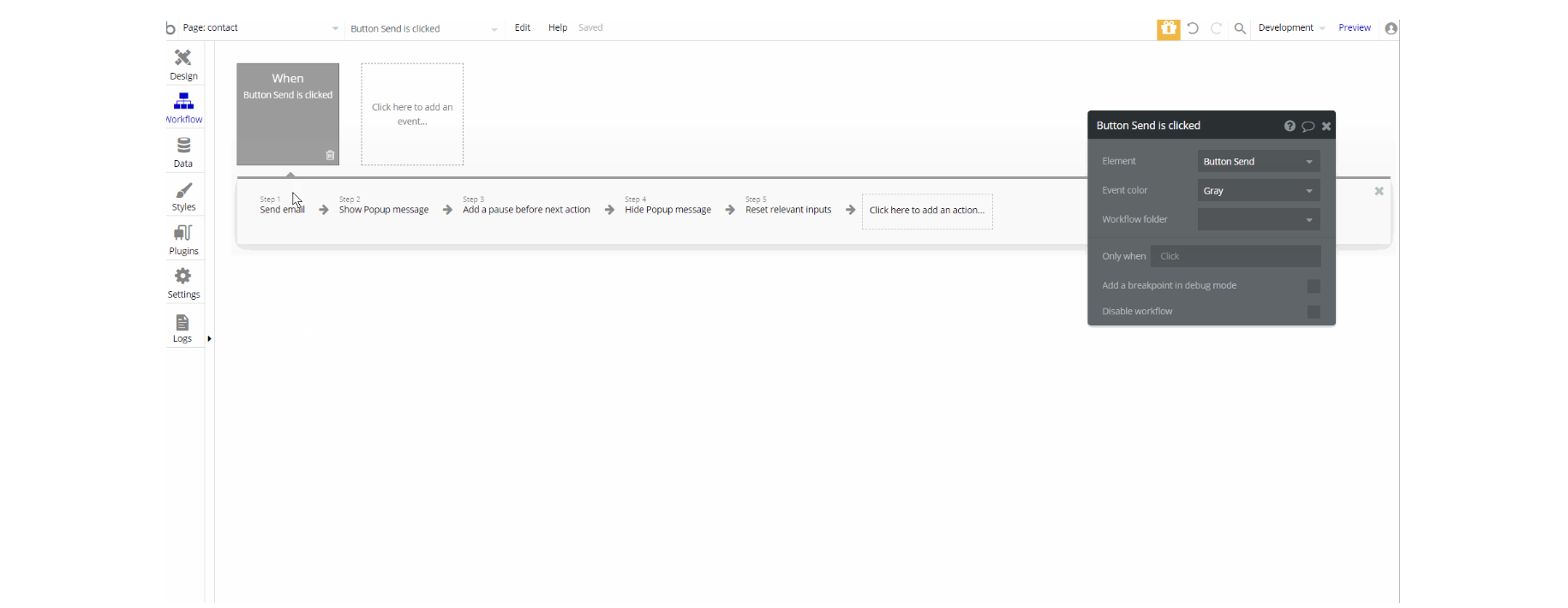
There is only one workflow element on this page, which is placed on Send Button element to send an email.
dashboard
This page consists of different sections: tables, widgets, and charts. Here we have previews of different data visualization using charts, tables, or widgets. The widgets and chart data are pulled dynamically from the database.
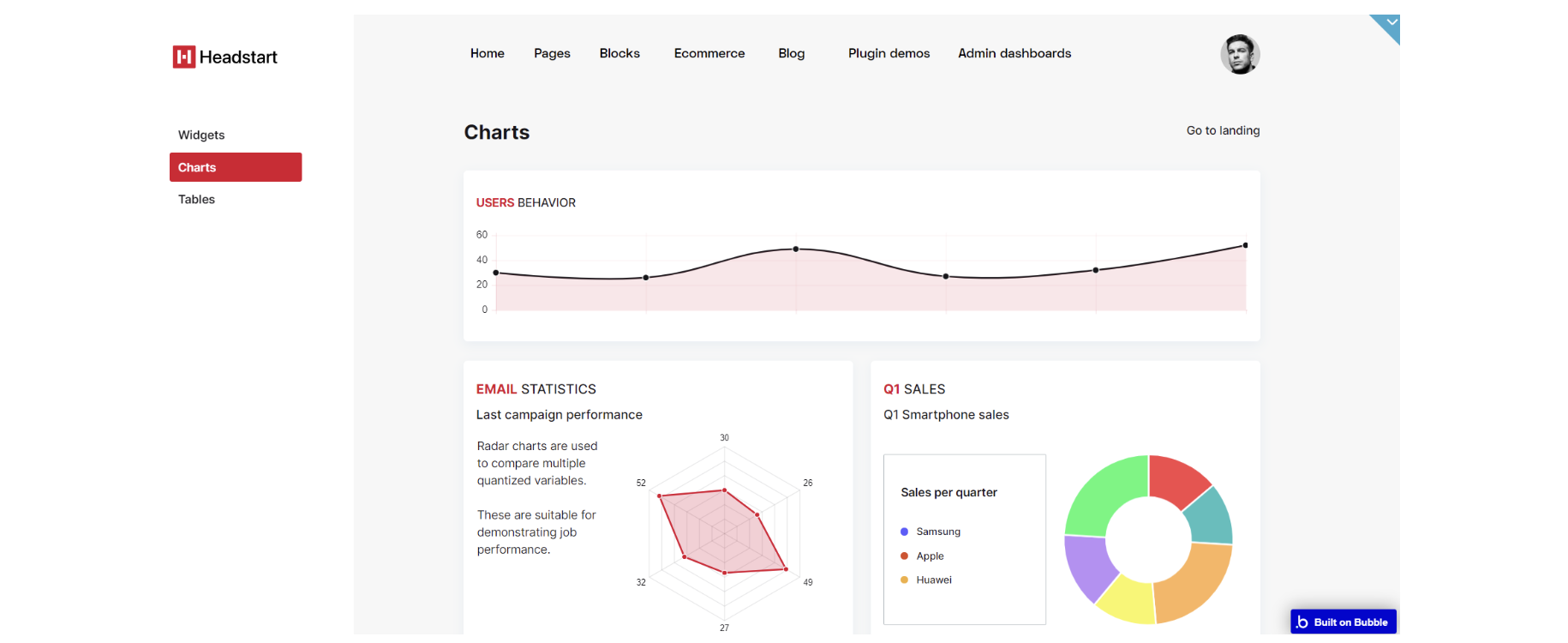
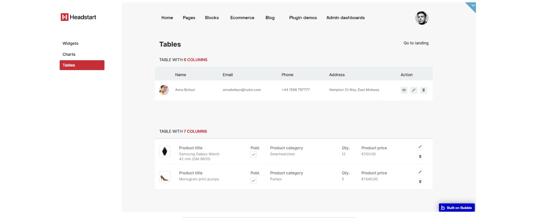
The design for this page consists of the main "Group container", "Group menuBar" and dashboardheader A reusable element. The "Group menuBar" contains the "Group leftMenu" with an icon and RG with dynamic value data type DashboardMenu .
The main "Group container" contains "rightContainer" and "containerLeftMargin" for responsive page making. "Group rightContainer" is the biggest container with "Group tables", "Group widgets" and "Group charts" to display all data on the page.
The workflows on this page are mostly setting state values for showing and scrolling elements on the page and navigation actions to a couple of pages.
dashboard-index
This page is one of three landing layouts we're offering with this template. Here we have previews of the dashboard components you can see in more detail on the dashboard page.
This page can be remade as per your preferences and used as a landing page for your project.
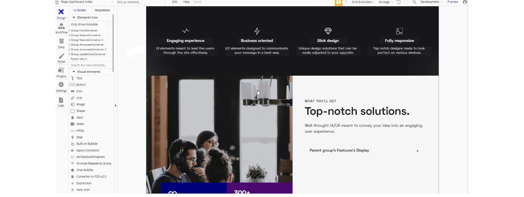
The design for this page consists of six containers for different data to be displayed in page sections: Group heroContainer, "Group featureContainer," "Group featureContainer 2", "Group showcaseContainer"," Group showcaseContainer "2, and "Group capabilitiesContainer" with footer_new A reusable element in the end.
Different sections are designed to hold all the information on the page.
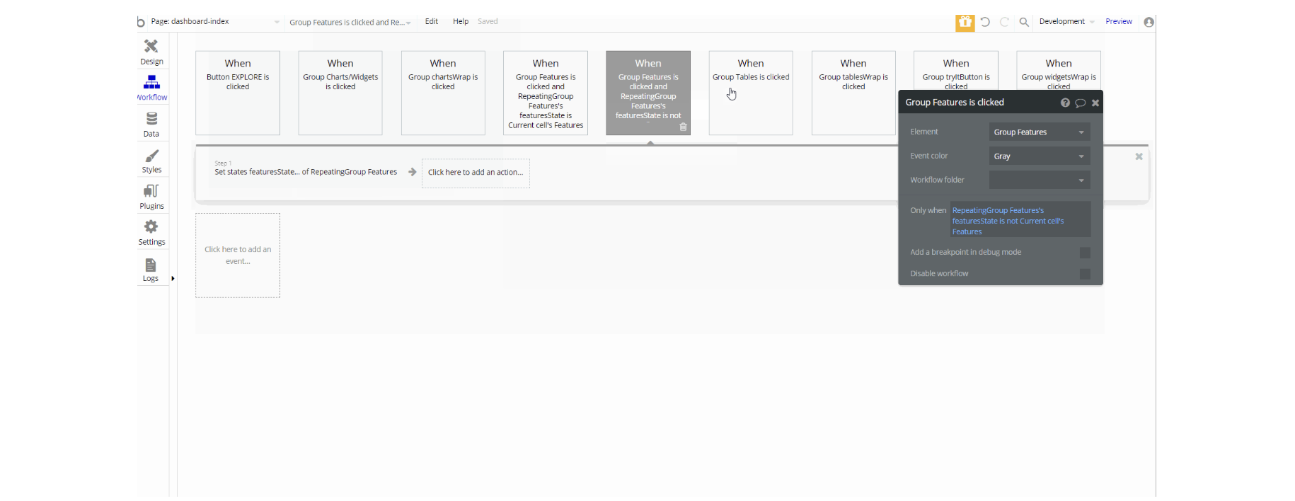
The workflows on this page are mostly navigation actions to a couple of pages and setting state values for showing elements on the page.
header_footer
This page was intended to highlight the available design options for both headers and footers. We have three designs for each element, they are all responsive and ready-to-use on your web page, just copy them and set up the logic behind menu items and icons.
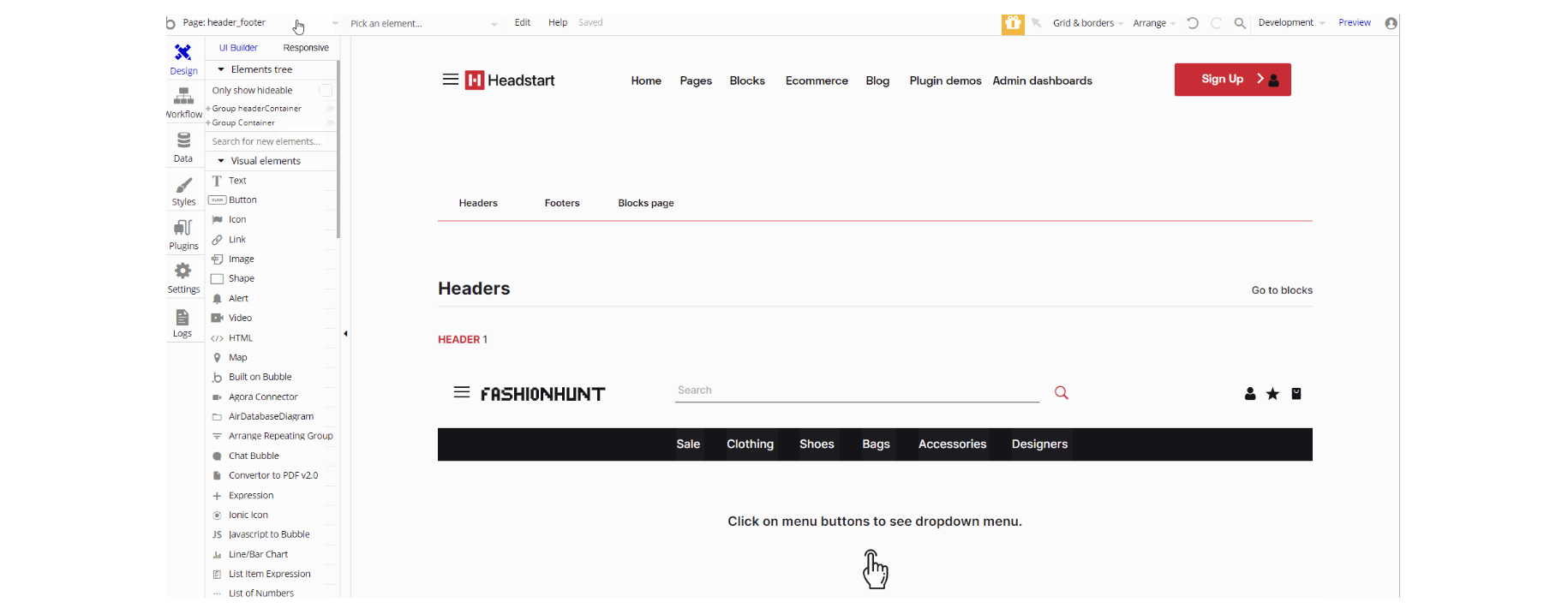
The design for this page consists of the main "Group container" and "Group headerContainer" which holds header A reusable element. The "Group container" contains "Group tabWithIcon", "Group Headers, and "Group Footers" with all the data in all sections header and footer examples.
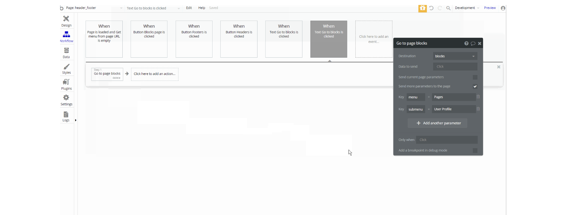
The workflows on this page have navigation actions to a couple of pages while passing parameters through the URL.
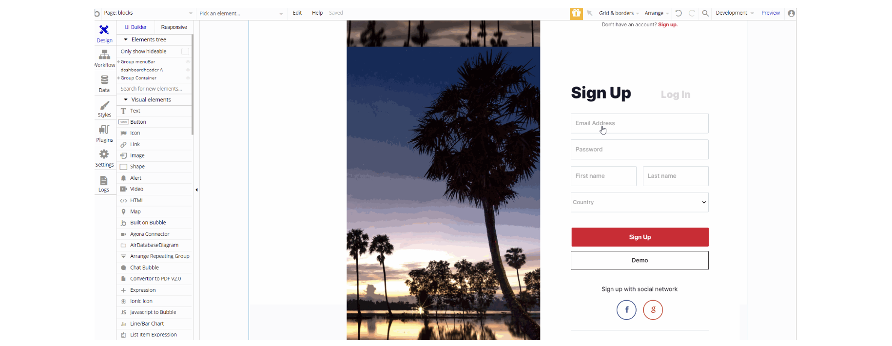
login
This page is used for creating an account or logging in to an existing one. To access it, users will click on “Signin” button in the header.
On this page, users are offered a demo user to log in and test all the template features. For detailed information on how to remove this button, see the Remove Demo Login section.
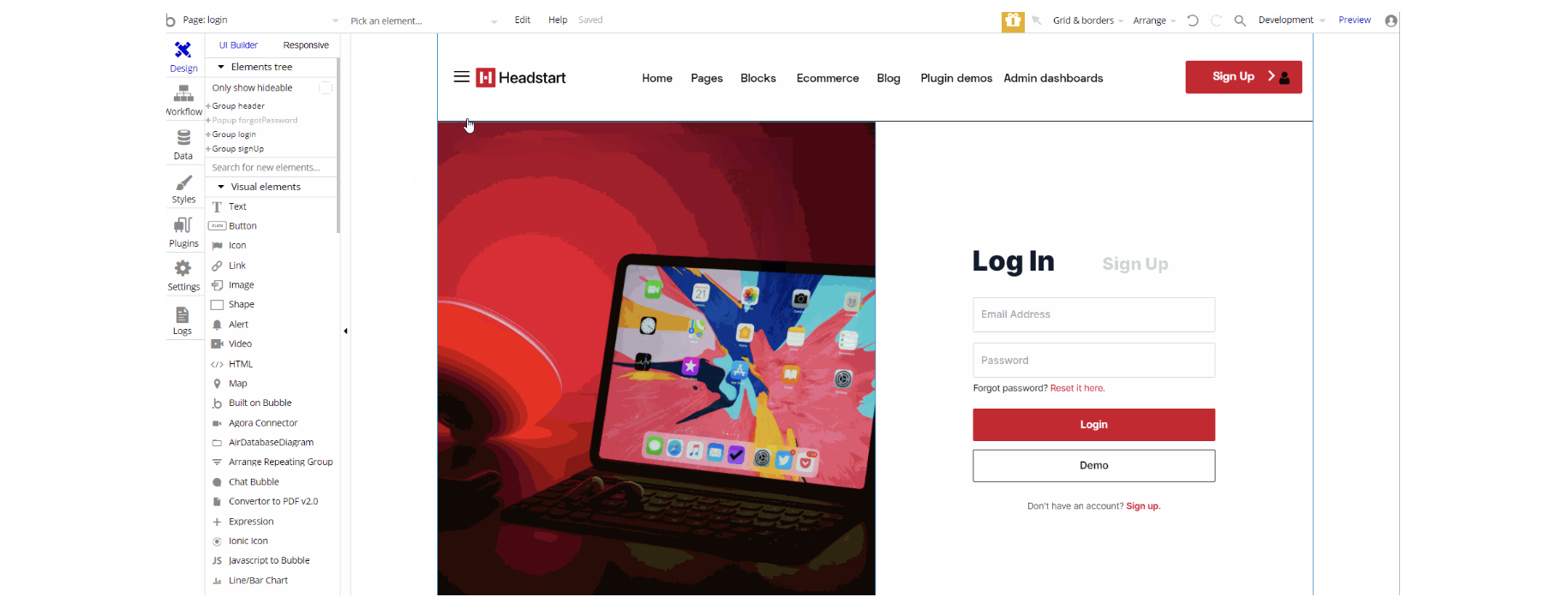
The design for this page consists of "Group header" which holds header A reusable element, "Group login", "Group signup" and a hidden "pop-up forgotPassword ".
The Groups login and signup contain the main login and signup forms with hero images on the left side.
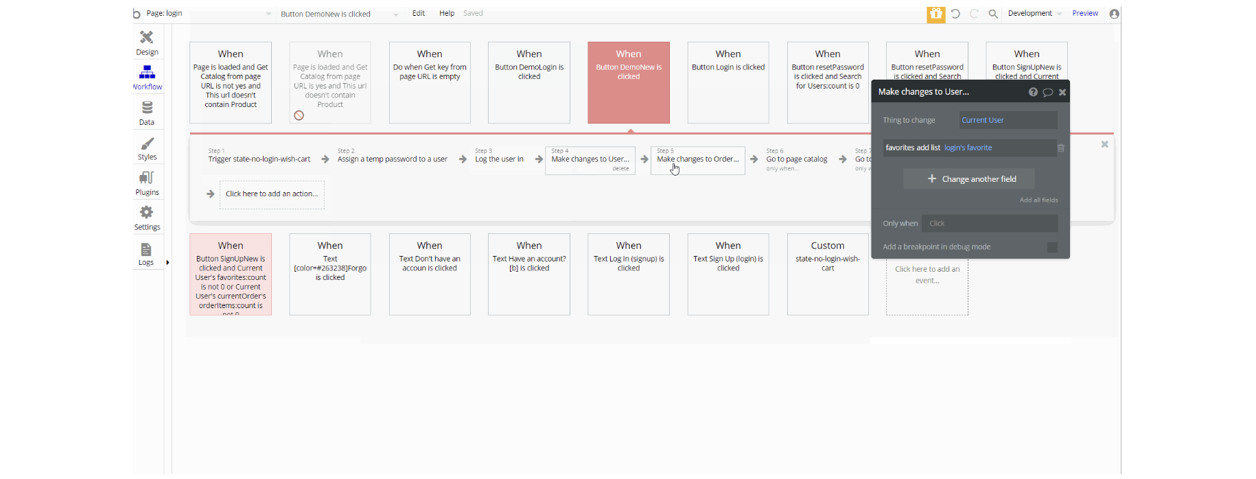
The workflows on this page are mostly navigation actions to a couple of pages. This page also combines actions working with data, modifying the values of the database type User Conversationlist and product_details, as well as setting state values for showing and displaying elements on the page.
Tip: This page comes with demo logins that have been placed for testing purposes. They may be removed from your app.
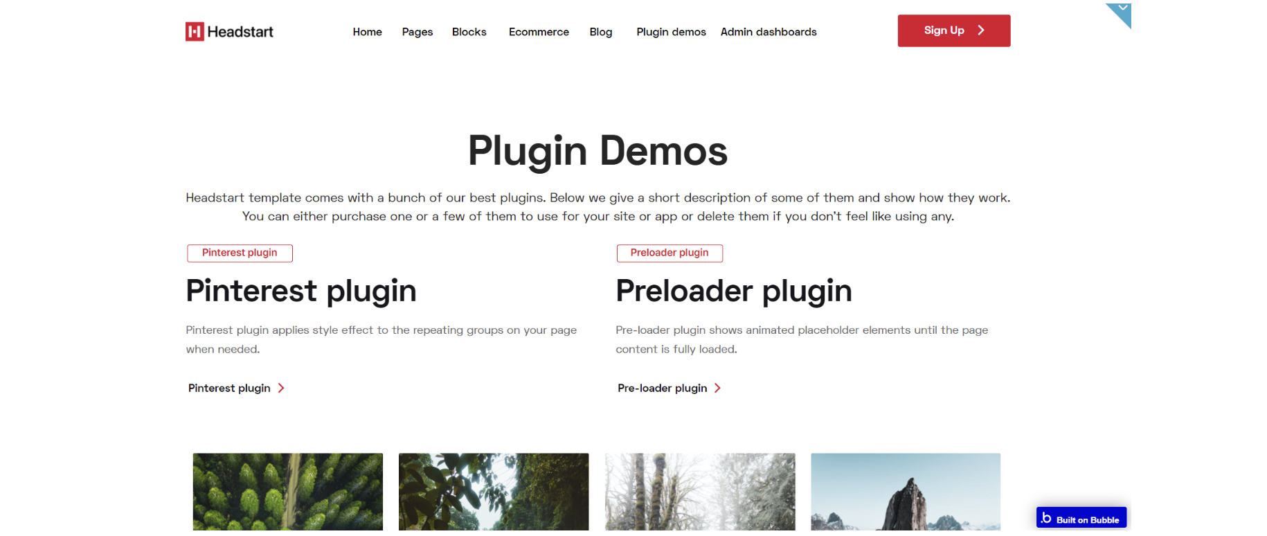
plugin-index
Note: Template comes with 8 Premium Zeroqode Plugins pre-installed. If you do not want to use them, simply remove the plugins from the template by uninstalling and unsubscribing.
On this page, we give a short description of them and show how they work.
We showcased our Pinterest plugin that gives you the opportunity to create a Pinterest- like layout using a repeating group.
Second, comes the Content Preloader plugin that creates a loading effect on your layout and keeps the users on the still loading page.
Next is the Rich Text Editor plugin is a WYSIWYG HTML editor that supports mentions, hashtags, pasting images from the clipboard, saving content in browser storage, etc. together with another plugin called Bubble Page to PDF Converter. You can test them directly on the page by typing some text into the Rich Text Editor input and convert it right away into a PDF and download the PDF file.
Agora Web Conferencing plugin is next and allows integrating live video conferencing as well as streaming into your Bubble app using the Agora Platform. To test it out share the plugin-index page link with someone else and enter the same room on both devices.
Video Player plugin advanced features allow you to play the video by providing either an external link (e.g. Youtube or Vimeo) or a link to a video file from Bubble DB. You can set the speed of the playback, enable auto-play, auto replay at the end, workflows to play next, previous, first, the last video. You can also customize the colors of the play button and the color of the playing bar.
DataTables plugin is an advanced plugin that gives you the possibility to use data tables with your Bubble database. It includes search, filtering, sorting, etc.
The last plugin demonstrated on this page offers you the opportunity to integrate the Algolia Search plugin - a lighting fast search as a service solution for your app.
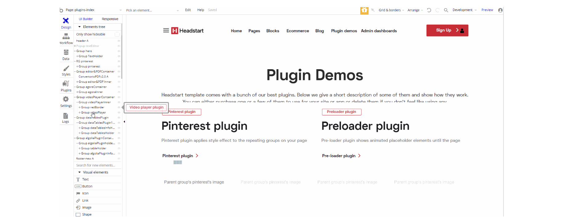
The design for this page consists of 5 groups designed to hold and demonstrate the plugins in action "RG pinterest", "Group editor&PDFConverter", "Group agoraContainer", "Group videoPlayerContainer", "Group dataTables Plugin", and "Group algoliaPluginContainer" with "Group Hero", footer_new A and header A reusable element on-page. A hidden "pop-up textEditor" element is also used for demonstration of the editing tool in the pop-up.
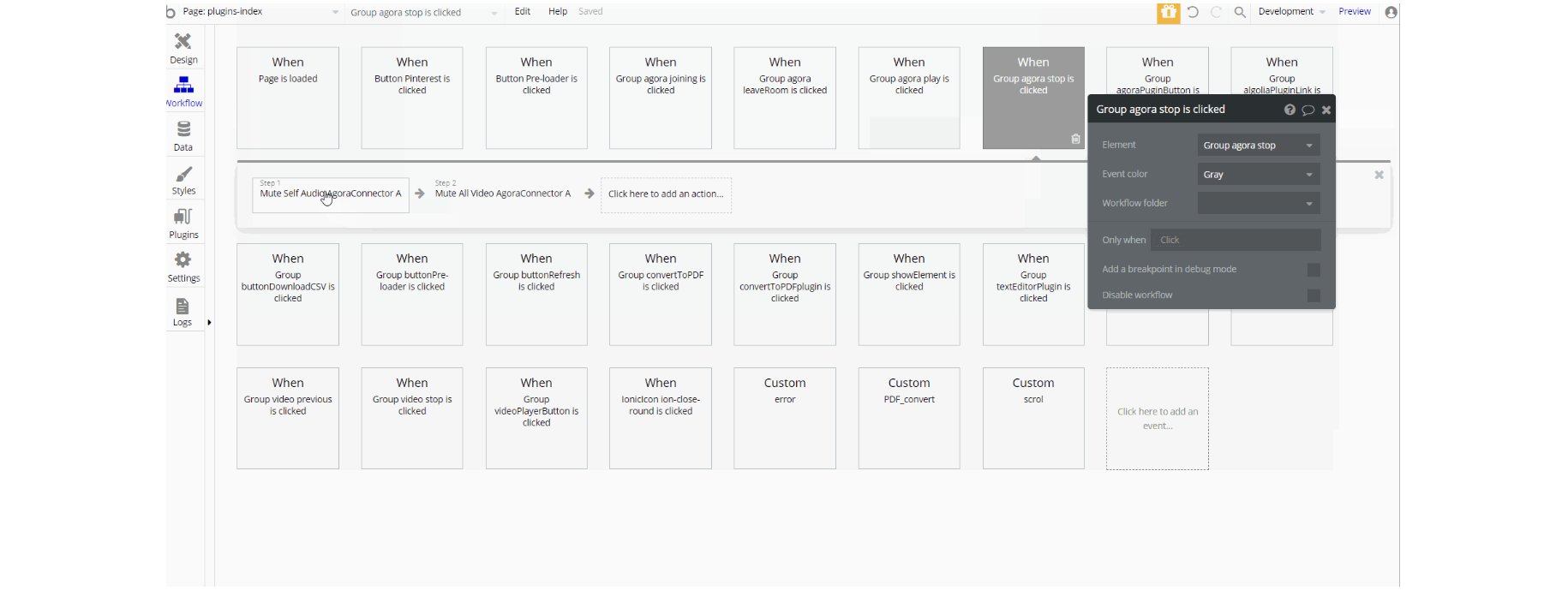
The workflows on this page are mostly related to all premium plugins actions & setting state values for showing elements on the page. The navigation is down by opening the URL in a new tab action from a plugin on the page.
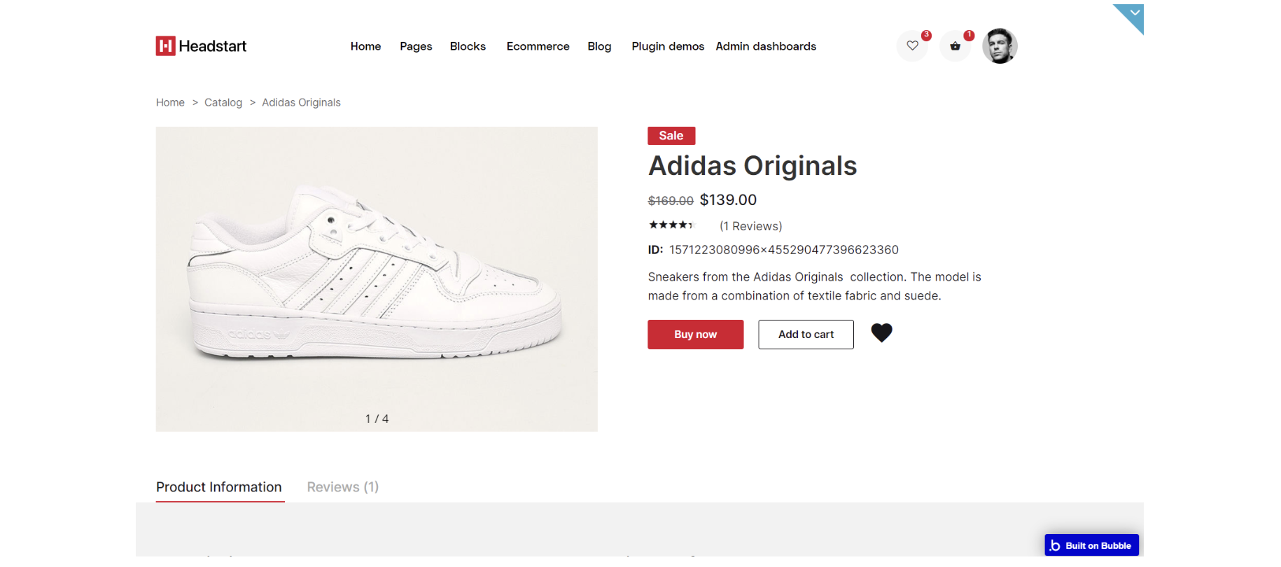
product_details
This page was designed to showcase the products of the store. It has all the necessary fields for description. It comes with a footer and a header with the main container for all the data to display product details.
With the type of contentProductproperty that defines the type of thing, the page should expect. Once set, you can refer to the Current page thing in the Bubble Editor.
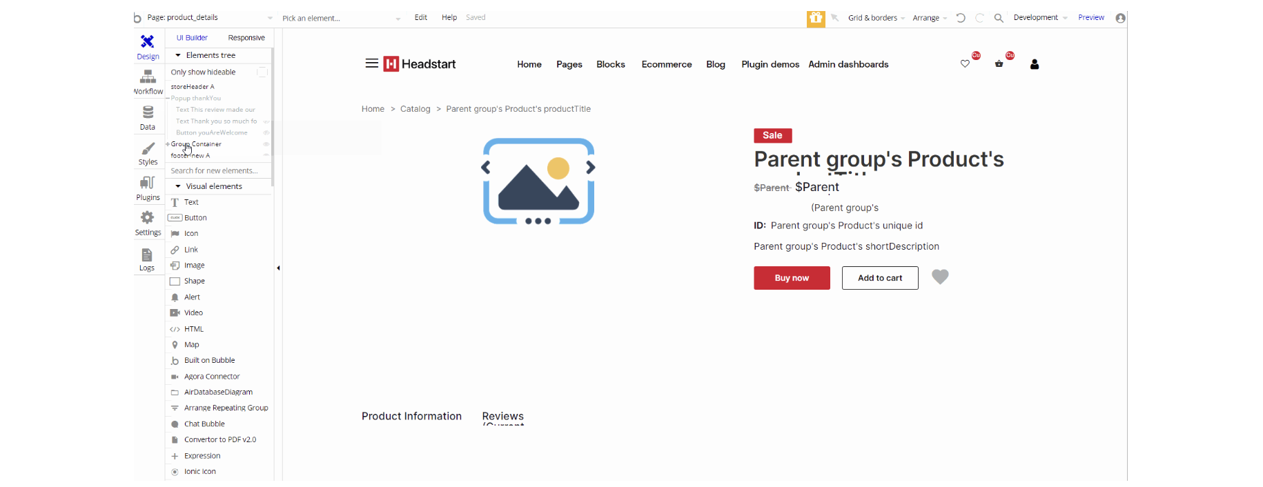
The design for this page consists of the main "Group container", storeHeader A, footer_new Areusable elements and a hidden pop-up "thankYou element".
The main Group container holds, the "Group crumbleHolder", "Group productItem" and "Group productAdditionalInfo" with dynamic value data typeProductto display product details.
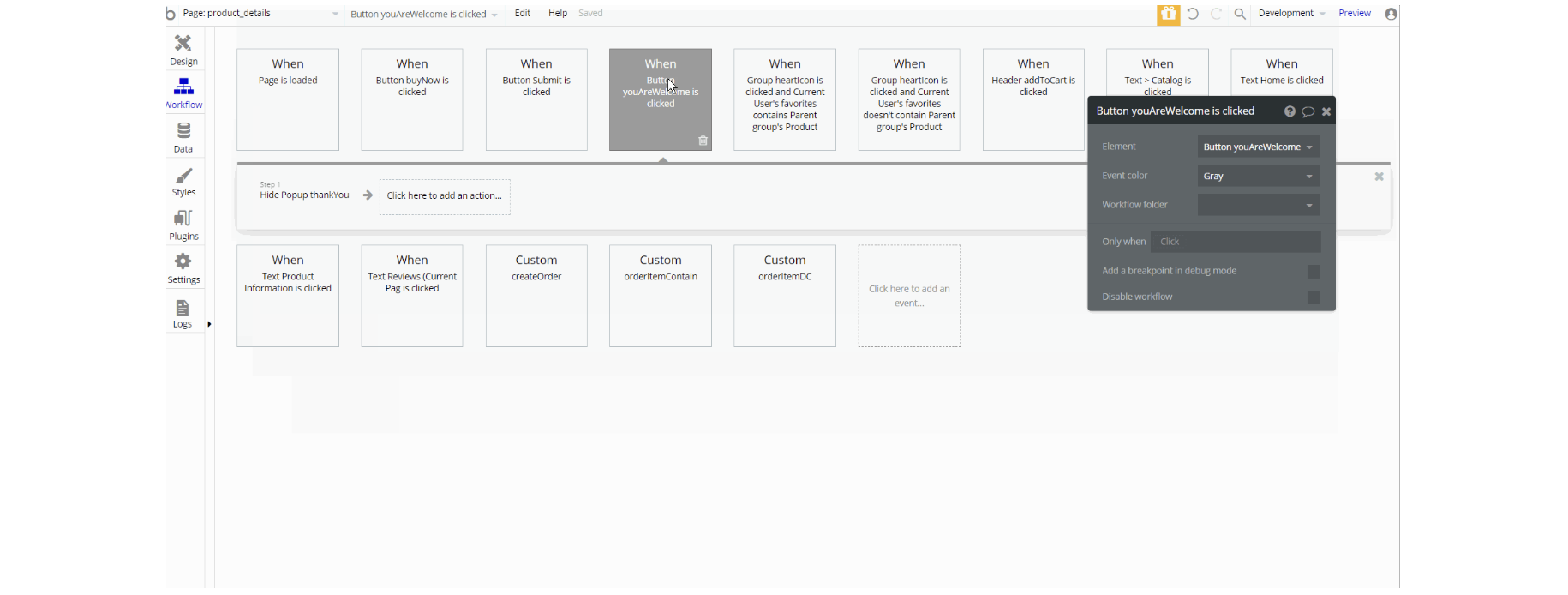
The workflows on this page are mostly navigation actions to a couple of pages. This page also combines actions working with data, modifying the values of the database type User Order, OrderItem, Review and Product, as well as setting state values for showing and displaying elements on the page.
product_uploader
This page was designed to add products to the store. It has all the necessary fields for description.
It comes with two image uploaders: one that uploads regular pictures and one for the main image that will serve as a product presentation.
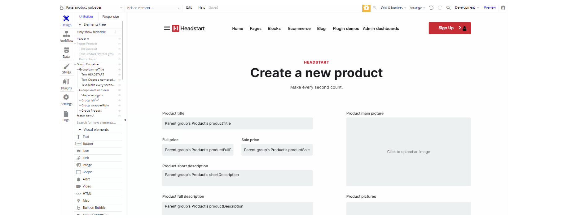
The design for this page consists of the main "Group container", header A, footer_new Areusable elements and a hidden "pop-up product" element.
The main Group container holds the "Group bannerTitle", and Group "containerForm" with dynamic value data typeProductto write and upload product details to the database.
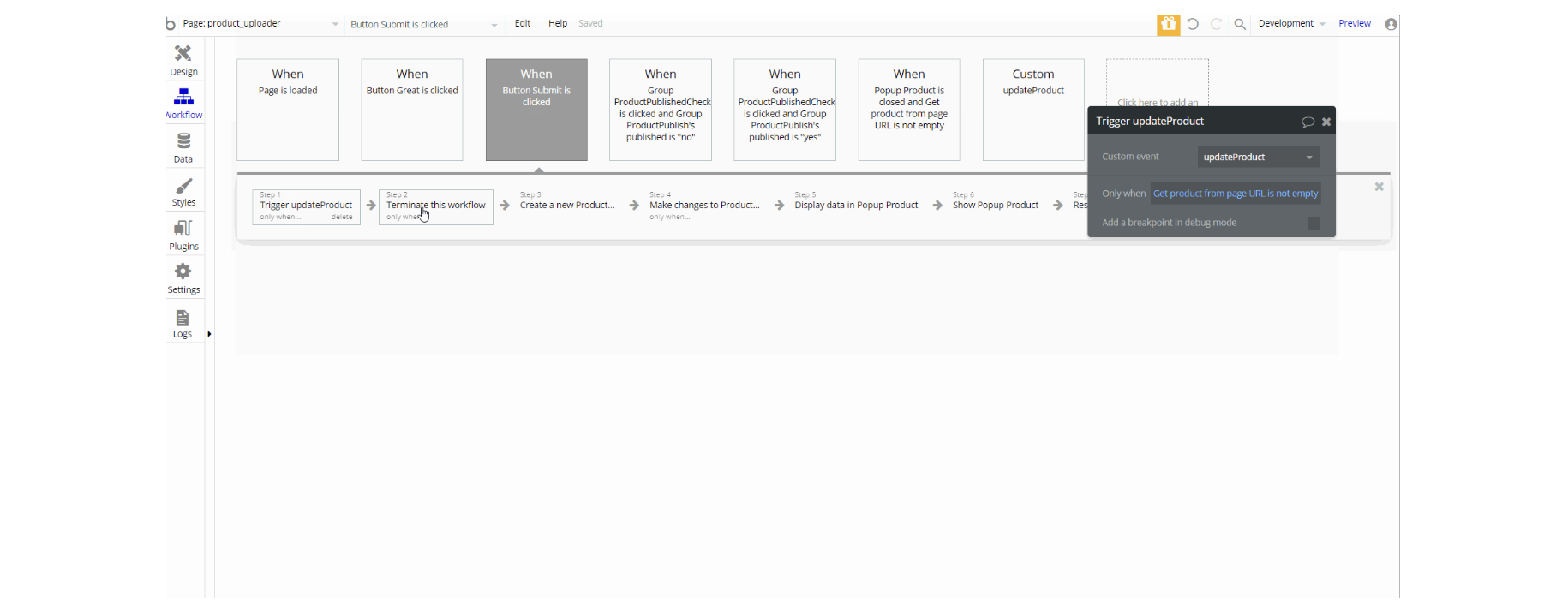
This page also combines actions working with data, modifying the values of the database type Product, as well as setting state values for showing and displaying the value in elements on this page.
profile
On this page users can manipulate the profile data, like changing email, password, feeling in the necessary fields, and updating CC.
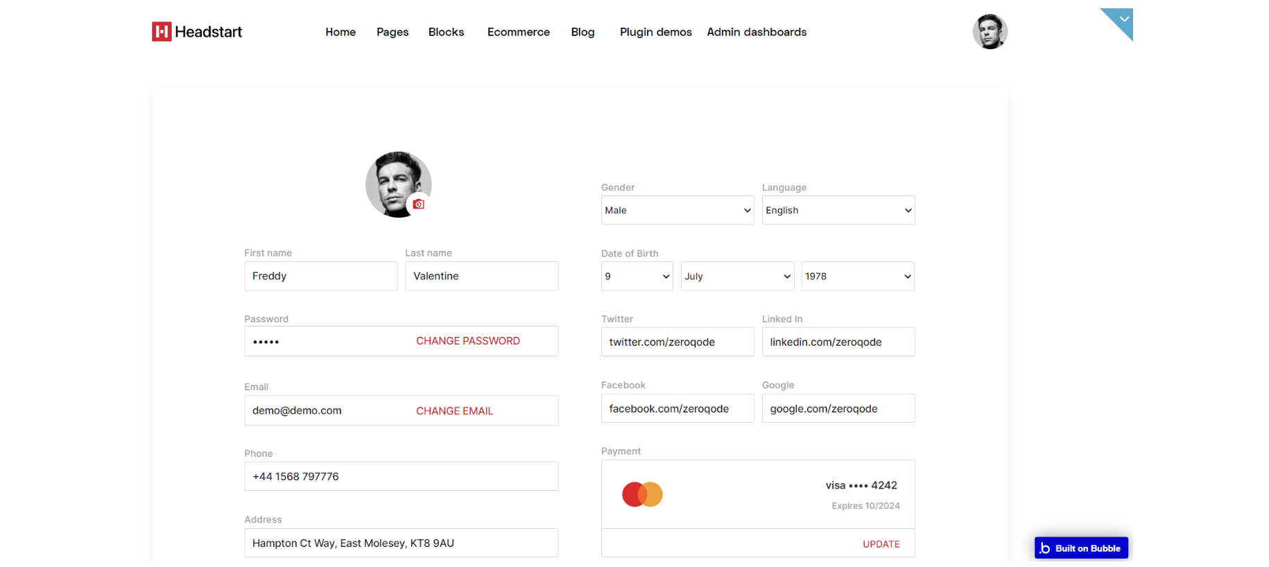
The design for this page consists of the main "Group container", a hidden "pop-up changePasswrod" element which has a form to change a password, with footer1 A variant and header A reusable elements.
The main Group Container has the "Group userinfo" which holds data about the User in group sections with CTA: "Group personalInfoRight", "Group personalInfoLeft" and "Group btnsContainer".
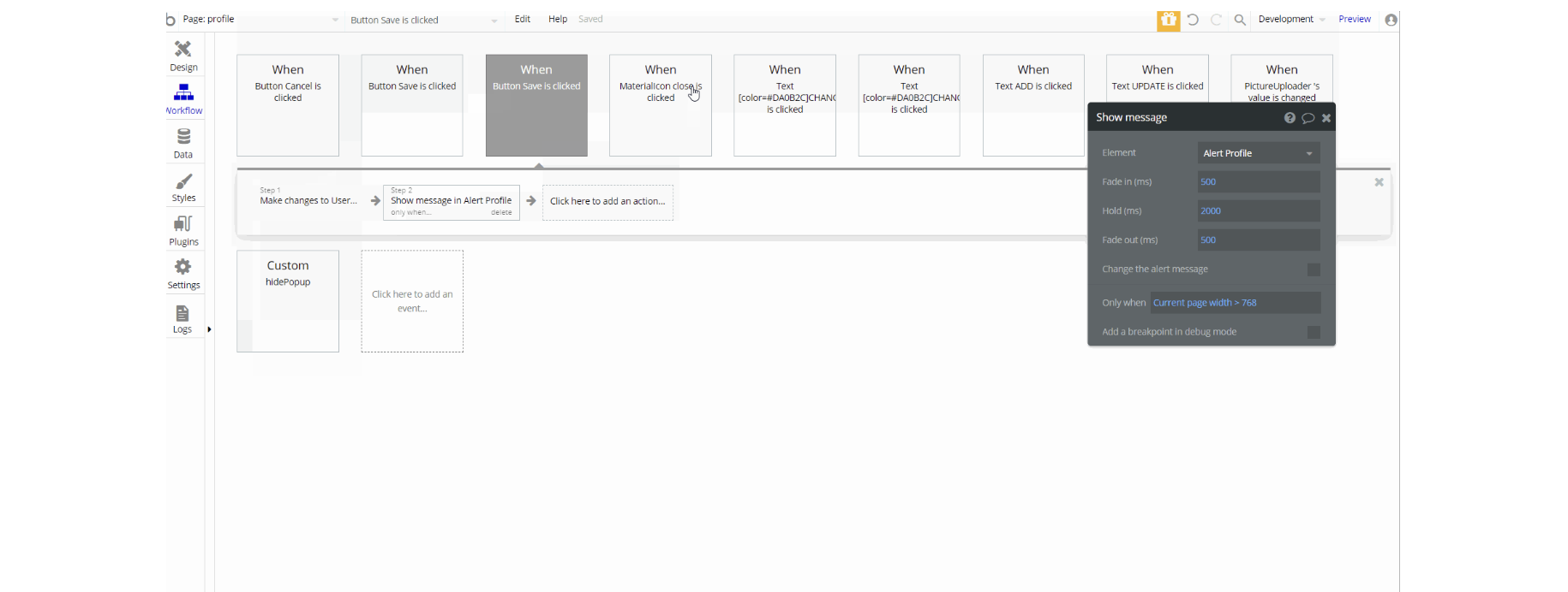
In the workflows on this page, there are actions working with data, modifying the values of the database type User as well as setting state values for showing and displaying elements on the page.
subscription
This page has 3 pricing plans you can subscribe to. We use Stripe for setting payment plans. Subscribers can upgrade, downgrade or cancel their plans. We set up the plans to update immediately after payment, however, you can change it if needed.
Tip: Genuine card information cannot be used in test mode. Instead, use test Stripe card credentials. 🙂
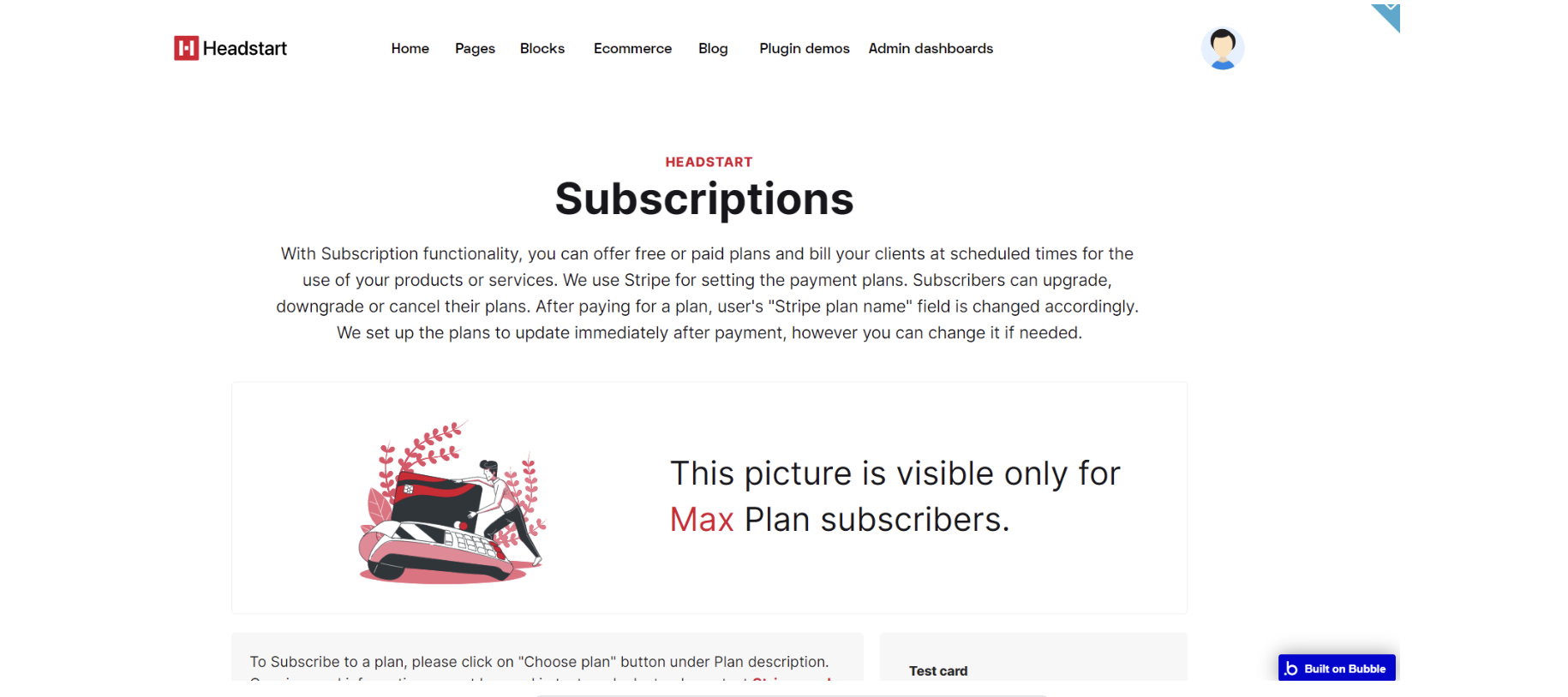
The design for this page consists of main "Group pricingBlocks", two hidden pop-up elements: "Popup cancel plan" and "Popup hooray" elements which are used to notify the user about changes in subscription plan with footer_new A and header A reusable elements.
"Group pricingBlocks" represents the main container for all page elements, it is divided into other group elements as follows: "Group headHolder", "Group borderNotPaid", "Group border", "Group description" and "Group Pricing blocks" variant 2 containers.
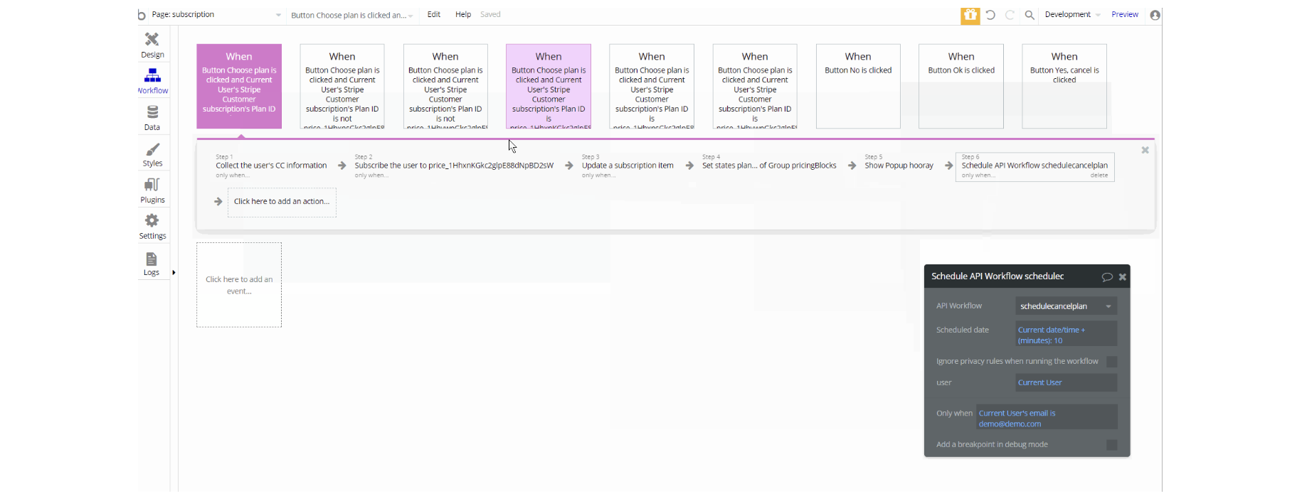
In the workflows on this page, there are actions working with Stripe subscription creation and cancelation, as well as setting state values for displaying and hiding elements on the page.
There are schedule actions for subscription cancelation that allow scheduling the run of an API workflow at a later time.
Note: Schedule API Workflow action is available to users with a paid Bubble plan. Activate the API in the API section in Settings Tab.
wishlist
On this page, it is displayed a list of products added by the user to their wishlist. The page can be copied to the main app and used out of the box design with tweaks to linking pages.
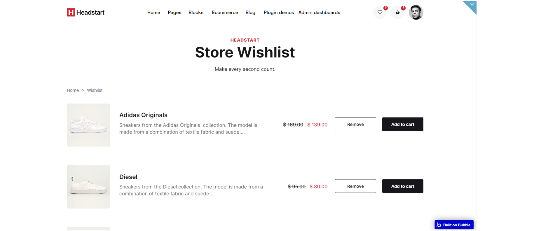
The design for this page consists of the main "Group container", a hidden "pop-up productAdded" element used to notify the user that a new product was added to the wishlist, with reusable elements footer_new A and storeHeader A.
Main "Group container", holds other information which is part of other groups: "Group bannerTitle", "Group crumbleHolder", "Group items" and "Group EmptyDreambox".
The workflows on this page are navigation actions to a couple of pages. This page also combines actions working with data, modifying the values of the database type Order, User and OrderItem as well as setting state values for showing and displaying elements on the page.
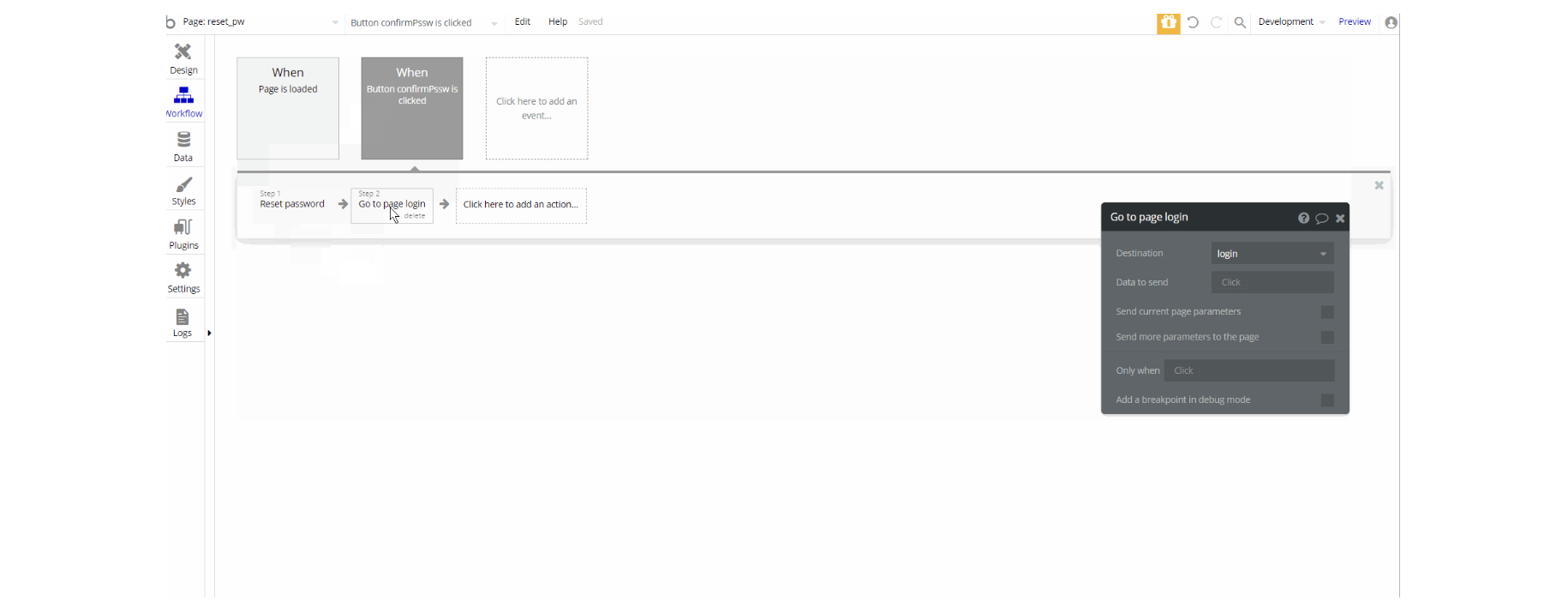
reset_pw
This page is for resetting the password.
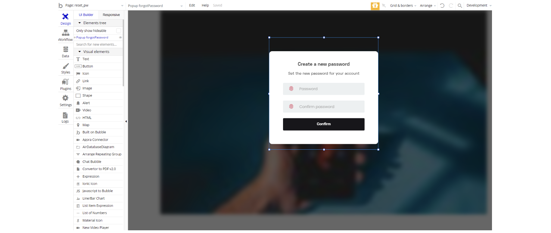
The design for this page consists of a hidden pop-up "forgetpassword" element used to reset the user's password.
404
This is a custom-designed page for 404 redirect errors, informing a user that the web page he or she is looking for cannot be found.
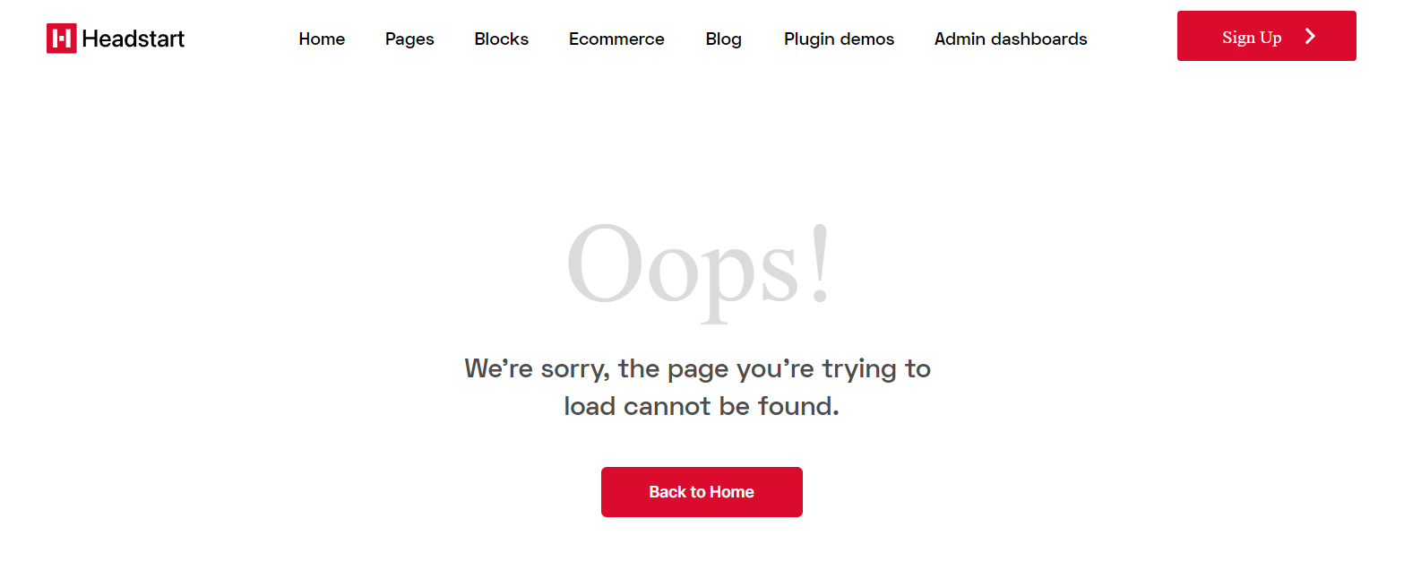
The design for this page consists of the main Group 404 wrap, with footer_new A and header A. The main container holds the rest of the content which is roughly text elements and "back button" element.
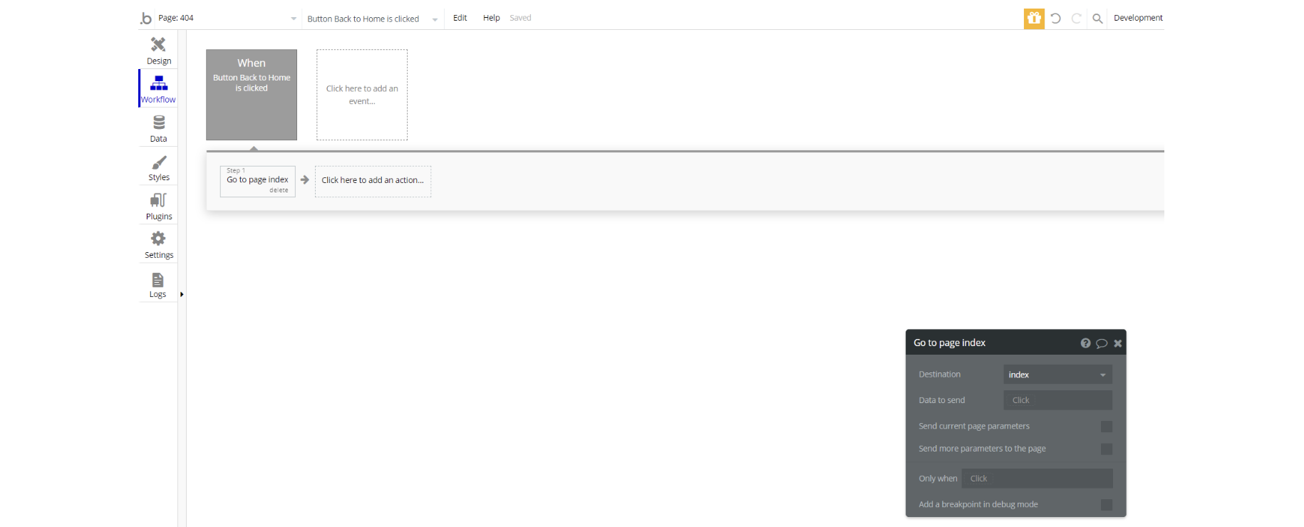
The workflow for this page is set only on a button action to navigate to a page on button click event.