About this Template
Link to the template page: https://bubble.io/template/custom-elements-block-1551770137563x610361489559126000
Introduction
Our Custom Elements Block is kind of a no-code kit containing custom (reusable) elements. These are the most commonly used and will fit almost any page.
Each element comes with explanations and instructions on how to use them. Click on the (i) to see details for each element.
To add an element to your app/page, just copy & paste it into your app.
Features
Elements available:
- Login/Signup form
- Account settings (personal data and change password)
- Popup
- Benefits section
- Custom cards section (2 options)
- Team members (teal view)
- FAQ Toggle
- Custom elements
- Pricing block with 3 plans
- Blog
- Article page
- Contact form
- Subscription forms (2 options)
Video Overview
Demo
Ready to move further?
Tip: Find out more on how to work with a template on Bubble here:
Setup Guide
Once you have bought or added a template to your account, you will see a dropdown in the New Application popup that lets you pick a template as the basis for the new application.
Note: This can only be done when you create a new app.
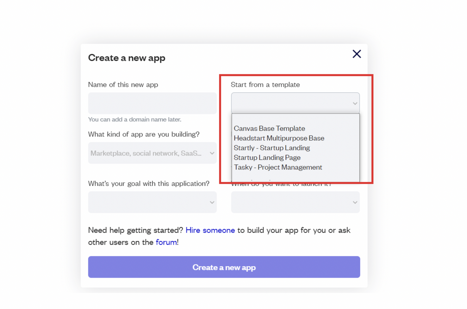
After selecting a template you’ve bought, please complete the other fields with the necessary data (i.e: Name of the new app, What kind of application you are building, etc) and press Create a new app.
Tip: A template isn't a theme for your app, but a pre-built set of elements and workflows. You can modify the template as you would modify another app.
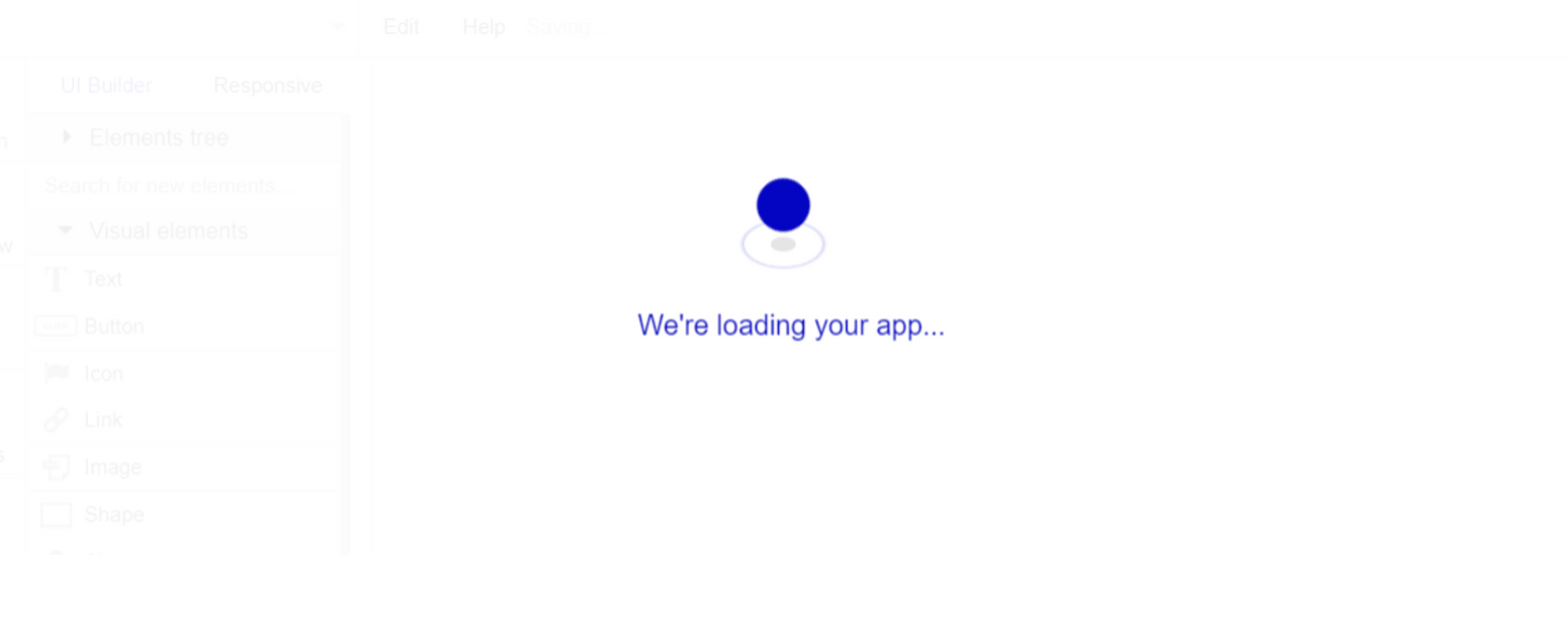
Wait for Bubble to load the application with all the data.
After the application has loaded, you'll see the Bubble assistant on the left side for New Application. You can close it or follow the assistant steps to adjust different settings.
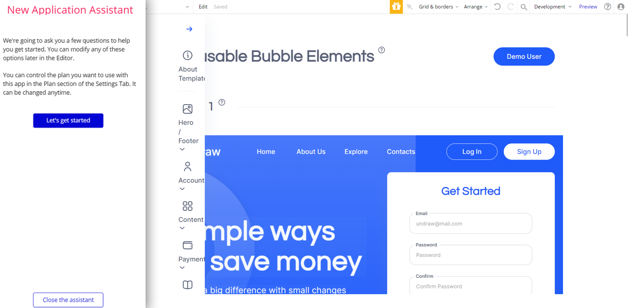
Now you're ready to go and dive into Bubble no-code development toolset.
Congrats! You have successfully created a Bubble app based on your template. Now, you can proceed with the setups.
Payments
Card payments in this template are powered by Stripe, using the default card checkout providing a secure environment for users. To set up your Stripe account, go to https://stripe.com, and create an account.
Note: This template is using Bubble's Stripe plugin and Stripe Customer Portal for payments.
Subscriptions
Since this template comes with a subscription feature based on Stripe payments (namely, in
Pricing reusable element), it is required to also set up the paid subscription plan in your Stripe dashboard, then set the appropriate plan ID in your Bubble workflows.Stripe Products

Click the + Add a product button and continue with the steps. Set the following fields and fill them with your own information: set the name (any you prefer), the price (set the price and select the currency of your choice), set the Recurring type so it is a subscription, and the period of your choice (Monthly).

Click to Save product. Now go back to your Bubble editor to configure the subscription workflows with this ID.
Bubble Workflows
1. Go to
pricingreusable element, open the following workflow and set the subscription ID of the products created in your Stripe dashboard. Assign the corresponding price plans ID in workflow actions: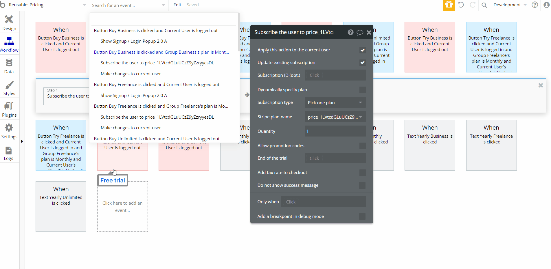
Note: Remember to change all the Test Keys to Live Keys when you are ready to go live with your app.
Tip: Genuine card information cannot be used in test mode. Instead, use test Stripe cards credentials.
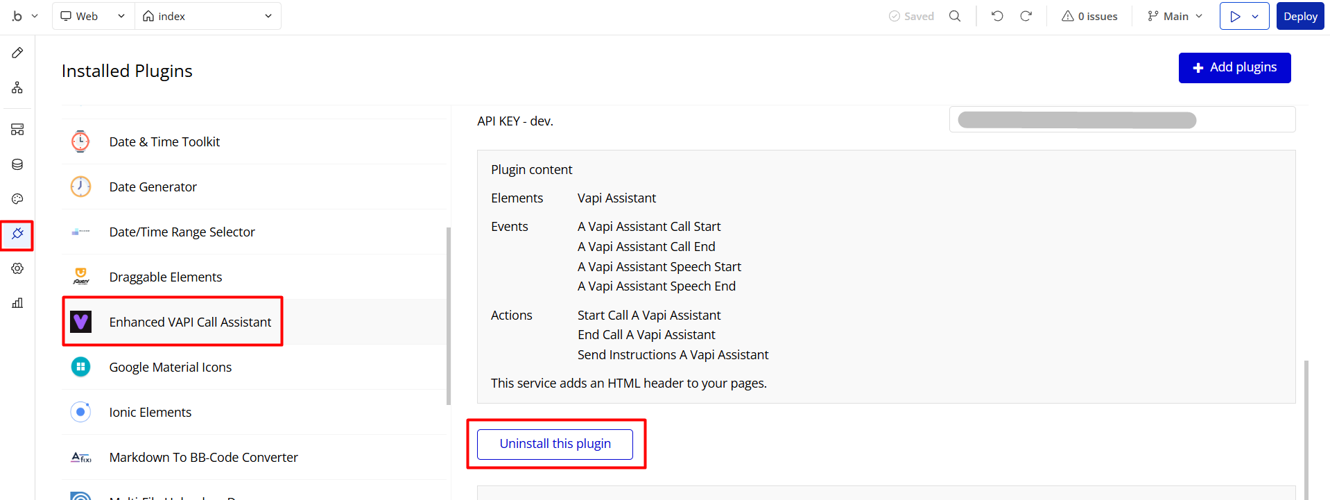
VAPI AI Call Assistant Integration
Check out a new feature that is powered by the VAPI AI Platform.
It allows your application to have a completely customizable voice assistant that will answer any customer’s questions within the framework of the set prompt.
Please note that this is a paid plugin, so to use it, you need to subscribe or buy it.
As for the traffic, you only pay for the minutes you use. Check the pricing details here: https://docs.vapi.ai/pricing
Call Assistant Setup: See the documentation on how to set up the Enhanced VAPI AI Call Assistant in the Bubble App.
If you don't need this feature within your app, feel free to remove it.
In this case, remove the:
- reusable element “AI Assistant” from the index page and reusable elements
- remove the following step in the workflow:
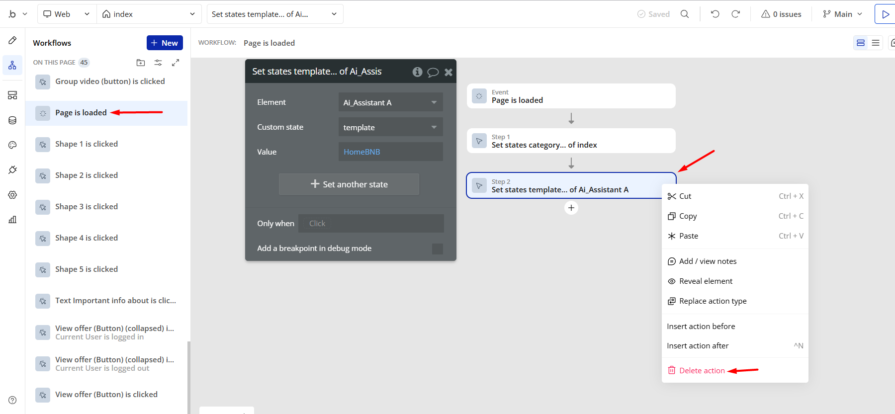
- Remove the Enhanced VAPI Call Assistant plugin from the plugin tab.
Remove Demo Login
This template comes with demo accounts and demo buttons for testing purposes, which do not require a full sign-up process in order to test the platform features. Feel free to delete these login options in your app.
Tip: Please note that deleting the demo buttons will delete the button workflows as well. Removing these demo options doesn't affect any other aspect of the template.
Here is how to delete them (in Signup / Login Popup reusable element):
Things to Note
Note: If you would like to use this template within another Bubble application, please note that for proper functioning, it is required to create all relevant data types within your application database, and add required plugins.
For reference, use the purchased template
Data Types and Plugins tab.General FAQs
We've answered questions about all things Zeroqode here: https://docs.rapidevelopers.com/general-faqs 👀
If you didn't find the answer yet, contact us by sending a mail to: support@rapidevelopers.com
Want to report a bug? Please follow this guideline!
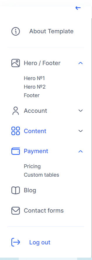
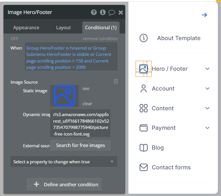
Hidden Design Elements
Tip: Initially, on some pages, design elements in Bubble Editor might be hidden.
Here is an example of how to unhide 👀 them:
Pages Overview
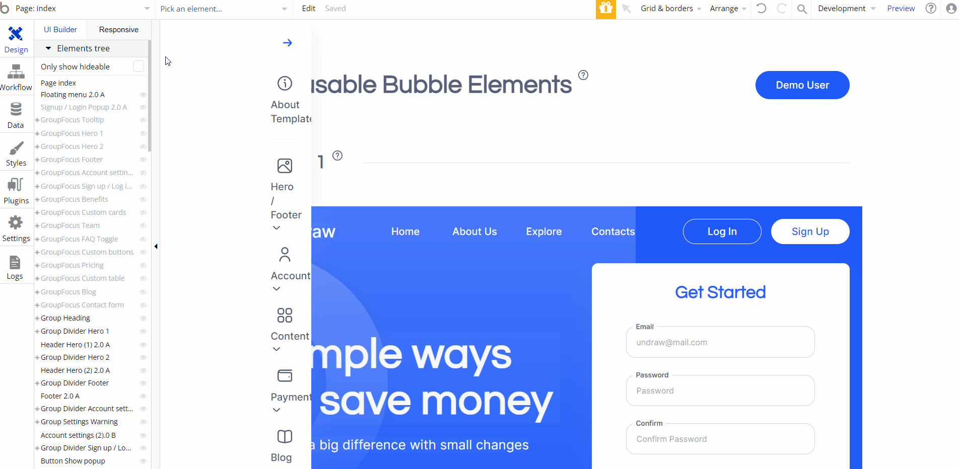
index
This is the main page of the block, where all reusable elements are placed in related sections. Here, users can see and test each reusable element.
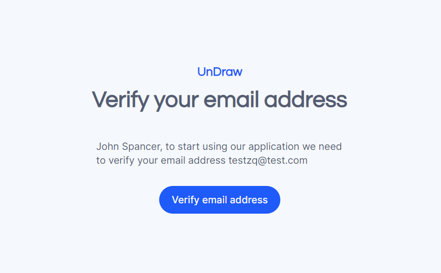
confirm_email
This page is accessed by users that click on an email confirmation link.
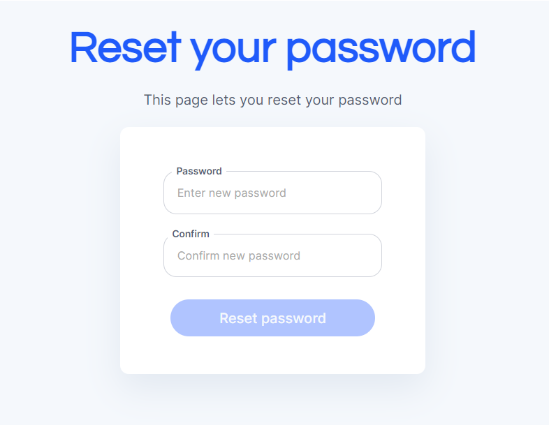
reset_pw
This page is for resetting the password.
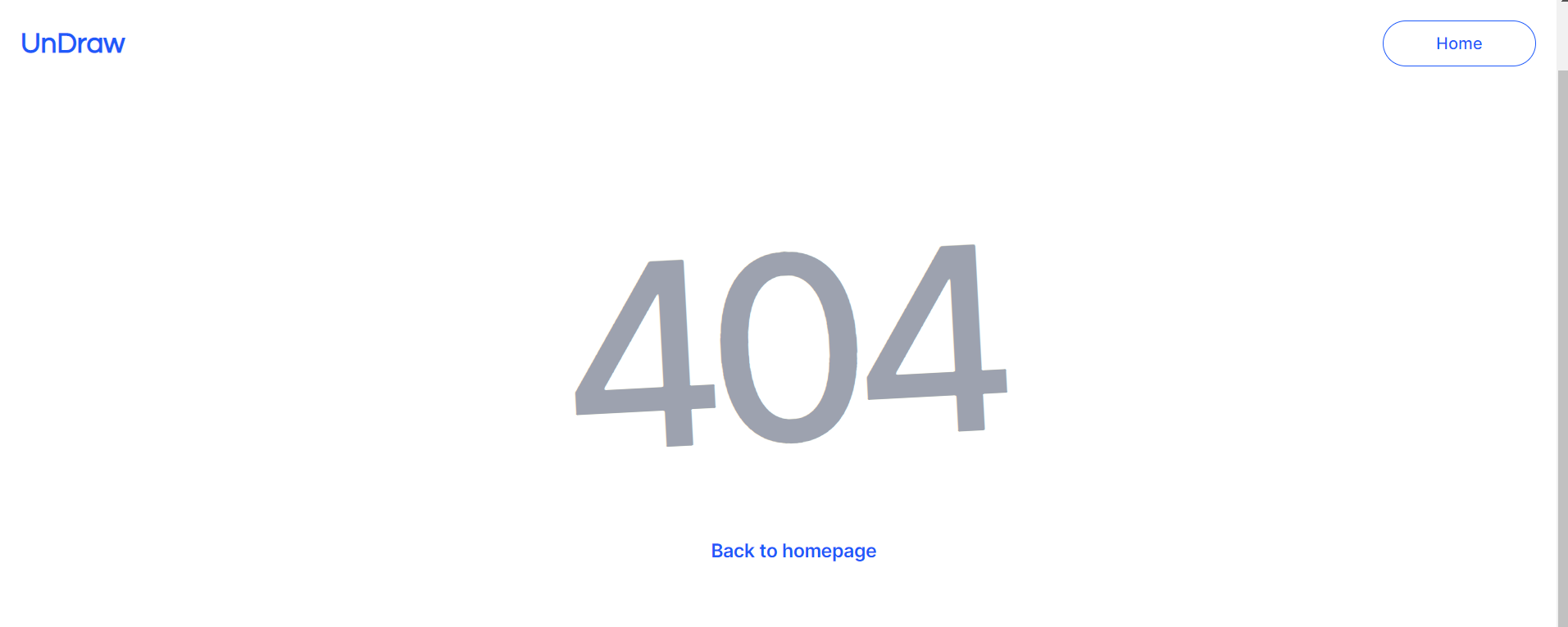
404
This is a page for 404 redirect errors, informing a user that the web page he or she is looking for cannot be found.
Reusable Elements Overview
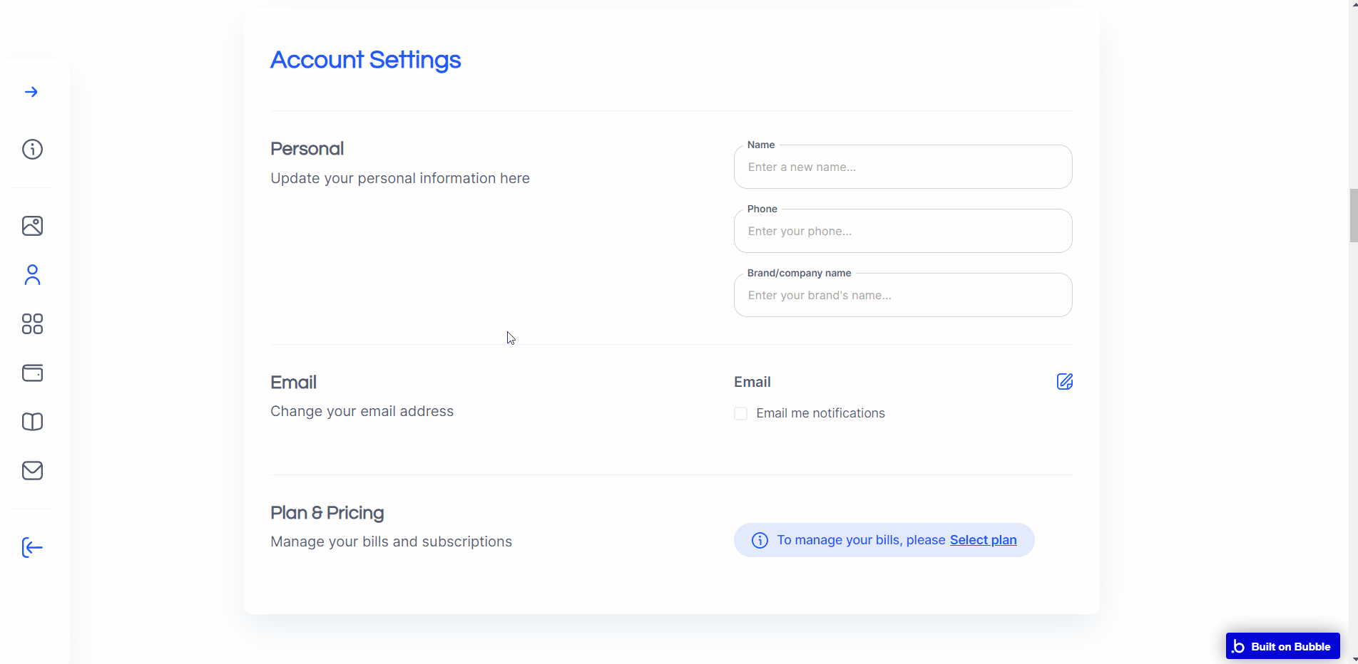
Account settings
This reusable element can be used within a user profile page, providing a complete set of fields for filling.
Article
This reusable element provides a complete set of elements for a blog article page. The data source for the element population is made through the “
Blog” data type. 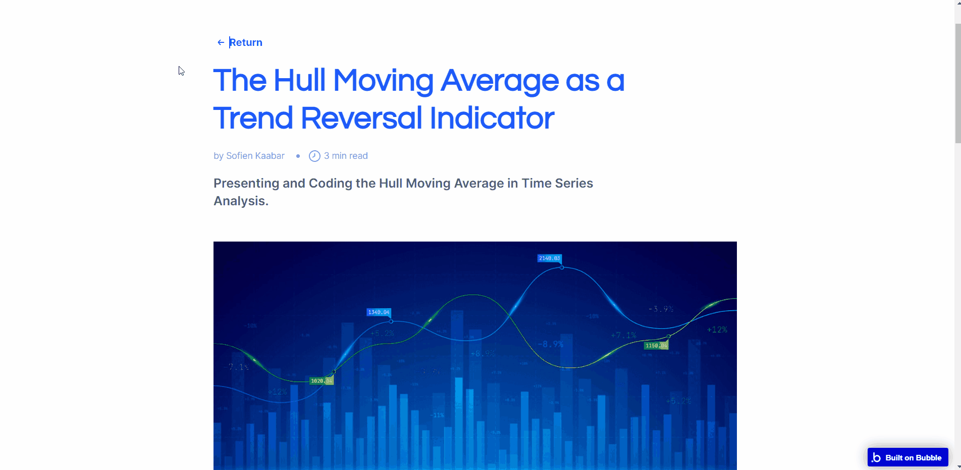
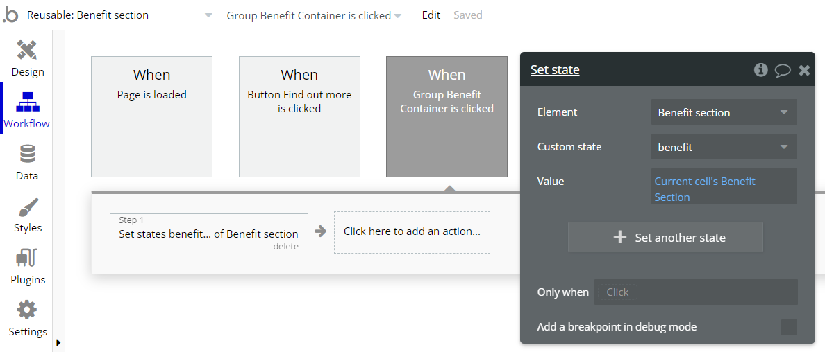
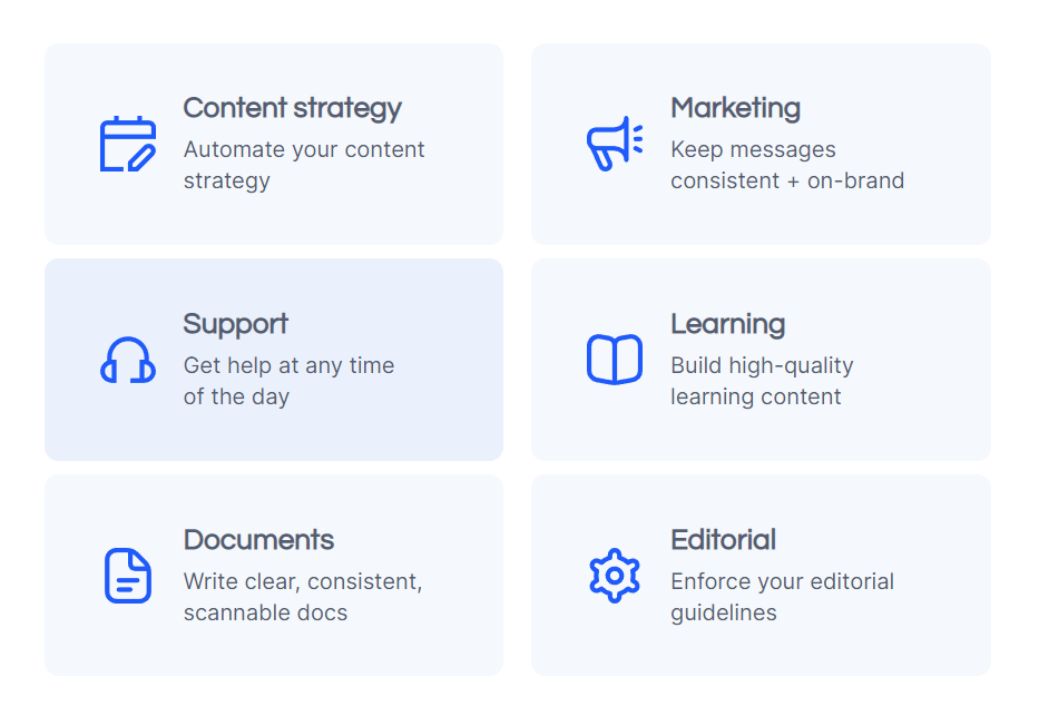
Benefit section
This reusable element provides a ready-to-use block for the benefits section of the page, with three examples of arguments included (you can add more, just be sure to fill in all required data).
The data source for the element population is made from the “
Benefit Section” data type. 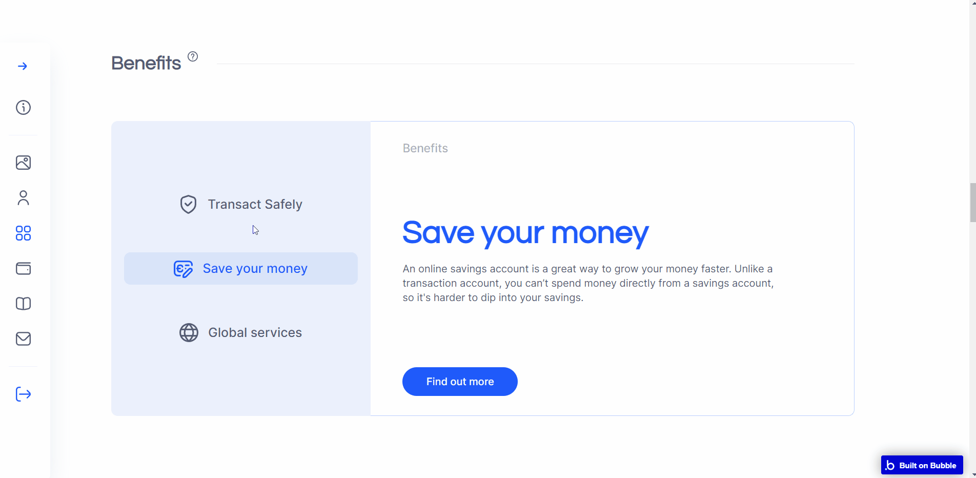
Navigation between benefit tabs is made through custom states.
Blog
This reusable element provides a ready-to-use block with 4 in-a-row blog articles short summary information (you can add more articles, just be sure to fill in all required data). The 4th and subsequent blog articles are available on RG scrolling.
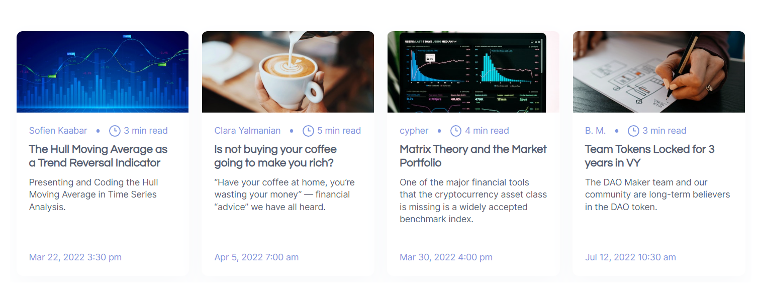
The data source for the element population is made from the “
Blog” data type. Note: The HTML element within this reusable element is used to reduce the scroll bar thickness.
Contact form
This reusable element contains all the main elements necessary for a contact form.
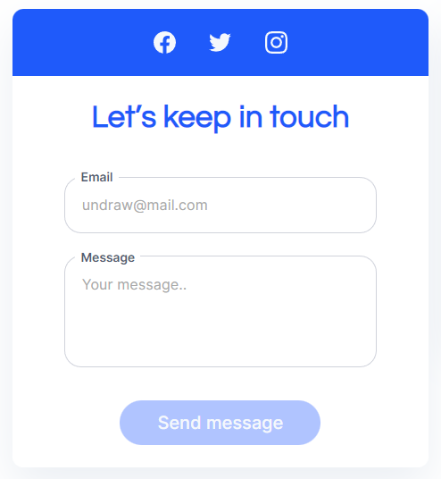
Once the “Send Message” button is pressed, it created a new data field in the “
Messages” data type. 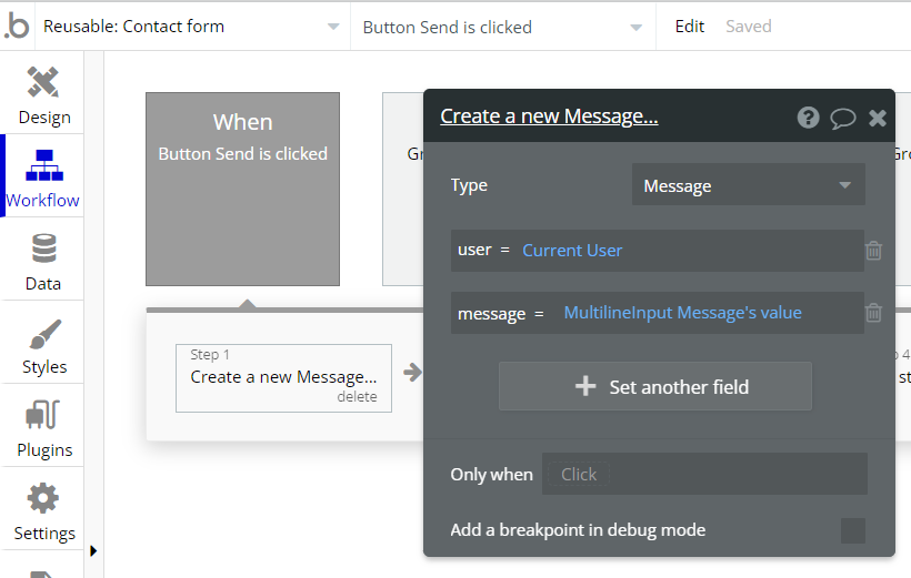
Custom cards 2
This reusable element can be used to redirect users to other pages. All content is placed in tile-like groups and is directly written in text elements.
Custom cards
This reusable element can be used to redirect users to other pages. All content is placed in groups and is directly written in text elements.
Custom table
This reusable element can be used if a volume of data needs to be displayed in a table.
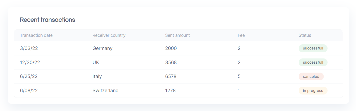
The data source for the element population is made from the “
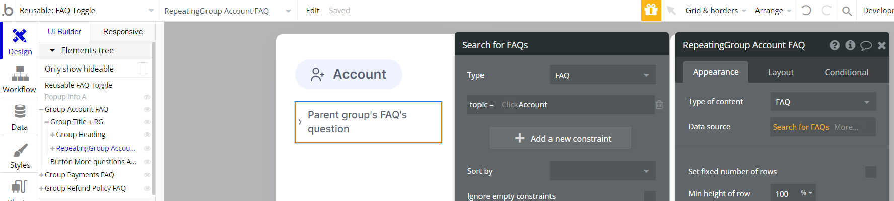
Transaction” data type. FAQ Toggle
This reusable element can be used for a FAQ section of the page.
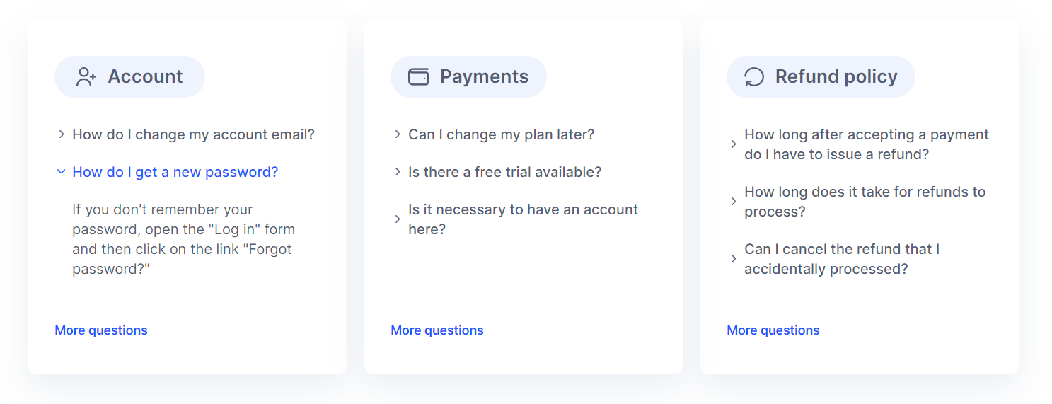
Answers to questions are hidden under the toggle and are displayed through a custom state condition.
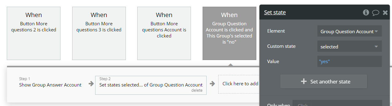
The data source for the element population is made from the “
FAQ” data type. If more FAQ need to be displayed within the block, copy & paste related Repeating Group and indicate the required fields.
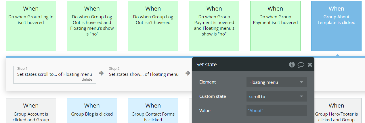
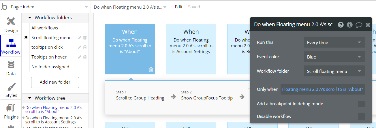
Floating menu
This reusable element can be used for fast navigation within the page sections.
It supports icon color change on page scrolling, to track the current user position on the page.
Scrolling navigation is made by using custom states within the reusable element and page.
Footer
The footer reusable element is located at the bottom of a page. It provides an example of how it can include external links, such as the company's social media, navigation, and copyright notices.
A great website footer design keeps people engaged and moving through the website. The workflows included with this element are pretty straightforward to follow.
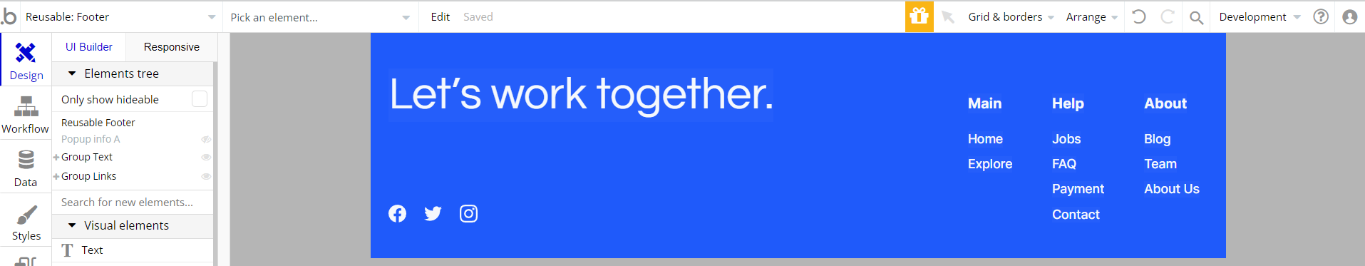
This reusable element is customizable, so it is possible to change the styles and content of elements while keeping workflows or using it as inspiration for your own.
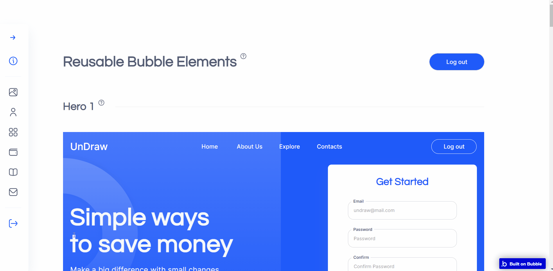
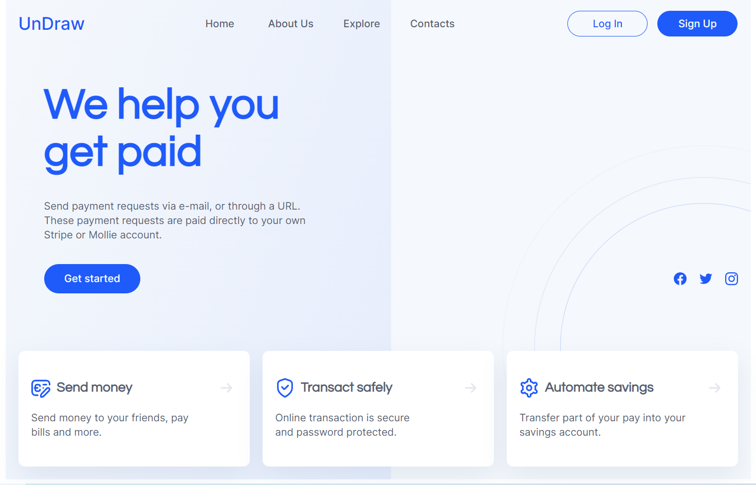
Header Hero (1)
This reusable element is a ready-to-use hero section for the index or home page.
Header Hero (2)
This reusable element is a ready-to-use hero section for the index or home page, including three-in-a-row tile-like groups. All content is directly written in text elements.
Popup info
This reusable pop-up element is used as a stub popup in the majority of the workflows on the
indexpage. 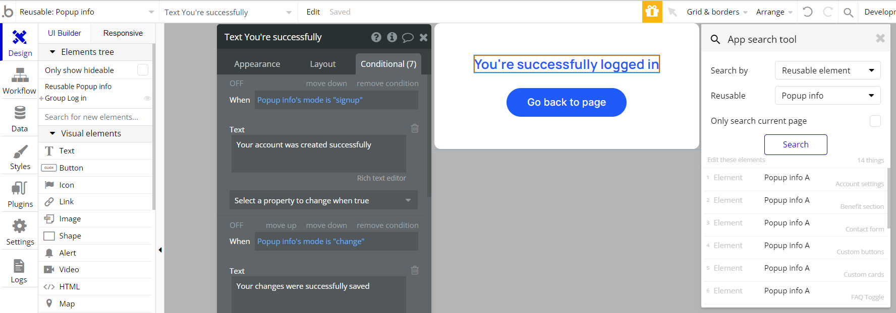
The text displayed within the popup is changed accordingly to the relevant condition:
Previous page button
This reusable element is used in the
article page and has only one workflow attached - go to the previous page. 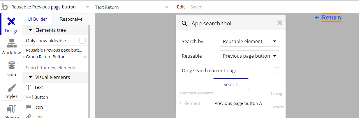
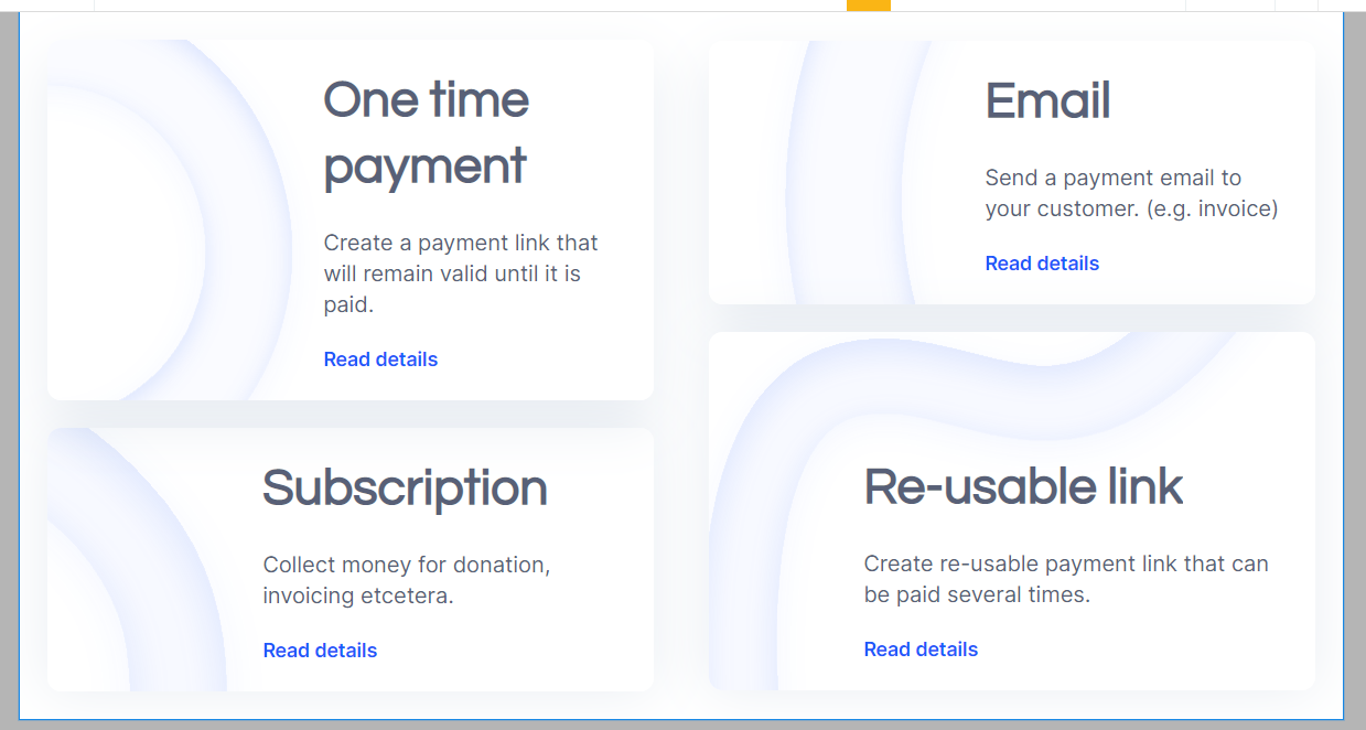
Pricing
This reusable element provides a complete set of elements and workflows required for selling subscriptions block. Element functionality is built based on the default Bubble Stripe plugin actions.
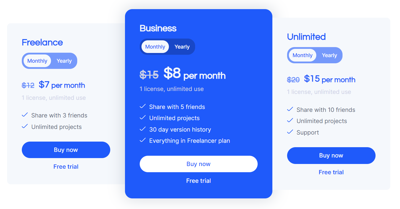
Note: For a proper setup, follow the guidance of the Setup section of this documentation.
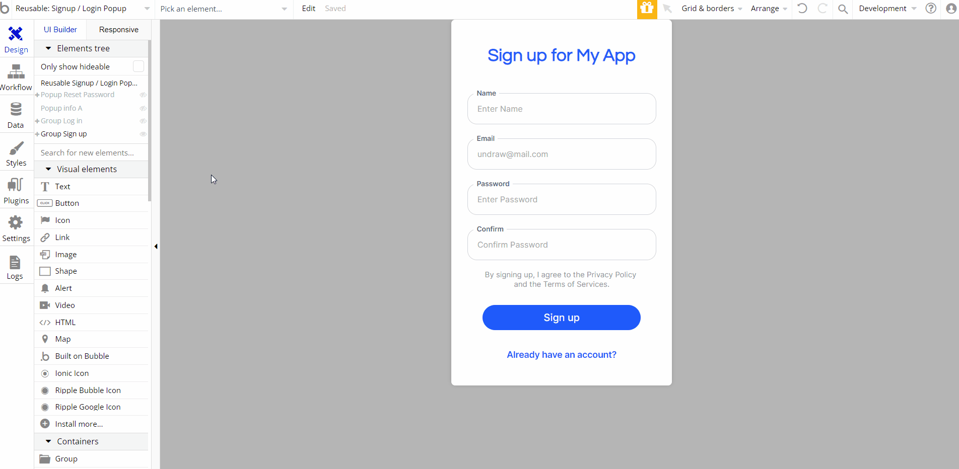
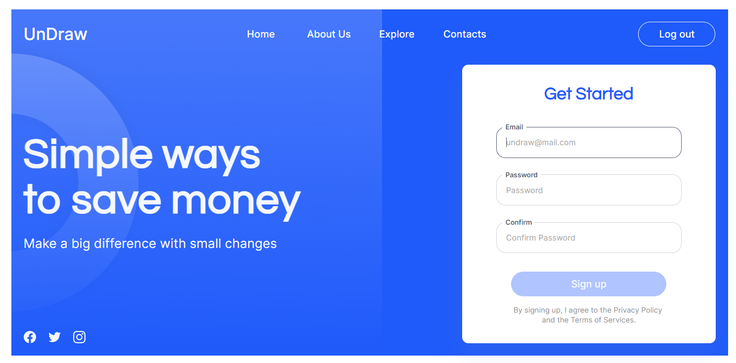
Signup / Login Popup
This reusable element is used in a few other reusable elements, as a popup for sign and login actions. It has all required workflows (login, signup and reset password) as well as demo login.
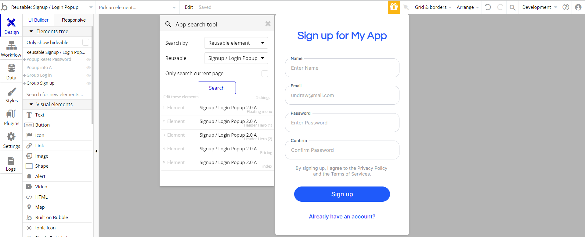
Note: To delete the “Demo User” button, see the Remove Demo Login section of this documentation.
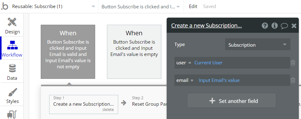
Subscribe (1)
This reusable element can be used for subscribing users to newsletters.
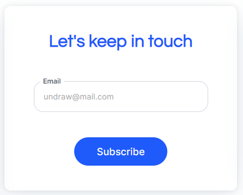
Once a user submits an email, a new thing is created.
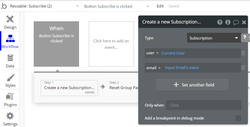
Subscribe (2)
This reusable element can be used for subscribing users to newsletters.
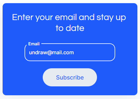
Once a user submits an email, a new thing is created.
Team
This reusable element can be used to display a managing team. All content is placed in tile-like groups and is directly written in text elements.

Data Types
Benefit Section
This object stores the benefits of the company. It is a test data that is displayed on "Benefit Section" reusable element.
Field Name | Type | Notes |
description | text | Stores the explanation of a benefit. |
iconBlue | image | This field stores the icon that is shown near the title of a benefit in blue color. This icon is used when a user hovers the title and the icon changes it's color. |
iconDark | image | This field stores the icon that is shown near the title of a benefit in black color. |
title | text | Stores the title of the benefit. |
Blog
This object stores the articles for a blog for the "Blog" reusable element.
Field Name | Type | Notes |
author | text | This field stores the author's name. |
content | text | Stores the content of an article. |
date | date | This field stores the date the article was published. |
description | text | Stores the description of an article. |
image | image | Stores the cover image of an article. |
readingTime | number | This field stores the time for a user to read an article. |
title | text | Stores the title of an article. |
FAQ
This object stores the test FAQ that are separated by topics. FAQ are displayed on "FAQ Toggle" reusable element.
Field Name | Type | Notes |
answer | text | This field stores the answer to a question. |
question | text | Stores the text of a question. |
topic | text | This field stores the topic the question is related to. |
Message
This object stores the data about users that sent a message with a "Contact form" reusable elements.
Field Name | Type | Notes |
message | text | Stores the text of the message that user filled in a multiline input. |
user | User | This field stores the current user. |
Subscription
This object stores the data about users that clicked on "Subscribe" button on "Subscribe(1)" or "Subscribe(2)" reusable elements.
Field Name | Type | Notes |
email | text | This field stores the email that a user filled in the input. |
user | User | This field stores the current user. |
Transaction
This object stores the test data of transactions that is displayed on "Custom table" reusable element.
Field Name | Type | Notes |
amount | number | This field stores the sum of money that was transfered. |
date | date | This field stores the date of a transaction. |
fee | number | Stores the transfer fee. |
receiverCountry | text | This field stores the receiver country's name. |
status | text | Stores the status of a transaction. |
User
This data type stores user-related information.
Field Name | Type | Notes |
brand | text | Stores the name of user's brand (test data). |
emailNotifications | yes / no | This field determines whether a user wants to recieve notifications on email. |
emailVerified | yes / no | This field determines whether a user's email is verified. |
frequency | text | This field stores the frequency of a plan the user is subscribed to. |
name | text | This field stores the name of a user. |
phone | text | This field stores the phone of a user. |
stripeCustomerID | Stores the ID that identifies a customer in Stripe. | |
stripeSubscriptionID | text | Stores the ID that identifies the user subscription in Stripe. |
subscriptionStatus | text | Stores the subscription status of a plan the user is subscribed to. |
subscriptionEnd | text | This field stores the day the subscription ends. |
subscriptionStart | text | This field stores the day the subscription started. |
tempPassword | text | This field stores the temporary password of a demo user. |
usedFreeTrial | yes / no | This field determines whether a user used the free trial. |
Tip: The User data type have the following fields: email, Modified Date, Created Date and Slug.
These fields' values can be used in workflows, conditional formatting, etc. To learn more, see the Bubble manual
Note: The data type has a privacy rule applied. See the 💬 in the database under the privacy section for details.
Release Notes
04 October 2022
UPDATE NOTE: This template received a complete overhaul of design as well as functionality. Most of the known bugs and issues have been fixed and new features added.
- 🔄 Template's design reworked and updated to the new Bubble Responsive Engine
- 🎉 New template documentation
- 🔧 Added "Setup Guide" section
- ❔ Added "FAQs" section
- ✅ Added "Release Notes" section
- 🎬 Added "Video Overview" section
Note: Template updates don’t apply to the apps which were built on the template prior to updates becoming available.
Tip: To check changes in workflows and design after the release update, you can create a new block copy and compare the settings (design/workflow) of the new copy and the app you have.
So you don't have to "move" your customizations from your already edited template to the new block copy.
Ready to move further?
Enhance your app with powerful plugins
🔌 Rapid Dev Plugins: add Superpowers to your App
Boost your Bubble skills within our Lab
🎓 Rapid Dev Labs: no-code Courses and Tutorials