This section states the purpose of each reusable element.
Introduction
Reusable Element - an element that contains other elements, like a group, that can be used in more than one place. This is useful when reusing the same elements often.
Tip: See Bubble Reference for details https://manual.bubble.io/core-resources/elements/reusable-elements 🙂
Reusable Elements
Create event
This is a pop-up and it's used for event creation process. It can be seen on pages like
my-events, organizer and profile.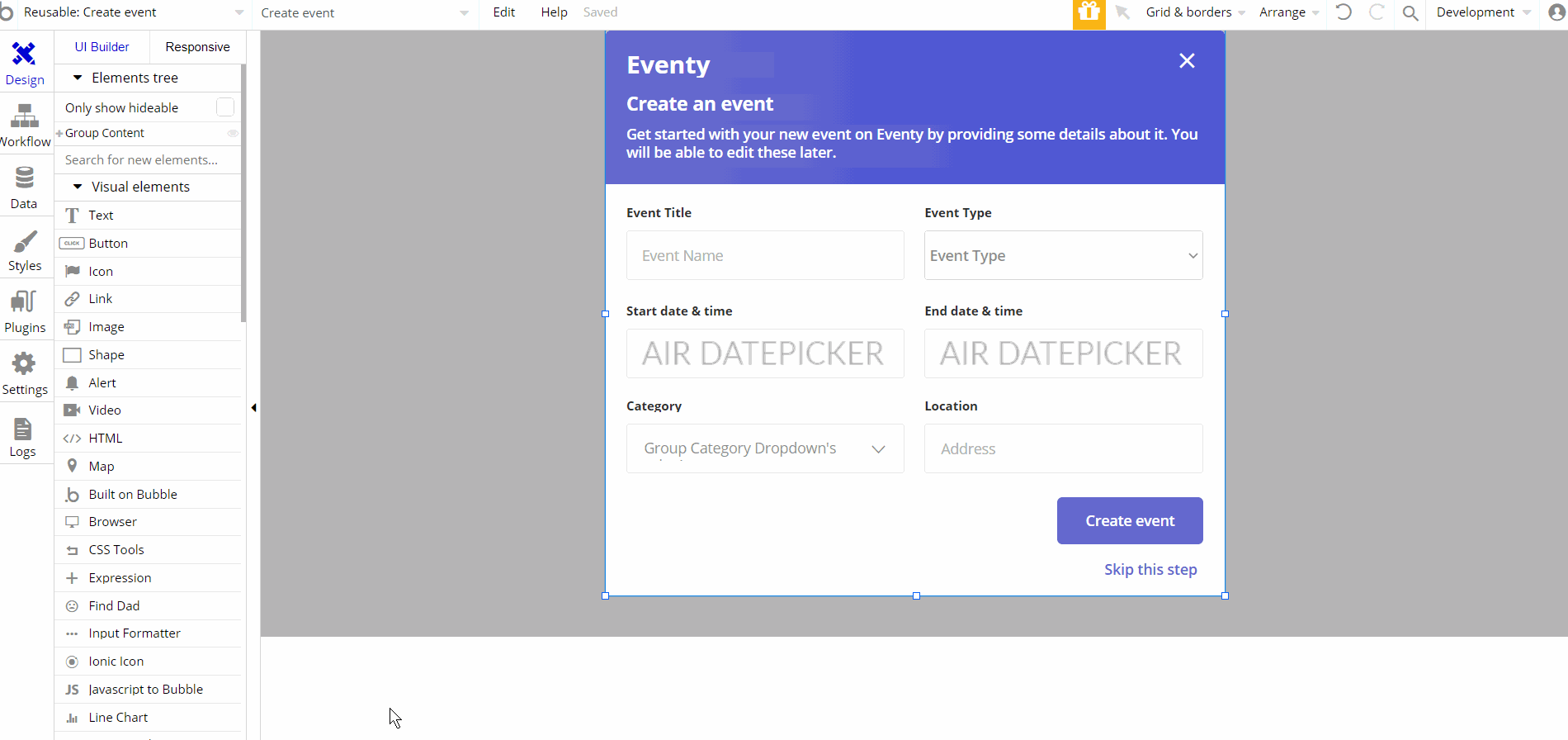
This reusable element is designed to be used on certain pages and other reusable elements. It contains the main "Group Content".
The "Group Content" holds other group elements "Group Header", "Group Content" and "Group Button Create Event".
These elements contain the inputs, dropdowns, text and buttons used for actions durring event creation. Certain elements are no visible on page load, like "GroupFocus Category" or image "create event loading".
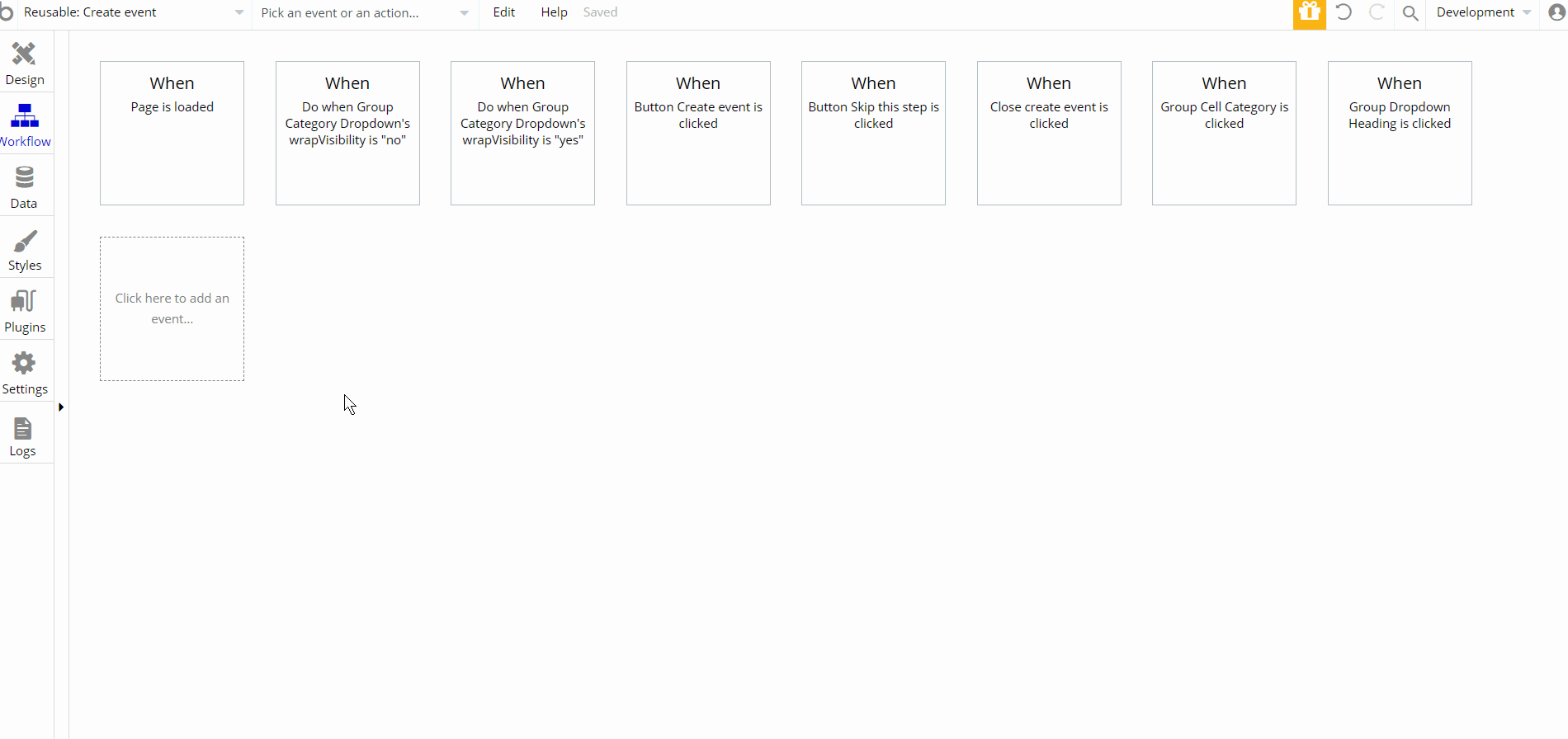
The workflows on this element are actions that manipulate database values using Make Changes and Create new thing forUser , Organizer and Event data type values.
The navigation actions to different pages after event creation process, and showing and hiding elements. The set state values actions are used to show categories in dropdown.
event-card
This reusable is used on several pages (
organizer, profile and events) as a card containing details about an event.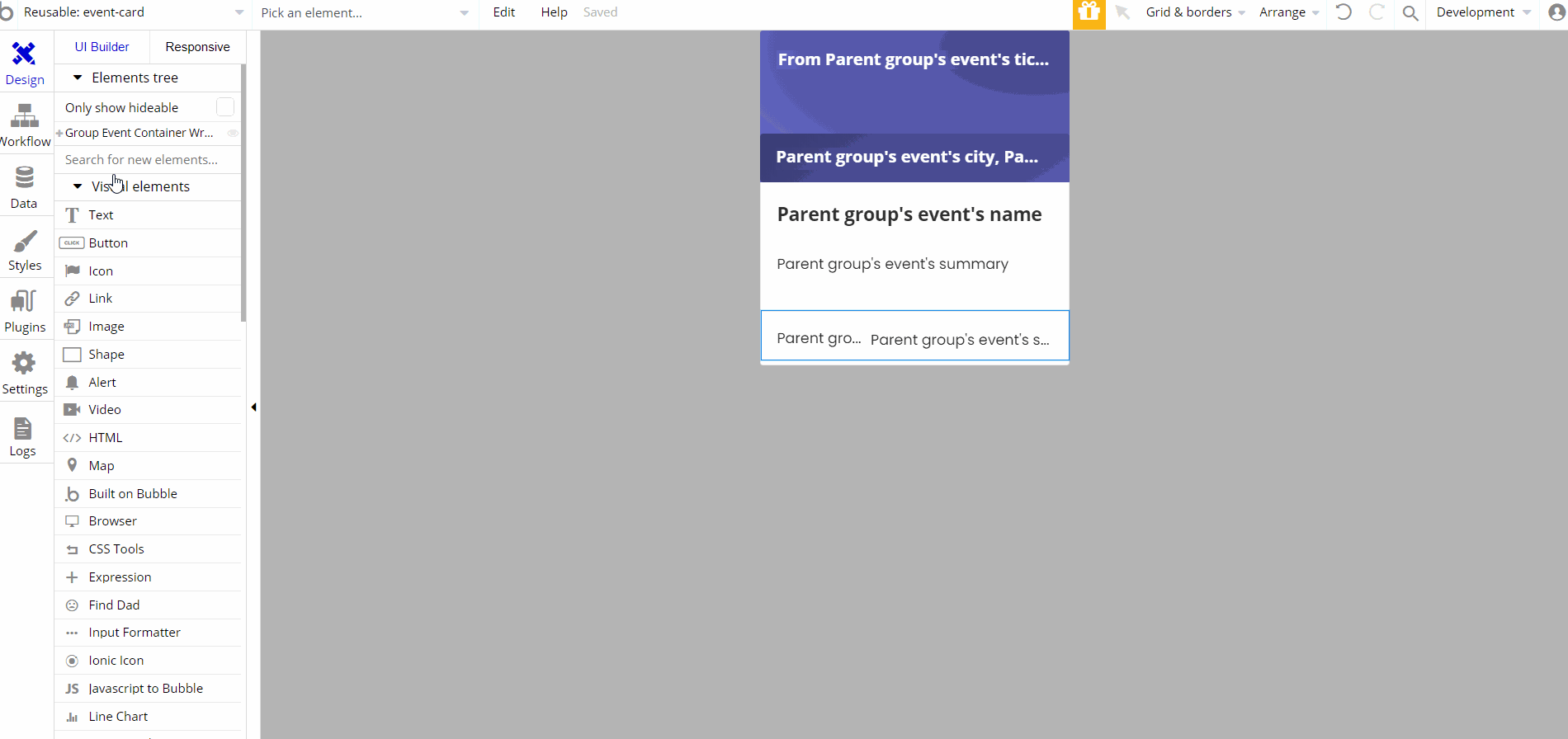
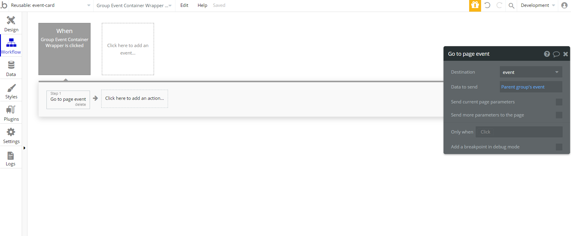
This reusable element is designed to be used on certain pages. It contains the main "Group Event Container Wrapper".
This group holds other group elements "Group Event Container", and "Group Event Info". These elements contain text, groups and button used for displaying the event card.
Footer
The header reusable element sits at the top of each page and serves a few very important purposes. It does provide a place for company's logo, navigation and page title which are part of a consistent user experience that all good websites share.
Other common header features are, search, shopping cart (for ecommerce), login/logout, user profile and notifications (if applicable).
This reusable element is customizable, so it is possible to change styles and content of element while keeping workflows or using as inspiration for your own.
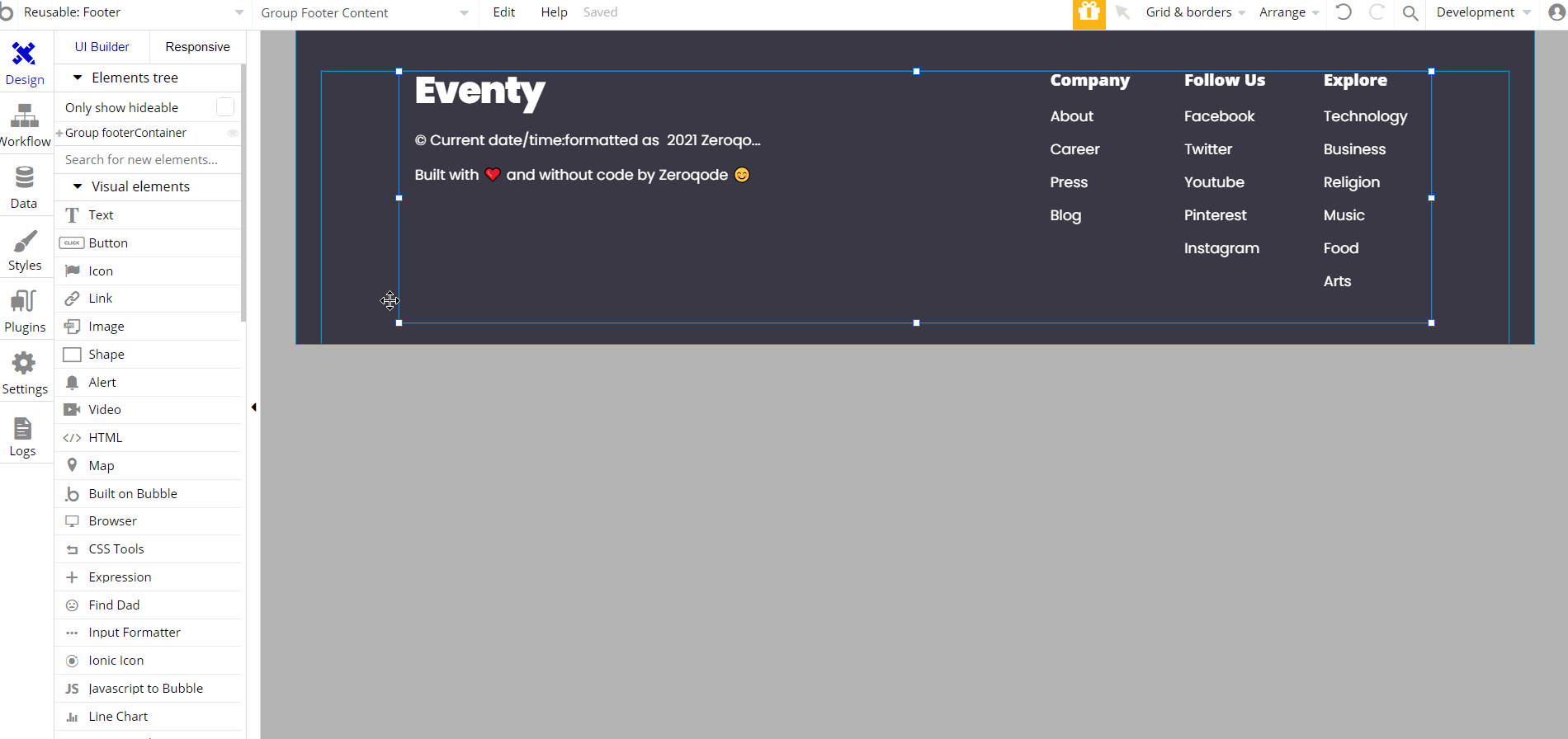
This reusable element is designed to be used on most pages, and contains the main "Group footerContainer". The "Group footerContainer" holds other groups and elements, also the link destinations to pages. There are no element workflows for this page.
Tip: Add Privacy and Terms links here, as well as create separate pages for these links. It will help you go through App Store and Google Play approval procedures, in case you convert your Bubble app into native iOS and Android apps. These links are also important for Facebook login.
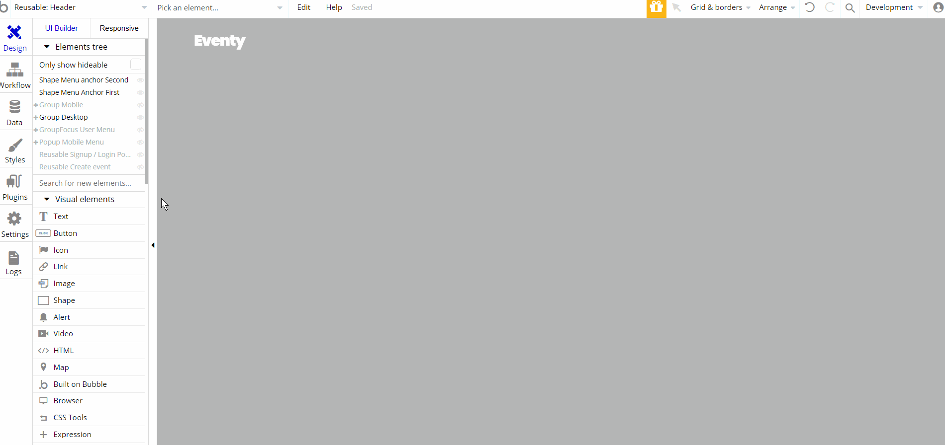
Header
The header reusable element sits at the top of each page and serves a few very important purposes. It does provide a place for company's logo, navigation and page title which are part of a consistent user experience that all good websites share.
Other common header features are, search, shopping cart (for ecommerce), login/logout, user profile and notifications (if applicable). The workflows included with this element are pretty straightforward to follow.
This reusable element is customizable, so it is possible to change styles and content of element while keeping workflows or using as inspiration for your own.
Tip: Initially, your design elements might be hidden in your editor. Here is how to unhide 👀 them:
This reusable element is designed to be used on most pages, and contains the main "Group Desktop". This group is designed to hold other elements , groups, buttons etc. for desktop size displays. It comes with condition to be visible when current page's width > 600px.
Other groups with elements may have different conditions, "Group Mobile", is visible when page's width < 600px and used for responsive mobile viewports. The reusable contains additional reusable elements inside, Reusable Signup / Login Popup and Reusable Create event Pop-up, both are used as pop-up type of elements.
"GroupFocus User Menu" has the location reference for the group "Shape Menu Anchor First" element.
The workflow actions on this element are mostly the set state values actions used to show elements when user clicks on a button. Additionaly the navigation actions to different pages and showing and hiding elements can be seen here.
organizer-hero
This reusable element is used only on
organizer page to show organizer profile data (i.e Full name, description, etc.).Tip: Initially, your design elements might be hidden in your editor. Here is how to unhide 👀 them:
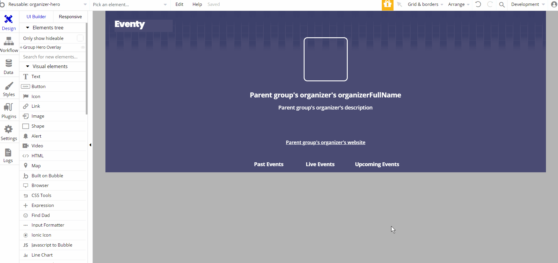
This reusable element is designed to show the organizer information as a hero element on page. It contains the main "Group Hero Overlay". This group is designed to hold other elements, groups, links, etc. hierarchically.
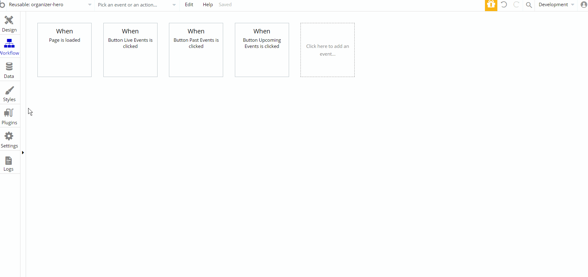
The only workflow actions on this element are the set state values actions used to show elements when user clicks a button and during page load.
sidepanels
This reusable element is used on the
event page, and contains actions that will trigger workflow event to modify details, payments, add tickets, change settings and manage an event. The panel itself is triggered by clicking the "Floating Group Edit event" that contains a green group and an image of the text in a vertical form.
Tip: Initially, your design elements might be hidden in your editor. Here is how to unhide 👀 them:
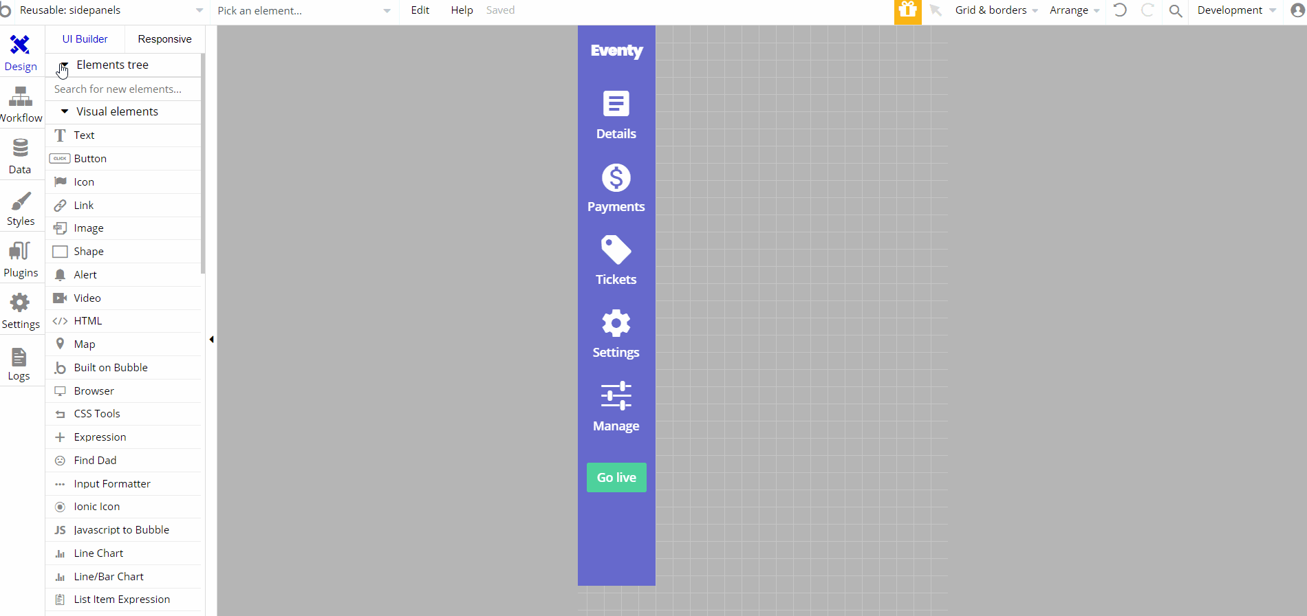
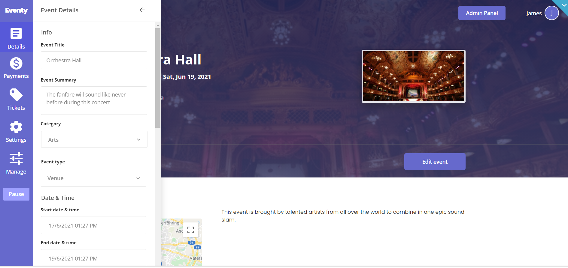
This reusable element is designed as a side panel for events management on page. It contains the main "Group Event". This group is designed to hold other elements, groups, buttons, dropdowns, etc. hierarchically.
Additionally, there is "GroupFocus Organizers" the has the location reference for the "Group Organizer Choice Box". The "Popup Delete Ticket", "Popup Delete Organizer", "Popup Expanded Description" and "Popup Ticket Warning" are part of the design that are showed during different user actions like a delete ticket or edit organizer.
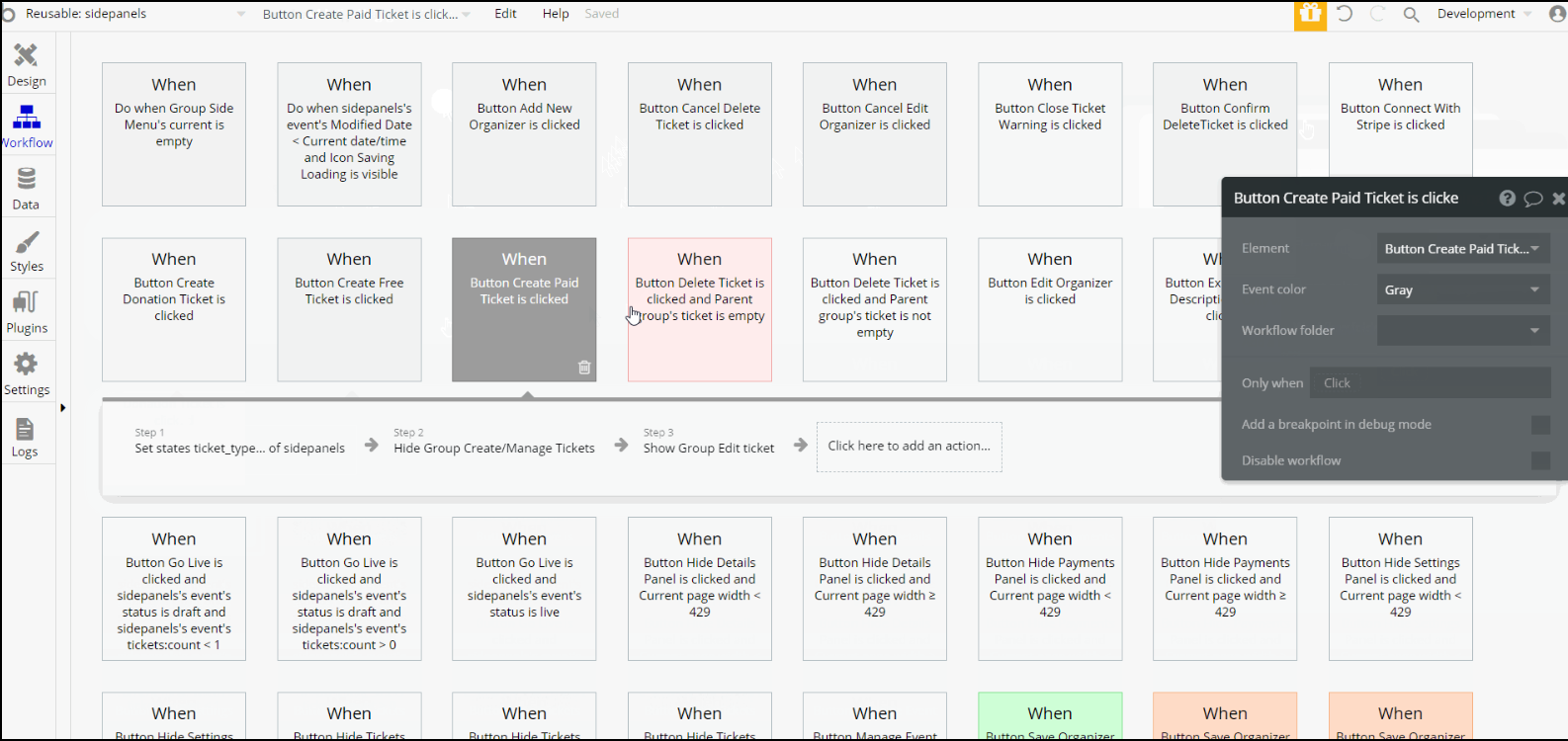
Most of the workflow actions on this page are showing and hiding different elements. Also there are working with data actions - modifying and makings changes to the event and ticket, create new thing (organizer).
Other actions include navigation to index page, register the user as seller, schedule API workflow on a list of things, and animate elements.
Note: Schedule API Workflow action is available to users with a paid Bubble plan. Activate the API in the API section in the Settings Tab.
Signup/login popup
This reusable is part of Header reusable element. It is used for login or signup, and also contains action for password reset.
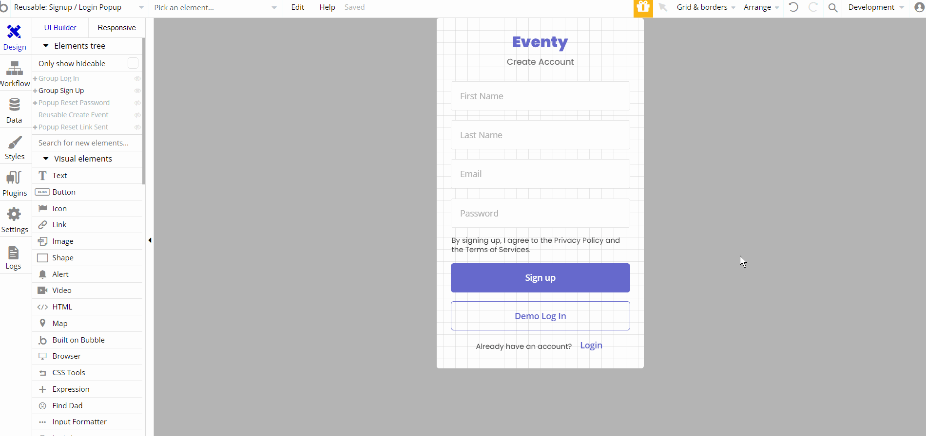
This reusable element is designed as a signup and login popup while also containing reset password feature and demo logins.
It contains the main group "Group Sign Up" which holds all the other groups, inputs, text elements, etc. "Group Log In" is not visible on page load , but has conditional "When Signup/Login Popup's mode is login" state value it will be showed for users.
Other elements like "Popup Reset Password" and "Popup Reset Link Sent" are part of design but not visible by default. Another reusable element is inside the element - Reusable Create Event, which is triggered only "When Signup/Login Popup's next is create" state value
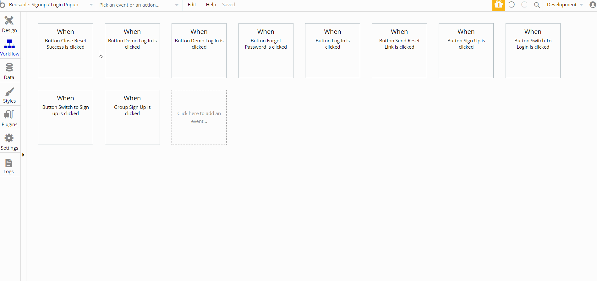
Workflow actions that can be seen here, are showing and hiding different elements, log the user in and sign the user up and lastly set state values actions used to show elements.
user-hero
This reusable element is used on
profile page, to show user profile data (i.e First and last names, profile image, etc.)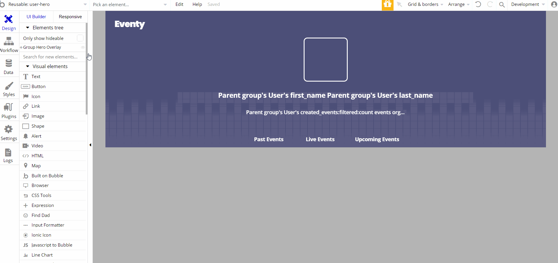
This reusable element is designed to show the user profile information as a hero element on page. It contains the main "Group Hero Overlay".
This group is designed to hold other elements, "Group Header" and "Group User Container Wrapper". The latest is a container for user information divided into groups and text elements.
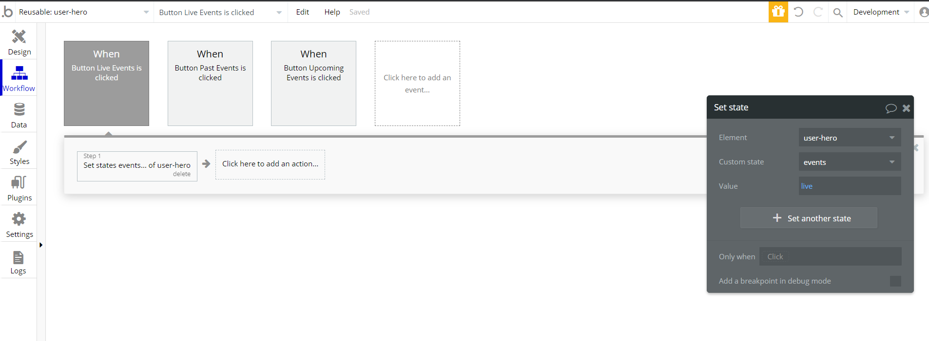
The only workflow actions on this element are the set state values actions used to show elements when the user clicks a button