This section states the purpose of each page.
Introduction
In this summary, we will describe each page and its content. The Page Element is the fundamental one that contains all the other elements.
Tip: See Bubble Reference for more information about Pages element https://bubble.io/reference#Elements.Page 🙂
Pages
index
This is the main page typically encountered first on the web app that usually contains links to the other pages of the site. A homepage includes a variety of menus that make it easy for users to find the information they need.
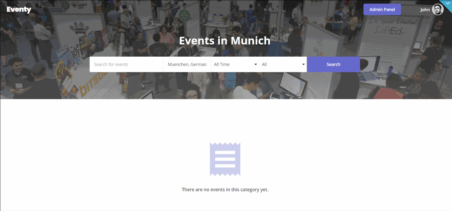
There is a search input in the hero section of the page where users can search the events they're interested in, by providing a name, and filter by location, time, or type of event🎫.
Next, there are two informational blocks, one that shows trending events near the user's location (if the user shared the location), and the other one displays available event categories for searching through.
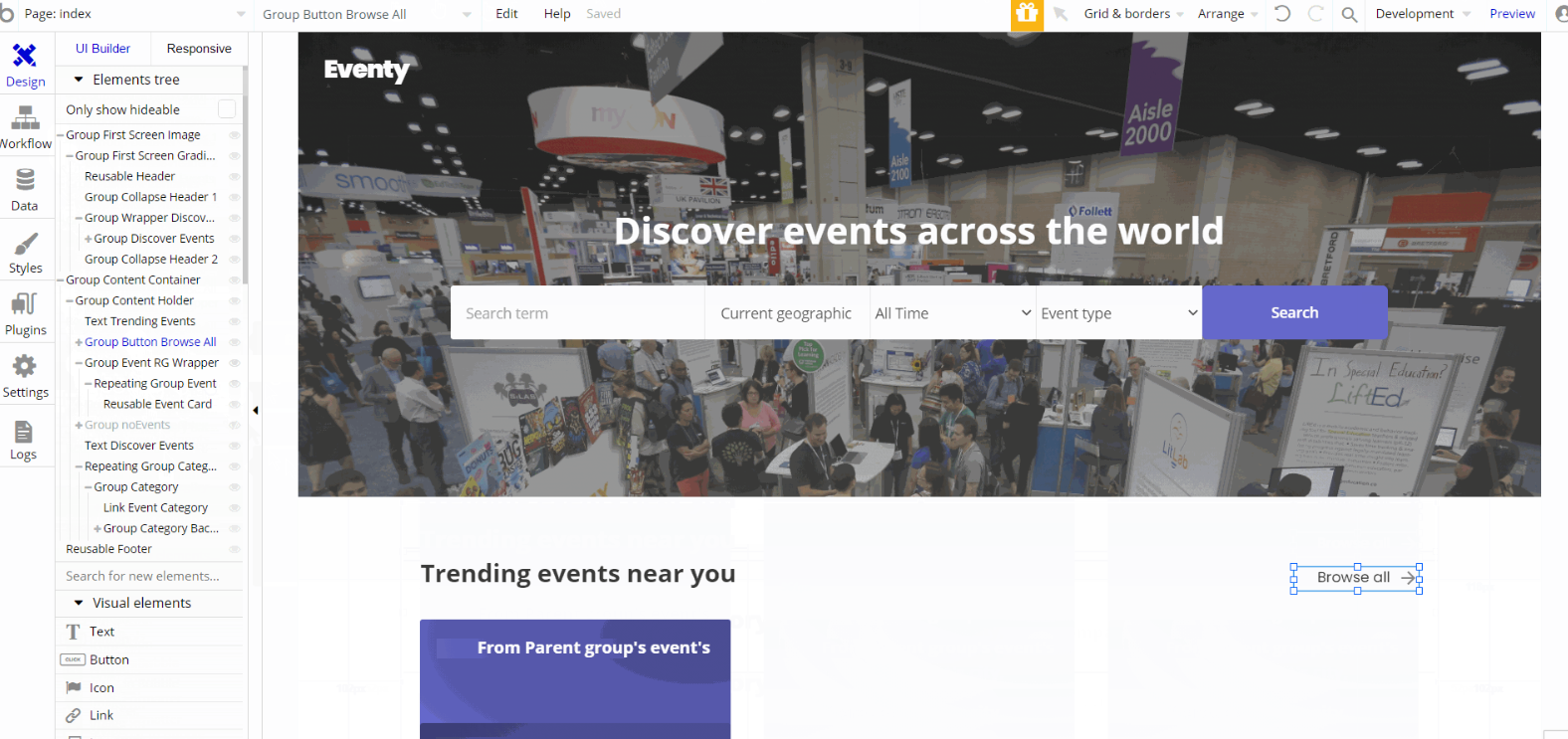
The design for this page consists of the main "Group Content container" which holds the other components, alongside "Group First Screen Image", with Footer and Header reusable elements on the page.
The main "Group Content container" is branched into other different group elements and group containers designed to display the content of the trending events and events categories blocks.
The "Group First Screen Image" is used as a hero group for searching features and holds the groups and other elements on-page. Header reusable element is inside this group.
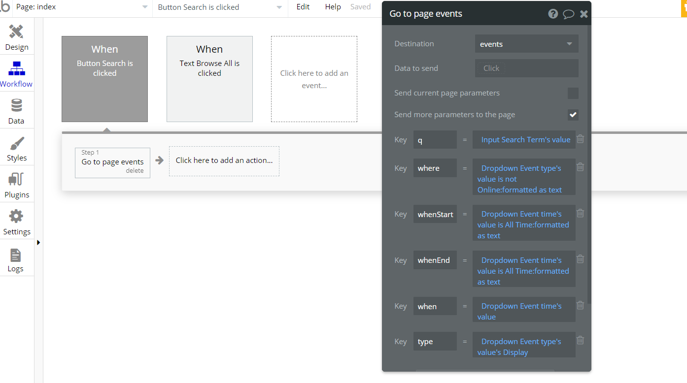
The only workflow actions on this page are navigation actions to
events page within the template while also sending key parameters values from input and dropdown elements.account
This page comes with two tabs. The profile tab is used to edit personal information like name, image profile, company name, address details, etc. The settings tab is used to edit credentials.
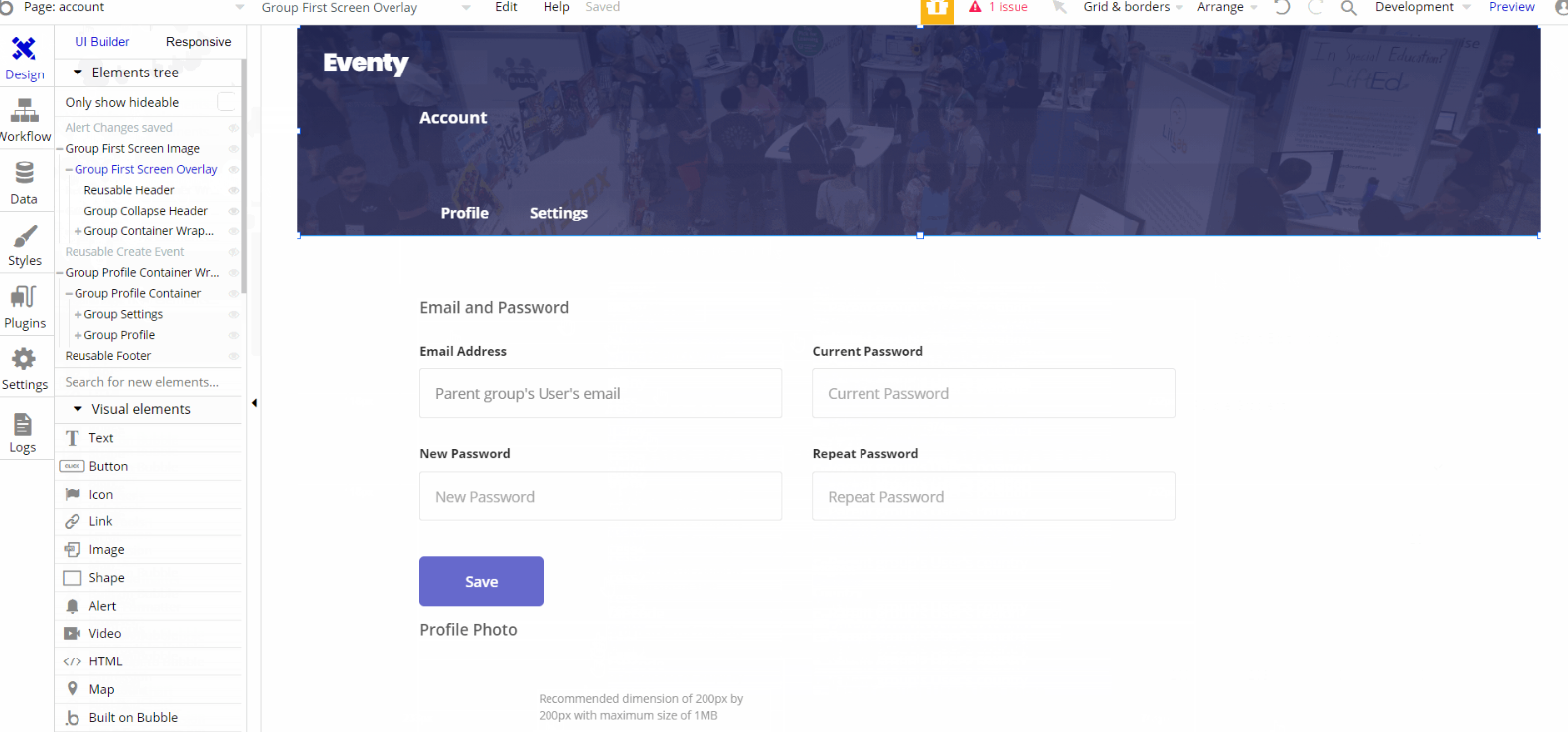
The design for this page consists of the main "Group Content Container Wrapper" which holds the other components, alongside "Group First Screen Image", with Footer and Header reusable elements on the page.
The main "Group Content Container Wrapper" is branched into other different group elements and group containers designed to display the content of the tabs where the user can edit certain info.
The "Group First Screen Image" is used as a hero image group with text elements used to switching between tabs. Header reusable element is inside this group.
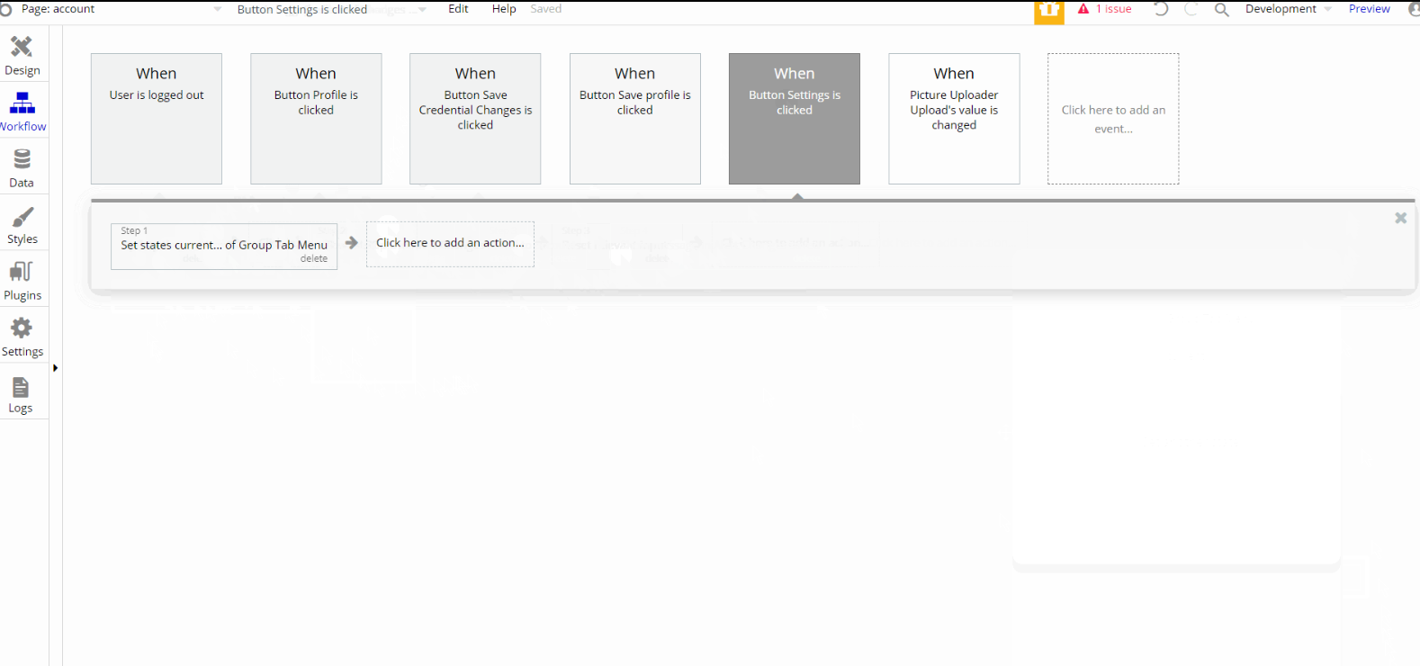
The workflow actions on this page are navigation actions to index page within the template, set state of an element, and scroll to an element. Other actions seen on page are makings changes to the user and updating the user's credentials.
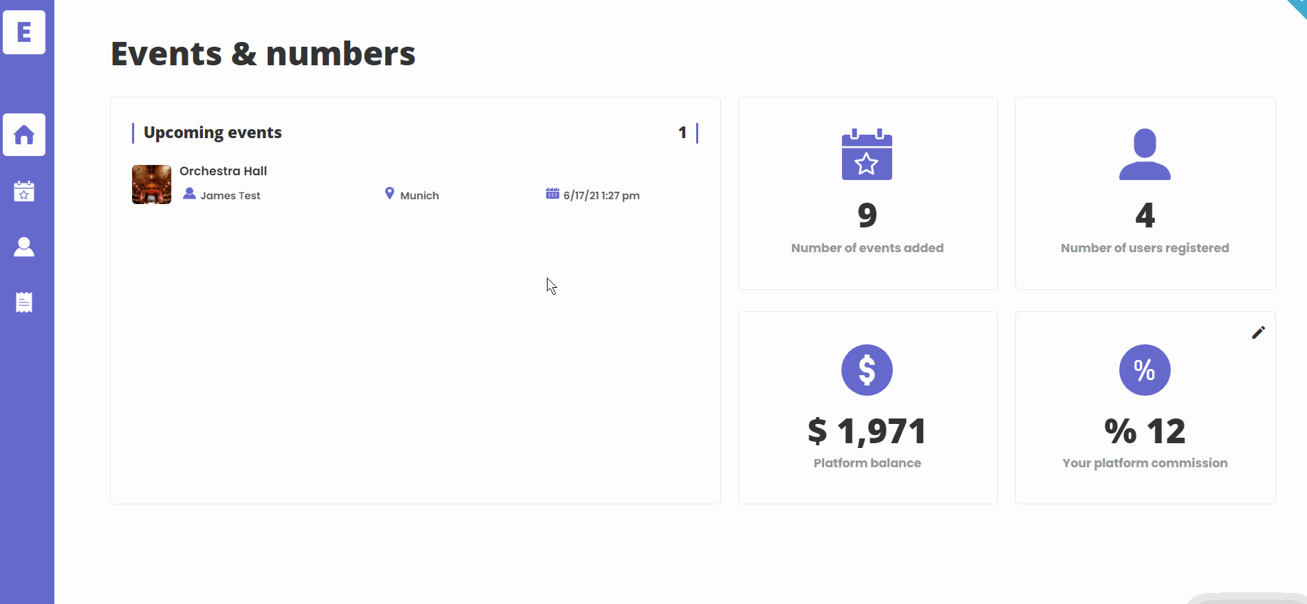
admin
This page is designed to manage platform data, e.g. Users, Items, Payments… and others. Only users with admin rights are able to access this page (in read-only mode), and those users who have access rights can edit or delete anything here.
First Tab has upcoming events + important information: the number of events added, users, registered, platform balance. Here platform commission can be edited.
The next tab displays a list of events, that the user can either access or delete, also the events can be sorted by a number of filters such as event name, organizer, etc.
Users tab is the next tab with details about the user, as well as events created by him, with the ability to delete that user if needed.
The last tab is the orders tab, here is general information about every order made on the platform.
Tip: Initially, your design elements might be hidden in your editor.
Here is how to unhide 👀 them:
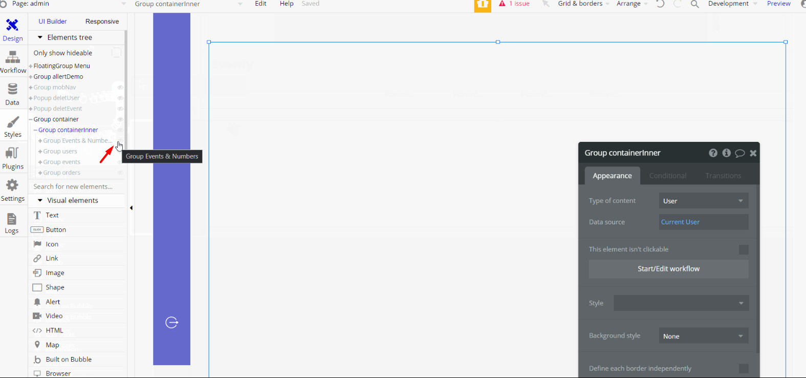
The design for this page consists of the main "Group Container " which holds the other components, alongside "Group allertDemo" with an alert bar, hidden "Group mobNav", a floating group "FloatingGroup Menu" and "Popup deleteUser", and "Popup deleteEvent" on the page.
The main "Group Content Container Wrapper" is branched into other different group elements and group containers designed to display the content of the tabs where the user can view and edit certain data. "Group mobNav" is a hidden group container designed for mobile view.
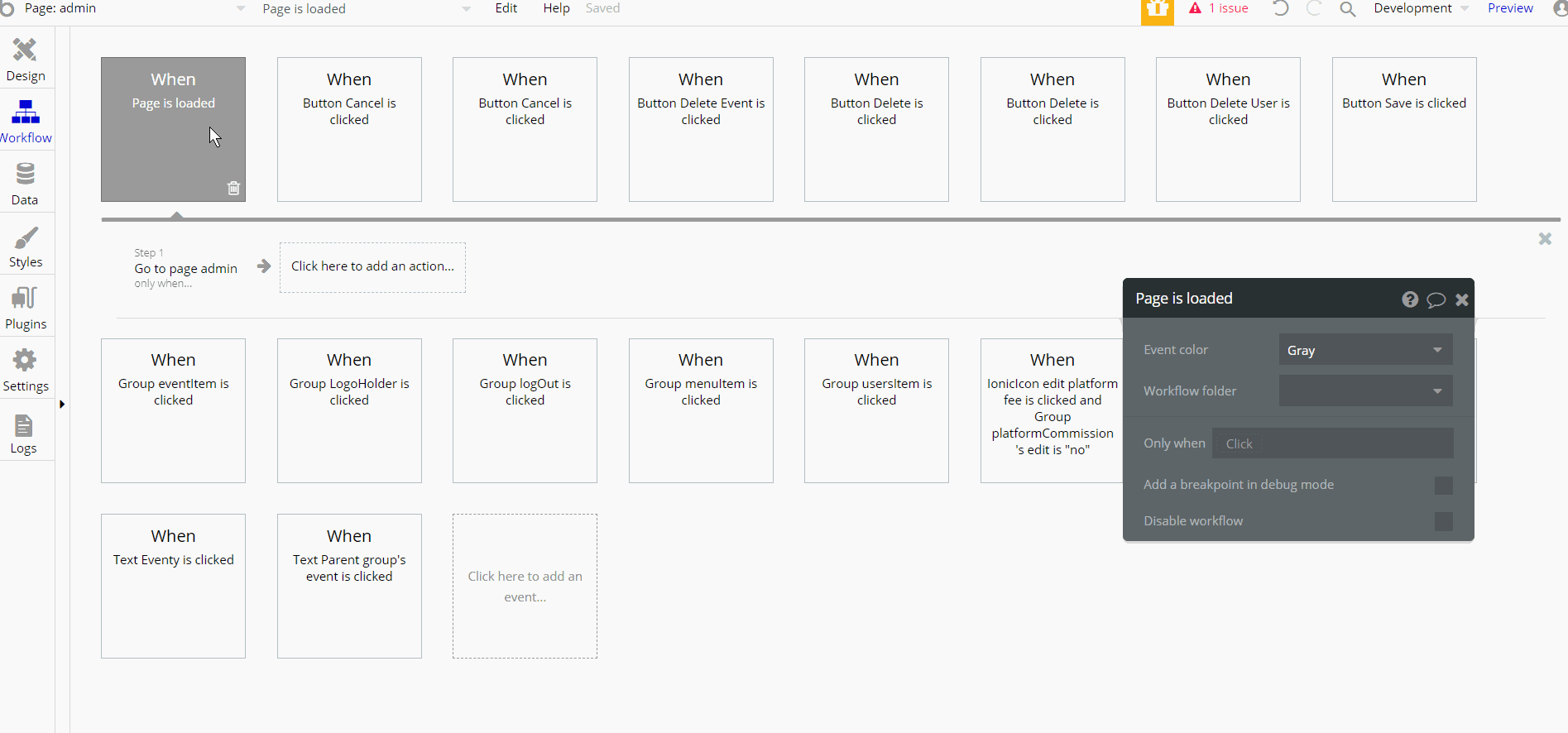
Most of the workflow actions on this page are, showing and hiding different elements on-page. Some of the actions are working with data, by saving, modifying, and deleting values inside Commission, Events, User database types.
Other actions include actions related to set state values for elements to set the visible ones and actions for navigation to other pages within the template.
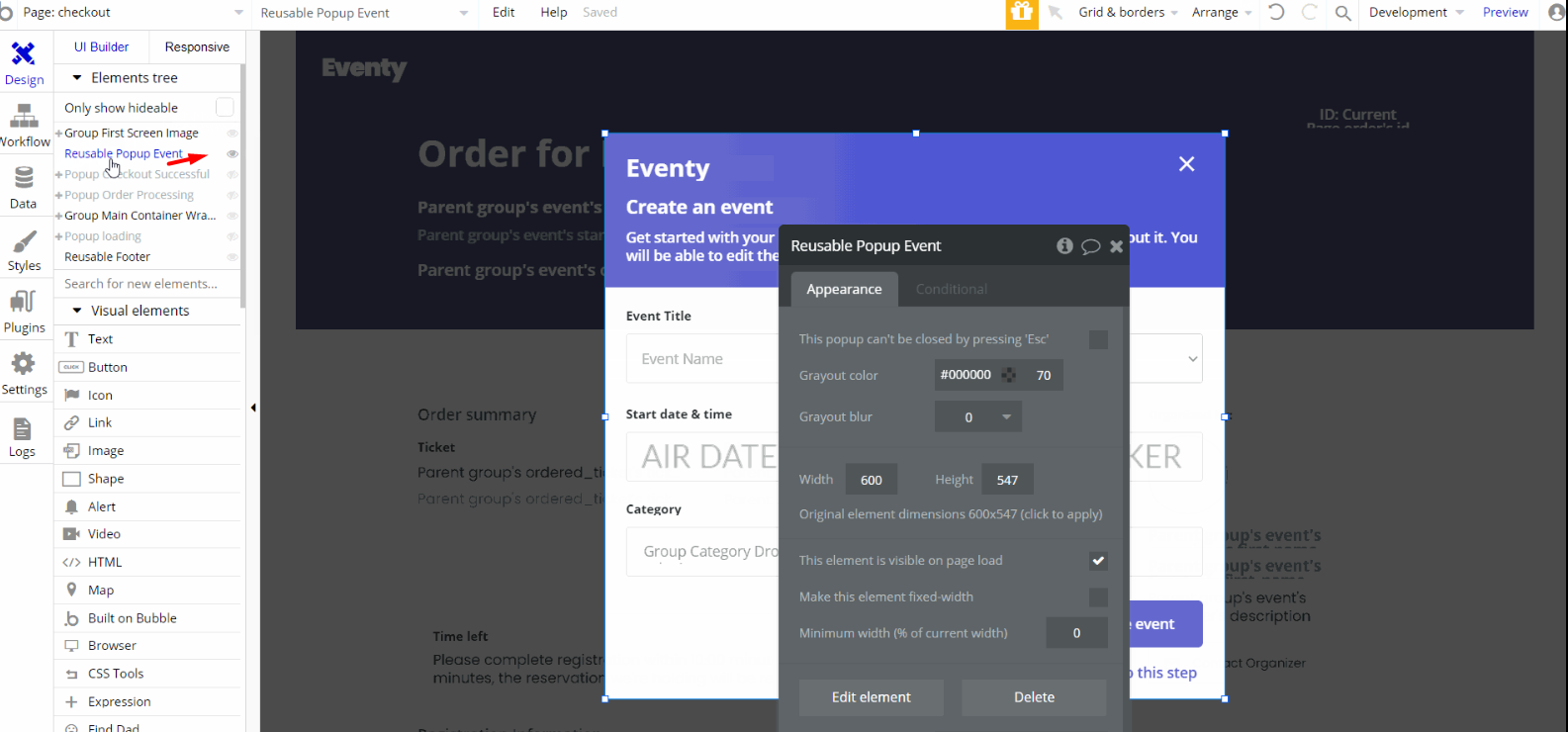
checkout
This is the page where the user can complete the registration information and pay for the tickets. The tickets are reserved for 10 minutes and during this period the user can pay for them. Also, users can contact the event organizer here.
Tip: Initially, your design elements might be hidden in your editor.
Here is how to unhide 👀 them:
The design for this page consists of the main "Group Content Container Wrapper" which holds the other components, alongside "Group First Screen Image", with Footer and Header reusable elements on the page.
The main "Group Content Container Wrapper" is branched into other different group elements and group containers designed to display the content of the ticket registration information where the user can edit it and place the order.
There are popup elements on-page, "Popup loading", "Popup Checkout Successful" and "Popup Order Processing" also "Reusable Popup Event" which is a reusable element Create Event.
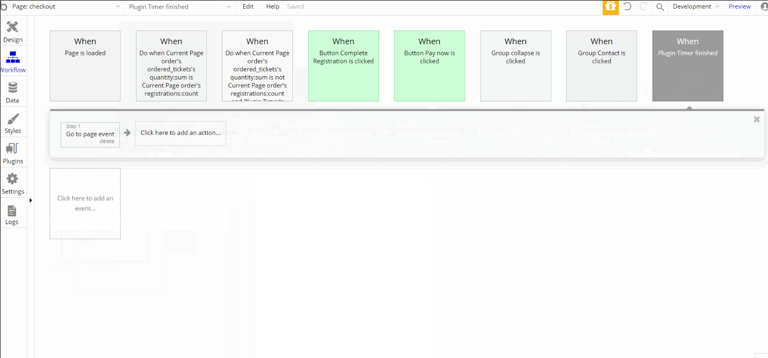
Most of the workflow actions on this page are for showing and hiding elements on-page. Some of them are for working with data by modifying and making changes to the user event and order.
Other actions include navigation actions to
index and event pages, with set state of an element and send email actions. Charge the current user is also an important part of the workflow.event
This page displays event information (title, cover image, date, and location). Also here users can find the organizer's name, venue geolocation, and share the event on social networks. Tickets for the event can be purchased here.
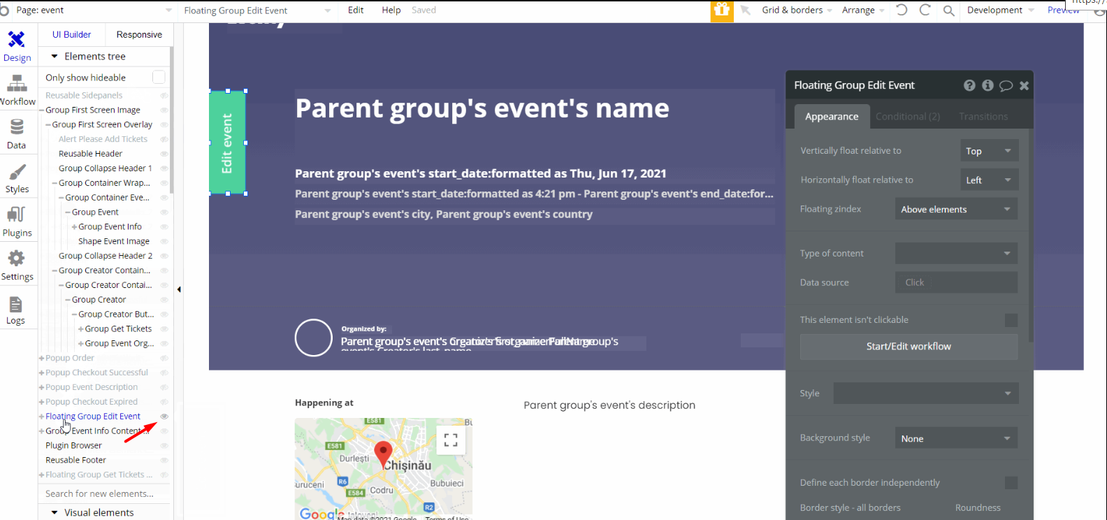
The design for this page consists of the main "Group Event Info Content " which holds the other components, alongside "Group First Screen Image", with Footer, Header and sidepanels reusable elements on the page.
The main "Group Content " is branched into other different group elements and group containers designed to display details of the event. "Group First Screen Image" also contains event content which is being displayed on-page in the hero section.
Most of the workflow actions on this page are showing and hiding different elements on-page. Some of the actions are for working with data, by modifying and makings changes to theuser andordered_ticket, create new thing (order).
events
On this page, users can see all the events posted (only those visible ones) and can sort them by newest/oldest. It comes with a search feature that resembles the one found on the
index page.Tip: Initially, your design elements might be hidden in your editor.
Here is how to unhide 👀 them:
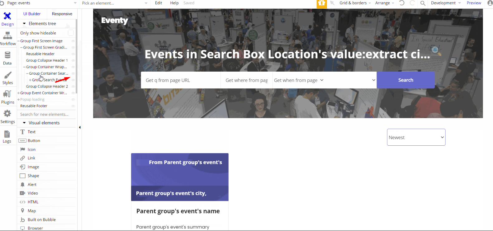
The design for this page consists of the main "Group Event Container Wrapper" which holds the other components in the second section including groups for sorting and repeating groups, with a hidden group when no object was found during a search.
The hero section has "Group First Screen Image" that contains groups and elements used for searching, both Footer and Header reusable elements on the page.
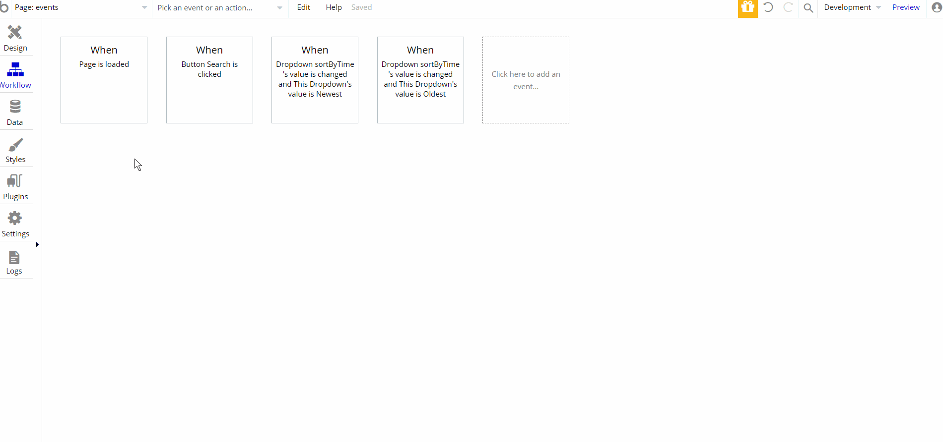
There are a few workflow actions on this page, are for showing and hiding elements on-page and set state of an element. Other action includes navigation to events page by sending parameters to search through events.
manage
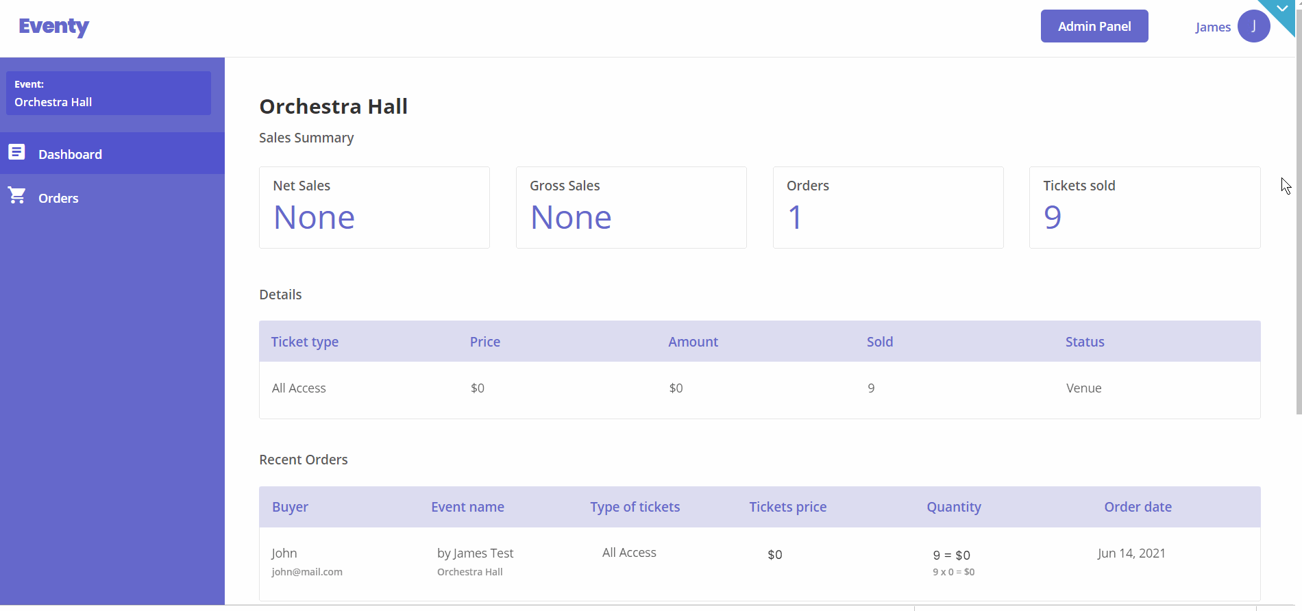
This page was designed for the organizer to help him to keep track of an event's data. It has a side panel menu with two options: Dashboard and Orders.
In the dashboard menu, the information displayed is as follows - sales figures, order quantity, and the number of tickets sold. In the orders menu, users can check the total of event orders made on the platform.
Tip: Initially, your design elements might be hidden in your editor.
Here is how to unhide 👀 them:
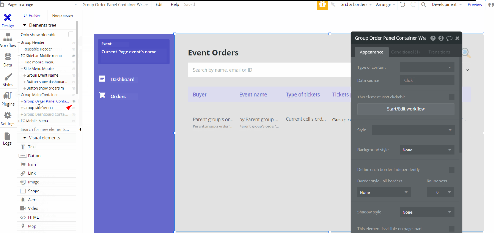
The design for this page consists of the main "Group Main Container" which holds all of the components including groups, elements, and repeating groups, to display the information. There are hidden groups "Group Order Panel Container Wrapper" and "Group Dashboard Container" which are visible depending on state values.
Other elements such as floating groups "FG Mobile Menu" and "FG Sidebar Mobile Menu" are used for responsive design that contains other components.
The Header reusable element is wrapped into a group "Group Header".
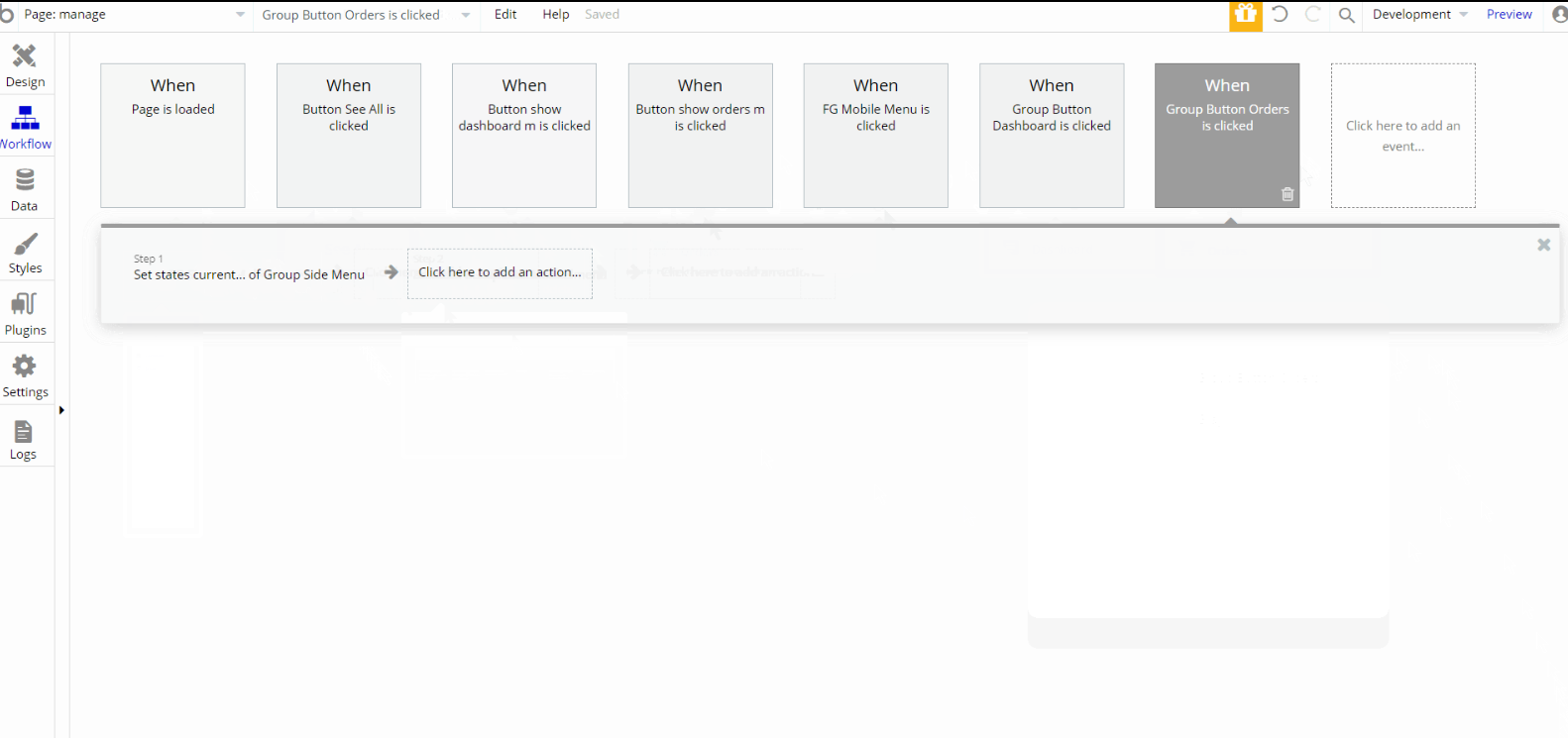
Most of the workflow actions on this page are, set state of an element by displaying appropriate view option, either for Dashboard or Orders, and showing different elements on-page.
my-events
This page is made for the events organizer. The page has three tabs: Draft, Published, and Past to check and manage the events added.
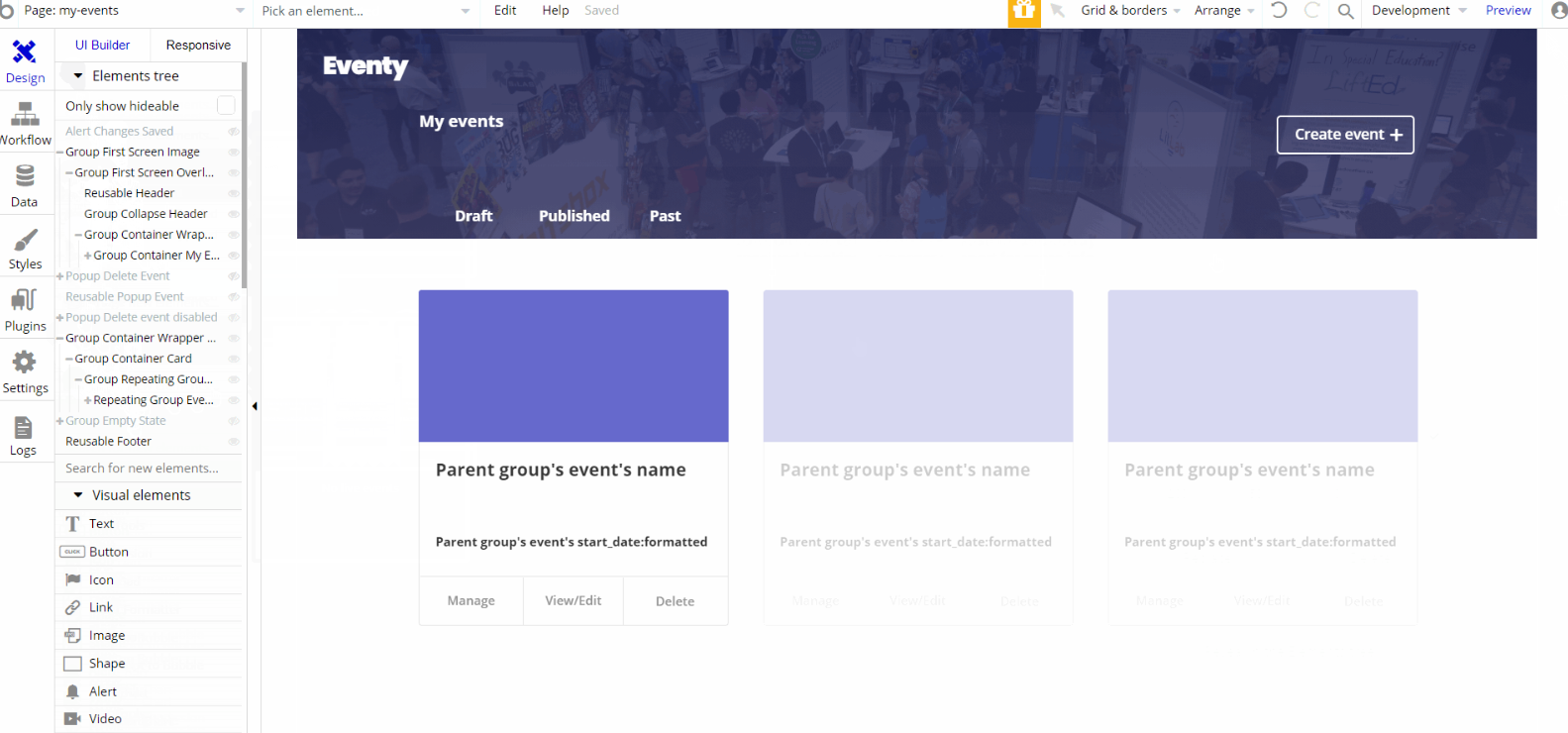
The design for this page consists of the main "Group Container Wrapper Card" which holds all of the components including groups, elements, and repeating groups, to display the events.
There are hidden elements such as "Group Empty State" used to show a placeholder value when no live events are found, an alert tab "Alert Changes Saved" is showed after users delete an event successfully.
"Group First Screen Image" is used for the hero section and contains groups and elements to display the image, title, and button. Both Footer and Header reusable elements are on the page.
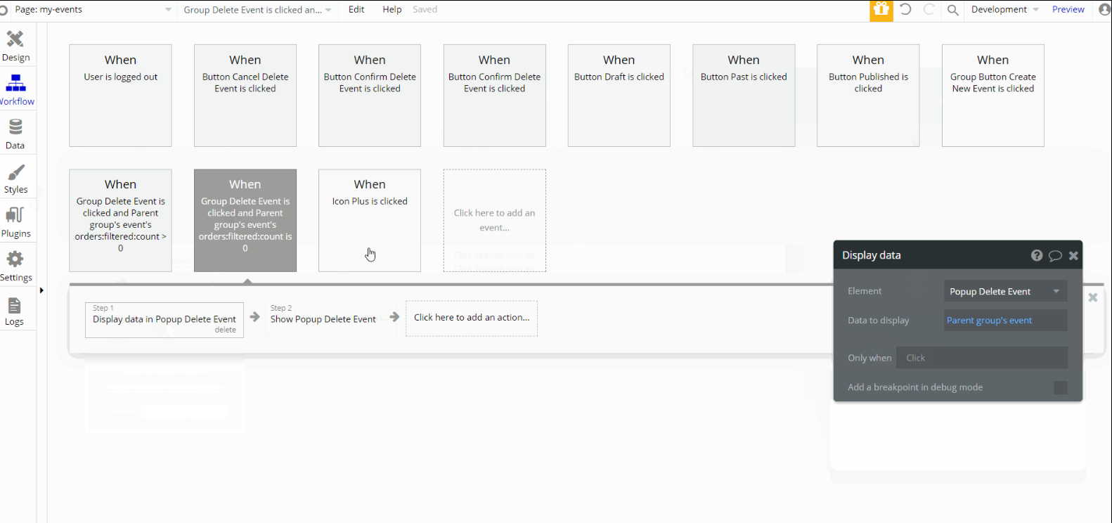
Most of the workflow actions on this page are, set state of an element by displaying the appropriate tab, Draft, Published, or Past, and showing/hiding elements on-page.
my-tickets
This page is for the event tickets a user purchased. It has two tabs: Live and Past. When a user selects a ticket, he'll be redirected to the
order details page.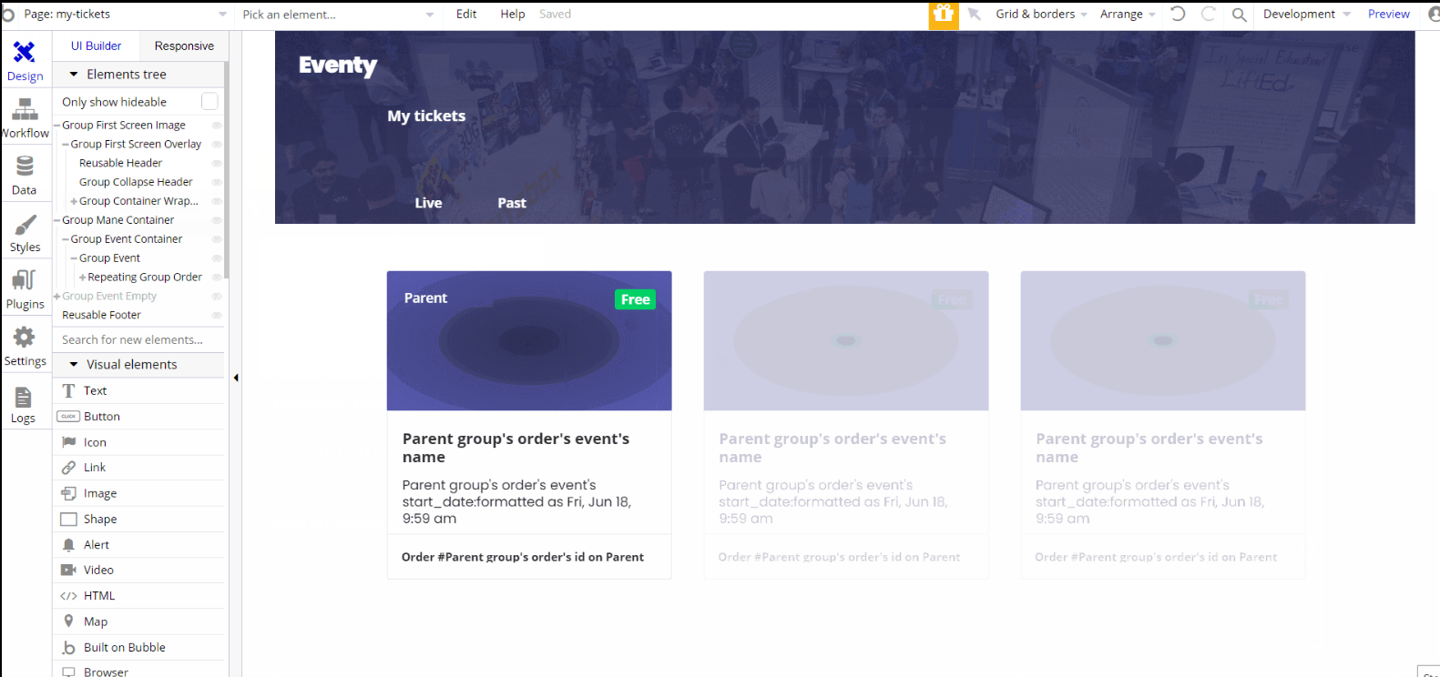
The design for this page consists of the main "Group Main Container" which holds all of the components including groups, elements, and repeating groups, to display the events to which the user is attending.
There is a hidden element such as "Group Event Empty" used to show a placeholder value when no tickets have been purchased. "Group First Screen Image" is used for the hero section and contains groups and elements to display the image, title, and button.
Both Footer and Header reusable elements are on the page.
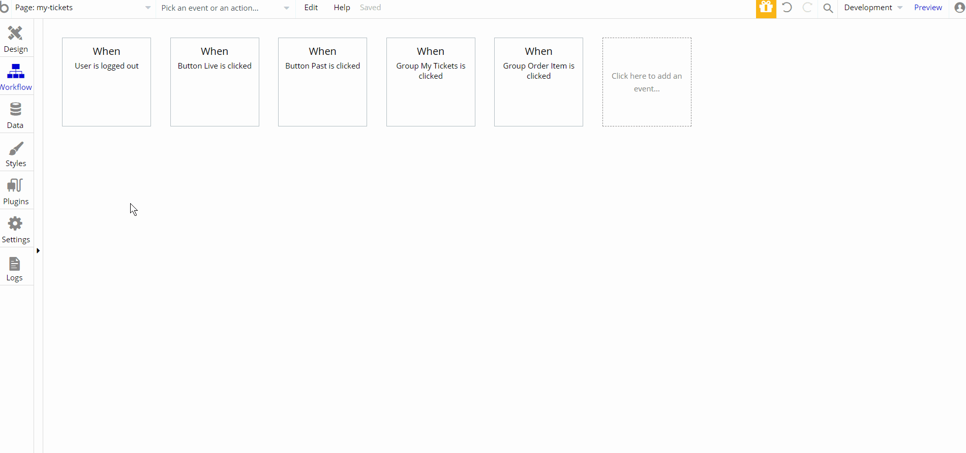
There are a few workflow actions on this page, set state of an element and navigation to
index and order pages, with the latest action sending order data.order
On this page, the user can see all the information about a particular order. Here ticket details such as first & last name, email, and phone number for the particular attendees can be modified.
Also from here, the user can navigate back to the
my-tickets page.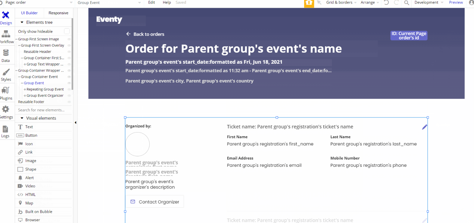
The design for this page consists of the main "Group Container Wrapper Event" which holds all of the components including groups, elements, and repeating groups, to display the event tickets details and organizer information.
"Group First Screen Image" is used for the hero section and contains groups and elements to display the image, title, event details and ID of order.
Both Footer and Header reusable elements are on the page.
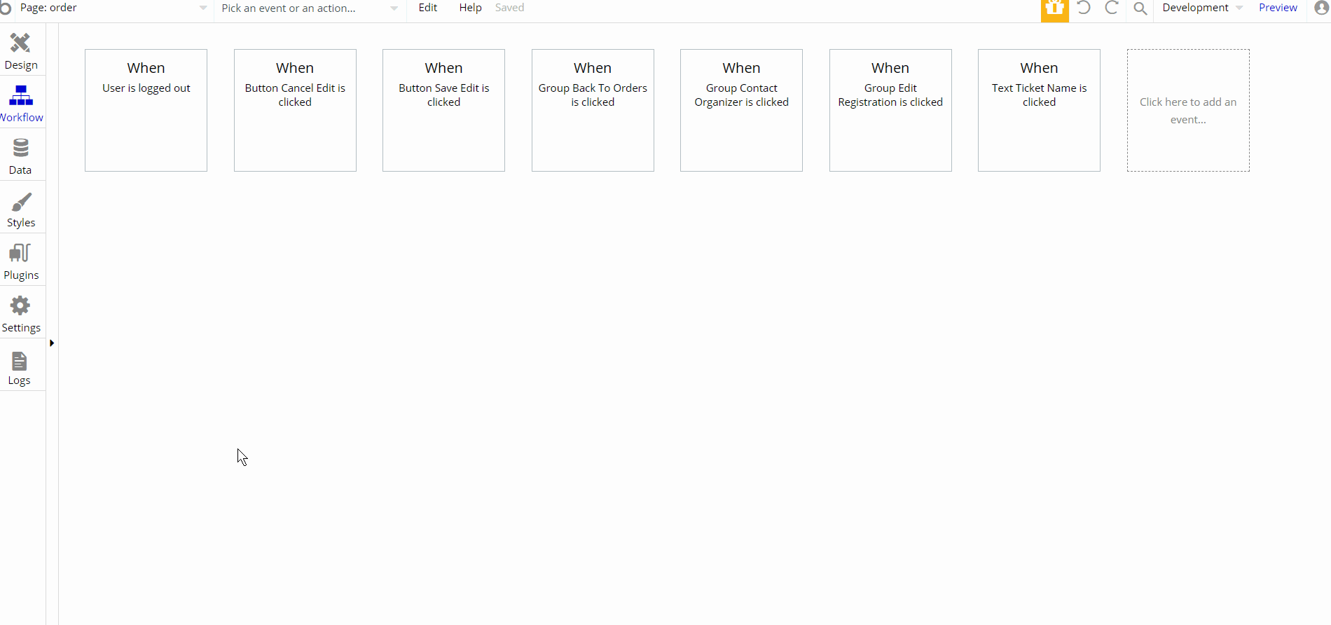
There are a few workflow actions on this page, set state of an element and navigation to
index and my-tickets pages, with actions makings changes to registration data type and open URL in new tab to contact event organizer a by email service. organizer
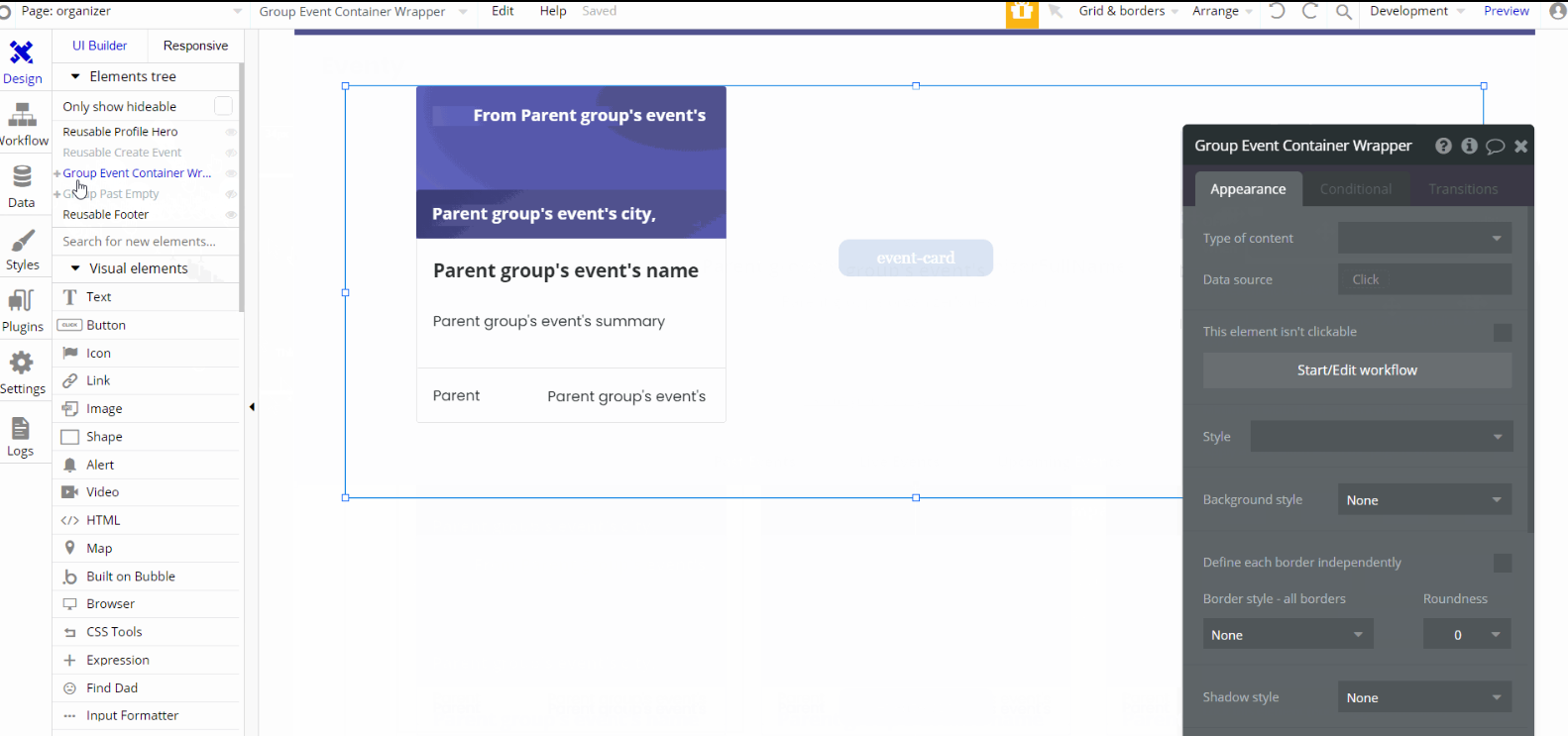
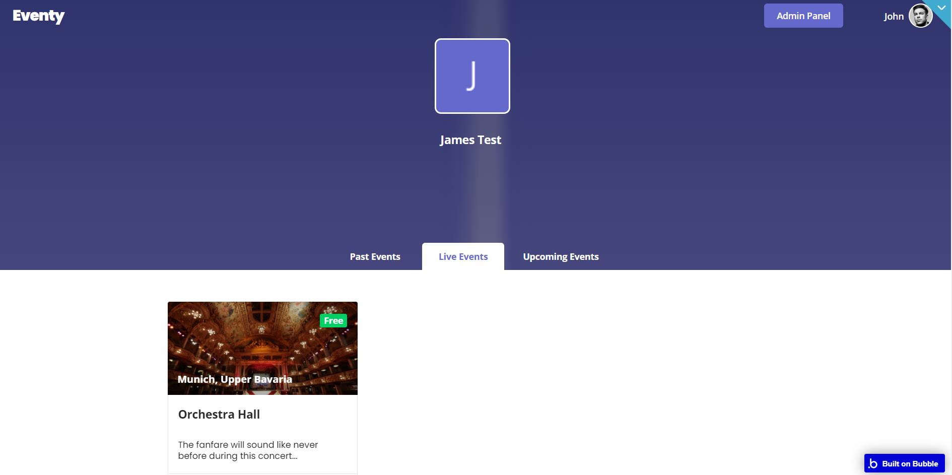
This page was created for cases when the event creator will choose someone else to be the event organizer. Here users can see the organizer's details like full name, their webpage, and image profile.
Below users can see the organizer events displayed in three tabs: Past Events, Live Events, and Upcoming Events.
Tip: The event creator can change the organizer of the event during event creation or modifying it afterward on the
event page. The design for this page consists of the main "Group Event Container Wrapper" which holds all of the components including groups, elements, repeating groups, and reusable element Reusable event-card, to display the event details.
Reusable element Reusable Profile Hero, is used for the hero section and contains groups and elements to display the full name, image profile, and their webpage for an organizer.
Both Footer and Header reusable elements are on the page, though the latest is inside another reusable element Reusable Profile Hero.
There are no element workflows for this page.
Tip: The workflow actions are related to reusable elements. Check their section respectively Reusable event-card, and Reusable Profile Hero.
profile
This page is used when the creator of the event is also the organizer. The page pretty much resembles and works like the
organizer page, while there is the condition in place that the creator is the event organizer. 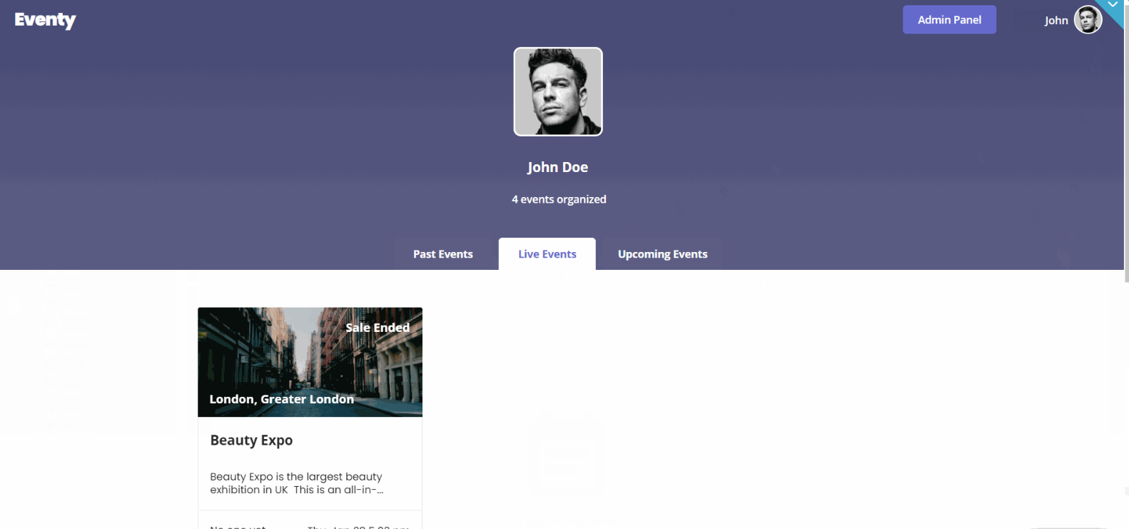
There are no element workflows for this page.
reset_pw
This page is used for resetting the password.
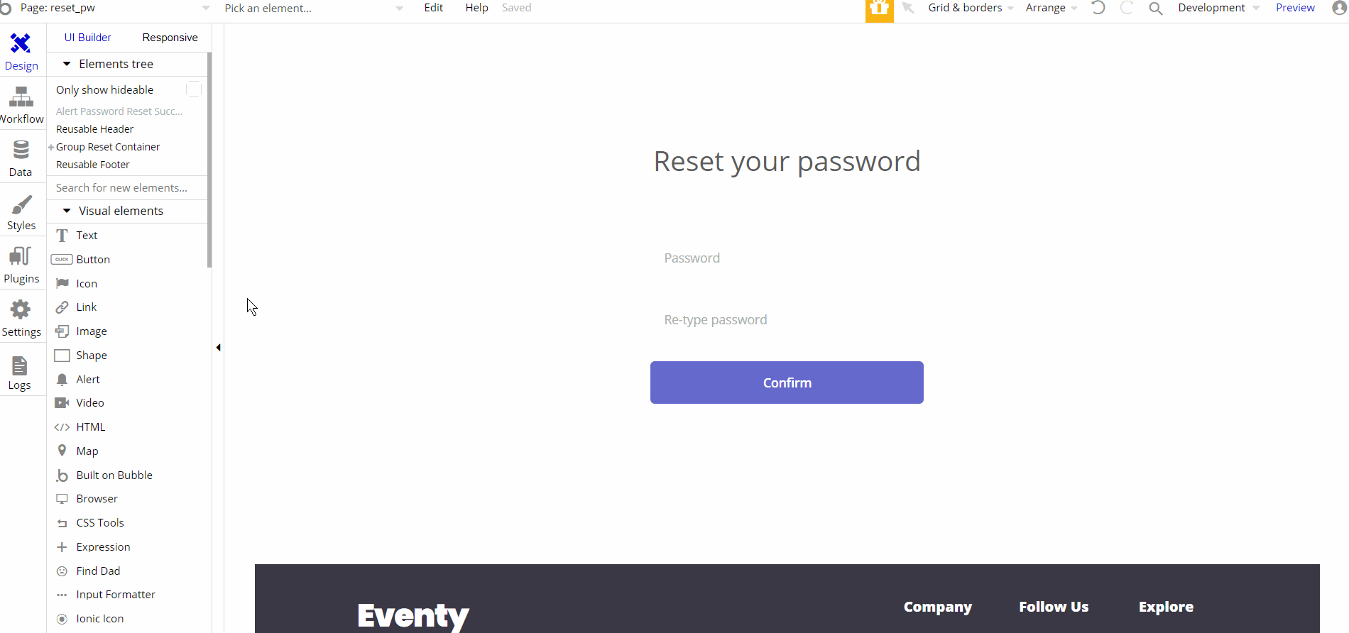
The design for this page consists of the main group "Group Reset Container" which has a form for resetting the password using different elements (i.e inputs and button) inside the container alongside components like Header and Footer reusable elements on-page.
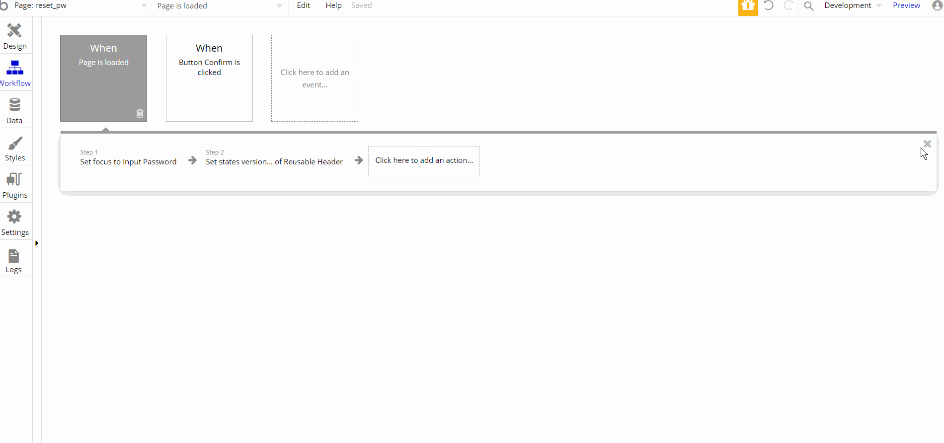
The workflow on this page consists of primary reset password action. Additionally, there are set focus and set state actions
404
This is a custom-designed page for 404 redirect errors, informing a user that the requested web page cannot be found, or doesn't exist.
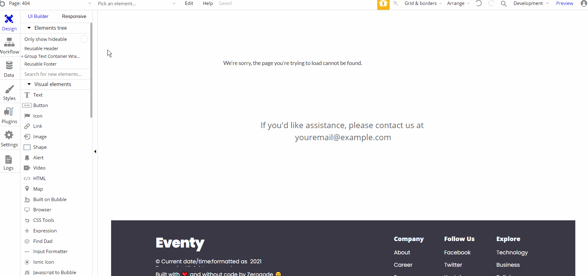
The design for this page consists of the main group "Group Text Container Wrapper" which holds the text and group elements inside the container alongside components like Header and Footer reusable elements on-page.
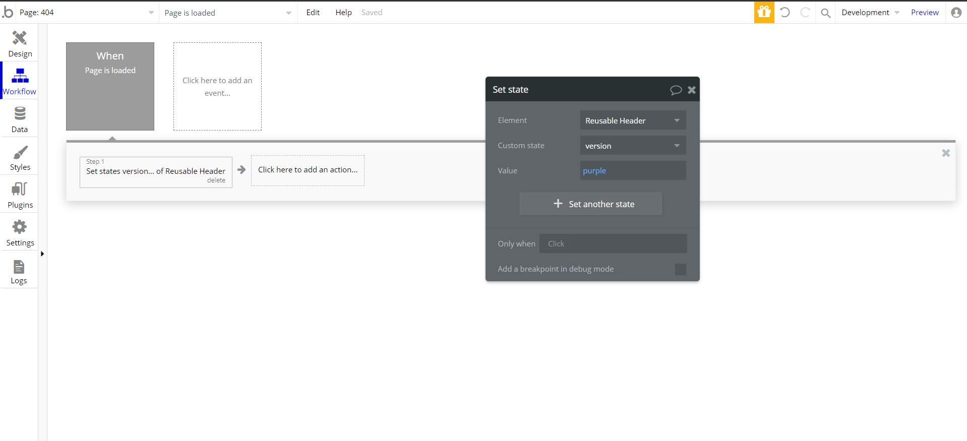
The one action on this page consists of set state action during page load to display the header on-page.