This section states the purpose of each reusable element.
Introduction
Reusable Element - an element that contains other elements, like a group, that can be used in more than one place. This is useful when reusing the same elements often.
Tip: See Bubble Reference for details https://manual.bubble.io/core-resources/elements/reusable-elements 🙂
Reusable Elements
addon_options
The addon_options reusable element includes buttons and popups for editing addons on the
admin page. With its help, the admin can change the name, cost, and description of the addon.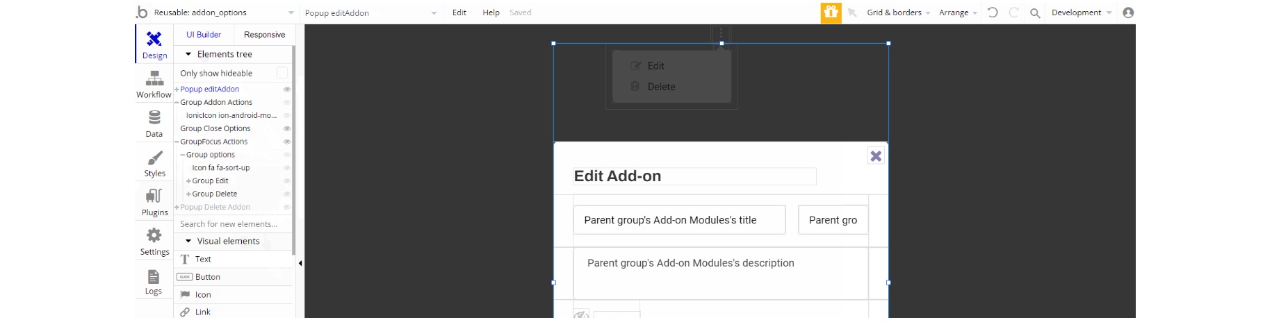
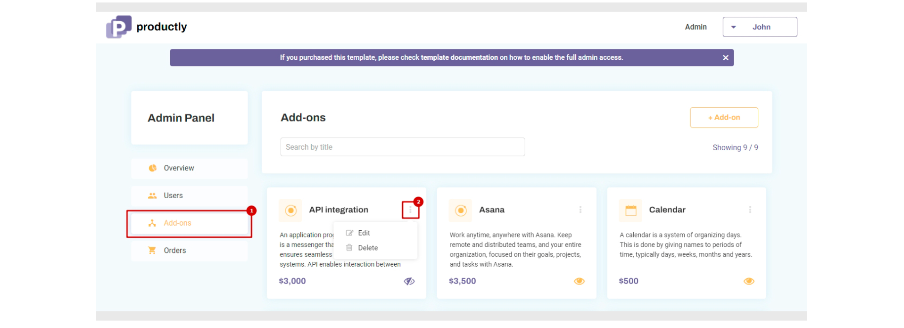
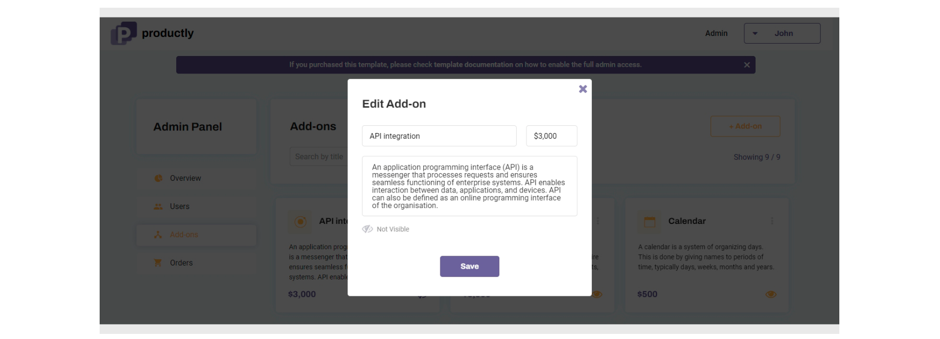
This reusable element is designed to be used on the
admin page, and consists of a main visible group "Addon Actions" which holds the icon. The rest part of the design consists of Popup elements "Delete Admin", "editAddon" and GroupFocus "Actions" which form the reusable element.
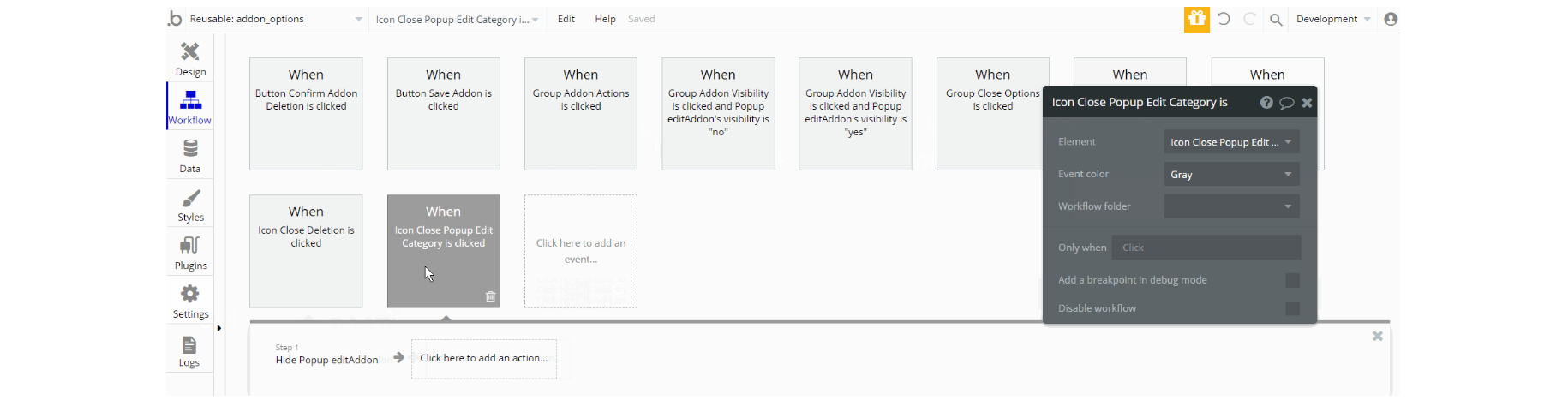
The workflows of this element describe the logic of actions working with data: delete a thing, make changes to thing, Add-on Module data type.
Footer
The footer reusable element is located at the bottom of a page. It provides an example of how it can include external links, such as the company's social media, navigation, and copyright notices.
A great website footer design keeps people engaged and moving through the website. This reusable element is customizable, so it is possible to change the styles and content of elements while keeping workflows or using them as inspiration for your own.
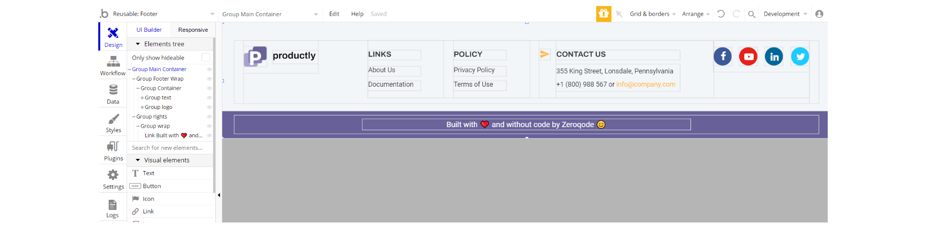
The footer is designed to be used on most pages and contains the main Group "main Container" which holds all the elements on the page (groups, texts, links, and icons).
There are no element workflows for this page.
Tip: Add Privacy and Terms links here, as well as create separate pages for these links. It will help you go through App Store and Google Play approval procedures, in case you convert your Bubble app into native iOS and Android apps. These links are also important for Facebook login.
Header
The header reusable element sits at the top of each page and serves a few very important purposes. It does provide a place for the company's logo, navigation, and page title which are part of a consistent user experience that all good websites share.
Other common header features are search, shopping cart (for e-commerce), login/logout, user profile, and notifications (if applicable). The workflows included with this element are pretty straightforward to follow.
This reusable element is customizable, so it is possible to change the styles and content of elements while keeping workflows or using as inspiration for your own.
Tip: This page comes with demo logins that have been placed for testing purposes. They may be removed from your app.
Tip: Initially, your design elements might be hidden in your editor.
Here is how to unhide 👀 them:
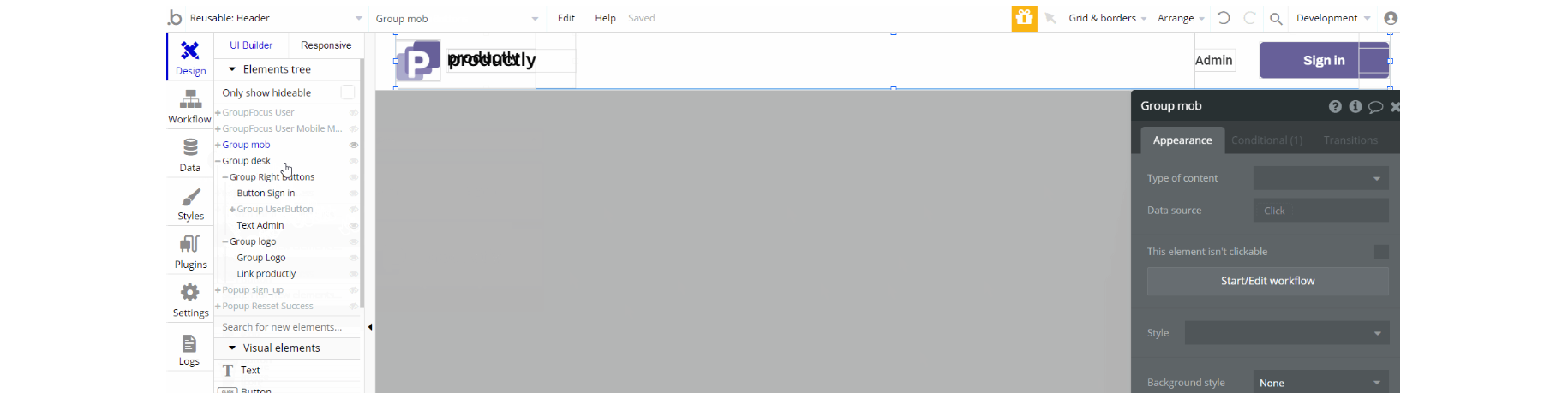
This reusable element is designed to be used on most pages and contains the group "desk" which holds the elements for desktop-sized devices and group "mob" which holds elements for mobile responsive devices like (groups, texts, buttons, etc.).
Other elements like group focus and pop-ups are also part of the header which are visible on triggered actions.
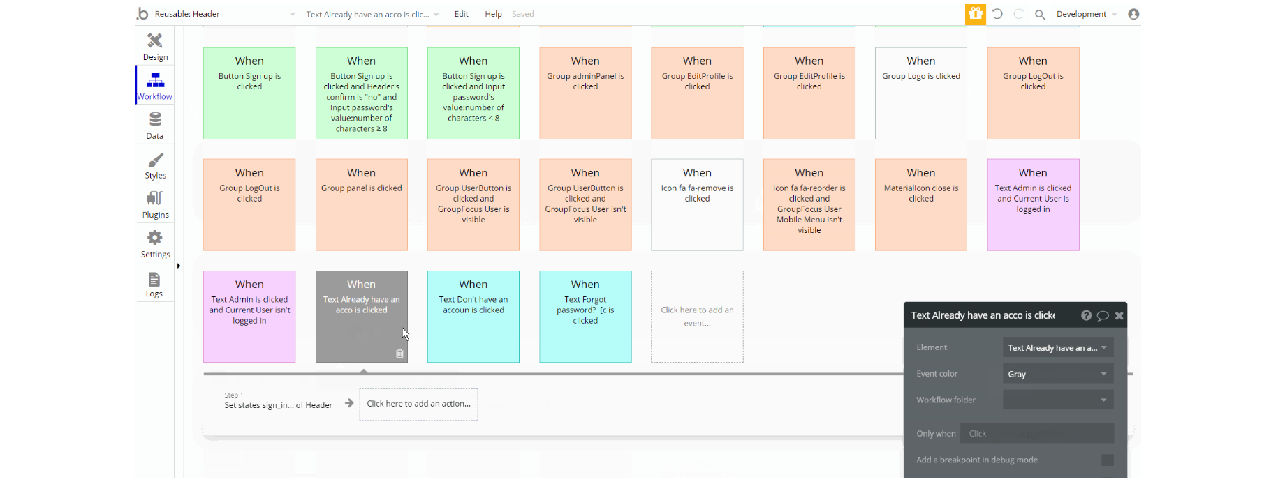
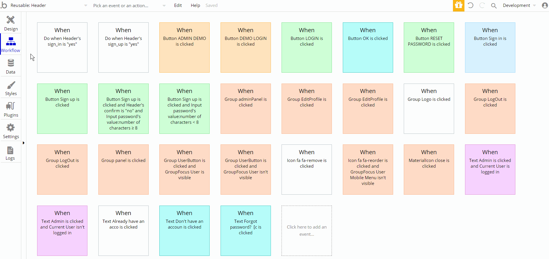
The workflows of this element are mainly transitions between platform pages using the navigation to page actions and showing/hiding different elements, as well as set state values to an element.