This section states the purpose of each reusable element.
Introduction
Reusable Element - an element that contains other elements, like a group, that can be used in more than one place. This is useful when reusing the same elements often.
Tip: See Bubble Reference for details https://manual.bubble.io/core-resources/elements/reusable-elements 🙂
Reusable Elements
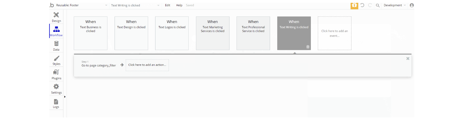
Category Bar
This reusable element is used on
index, product_page and user_profile pages as a bar menu for shortcuts and quick access to the services.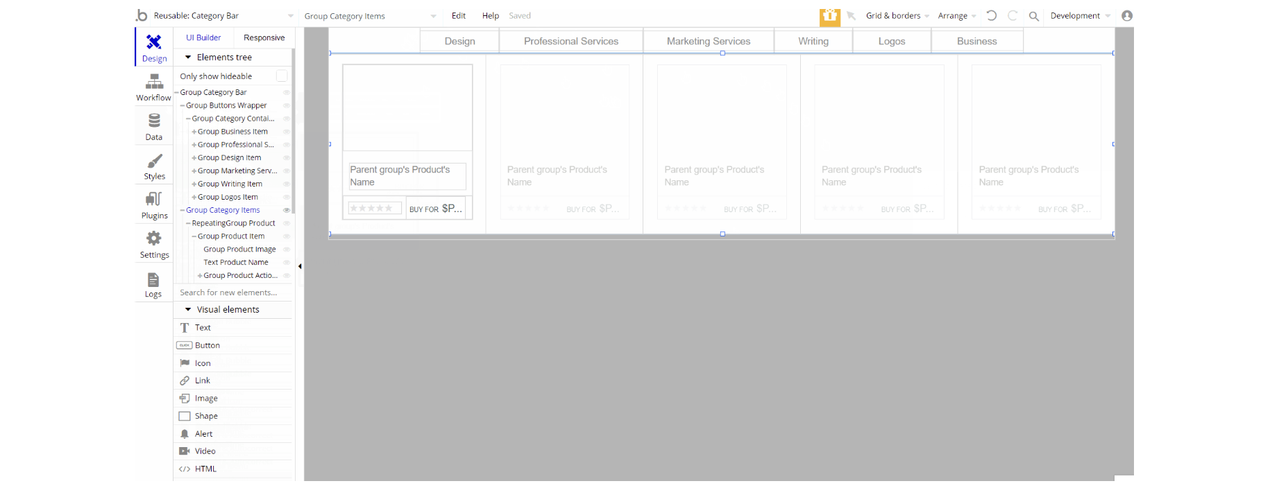
The design of this reusable element consists of 2 groups that hold all of the elements, one "Category Bar" is the group for the bar menu and the second is "Category Items" which holds the cards information.
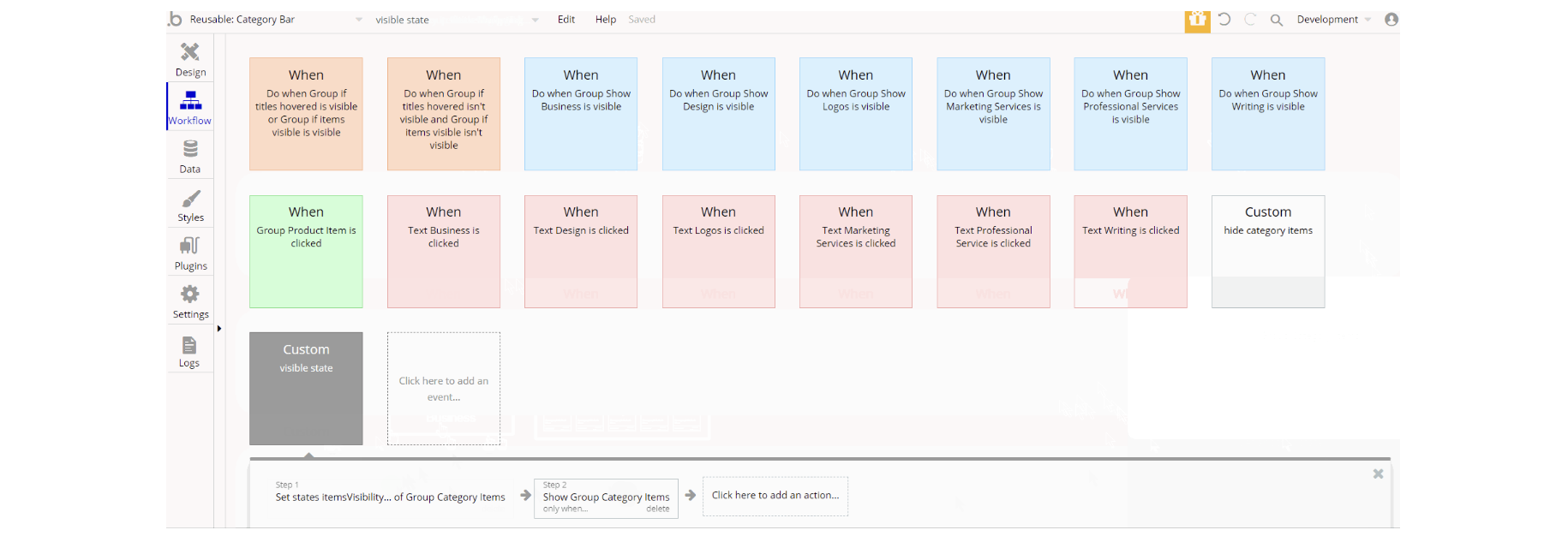
The workflows above are mostly set state values for visibility, show/hide an element for showing and hiding elements triggered by custom events and animate an element used for group animation.
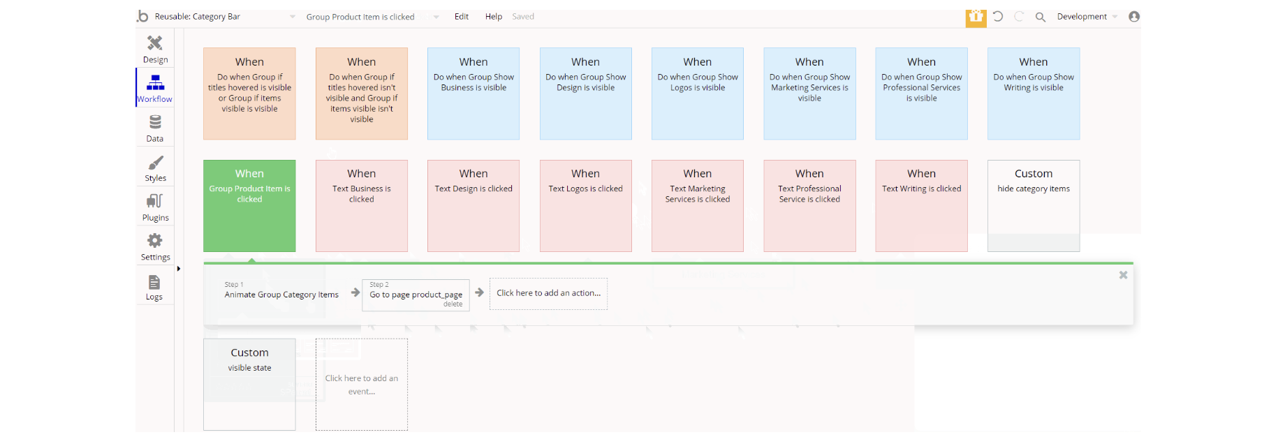
Additionally, there is the navigate to page action in workflows with filter parameter sent to page
category_filter.Contact user
This reusable element is used on
product_page and user_profile pages for users chatting.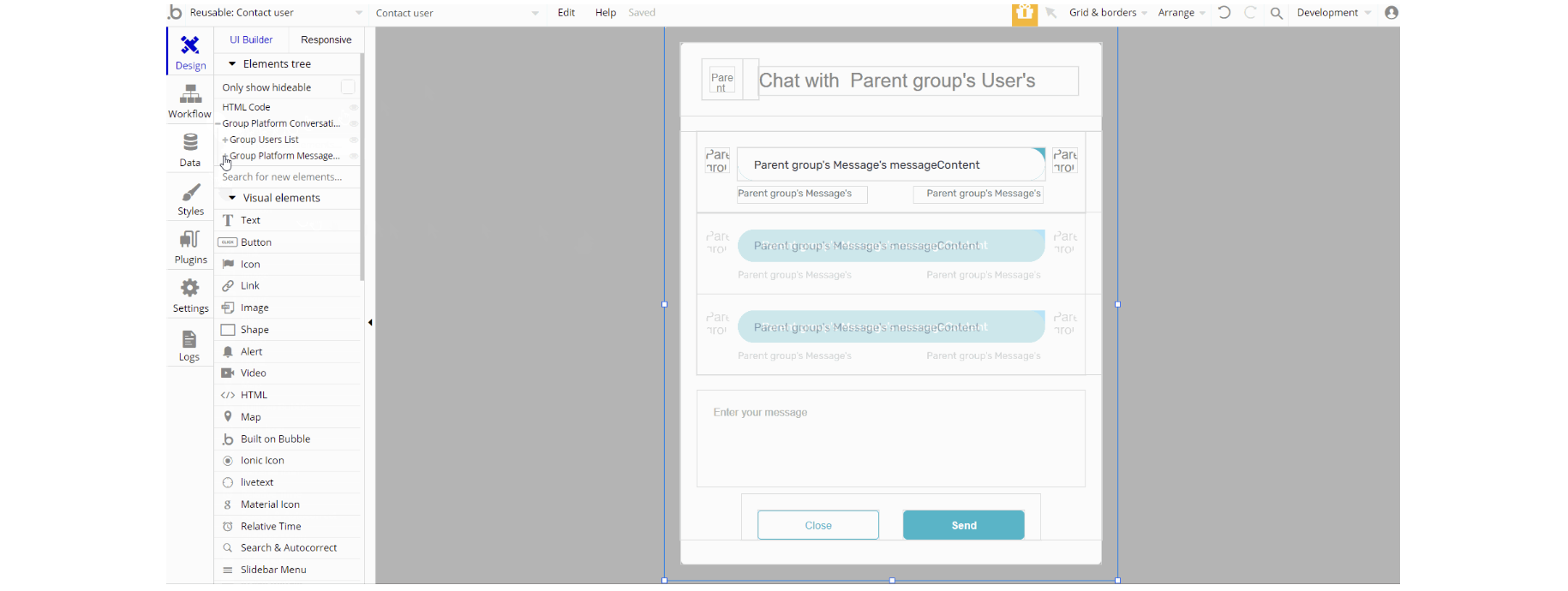
The design of this reusable element consists of the main group "Platform Conversation" which is composed of two groups: Group "User Lists" and Group "Platform Messages Window" used to display a list of users and conversation area.
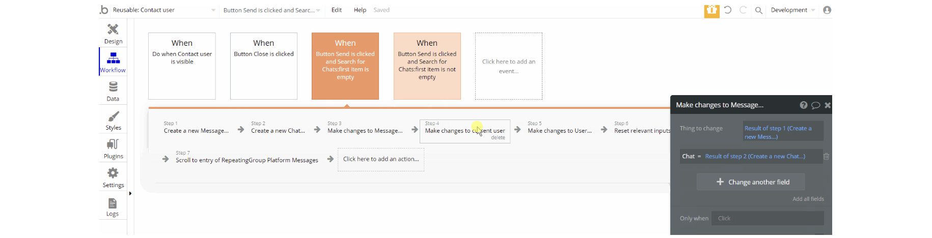
The workflows for this reusable element are pretty straightforward, working with database actions create a thing, make changes to Chat, Messages and User data types.
Conversation
This reusable element is used inside of other reusable elements Header and SideBar Content. It's alike Contact user reusable element but is used just for the mobile view to display a list of users and the conversation area.
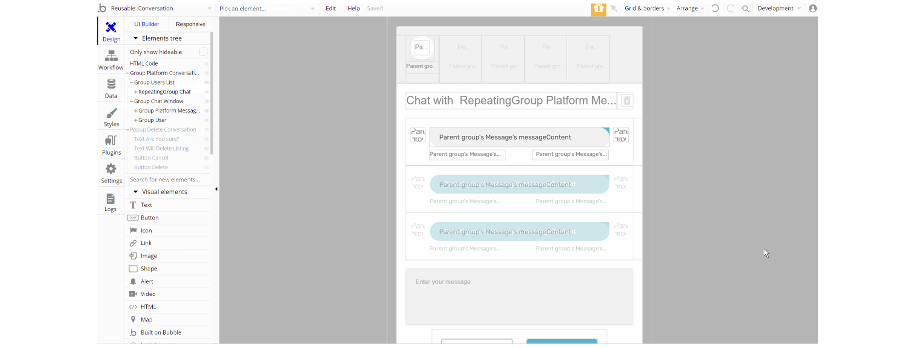
The design of this reusable consists of the main group "Platform Conversation" composed of two groups: Group "User Lists" and Group "Platform Messages Window".
Additionally, it comes with a "Delete Conversation" pop-up.
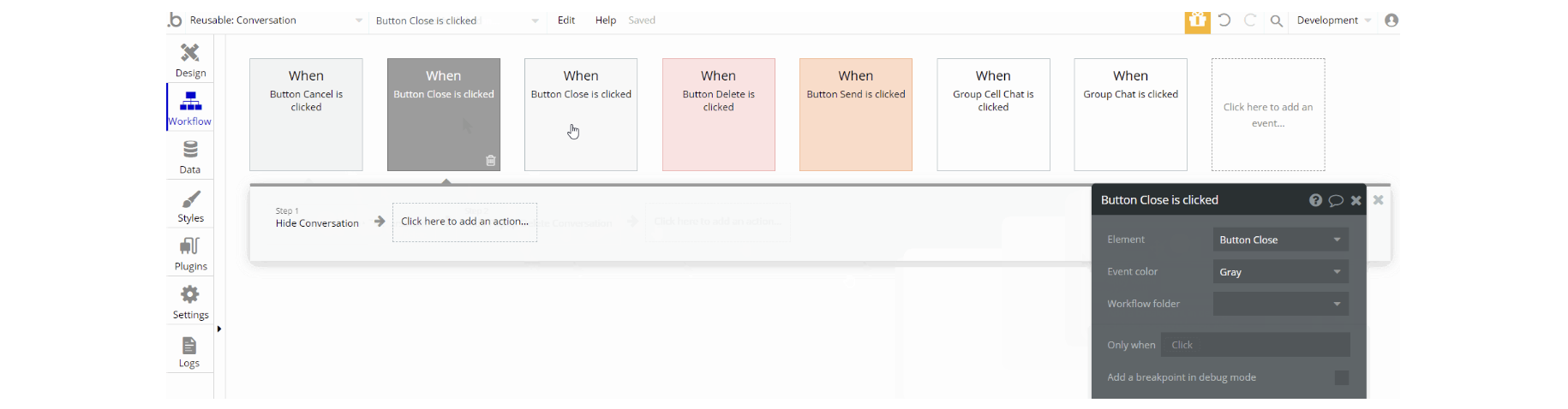
The workflows for this reusable element are similar to Contact user reusable element with additional delete a thing action, show an element, and display data in group/pop-up actions.
Edit Profile
This reusable element is used for modifying profile details (i.e. First Name, Last Name, Location, etc). It is part of Header and SideBar Content reusable elements and is used on
index and user profile pages.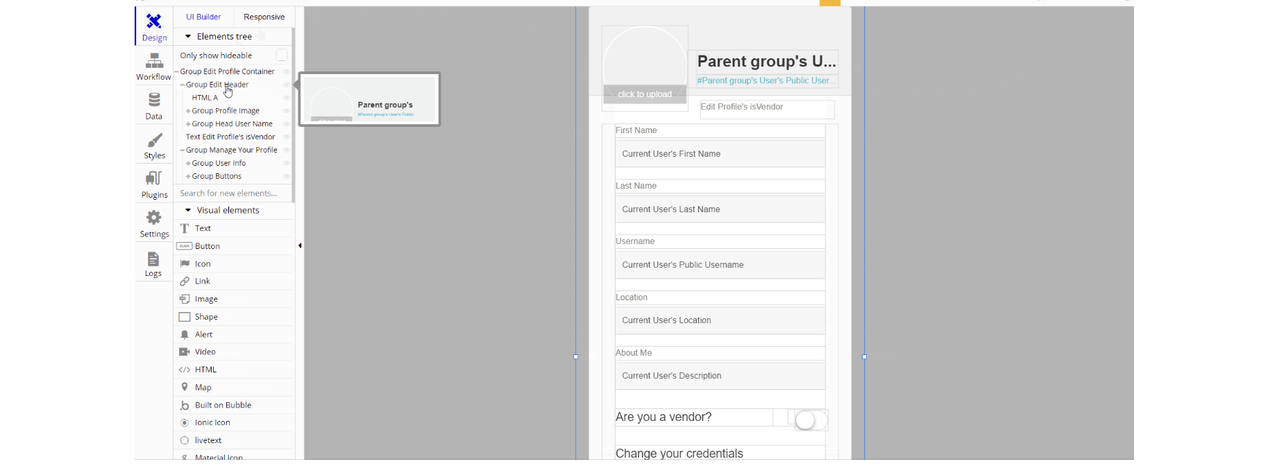
The design of this element consists of one main group container "Edit Profile Container" which is divided into two groups and elements. These groups hold other elements (texts, inputs, toggles) used for profile editing.
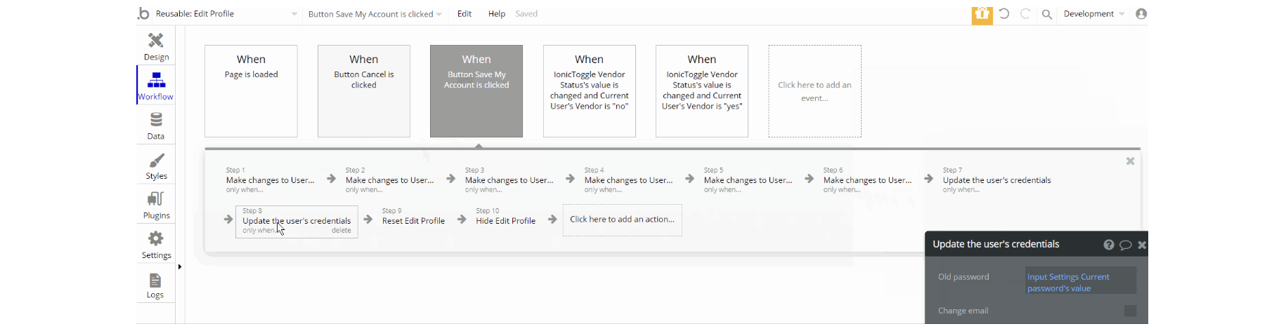
The workflows for this reusable element are mostly to make changes to User, Product data type, hide an element, reset of group/pop-up element, and update user's credentials actions. Additionally, there is the default animate an element action for animation.
Edit Profile Admin
This reusable element is the same as Edit Profile reusable element, however, this one is used on the
admin page for admin profile editing.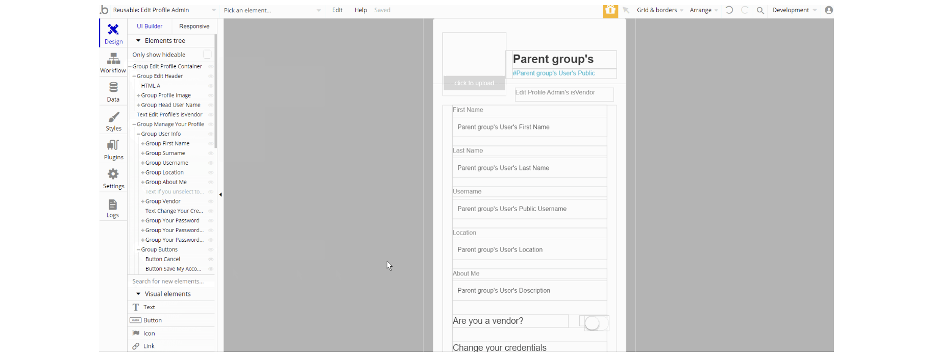
The design of this reusable element is similar to Edit Profile.
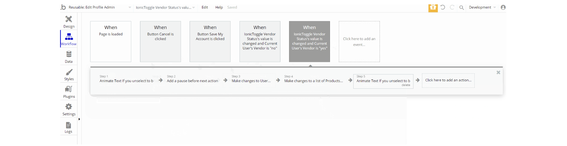
The workflow actions are similar to the actions of Edit Profile reusable element: make changes, hide, reset a group and animate an element, and update the user's credentials.
Footer
The footer reusable element is located at the bottom of a page. It provides an example of how it can include external links, such as company's social media, navigation, and copyright notices.
A great website footer design keeps people engaged and moving through the website. The workflows included with this element are pretty straightforward to follow.
This reusable element is customizable, so it is possible to change styles and content of element while keeping workflows or using as inspiration for your own.
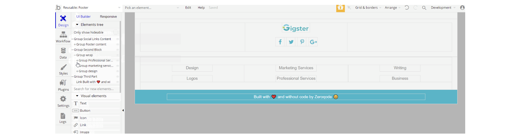
The design of this element consists of 3 main groups "Social Links Content", "Second Block" and "Third Part" that hold links and icons for social networks, category pages, and the zeroqode banner.
The workflow actions for this reusable element are only for navigation to pages while also sending additional parameters to the page category_filter.
Tip: Add Privacy and Terms page links here, as well as create separate pages for these links. It will help you go through App Store and Google Play approval procedures, in case you convert your Bubble app into native iOS and Android apps. These links are also important for Facebook login.
Header
The header reusable element sits at the top of each page and serves a few very important purposes. It does provide a place for company's logo, navigation, and page title which are part of a consistent user experience that all good websites share.
Other common header features are - search, shopping cart (for ecommerce), login/logout, user profile, and notifications (if applicable). The workflows included with this element are pretty straightforward to follow.
This reusable element is customizable, so it is possible to change styles and content of element while keeping workflows or using as inspiration for your own.
Tip: This element comes with demo logins that have been placed for testing purposes. They may be removed from your app.
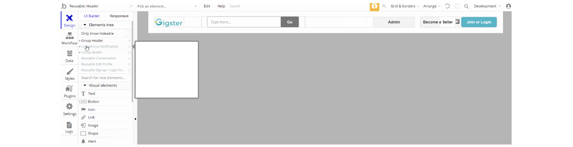
The design of this element consists of the main group "Header" which holds elements, groups, inputs, and buttons. The GroupFocus "Notification" position is relative to another element group "Header Notification".
The hidden group "Mobile" is used for mobile responsive design, with conditional to set it visible when current page width <900 px. Other reusable elements are part of the design Reusable Conversation, Reusable Edit Profile, and Reusable Signup / Login Popup.
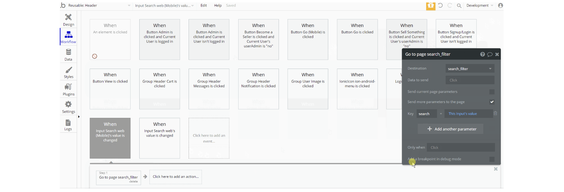
The workflow actions for this reusable are mostly navigation to pages while also sending parameter, show and hide element actions as well are present on the page. Other actions are set state value for menu visibility and make changes to list of Notification data type.
Product-Card
This reusable element is used for displaying information in form of cards on pages:
index, category_filter, my_cart, search_filter and user_profile.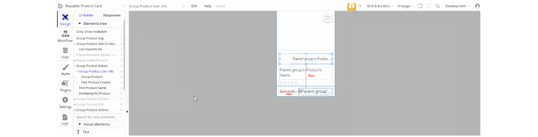
The design of this element consists of groups that hold other elements (i.e icons, texts, buttons groups) to form the card view of a product. Some groups are used as image type containers - group "Product Img".
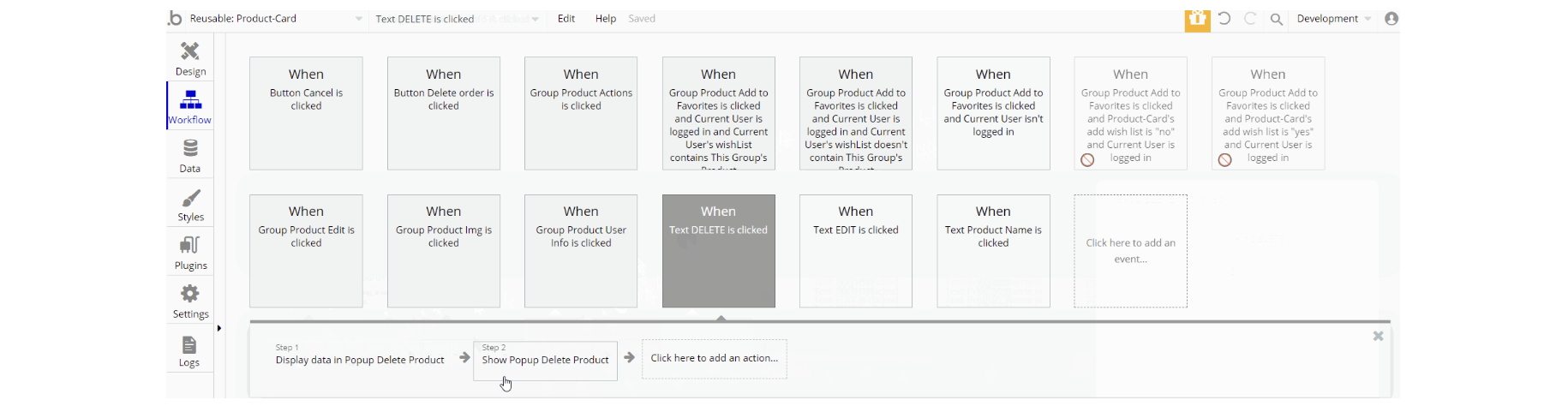
The workflows for this reusable are: show and hide an element, work with data using actions create a new thing, delete a thing, and make changes to current user for
Order, Product and User data types. Another action which frequently seen here is navigation to pages while sending product data alongside some actions.
Scroll Top
This reusable element is used for one of the common actions to scroll back to the top of the page. It is part of pretty much all pages besides 404 and reset_pw pages, where its usage does not make an impact on UX.
The design is simple which consists of an icon in form of an arrow. The image above shows the element and preview on page.
There are no element workflows for this page.
SideBar Content
This reusable element is used for the mobile responsive view as a side burger menu. It is part of all pages.
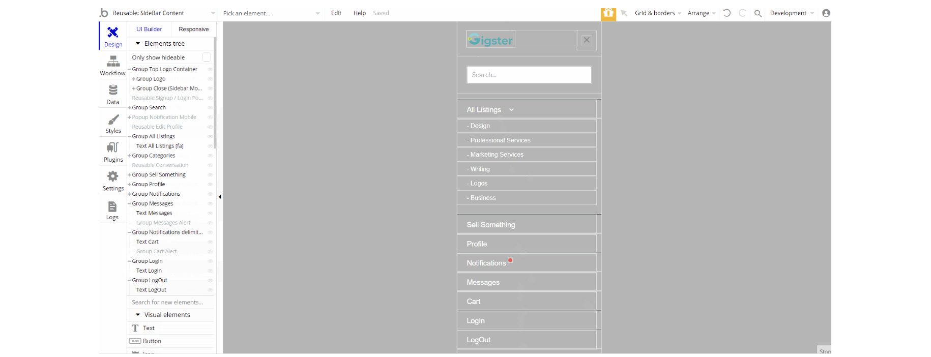
The design of this element consists of group containers that hold pretty much only texts and some have icon/image, or links elements.
Other elements part of the design are hidden reusable elements Reusable Signup / Login Popup Reusable Edit Profile and Reusable Conversation which are part of it.
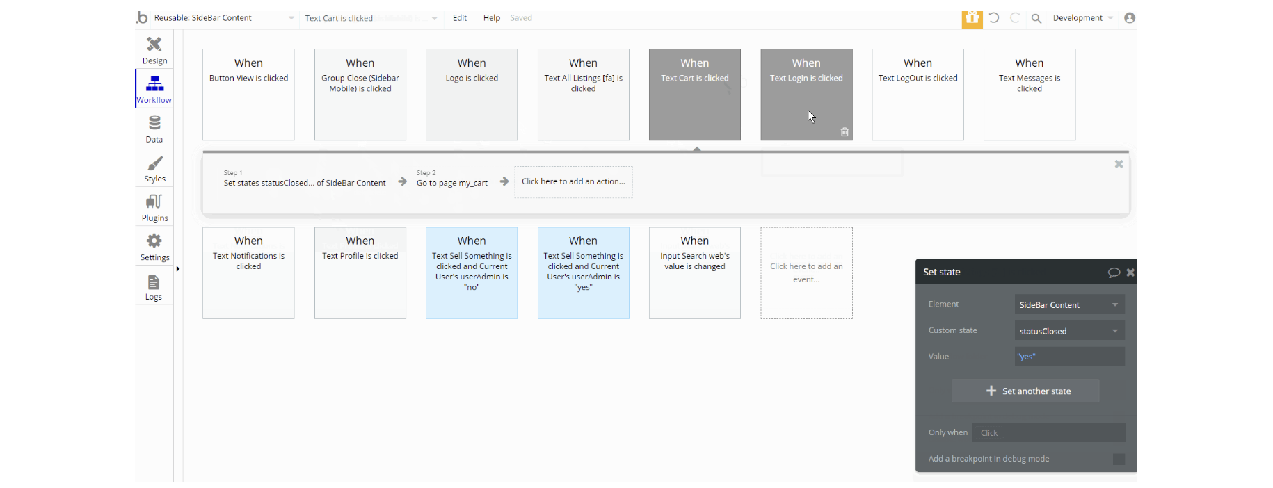
The workflows for this element are the composition of set state value for element visibility, also the show and hide an element action and navigation to page.
Additionally, there are actions to log out the user and make changes to a list of Notification data type.
Signup / Login Popup
This reusable element is a pop-up element used for simple sign-up and login processes.
Tip: Initially, your design elements might be hidden in your editor.
Here is how to unhide 👀 them:
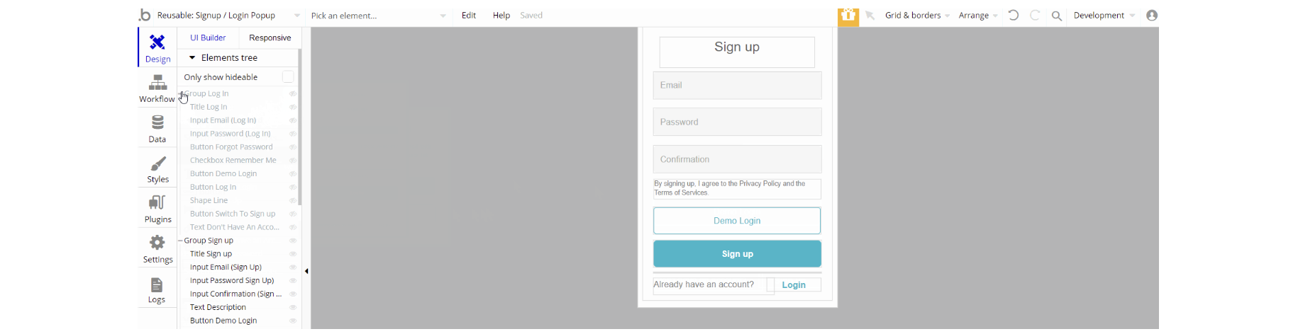
The design of this reusable consists of two main groups: "Log in" and "Sign up". They hold the elements for the signup/login forms like inputs, buttons, and texts. The "Reset Password" pop-up is visible only when a user triggers the reset action.
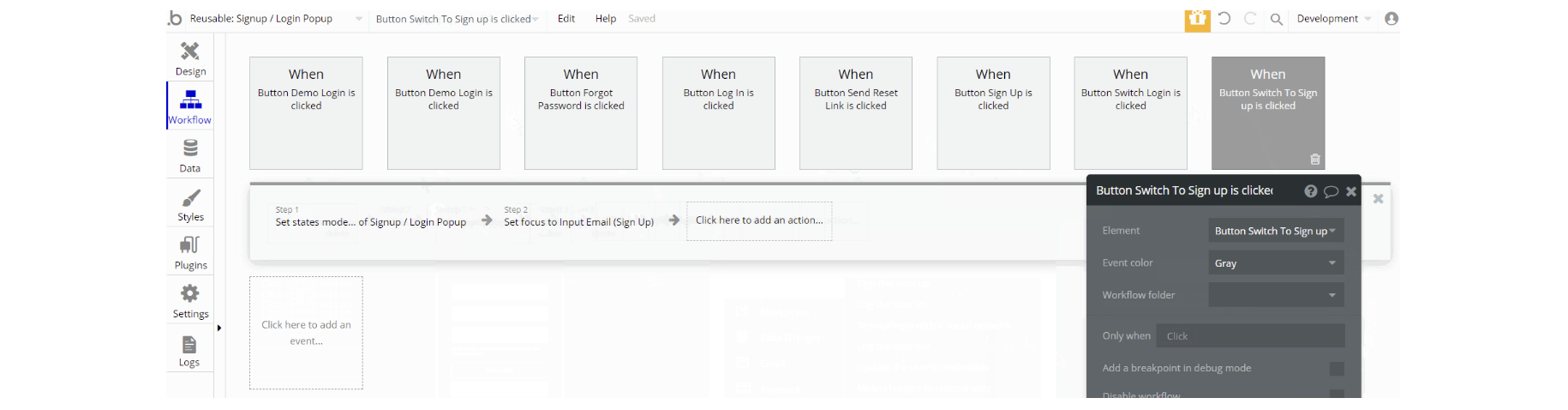
The workflow actions for this element are: show and hide an element, set state values for element visibility depending on the state.
Not without the important actions Log the user in and Sign the user up, as for password reset - the action send password reset email is used.