This section states the purpose of each page.
Introduction
In this summary, we will describe each page and its content. The Page Element is the fundamental one that contains all the other elements.
Tip: See Bubble Reference for more information about Pages element https://bubble.io/reference#Elements.Page 🙂
Pages
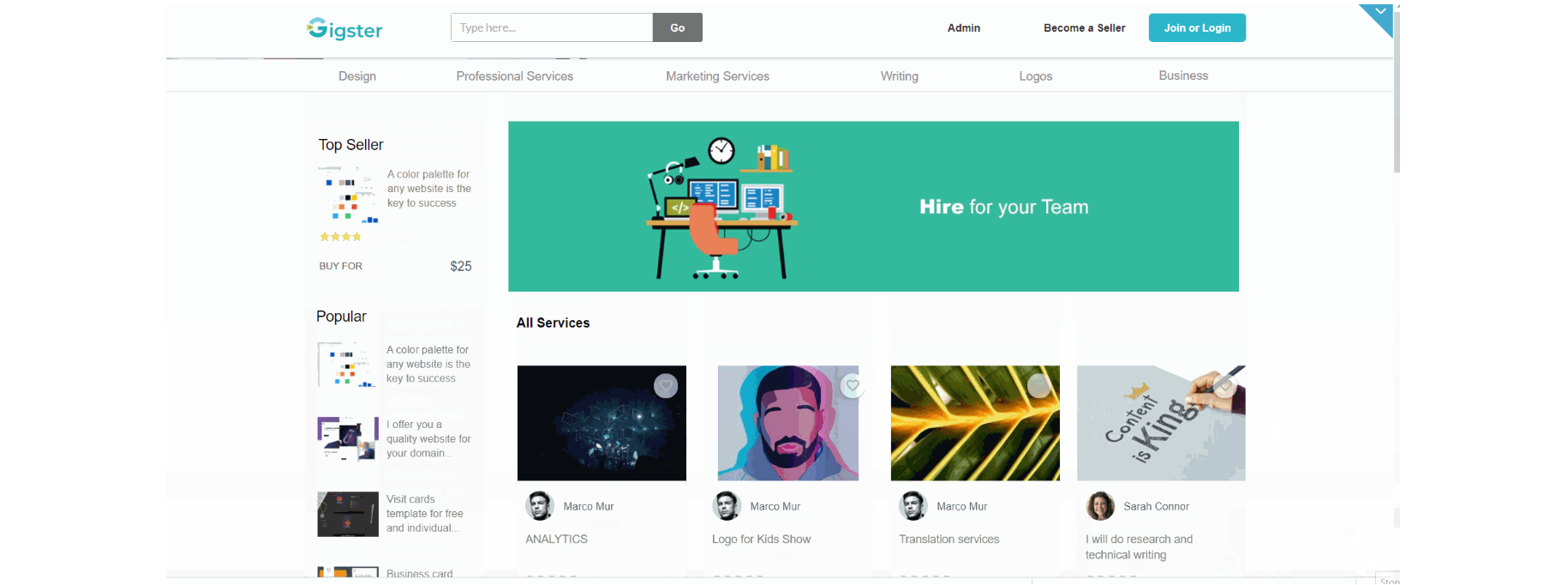
index
This is the main page typically encountered first on the web app that usually contains links to the other pages of the site. A homepage includes a variety of menus that make it easy for users to find the information they need.
There is a category bar in the top part. When the user hovers a specific category, a floating section is shown. The index page also has a promo banner🖼, all services with details displayed in a grid, and on the left side, users can see popular and top-selling items.
Tip: Initially, your design elements might be hidden in your editor.
Here is how to unhide 👀 them:
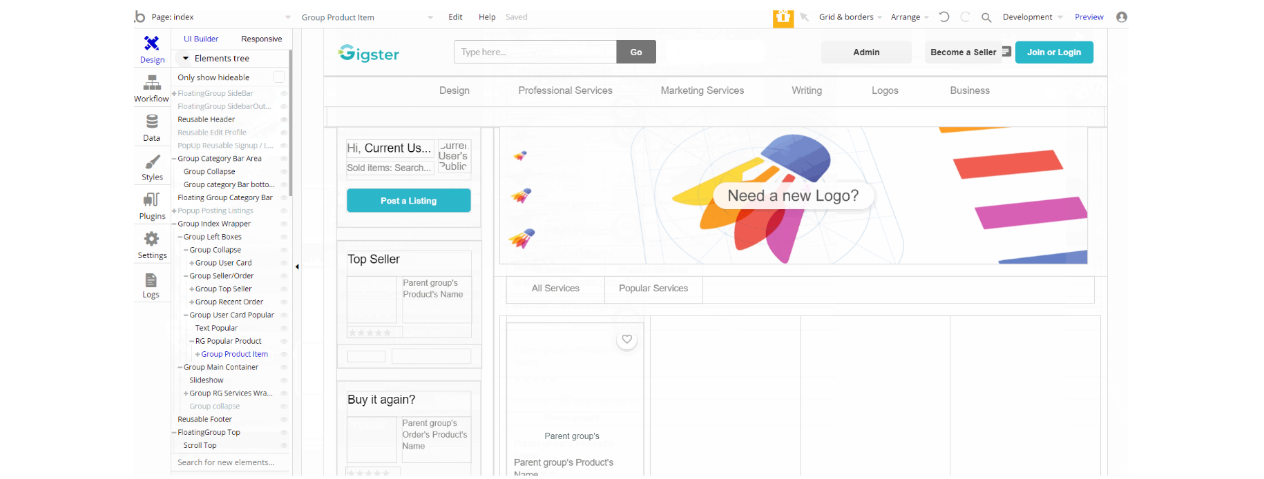
The design of this page consists of reusable elements like SideBar Content, Edit Profile, Product-Card, and others. "Group Main Container" holds the elements (buttons, texts, repeating groups, etc.) that display services on-page, the group "Group Category Bar Area" is used as an element to display services in the top bar.
FloatingGroup SideBar is used as a container for "SideBar Content" reusable element. The Footer and Header reusable elements are also part of the page design.
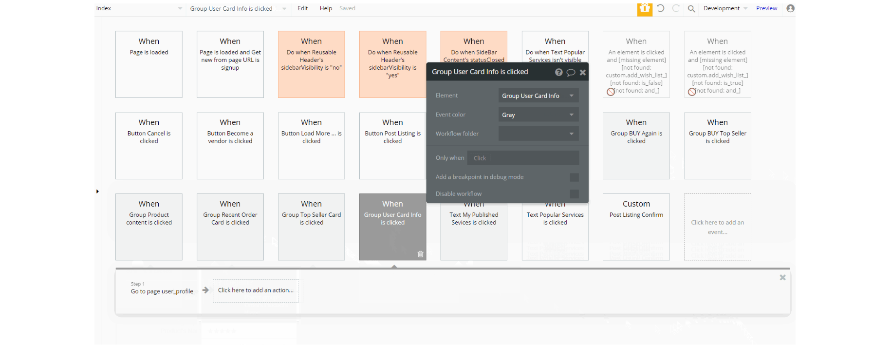
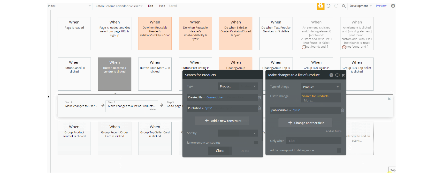
The workflows on this page (seen in the screen above), are meant for navigation to other pages are done using Go to page action.
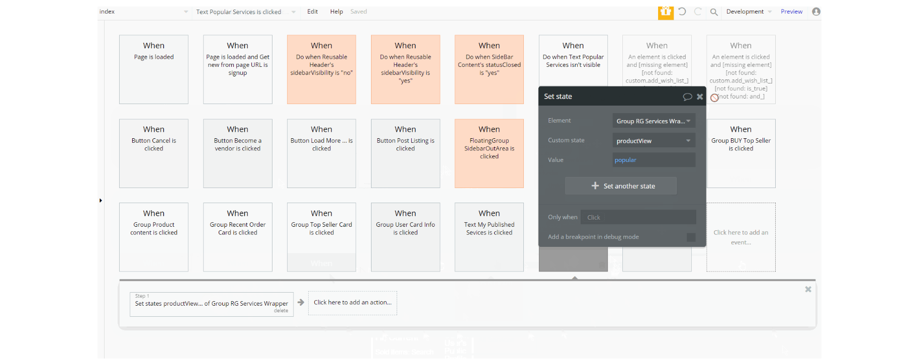
Other workflows like set state of a group element are used to show this element on the page, with and additional actions for showing and hiding an element. The preview of the set state value can be seen below when clicking the "Load More" button.
admin
This page is designed to manage platform data, e.g. Users, Items, Payments… and others. Only users with admin rights are able to access this page (in read-only mode), and those users who have access rights can edit or delete anything here.
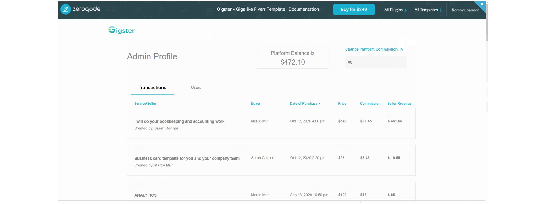
This admin dashboard is used to make changes to the database by the admin, and he can set the platform's commission fee and platform balance.
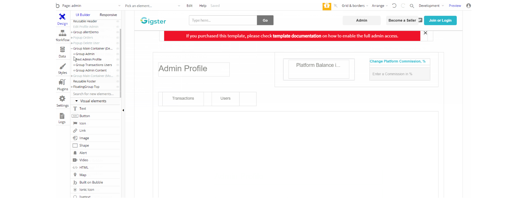
The design of this page consists of reusable elements, Sidebar Content, Reusable Edit Profile, Product-Card, and others. "Group Main Container Desktop" and "Group Main Container Mobile" hold the elements (buttons, texts, repeating groups, etc.) that display transactions and users tabs on page for desktop and mobile respectively, the group "Group allertDemo" is used to notify about admin rights access.
FloatingGroup SideBar is used as a container for "Sidebar Content" reusable element. The Footer and Header reusable elements are also part of the design page.
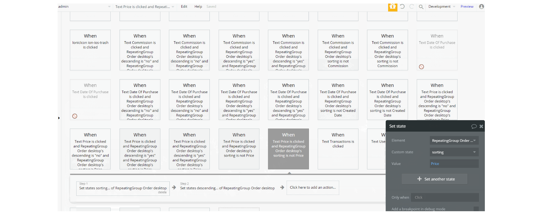
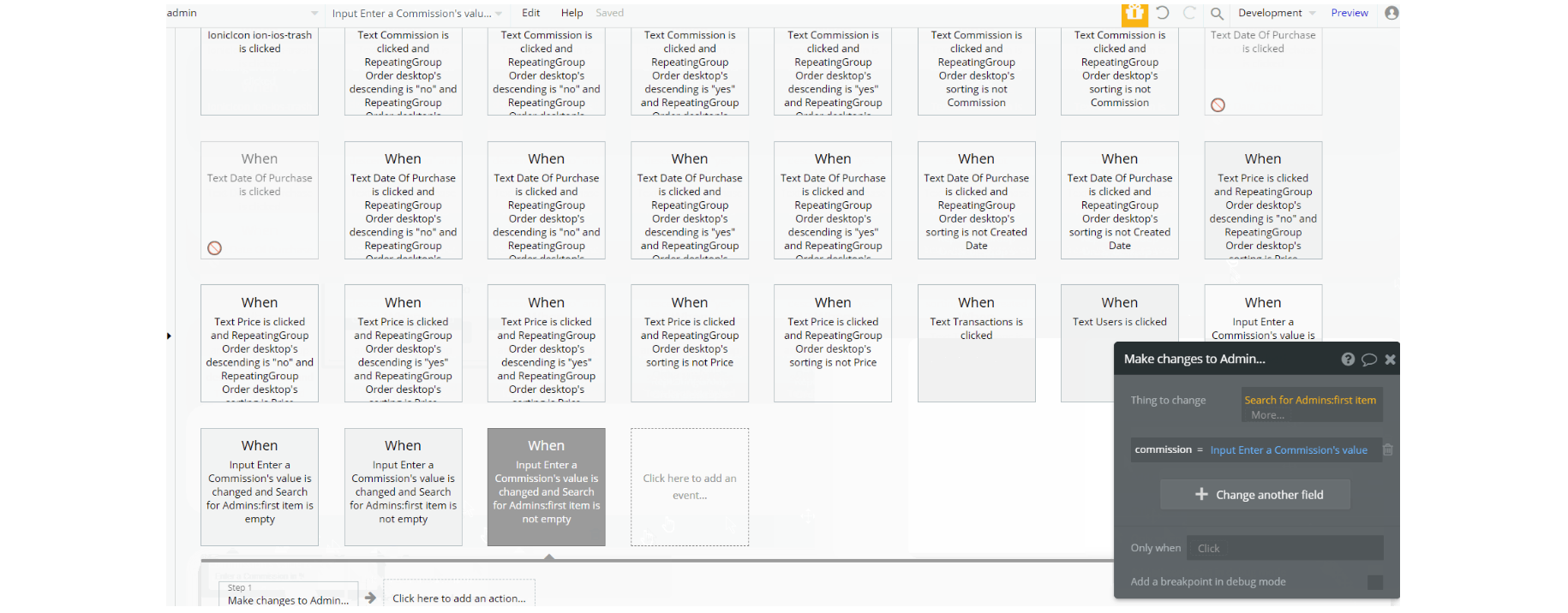
The workflows on this page seen in the screen above, are set state of a group/visual elements are used to show these elements on the page depending on view value. The set state action is seen below during navigation between tabs (Transactions and Users)
Other workflows on the page are actions for showing and hiding an element. See the hiding alert notification action in the preview image above.
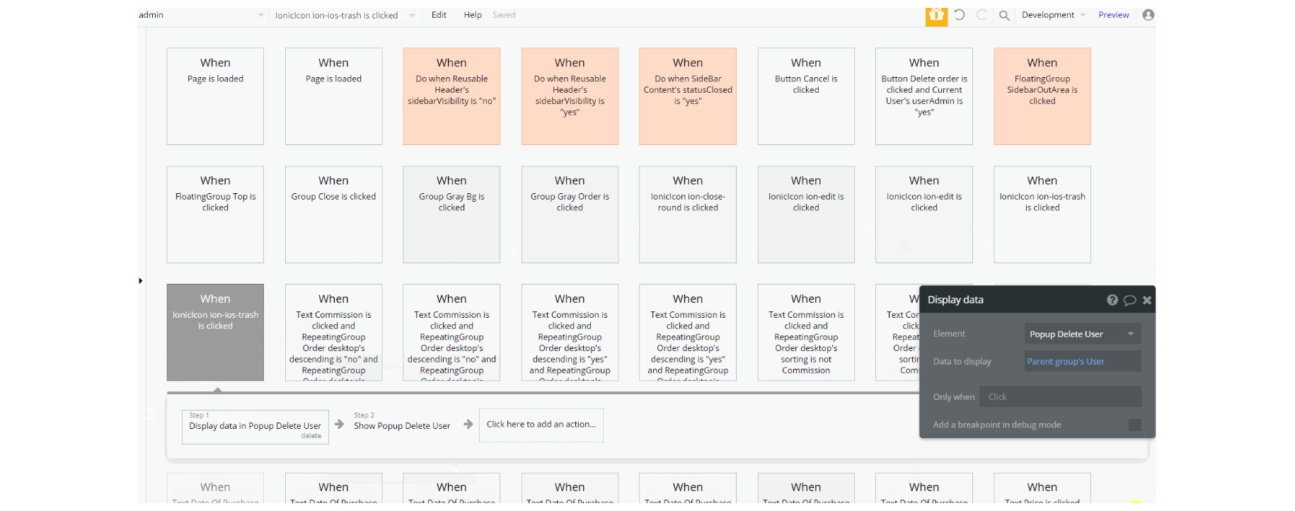
Additionally, workflow actions like navigation to other pages and makings changes / delete the admin data type.
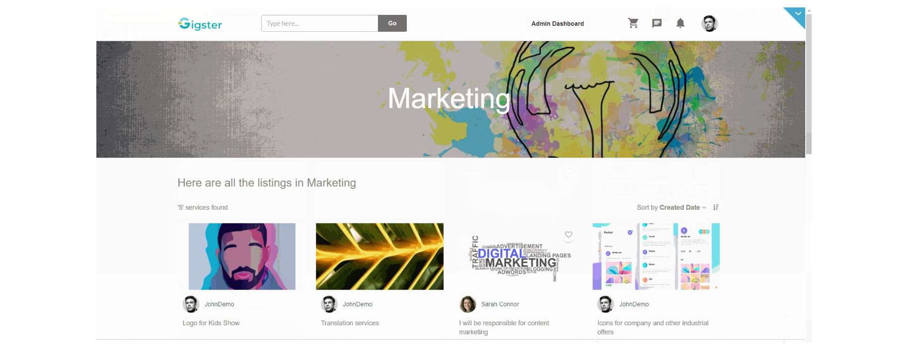
category_filter
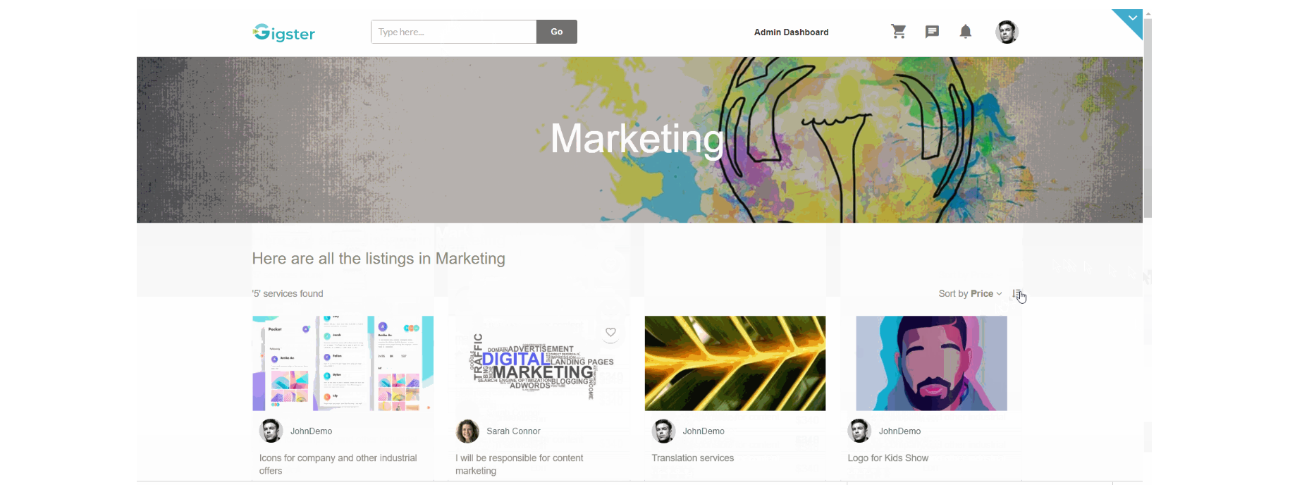
This is the page where users land by selecting a category to filter the listings. Here users can see all listings for a particular category displayed in a grid with the option to sort by creation date and price💲.
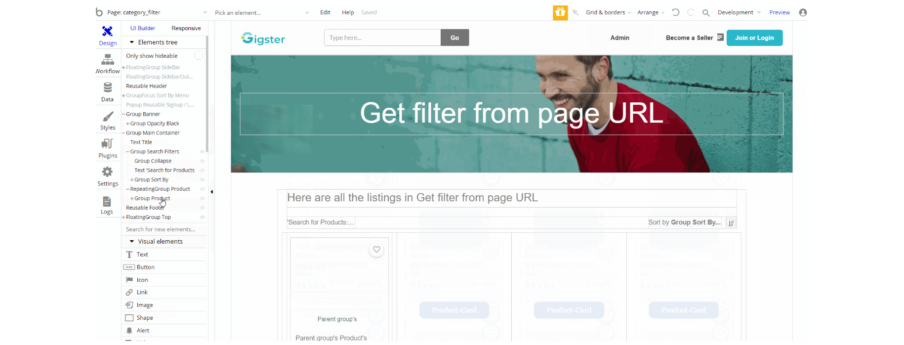
The design of this page consists of container Group "Main Container" which holds the elements for the filtering (Repeating Groups, Texts, etc ), the Group "Banner" is responsible for heading where we see page title and image. Additionally, on the page, there is FloatingGroup "Top" responsible for scrolling back to top.
The FloatingGroup "SideBar" is a reusable element group used for mobile responsive and is hidden by default, while the GroupFocus "Sort By Menu" is used on position relative to element Group "Sort By" offering a choice between creation date or price sorting. The Footer and Header reusable elements are also part of the design page.
The preview of the page looks like this:
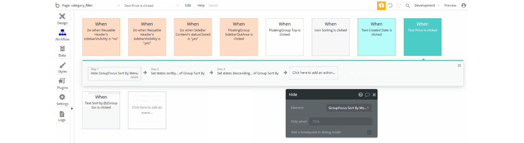
The workflows for showing and hiding different states of visual elements use, set state value actions, hide an element, and some animations with standard animate element actions.
Additionally for opening the dropdown sorting option and scrolling back to the top, the workflow actions are toggle and scroll to an element. A small preview can be found here:
listing_redact
This is the page where the seller can edit his listing details like title, price, description, change category and add questions/answers to the FAQs section. The edited listing can be then saved as a draft or published.
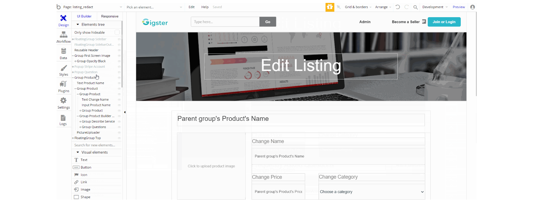
The design of this page consists of container Group "Product" which holds the elements for the editing functionality (Groups, Inputs, Texts, etc ), the Group "First Screen Image" is responsible for the heading where we see the page title and image.
Additionally, on the page, there is FloatingGroup "Top" responsible for scrolling back to top. The FloatingGroup "SideBar" is a reusable element group used for the mobile responsive menu which is hidden by default.
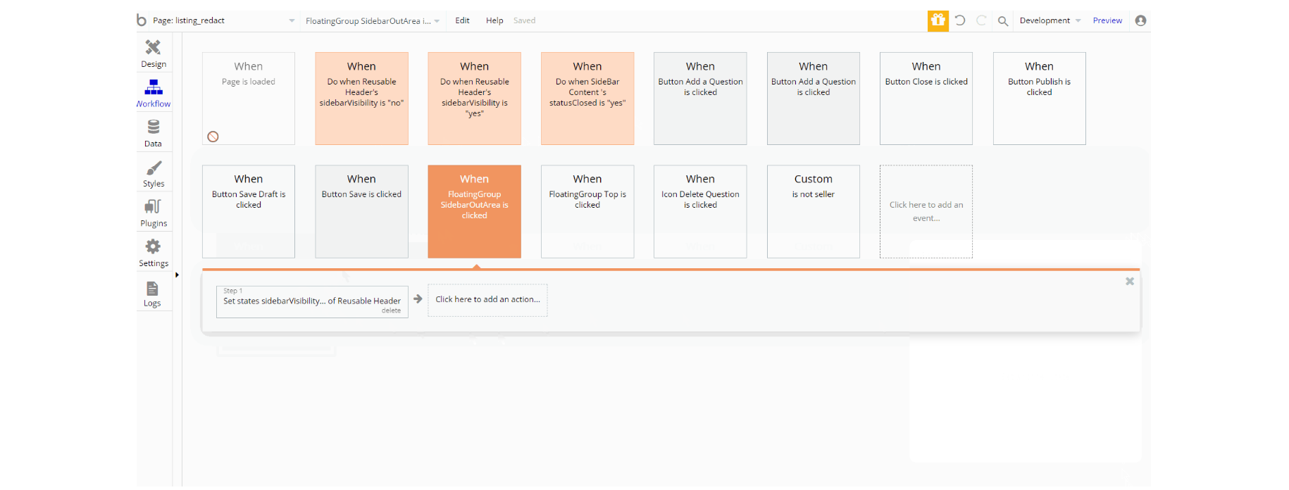
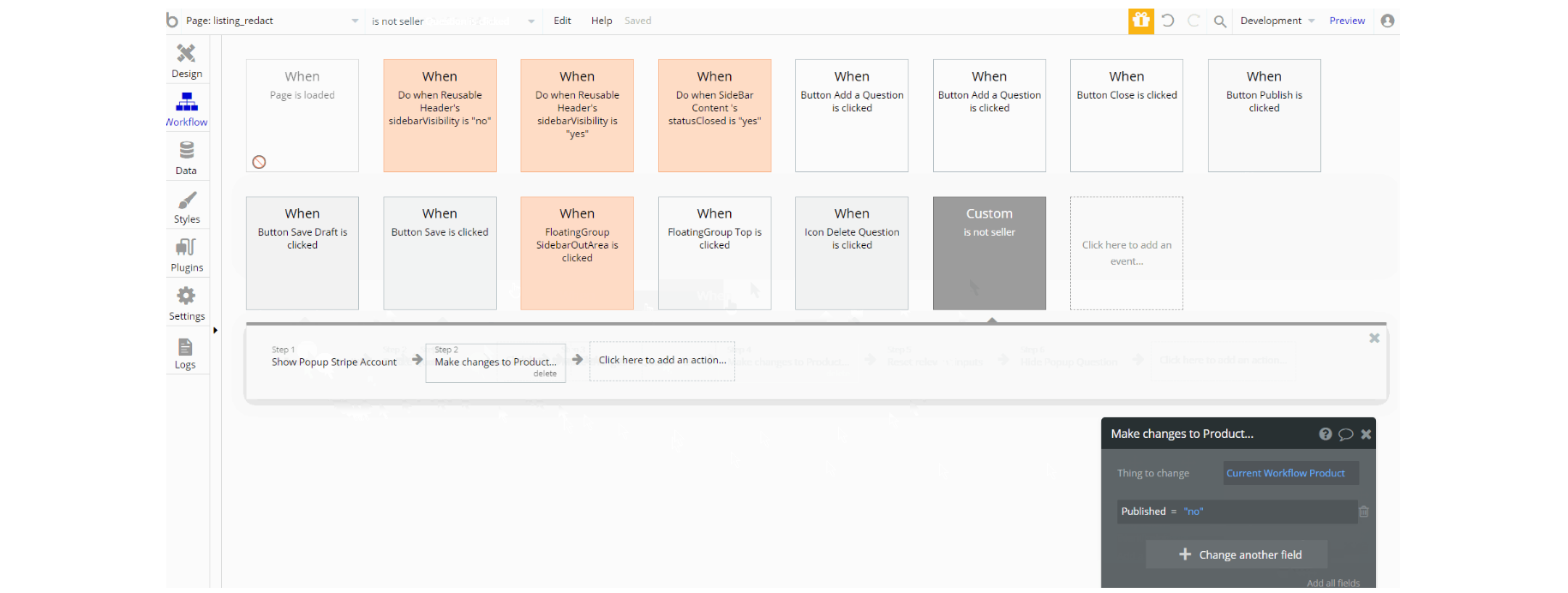
The workflows for showing and hiding different states of visual elements use, set state value actions, show and hide an element, and some animations with standard animate element actions. The displayed data in pop-ups is done using display data in group/pop-up action.
Other workflows seen on the page are database manipulation, making changes, create a thing, and delete a thing of Question, Answer and Product data types. With navigation to other pages, action can be seen here as well.
listing_upload
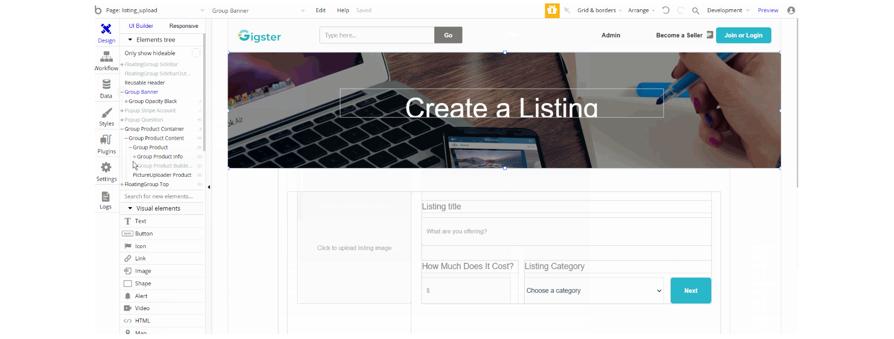
This page is where the seller creates the listing of the service, by providing title, price, category, and description for the service. Additionally, the seller is able to either save the draft or publish the service, and add questions/answers to the FAQs section.
The design resemblance the page
listing_redact, which is composed of main Group "Product Container" which holds the elements for listing creation (i.e inputs, texts, groups, buttons etc.). Group "Banner" is used in heading of page for displaying image and title. Additionally, on the page there is FloatingGroup "Top" responsible for scrolling back to top. The FloatingGroup "SideBar" is a reusable element group used for the mobile responsive menu which is hidden by default.
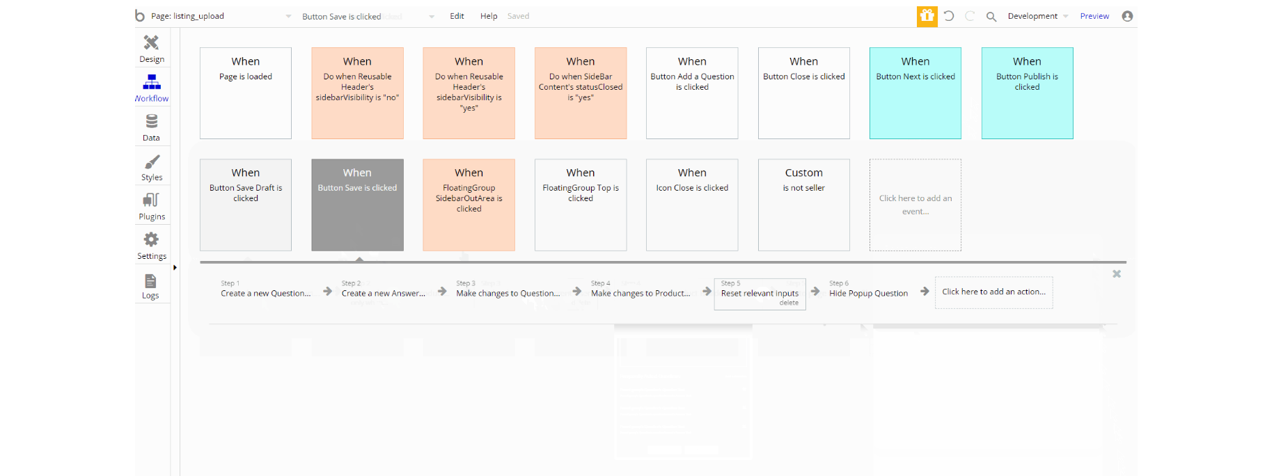
Similar to listing_redact page, the workflows here are used for showing and hiding different states of visual elements use, set state value actions, show and hide an element, and some animations with standard animate element actions. The displayed data in pop-ups is done using display data in group/pop-up action.
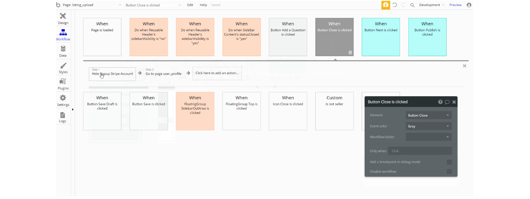
The data manipulation is also present which is almost identical making changes, create a thing, and delete a thing of Question, Answer ,Product and User data types.
my_cart
This page is where users can pile up the gigs they want to buy from the application and then simply checkout by paying online🛒.
Also on the page, there is the favorites section and option to search gigs.
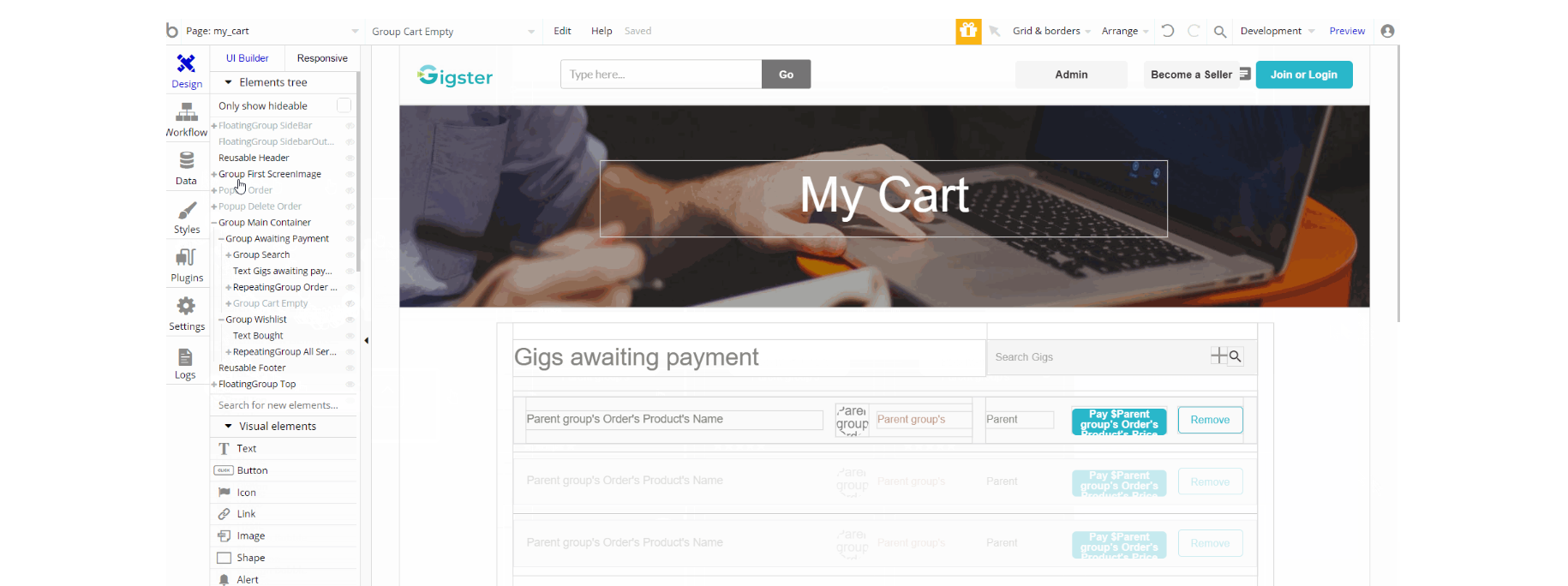
The design of this page consists main group "Main Container" which holds the elements for both cart and favorite sections. The search input is also part of the main group. Other elements such as group "First ScreenImage", pop-up elements "Order" and "Delete Order" are found on page, with the latest not visible.
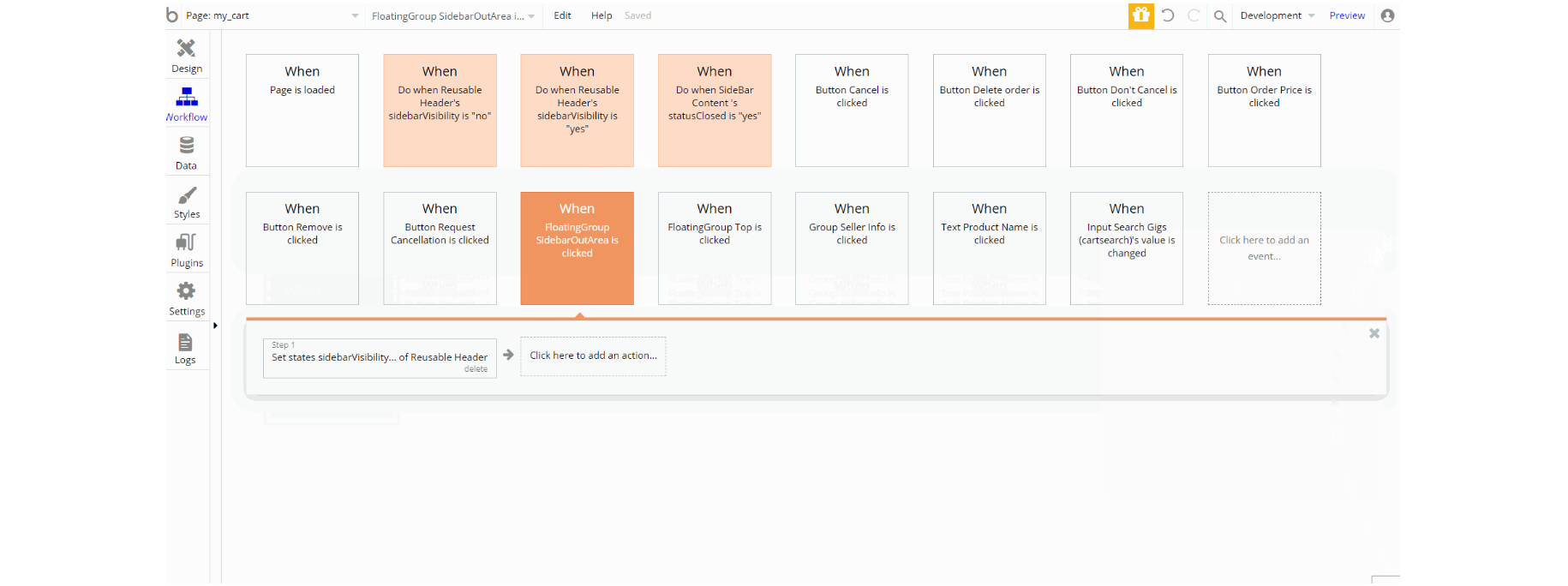
Additionally, on the page there is FloatingGroup "Top" responsible for scrolling back to top. The FloatingGroup "SideBar" is a reusable element group used for the mobile responsive menu which is hidden by default. The Footer and Header reusable elements are also part of the design page.
The workflows found on the page used for showing and hiding different states of visual elements use, set state value actions, show and hide an element, and some animations with standard animate element actions. Other actions can be seen such as navigation to pages
index, user_profile and product_page
Additionally, data manipulation actions like making changes, create a thing, and delete a thing of Order, Notification and User data types can be seen in workflows.
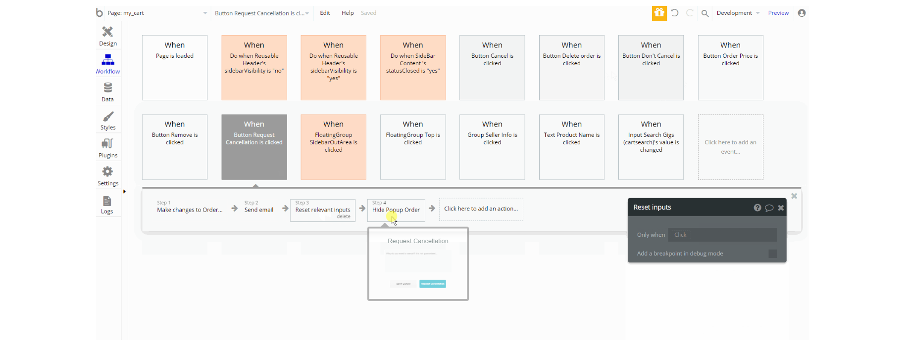
With supplementary actions like show and hide an element, display data, and send email. This set of actions also charge the current user as part of the cart page.
product_page
This page offers users all the important information about the product 🎫. It includes price details, title, description, faq and seller contacts.
Tip: Initially, your design elements might be hidden in your editor. Here is how to unhide 👀 them:
The design of this page consists main group "Main Content" which serves as a container for the elements designed to display the information about the product and seller.
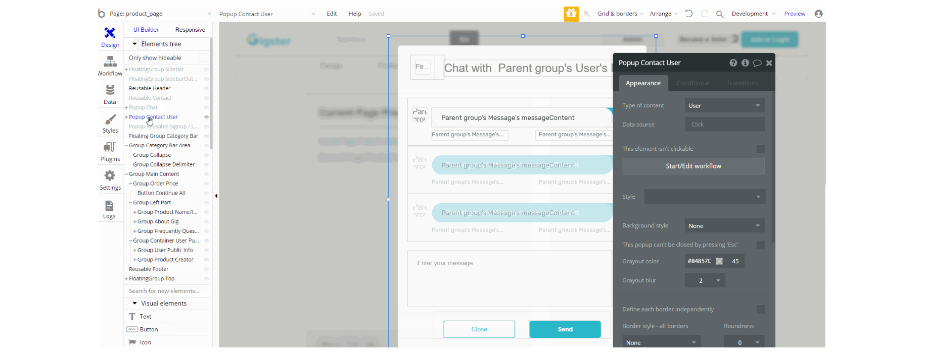
Another set of elements on page are pop-ups "Chat", "Contact User" and "Reusable Signup / Login" are not visible on page.
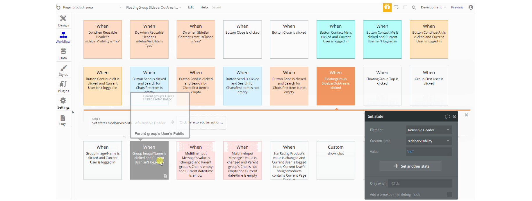
Additionally, on the page there is FloatingGroup "Top" responsible for scrolling back to top. The FloatingGroup "SideBar" is a reusable element group used for the mobile responsive menu which is hidden by default.
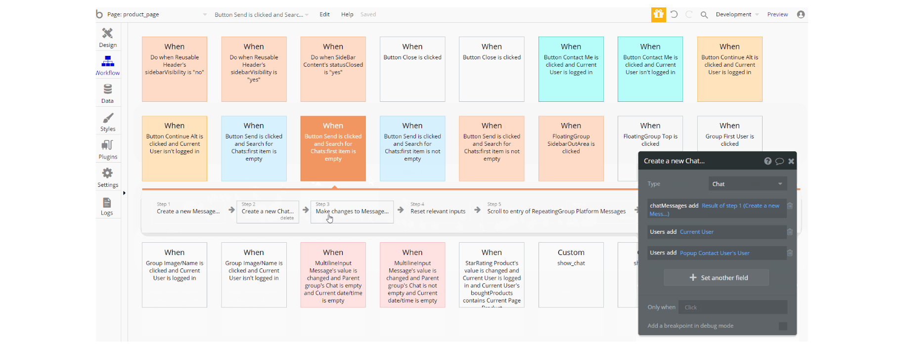
The workflows actions which can be encountered for some parts of the page are: make changes, create a thing of Order, Message and Chat data types, scroll to element, and reset relevant inputs values.
Other actions in workflows for visibility are set state values of groups, show an element and standard animation using animate action
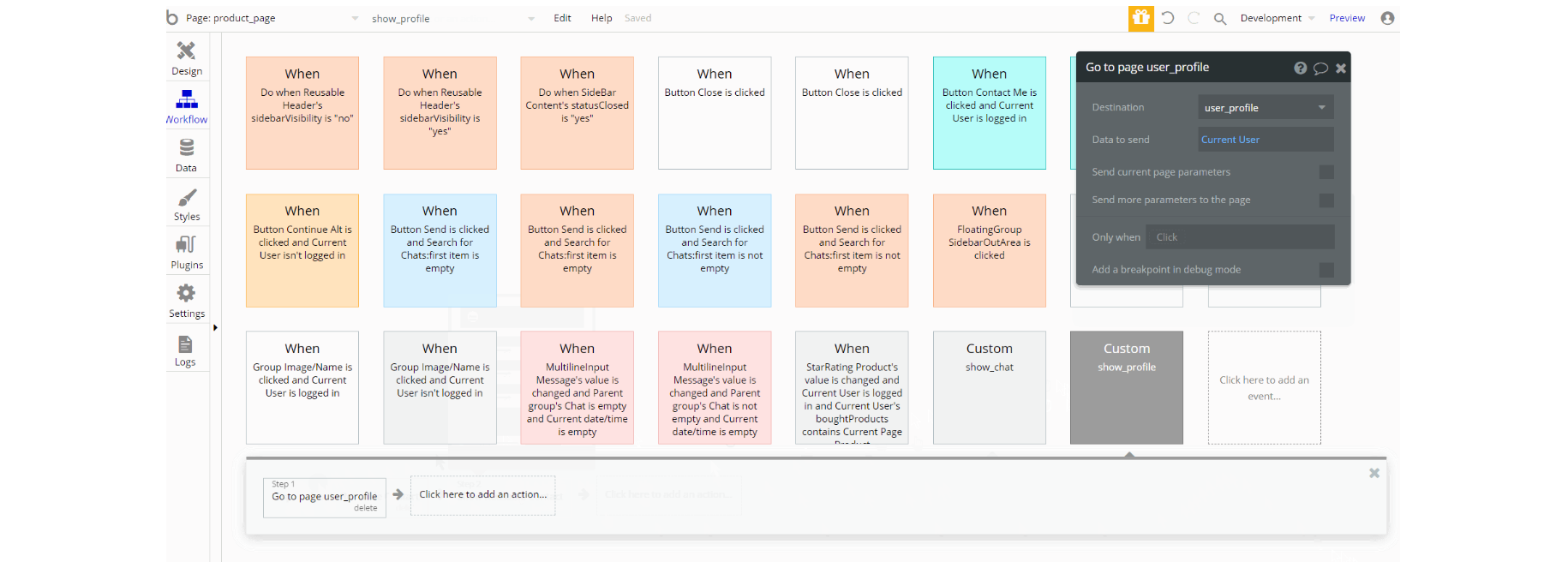
Two Custom Events actions are triggered on page, navigate to a page, and display data this way is to share actions between the different workflows of the page.
search_filter
This page is used for searching🔍through all available products on the platform that are published.
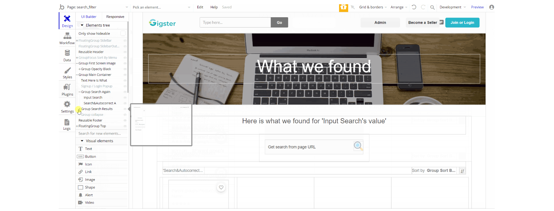
The design of this page consists of the main group "Main Container" that holds all of the elements related to search results (texts, input, groups, repeating groups).
The group "First Screen Image" is used in the heading with the title inside another group for the page. Additionally, on the page there is FloatingGroup "Top" responsible for scrolling back to top.
The FloatingGroup "SideBar" is a reusable element group used for the mobile responsive menu which is hidden by default.
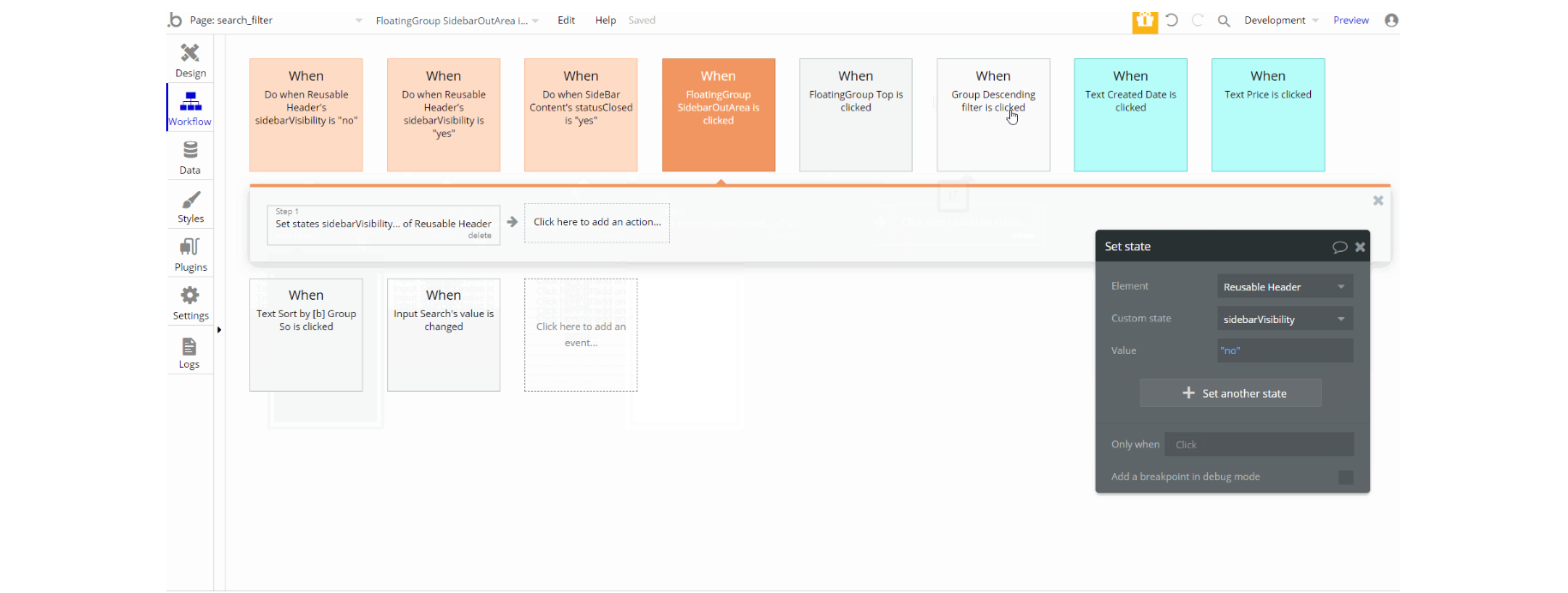
The most important workflows actions behind the design seen here are, set state values to show an element or block, show and hide element actions, standard animation using animate action, and navigation to current page by sending search parameter.
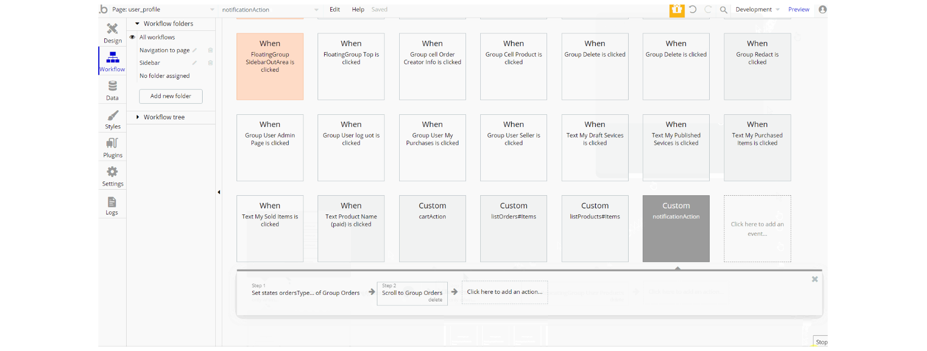
user_profile
This page is used by users of the platform to manage their profiles. Check their published or drafted services, see the purchased or sold items and edit their user profile ✍.
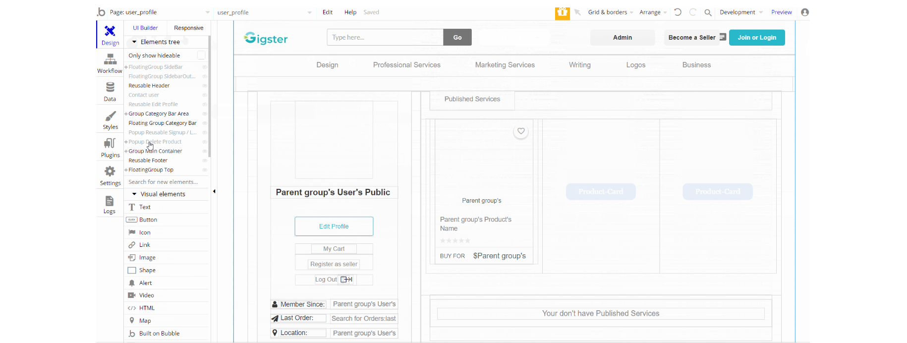
The design of this page is similar to some of the pages already encountered and consists of main group "Main Container" that holds all of the elements related to search results (texts, input, groups, repeating groups).
The group "Category Bar Area" is used to collapsing groups and floating group "Category Bar" is a services shortcuts menu under the header.
Additionally, on the page, there is FloatingGroup "Top" responsible for scrolling back to top. The FloatingGroup "SideBar" is a reusable element group used for the mobile responsive menu which is hidden by default.
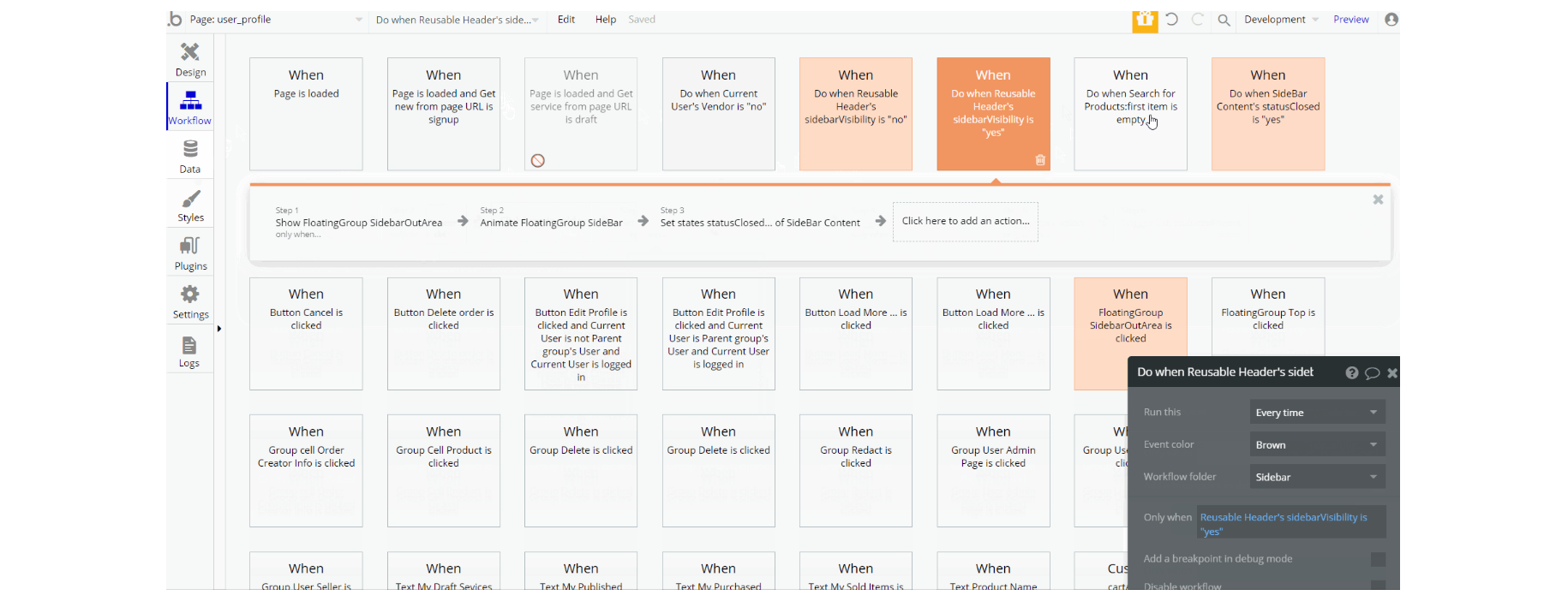
The workflows that can be seen for this part are set state values to show an element or block, show and hide element actions, standard animation using animate action, display data thing in element, and trigger custom events on page load.
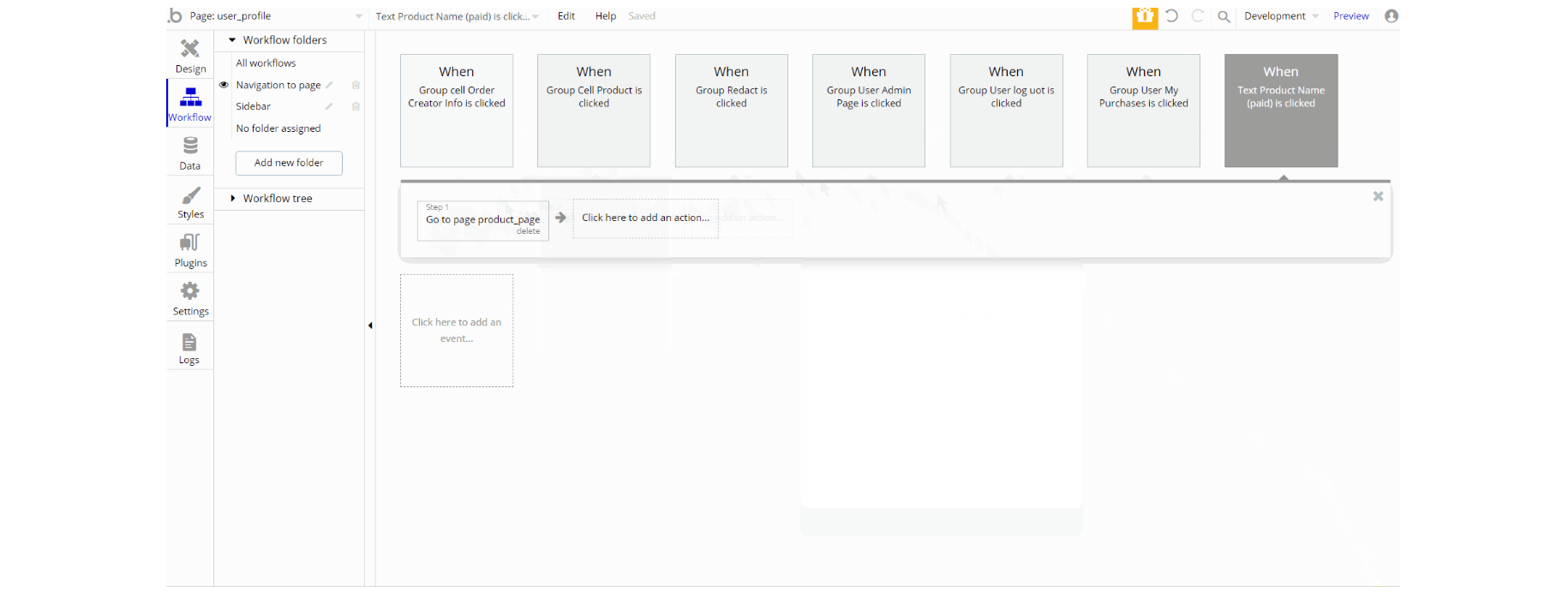
Other workflows found on page, are navigation to pages and log out the user. Also, these navigational workflows are part of the Navigation to page workflow folder.
reset_pw
This page is used for resetting the password.
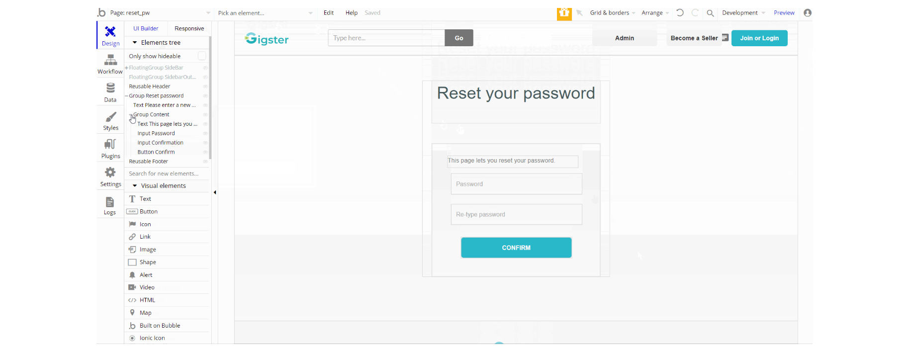
The design of this page has been redone over the default bubble one. It consists of the main group "Reset password" which holds the elements used for the reset form.
The FloatingGroup "SideBar" is a reusable element group used for the mobile responsive menu which is hidden by default.
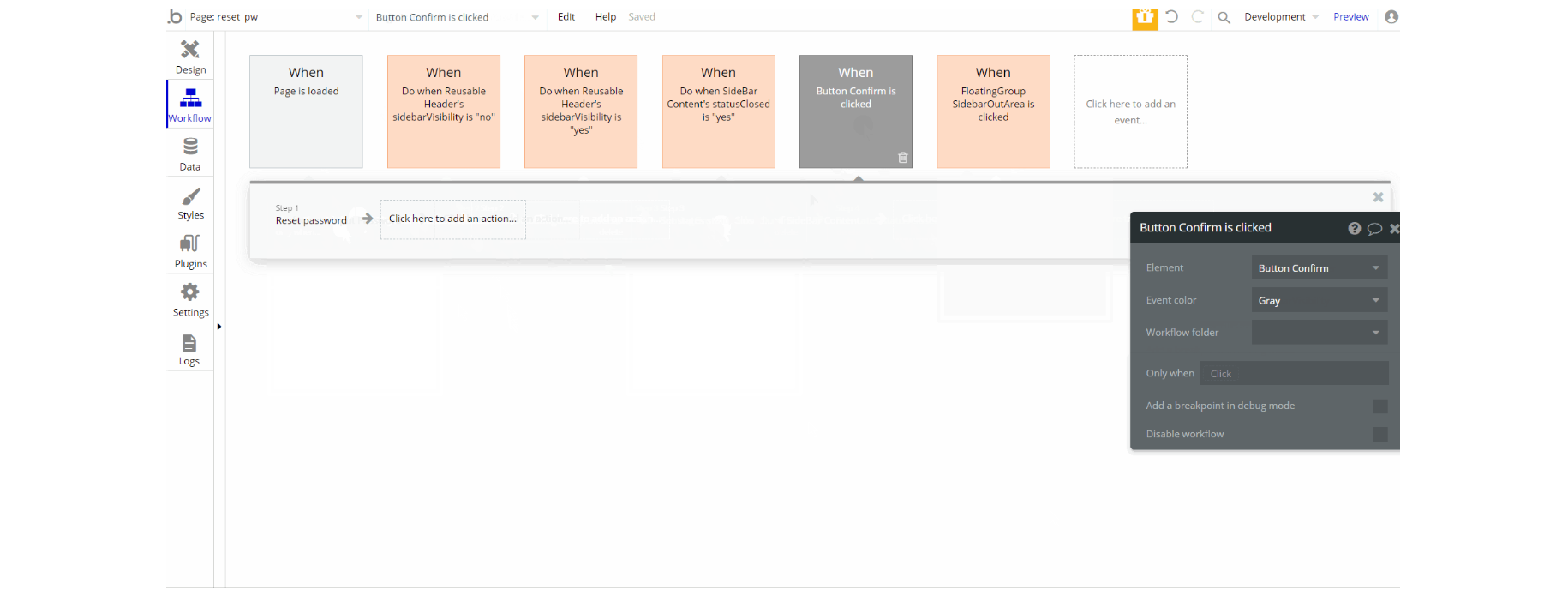
The workflows on the page are mostly set state actions used for visibility of elements, with show and hide actions accompanying. There is the default animate an element action with the actual reset password.
404
This is a custom-designed page for 404 redirect errors, informing a user that the requested web page cannot be found, or doesn't exist
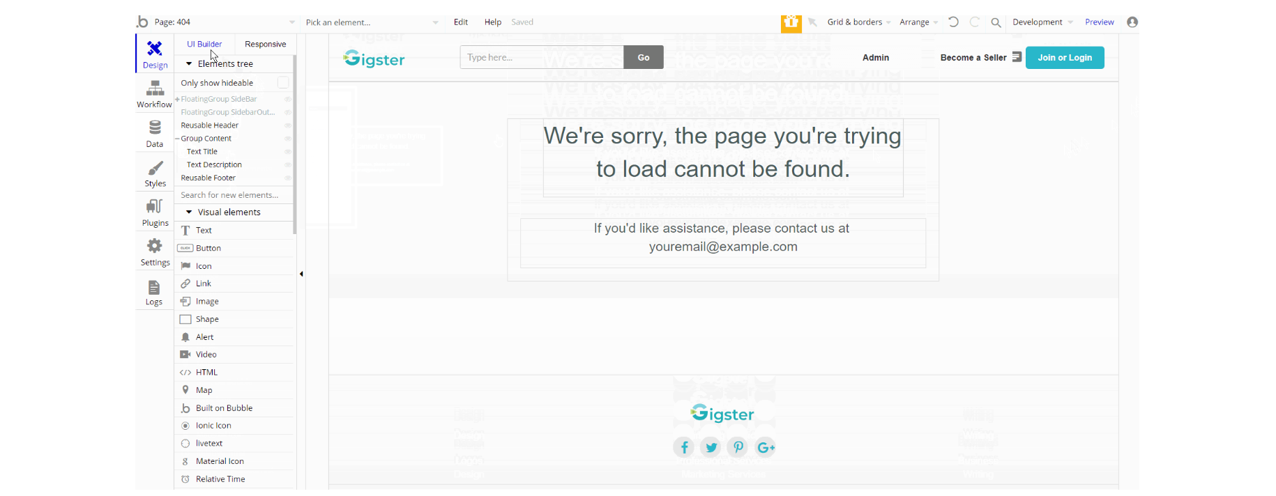
The design of this page consists of the main Group "Content" with texts only and the FloatingGroup "SideBar" a reusable element group used for the mobile responsive menu which is hidden by default.
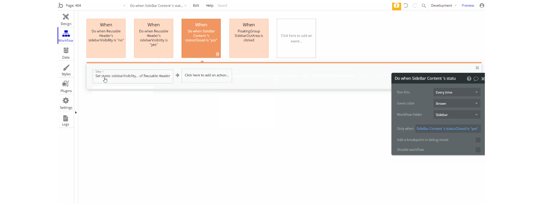
The workflows for this page are related to sidebar menu visibility using set state actions of elements, with show and hide actions accompanying and standard animate an element action.