This section states the purpose of each reusable element.
Introduction
Reusable Element - an element that contains other elements, like a group, that can be used in more than one place. This is useful when reusing the same elements often.
Tip: See Bubble Reference for details https://manual.bubble.io/core-resources/elements/reusable-elements 🙂
Reusable Elements
header
The header reusable element sits at the top of each page and serves a few very important purposes. It does provide a place for company's logo, navigation and page title which are part of a consistent user experience that all good websites share.
Other common header features are, search, shopping cart (for ecommerce), login/logout, user profile and notifications (if applicable). The workflows included with this element are pretty straightforward to follow.
This reusable element is customizable, so it is possible to change styles and content of element while keeping workflows or using as inspiration for your own.
Tip: This page comes with demo logins that have been placed for testing purposes. They may be removed from your app.
Here, the reusable element is used at the top of the page and offers overall navigation on the platform. From there the user can go to his profile or access his shopping cart.

The Header contains a hidden button that allows the user to switch between the Demo account options:
- Demo Customer
- Demo Courier
- Demo Restaurant Owner
- Demo Admin
footer
The footer reusable element is located at the bottom of a page. It provides an example of how it can include external links, such as the company's social media, navigation, and copyright notices. A great website footer design keeps people engaged and moving through the website. The workflows included with this element are pretty straightforward to follow.
This reusable element is customizable, so it is possible to change the styles and content of elements while keeping workflows or using as inspiration for your own.
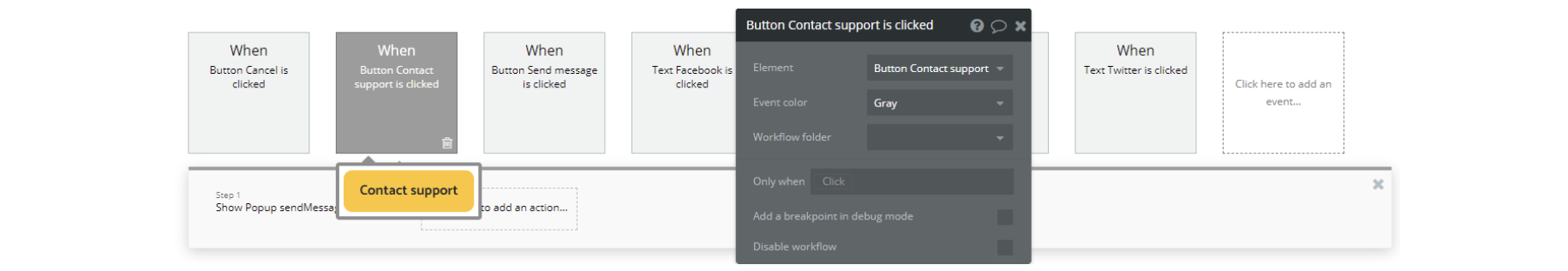
Here, the footer is used for basic navigation through the platform and contacting support.
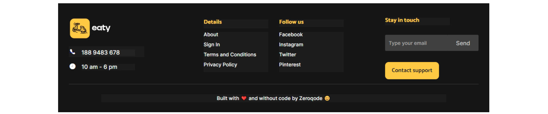
When you press the "Contact Support" button, a window hidden in the Bubble Editor opens for writing a message and sending it.
Tip: Add Privacy and Terms links here, as well as create separate pages for these links. It will help you go through App Store and Google Play approval procedures, in case you convert your Bubble app into native iOS and Android apps. These links are also important for Facebook login.
menu-item
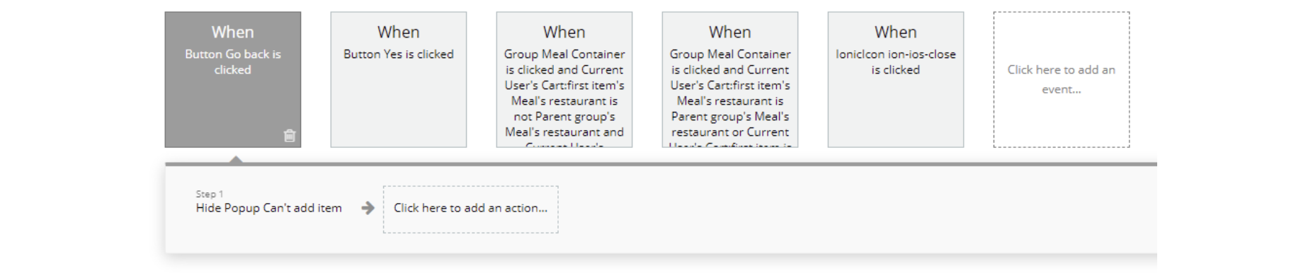
This reusable element is used to display the meal items of a restaurant. It also contains the workflows and popup elements for adding the meal to the cart.
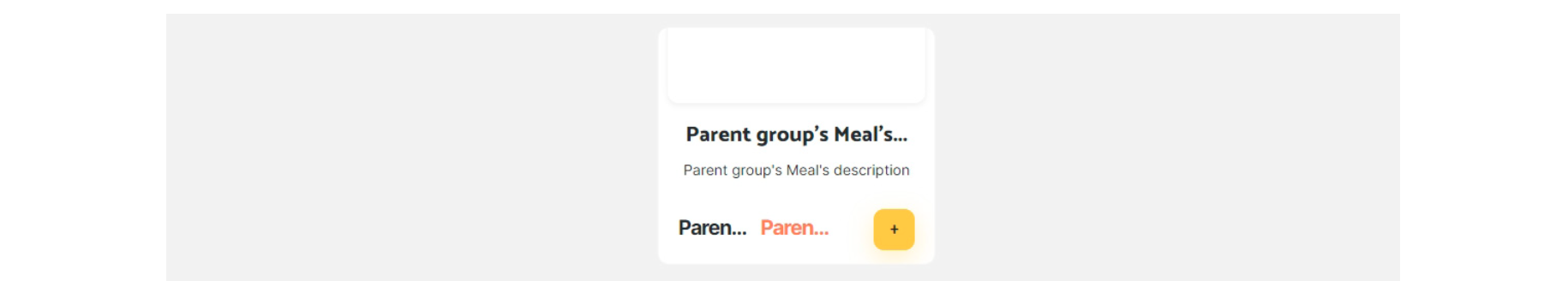
This reusable element protects against adding dishes from different restaurants to the same order.
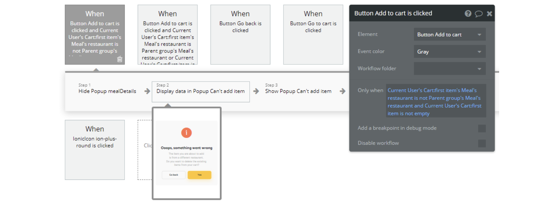
Tip: The dropdown window for this event is hidden, by default.
menu-item-categories
This reusable element is used on the
restaurant page. It looks similar to menu-item, the difference being showing the tags related to the meal and not having the add-to-cart functionality.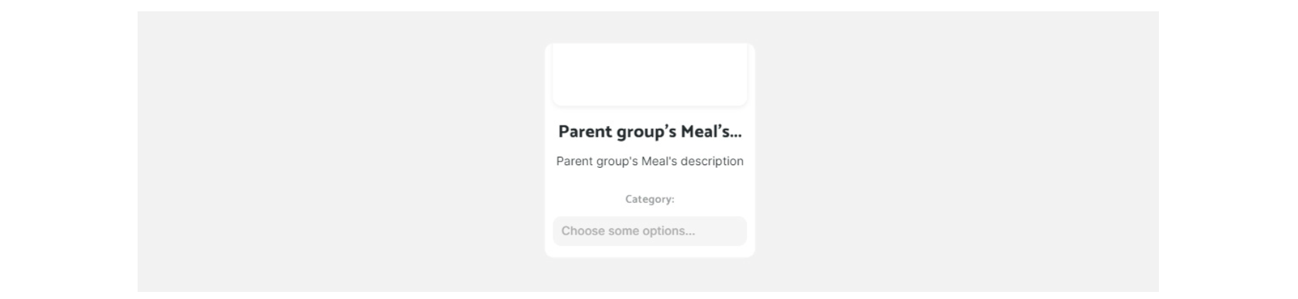
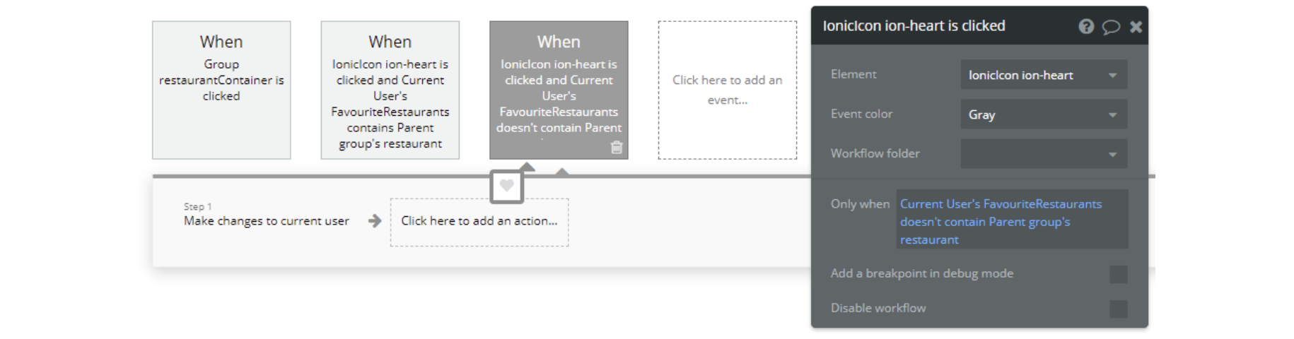
restaurant-item
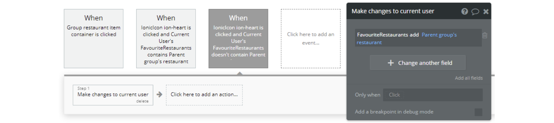
This reusable element displays the information about a restaurant in card form. It is used on pages like index, profile and restaurant_search.
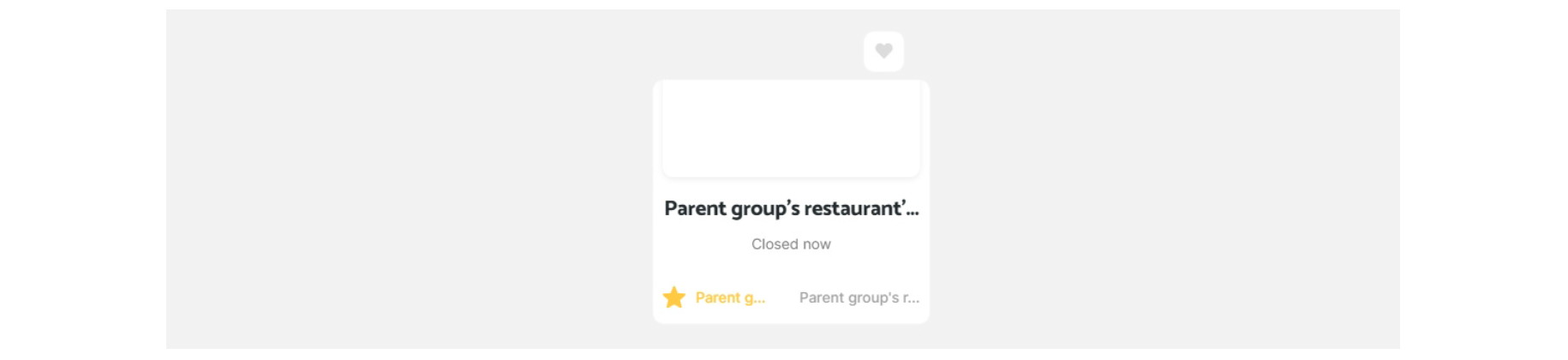
There are several workflows here that allow users to create their favorite restaurant lists by clicking on the heart icon.
restaurant-item2
This reusable element has the same purpose as the restaurant-item but displays the information about the restaurant in a different card form. It is used only on the index page.
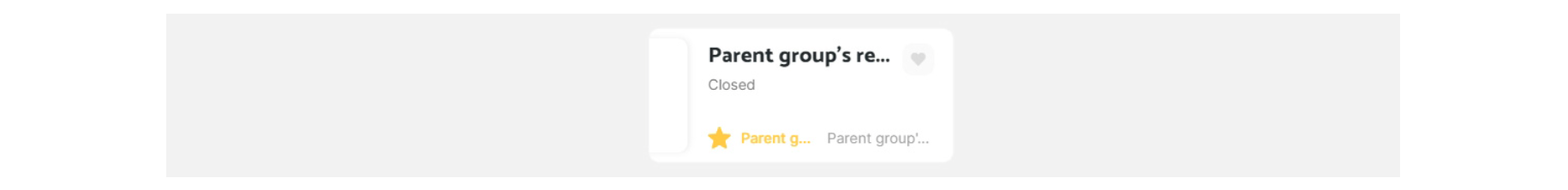
There are several workflows here that allow users to create their favorite restaurant lists by clicking on the heart icon.