This section states the purpose of each page.
Introduction
In this summary, we will describe each page and its content. The Page Element is the fundamental one that contains all the other elements.
Tip: See Bubble Reference for more information about Pages element https://bubble.io/reference#Elements.Page 🙂
Pages
index
This is the main page typically encountered first on the web app that usually contains links to the other pages of the site. A homepage includes a variety of menus that make it easy for users to find the information they need.
Also, there are the following features: a search to easily find instructors, buttons for signup/login, images of featured instructors, and a list of customers' testimonials.
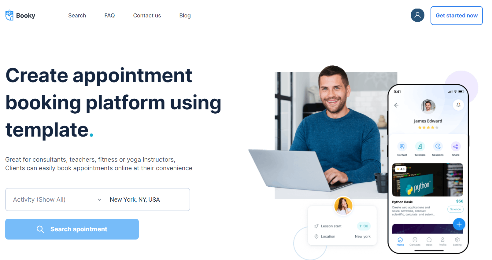
The design of this page consists of main hierarchy Group containers which are: "Group Hero", "Group Advantages", "Group Become a Teacher", "Group Testimonials", "Group Browse by Location" with branches in Elements tree for each main container with different groups and elements inside them.
Some groups are used for responsive design like "Group Collapse Mobile Top" which has the condition When the current page width is less or equal to 600px the element is not visible👁🗨. Another element like "Group Search Mobile" is not visible on page load and has the condition when the current page width is less when 768px this element is visible.
The Footer and header reusable elements are also part of the design page.
The only workflow actions on this page were created for navigation to the
search page within the template and also combine actions working with data, by modifying value inside database type User. about
This simple page should be used to show information about the appℹ. It has no custom states.
Tip: This page is not filled with content but rather has placeholder elements. It can be customized to any style and content.
The design of this page consists of main Group containers which are: "Group About", and "Group Contact". "Group About" contains in the Elements tree "Group No inbox messages" and "Shape Scroll contact" elements.
The "Group Contact" is used for displaying conversations.
The Footer and header reusable elements are also part of the design page.
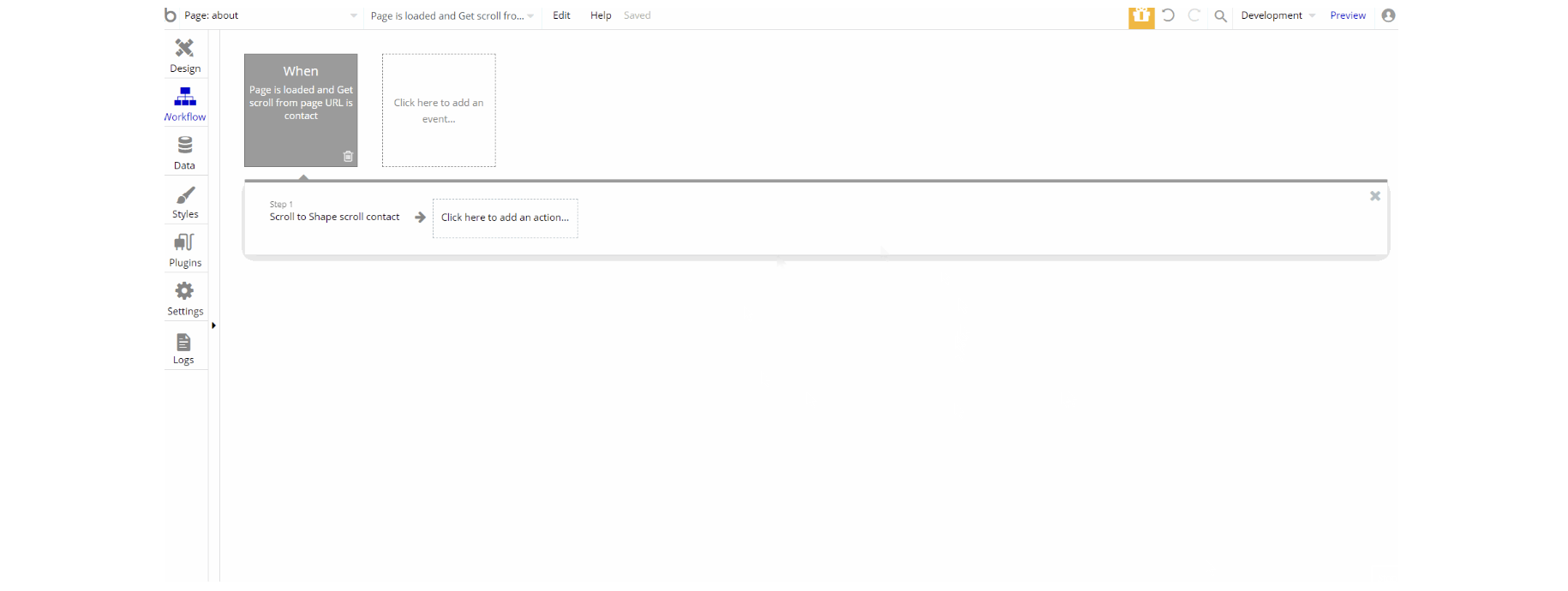
The workflow for this page is only created for UX to specific setup when the page is loaded.
admin
This page is designed to manage platform data, e.g. Users, Testimonials, Payments… and others. Only users with admin rights are able to access this page (in read-only mode), and those users who have access rights can edit or delete anything here.
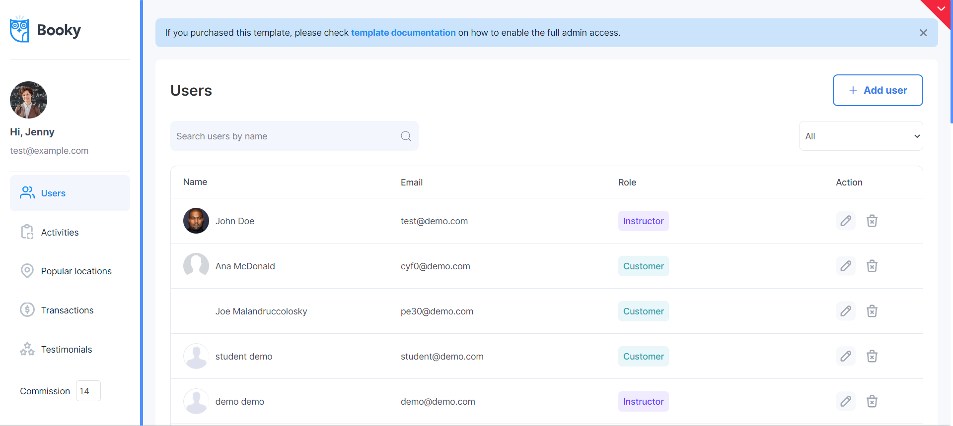
Custom states on the page are used for navigation between tabs and inside the floating group.
In the dashboard, the admin can edit/delete users, activities, and popular locations.
Also, the admin has the ability to check transactions and see/modify testimonials.
Tip: Initially, your design elements might be hidden in your editor.
Here is how to unhide 👀 them (click the eye icon):
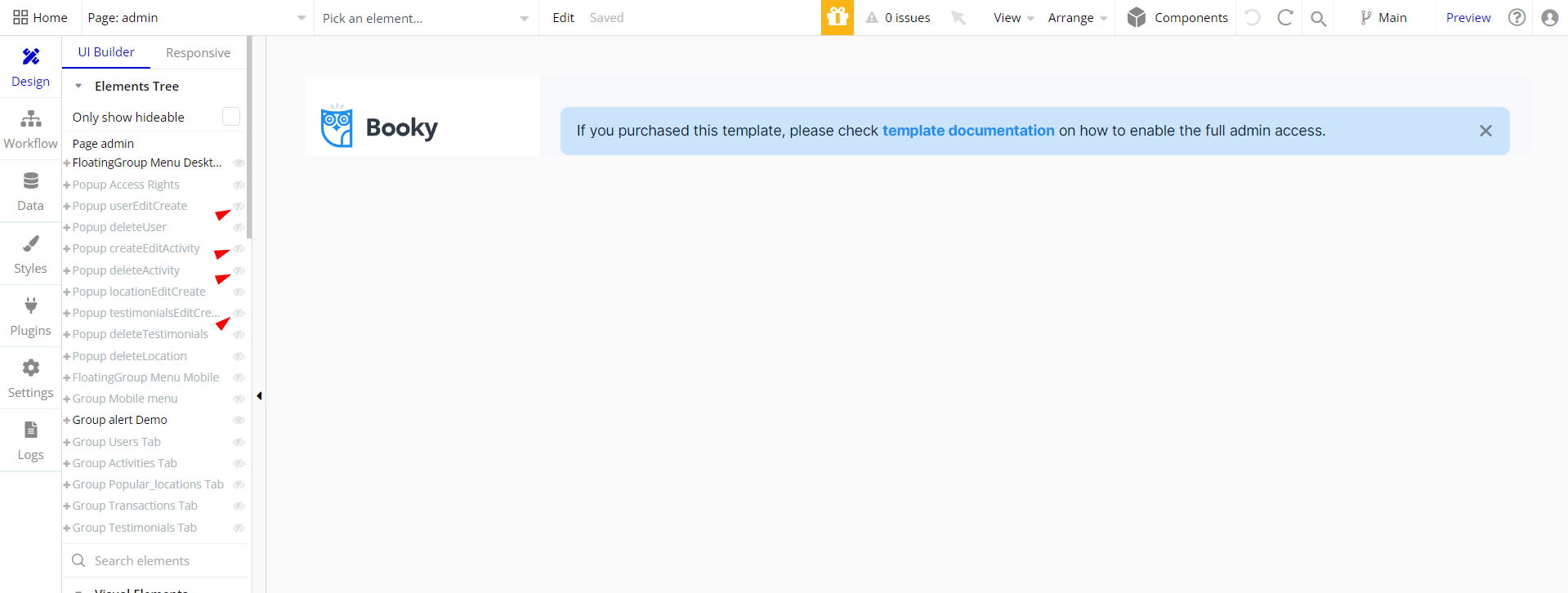
The design of this page consists of main Group containers which are sorted into 2 types, one type is for desktop view, and the other is the mobile view.
These containers hold the content for all tabs of the dashboard page.
In the editor, pretty much all elements are hidden from the user in order to not overpopulate the interface, but no worry just click the 👁 icon next to a group or element to reveal its content.
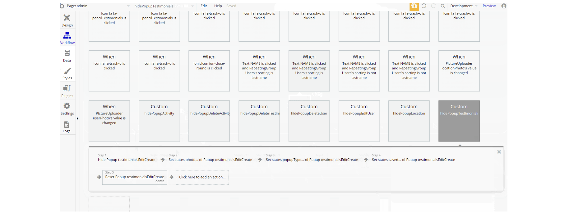
Most of the workflow actions on this page were created for showing different and hiding elements on-page also actions working with data (modifying and saving values inside Popular Locations, Activity, User database types).
Other actions include actions related to set state values for elements in the custom events, and actions for navigation to index page within the template.
becomeaninstructor
This page is where a user (instructor type) can create a listing for offering a service to other users.
It takes required details like the user's headline, activity (user's specialization), additional information about the activity, location, tags (dynamic keywords to filter user activity in a search), cover image, refund policy, and pricing.
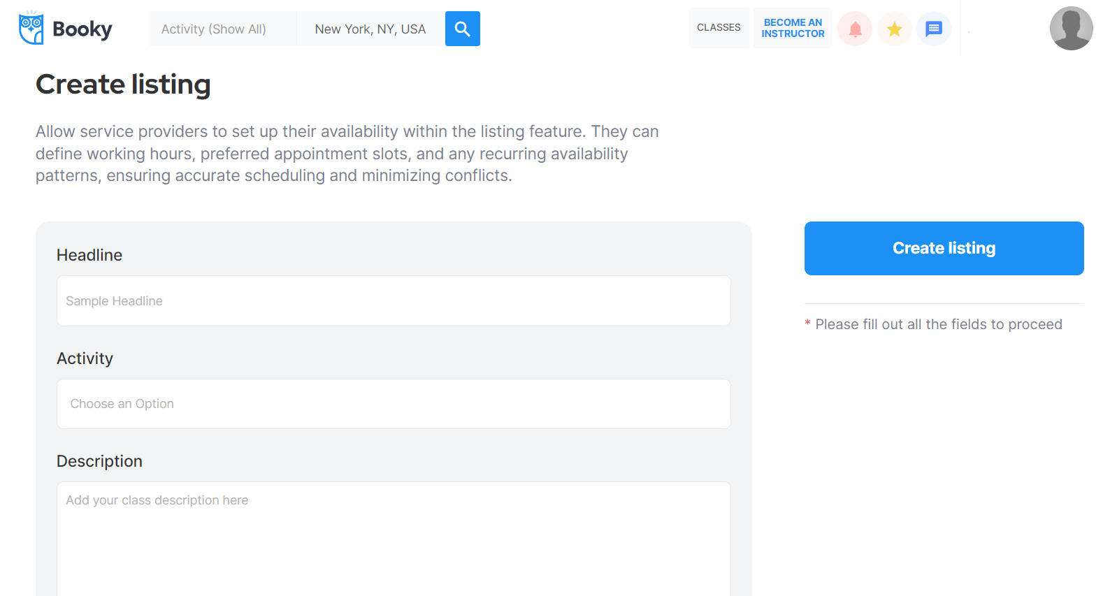
The design of this page consists of main Group containers "Group Heading" and "Group Create Listing" which contains one text element "Text Become an Instructor" that is used a title and "Group General Content".
The "Group General Content" is used to hold other groups and elements on the page. There is a hidden 🙈 group on page load, "Group Alert" which has conditional and evaluates if the current user's seller stripe account id is empty when this group is visible if it is not empty the group is visible.
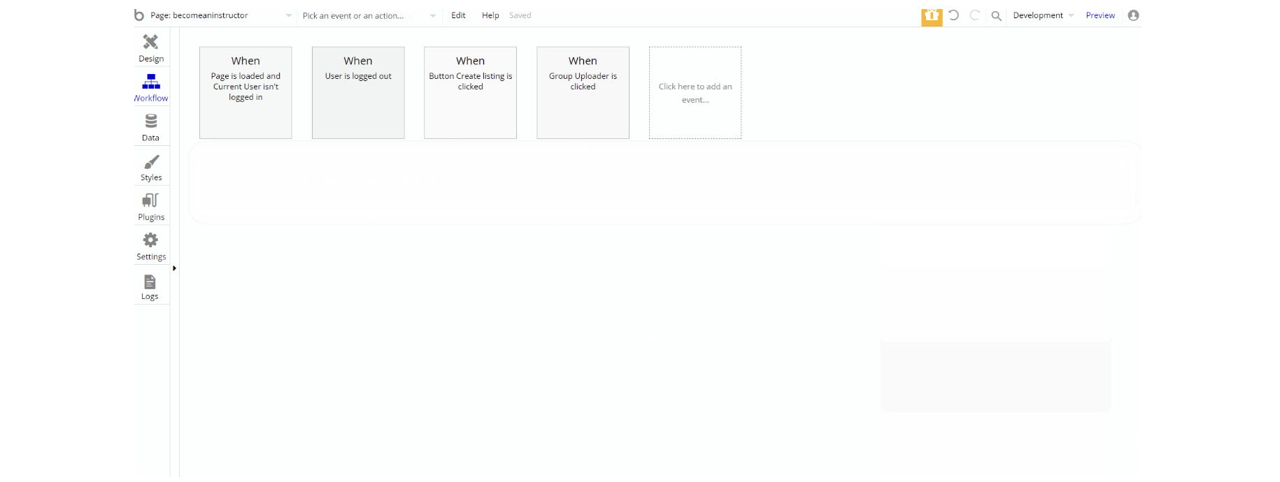
The workflow actions on this page were created for navigation to pages within the template and also combine actions working with data, by modifying value inside database type User and creating Listing data.
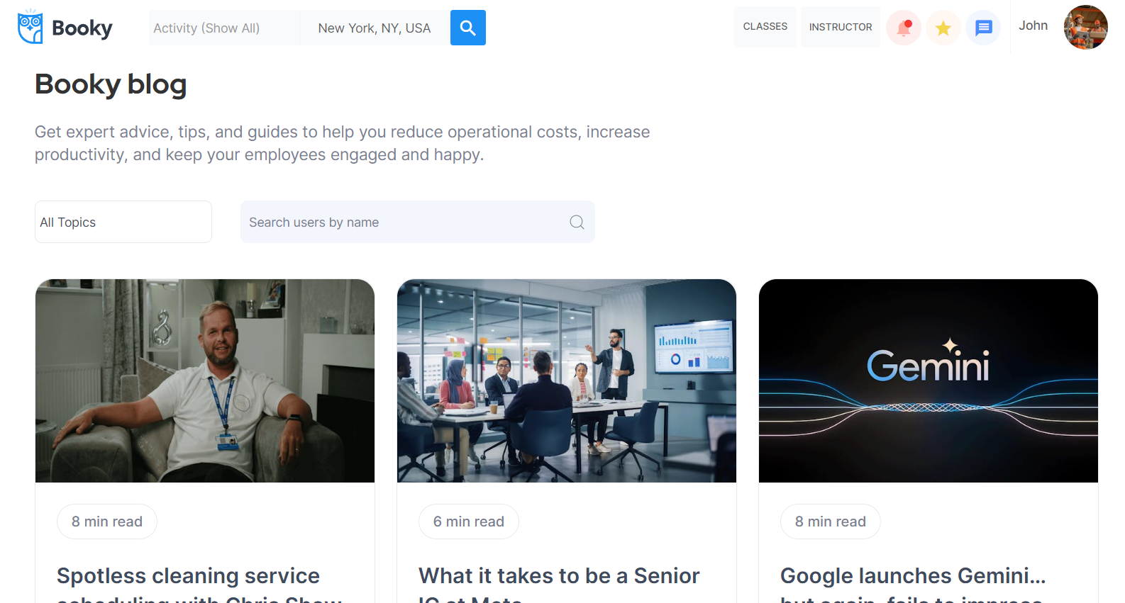
blog
This is the template's blog page that is used to show posts in a list.
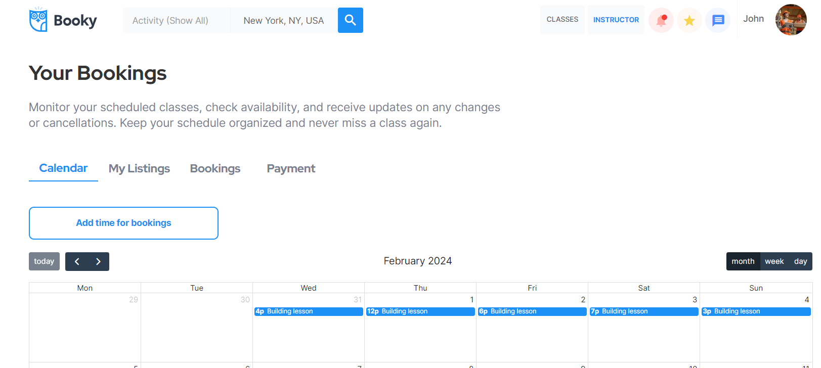
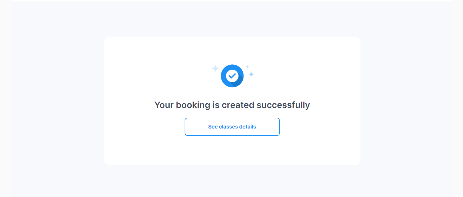
bookings
This is the page where the user's bookings (both upcoming and past) are displayed (Upcoming Classes tab and Previous Bookings tabs).
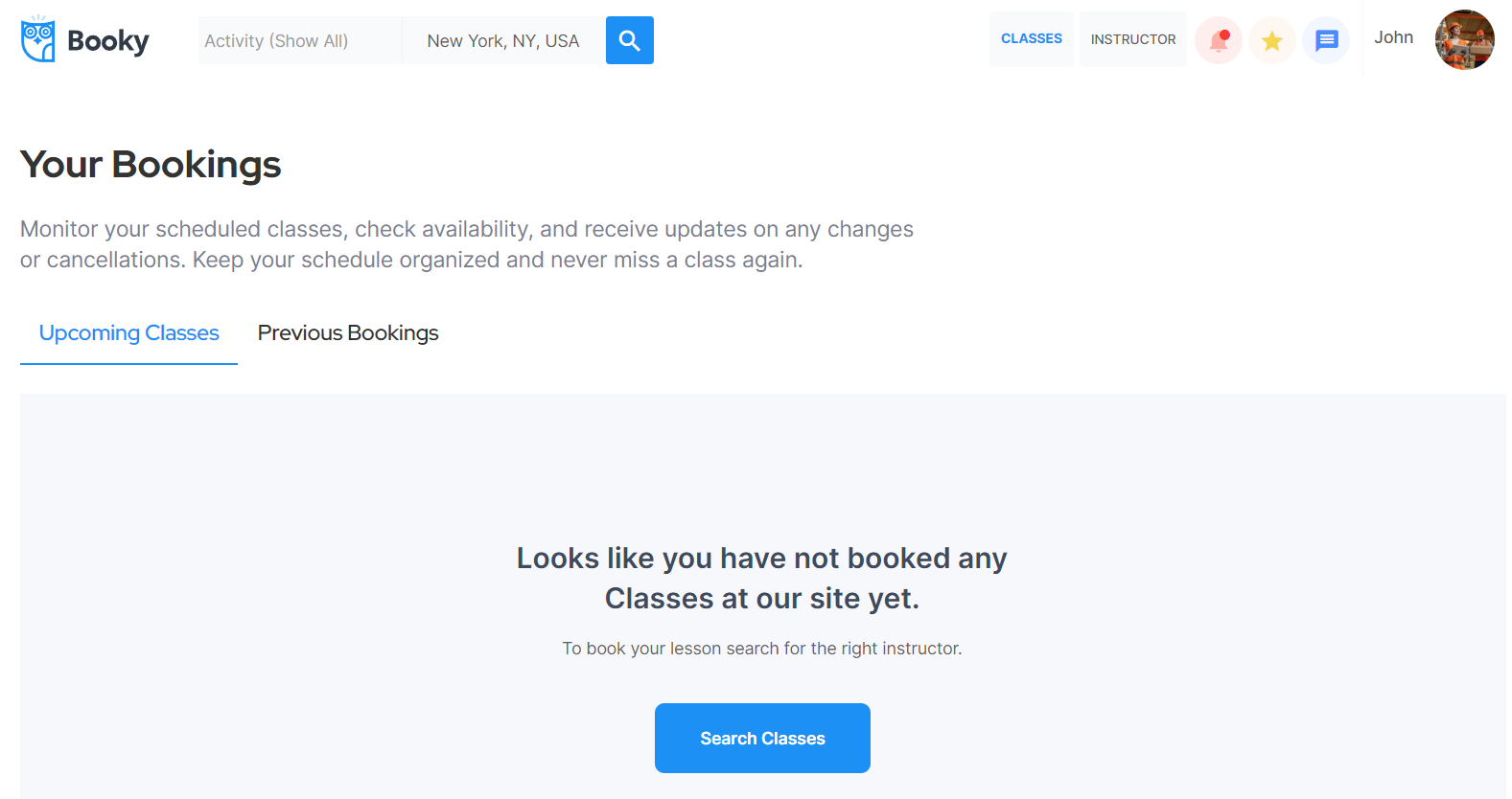
The design of this page consists of the main Group container "Group Booking Lists" which contains the "Group Title Tabs" container that holds groups and text elements for the title section.
Two not-visible groups "Group Upcoming" and "Group Previous" are used to display upcoming and previous bookings data on the page. The page also consists of hidden popup elements that are triggered via actions on the page.
The workflow actions used on this page are: chargings a user using saved CC information 💳, makings changes to the user, adding new object entries in the database for user, review, booking, notificationobj and transaction data types, and additional actions for showing and hiding elements on-page when the user clicks on one element or another.
On this page there is the action workflow for refunding process using Custom API Connection - Stripe custom create a refund.
contact
This page contains a request or an inquiry form that the user can complete and uses the details like the user's name, the user's email, subject of the message, and the message itself.
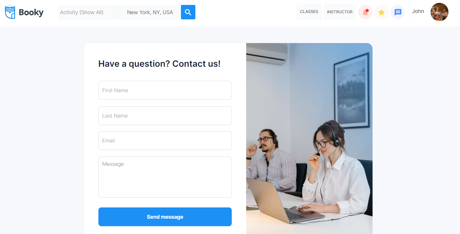
The design of this page consists of the main Group container "Group Contact" which contains input and other elements for the page. Also, there is a "Popup successfully sent" not visible on page load. The Footer and header reusable elements are also part of the page design.
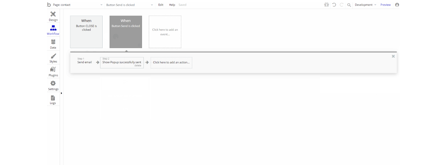
The workflow actions on this page were created for showing different and hiding elements on-page when the user clicks, a standard Send Email action is also used.
help
This page is used to display help information to assist instructor users or student users with any questions they have.
Note: This page is not filled with content but rather has placeholder elements. It can be customized to any style and content.
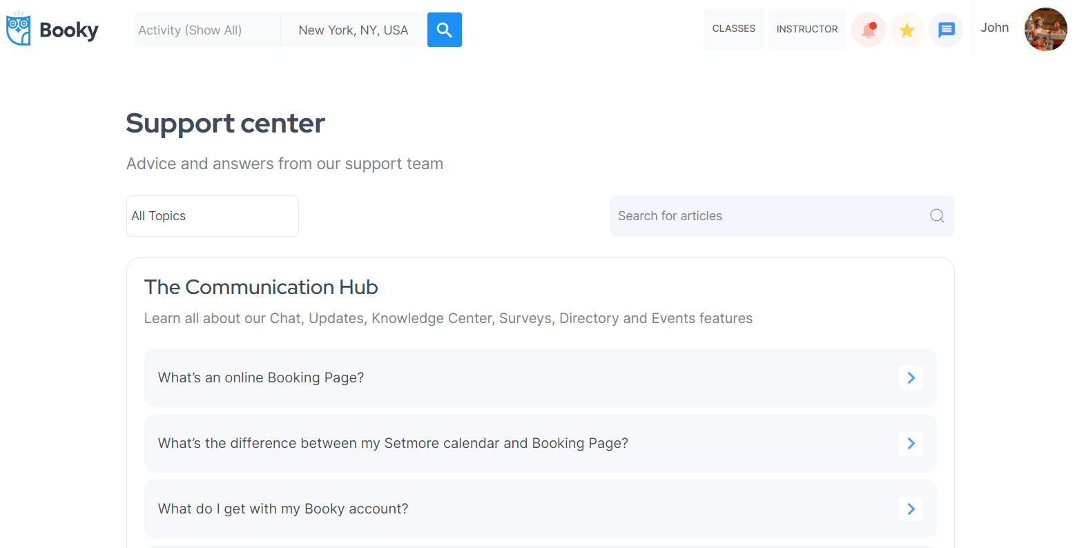
The design of this page consists of the main Group container "Group Support" which contains text and group elements for the page. Also, there is a "FloatingGroup Left Menu" which holds Group elements "Group Help" and "Group FAQ".
The Footer and header reusable elements are also part of the page design.
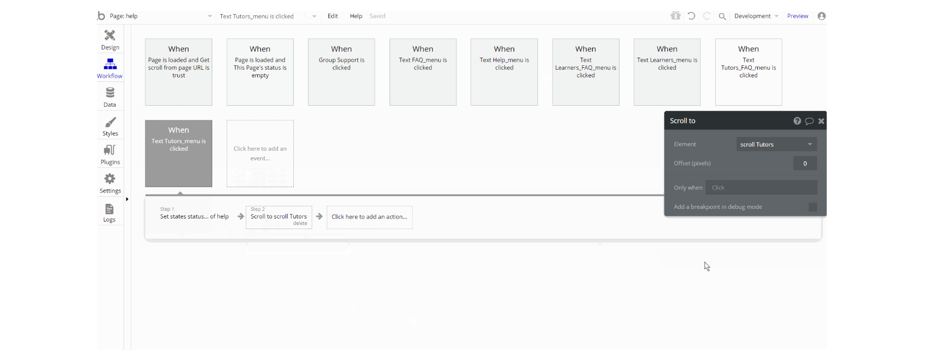
The workflow actions used on this page are: set state of an element and scroll to an element, to display different sections of the page.
inbox
The page is used to display the conversations between users. When the user has an incoming message, the body of the message and its date are displayed. If the user has no messages, this page is empty (just a placeholder is displayed).
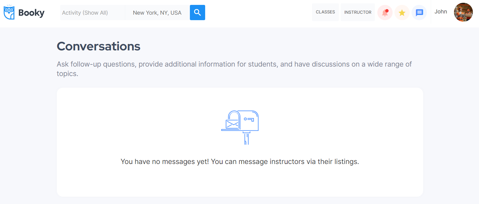
The design of this page consists of the main Group containers "Group No inbox messages" and "Group Message Display" which is a hidden group on page load with conditions when it is visible. These groups contain most text and group elements for the page.
Also, there is a text element "My ConversationLeft Menu" which serves as a title, and a hidden popup with an input form to write a review "Popup Leave review".
The Footer and header reusable elements are also part of the page design.
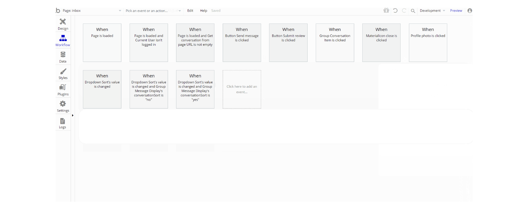
The workflow actions used on this page are: makings changes to the user, listing and messages adding new object entries in the database for messages and reviewdata types, and additional actions for showing and scrolling to an element, on-page when the user clicks on an element. Set state of an element is used to show this element on the page.
instructor_profile
This page is used by the instructors to check the calendar of upcoming and ongoing bookings, create new listings, edit the existing ones and set up the Stripe account on the platform.
It has four tabs: Calendar, My listings, Bookings, and Payment to interact with each of the instructor's features.
The design of this page consists of the main Group container "Group Instructor Main" which contains all of the group elements, texts, buttons, etc. for the page.
Also, the page consists of hidden popup elements: "Popup Edit Listing", "Popup Cancel booking", "Popup Booking" and "Popup Alert to Remove". The Footer and header reusable elements are also part of the page design.
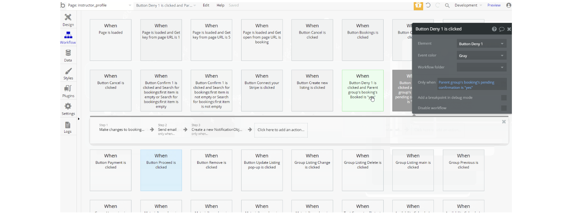
The workflow actions used on this page are: makings changes to the booking, calendar, user and messages adding new object entries in the database for notificationobj and calendardata types. Set state of a group element is used to show this element on the page, with and additional actions for showing and hiding an element, on-page when the user clicks on an element.
For a user to become a seller on the platform there is a stripe action - Register the user as a seller. On this page there is the action workflow for refunding process using Custom API Connection - Stripe custom create a refund. Navigation to other pages is done using Go to page action.
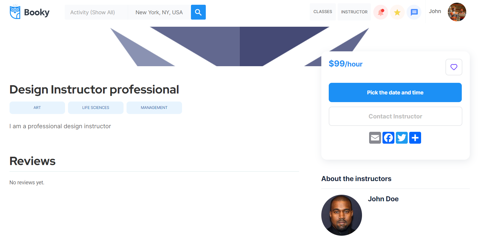
listing
This page contains information about a particular listing. It includes listing price, listing date (to set/book the date for the appointment calendar view 🗓 is used), instructor's location, the reviews for that listing, and options to contact the instructor or report the listing.
In addition to this, the listing page provides social media share links for users to publish listings on social media.
The workflow actions used on this page are: makings changes to the listing, conversations, user and messages adding new object entries in the database for messages, conversation,notificationobj and bookingtypes.
Set state of a group element is used to show this element on the page, with and additional actions for showing and hiding an element, on-page when the user clicks on an element.
Navigation to other pages is done using Go to page action and there is standard Send email action for email notifications about the listing.
profile
This page showcases details about the user and provides options for a user to edit those details for the current user. If a user is not a current user, the page offers the possibility to see another user's profile details or send a message.
On this page, users can also check the notifications about confirmed or canceled bookings.
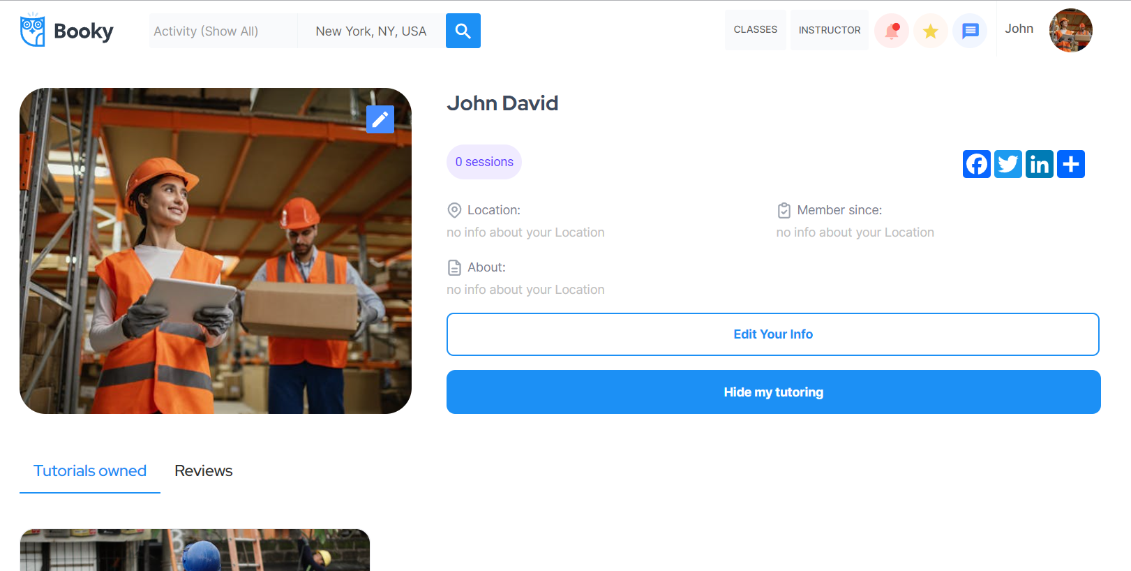
The design of this page consists of the main Group container "Group Profile" which contains all of the group elements, texts, buttons, etc. with content for the page. The "Group notifications" is a hidden group used to show notifications about bookings and is visible when the page receives a parameter in URL: open = notifications.
Also, the page consists of hidden popup elements: "Popup Edit Profile", and "Popup Send Message".
The Footer and header reusable elements are also part of the page design.
The workflow actions used on this page are: makings changes to the user , adding new object entries in the database for messages, conversation and delete a thing - notificationobj.
Set state of a group element is used to show this element on the page, with and additional actions for showing and hiding an element, on-page when the user clicks on an element.
profile_for_signup
This page is used for the profile signup process using email and password. Here users can find a welcome message and start exploring the platform by either finding an instructor or becoming one.
Also, edit basic profile details like profile image, location, and description.
The design of this page consists of the main Group container "Group Tutor Main" which contains all of the group elements, texts, buttons, etc. with content for the page.
The "Group Tutor Main" contains the hidden group "Group with listings" and is visible when the list of listings count is not 0.
Also, the page consists of a hidden popup element: "Popup Edit Profile" with input and button elements to edit profile details.
The Footer and header reusable elements are also part of the page design.
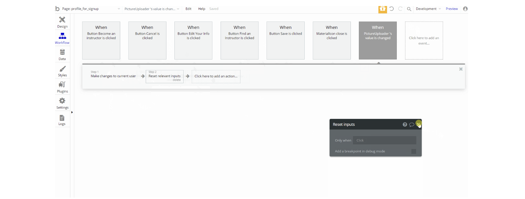
The workflow actions used on this page are: makings changes to the user , additional actions for showing and hiding an element, on-page when the user clicks on an element.
search
This is a page where search 🔍 results are displayed. Here user can make another search if needed using search filters: subject type of the service, the location, and the price range.
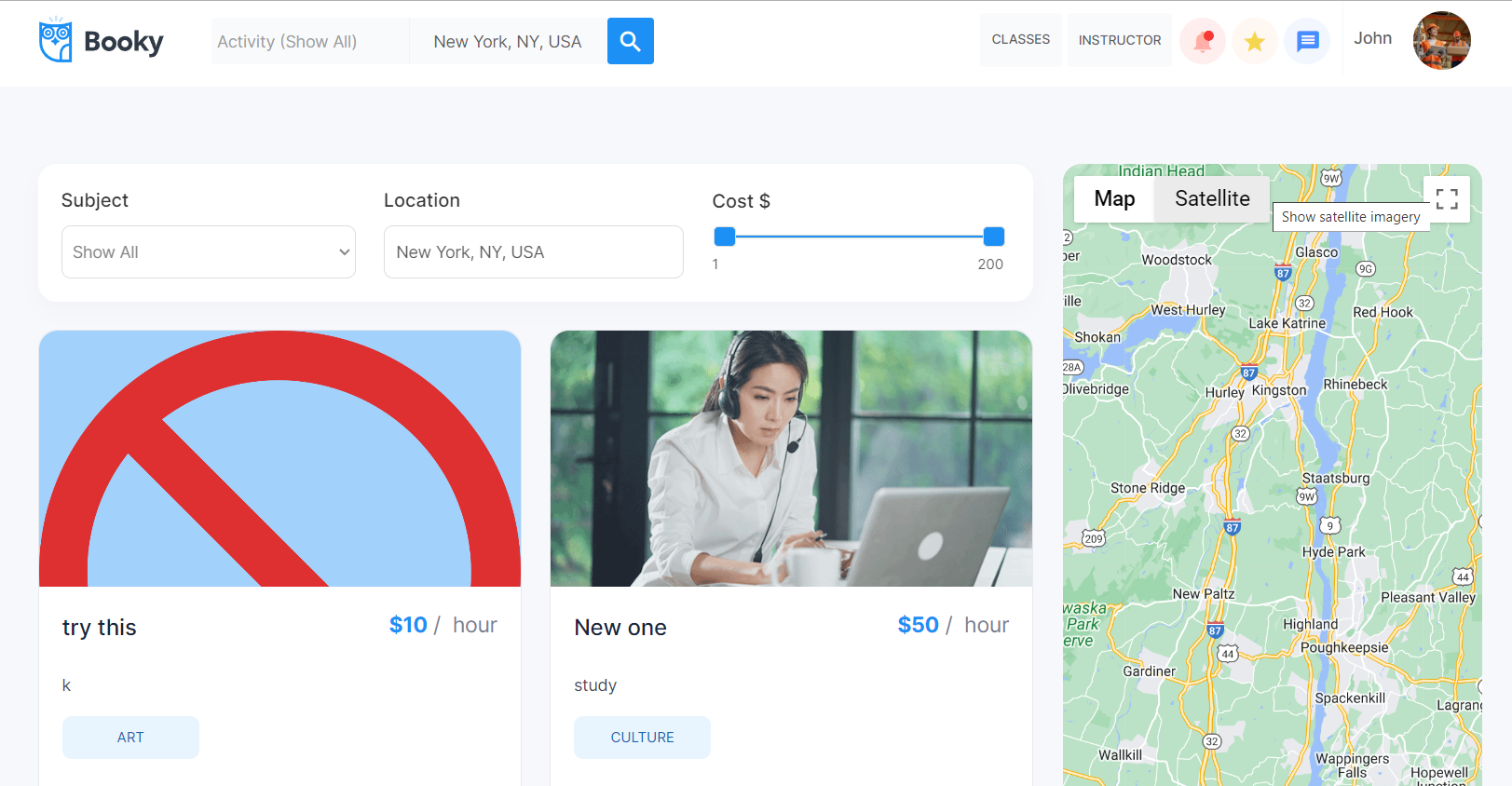
The design of this page consists of the main Group container "Group General Content" which contains all of the group elements, texts, buttons, etc. with listings, and content for the page. The "Group Map" contains the map element. The Footer and header reusable elements are also part of the page design.
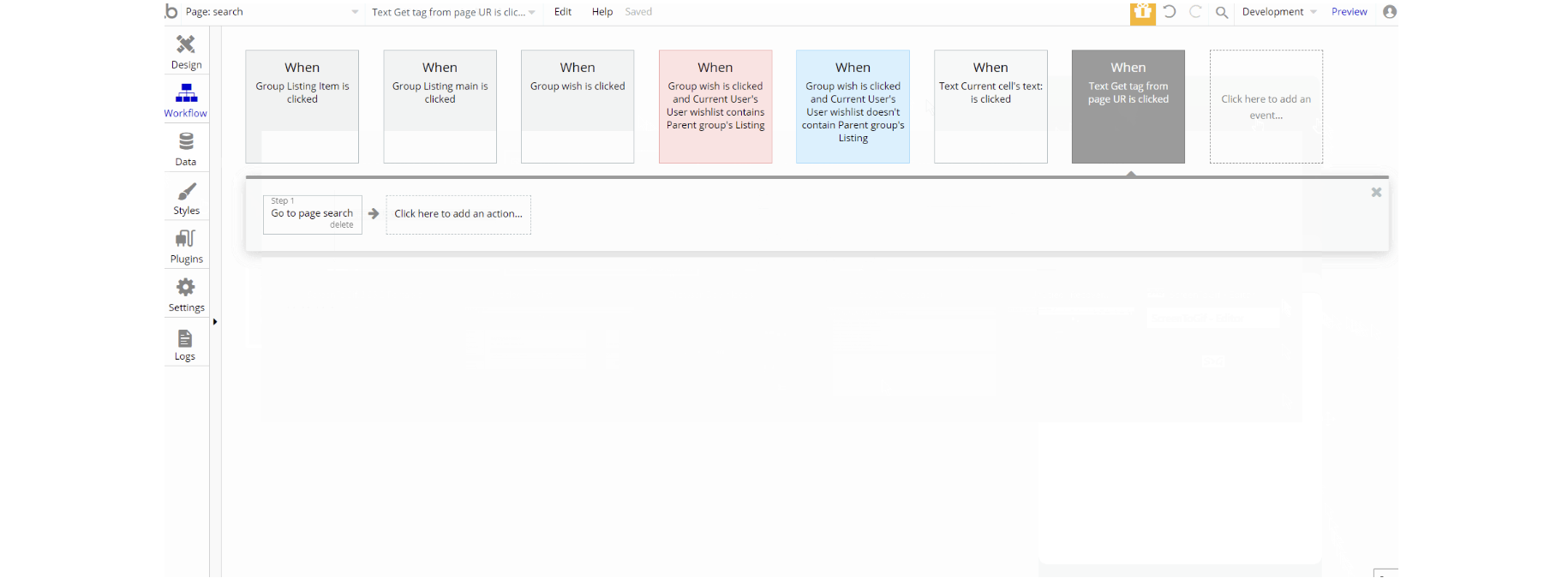
The workflow actions used on this page are mostly navigation to other pages using Go to page action. Also adding a listing to a wishlist by making changes to current user.
settings
This page is for user preferences and has two tabs: payment and notifications. The payment tab provides the user the option to add credit card details and connect Stripe accounts (for instructors).
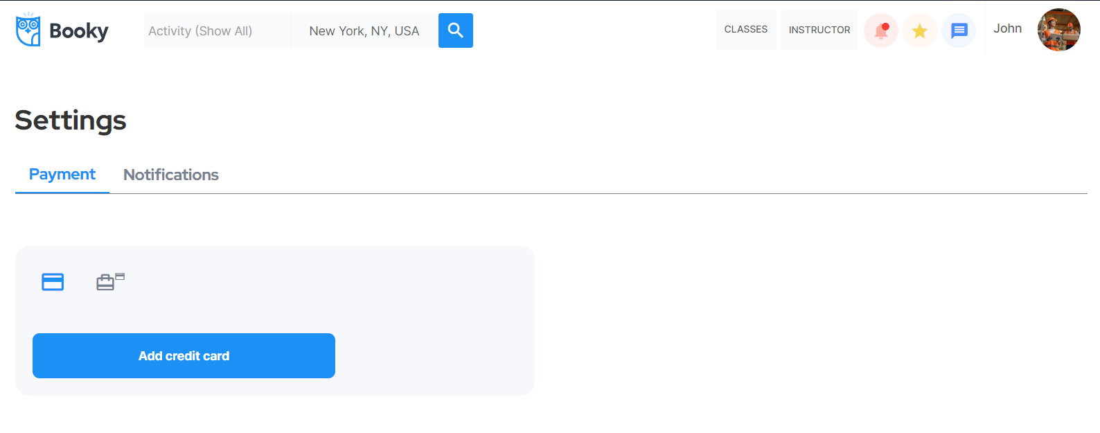
The notifications tab allows the user to determine how he wants to receive notifications (email or in-app). By default, both types of notifications are on.
Tip: Initially, your design elements might be hidden in your editor.
Here is how to unhide 👀 them:
The design of this page consists of the main Group container "Group User ID" which contains all of the group elements, texts, buttons, etc. on the page. The "Group User ID" contains hidden groups "Group User" "Group Payment" and "Group Notification" which are visible depending on the User ID state value.
The Footer and header reusable elements are also part of the page design.
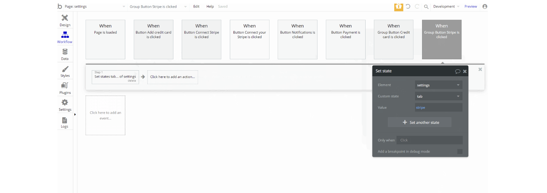
The workflow actions used on this page are: makings changes to the user and list of listings. Set state actions used for showing elements on-page.
Navigation to other pages is done using Go to page action and there is register a seller action for connecting Stripe seller.
signup
This page provides the user options to signup or login with an email and password, and also sign in with Facebook or Google.
Tip: This page contains demo logins actions. Check the setup guide on how to remove demo login buttons.
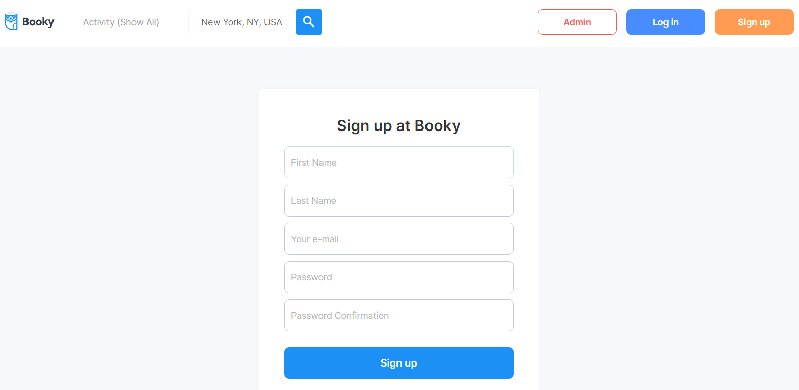
The design of this page consists of the main Group container "Group Log in" which contains group elements, texts, buttons, used to login to the application.
The "Group Signup" is not visible on page load and is visible when the page receives a parameter in URL: key = signup.
Also, the page consists of a hidden popup element: "Popup Reset Password" with input and button elements to send a password to reset email.
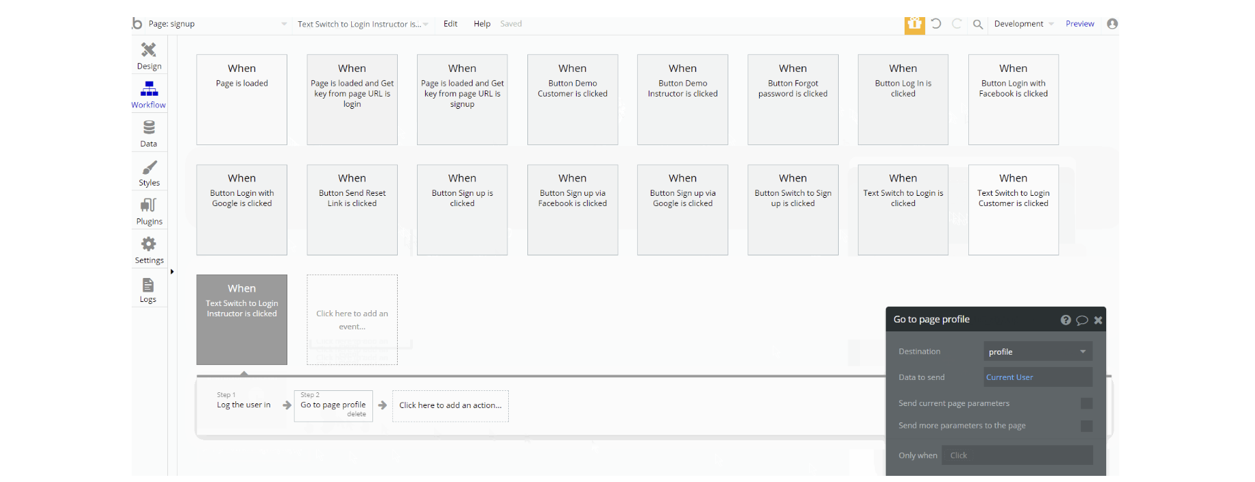
The workflow actions used on this page are making changes to the user. Set state of a group element is used to show this element on the page, with and additional actions for showing and hiding an element, on-page when the user clicks on an element.
Navigation to other pages is done using Go to page action. Also for Signup / Login with Social Network and Signup or Login the user.
success
A simple page that can be used as a welcome page after successful user registration or booking. Currently, it is not used in the template (but you have to configure it in workflows first).
Note: This page is not filled with content but rather has placeholder elements. It can be customized to any style and content.
The design of this page consists of the main Group container "Group Content" which contains group elements, texts, buttons, etc. used to display information.
There are no element workflows for this page.
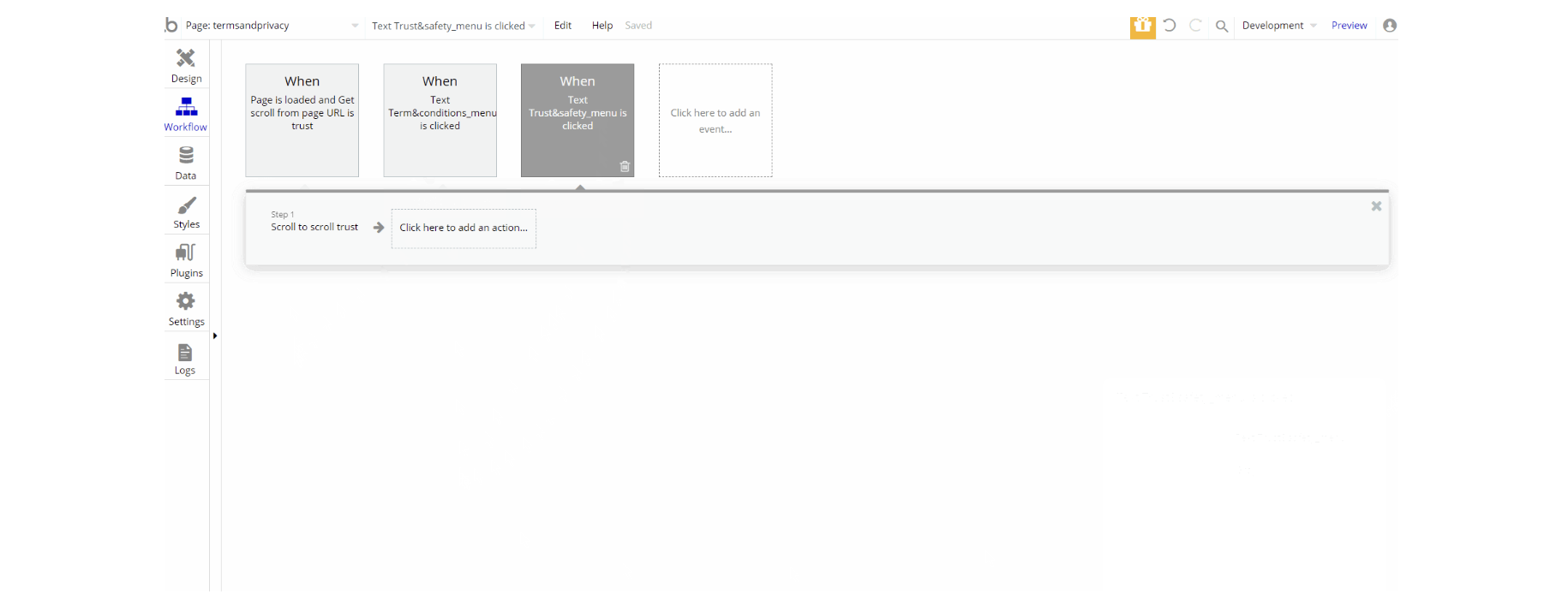
termsandprivacy
This is the page where users see the agreement act between both sides: the company that has the web application and users who access the web application.
The page is also where users see the legal statement that specifies how the company manages the collected user data.
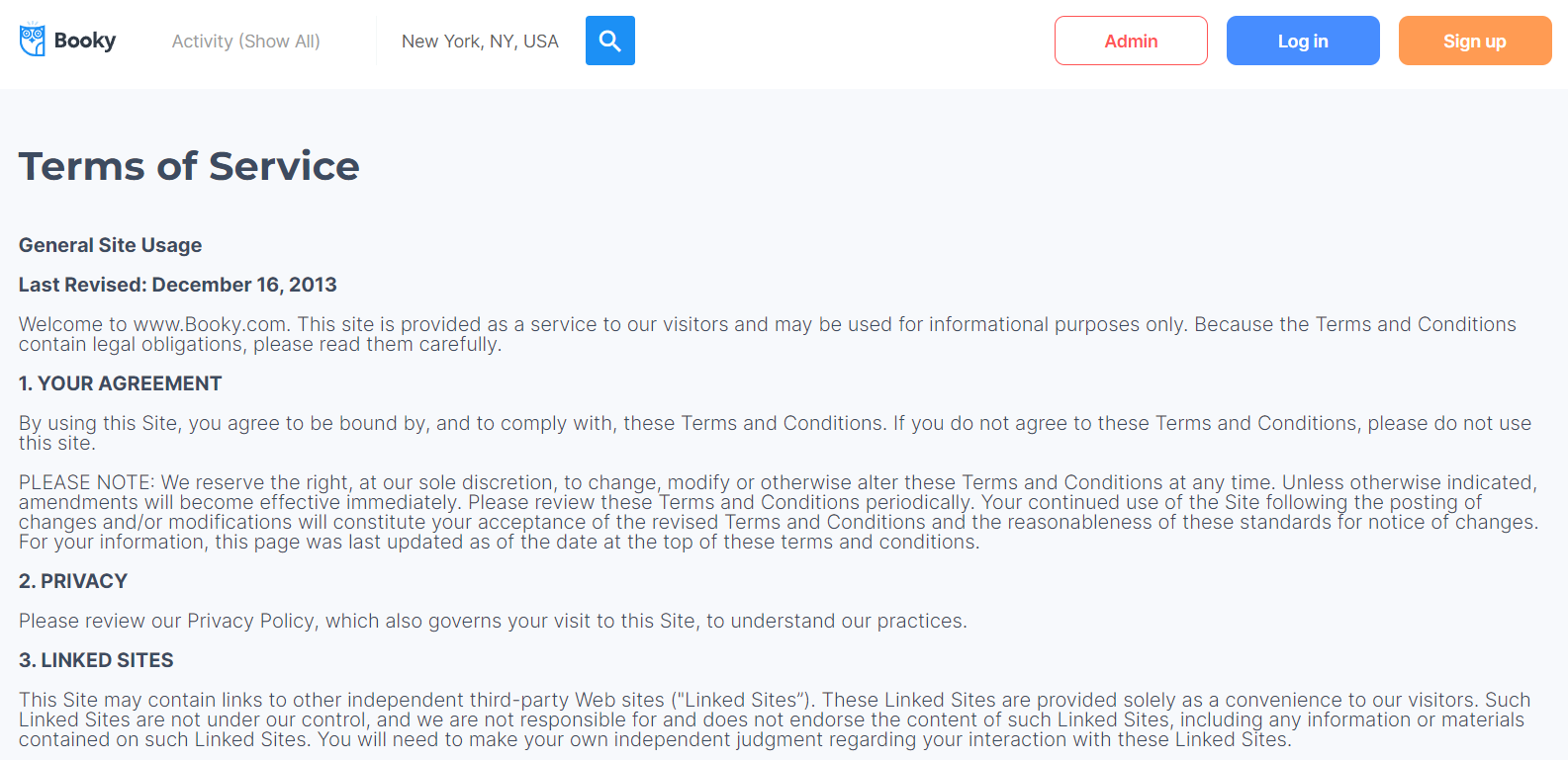
The design of this page consists of the Group containers "Group Terms" and "Group Trust" which contain group elements, text elements. The page also uses the "Shape element" to scroll to the respective section.
Tip: The text on this page is a placeholder and should be modified according to your own privacy policy and terms of service.
Tip: Also, make sure you have Privacy page in your app. This will help you go through App Store and Google Play approval procedures, in case you decide to convert your Bubble app into native iOS and Android apps. These links are also important for Facebook login.
wish_list
This page is used for users to check their saved listings ❤ and/or remove a listing from the wishlist.
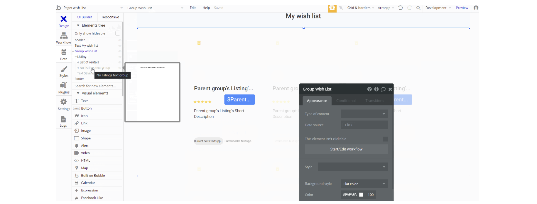
The design of this page consists of the main Group container "Group Wish List" which contains group elements, texts, repeating groups, etc. used to display information.
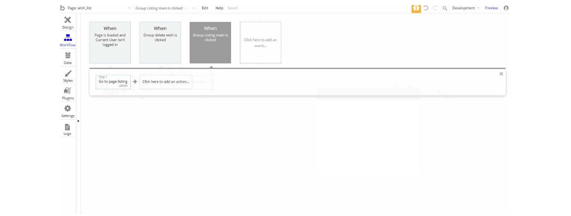
The workflow actions used on this page are: makings changes to the user. Navigation to other pages is done using Go to page action.
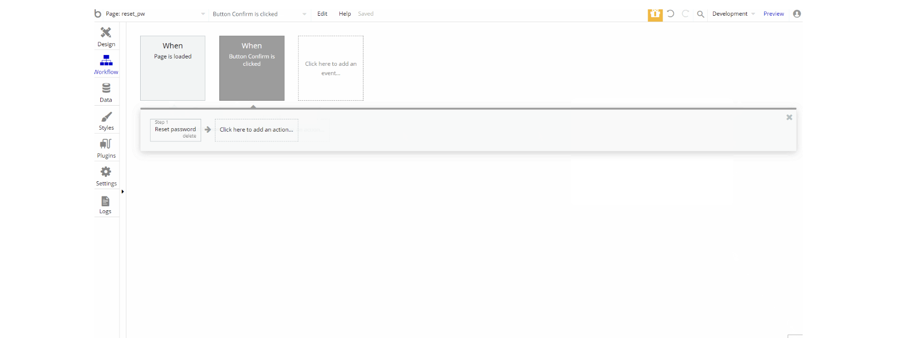
reset_pw
This page is for resetting the password.
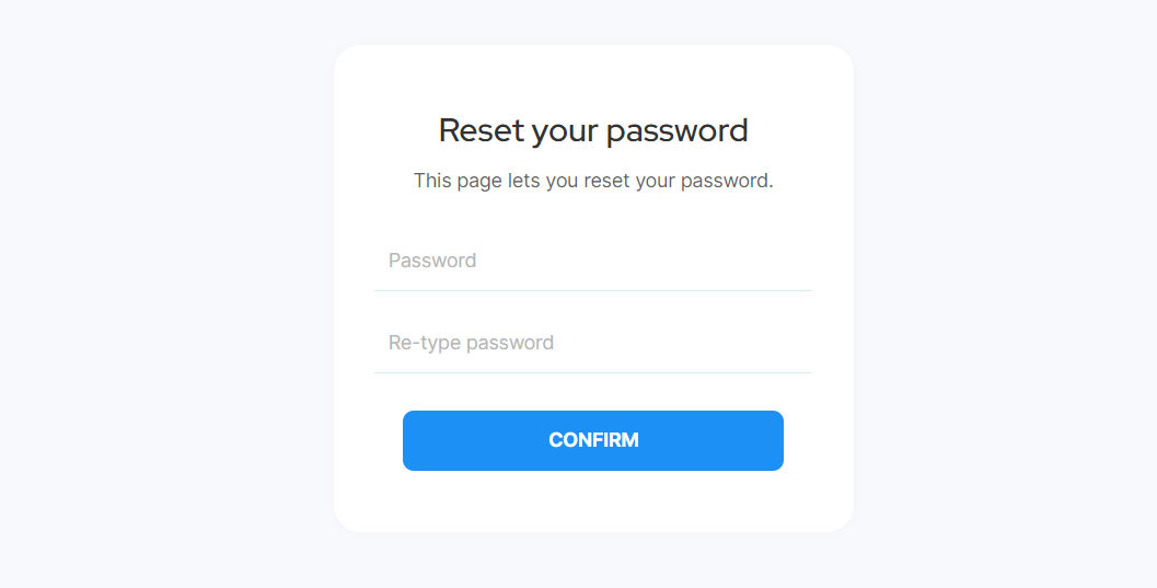
The design for this page consists of the main group "Group Content" which has a form for resetting the password using different elements inside the container alongside components like header and Footer reusable elements on-page.
404
This is a custom-designed page for 404 redirect errors, informing a user that the web page he or she is looking for cannot be found.
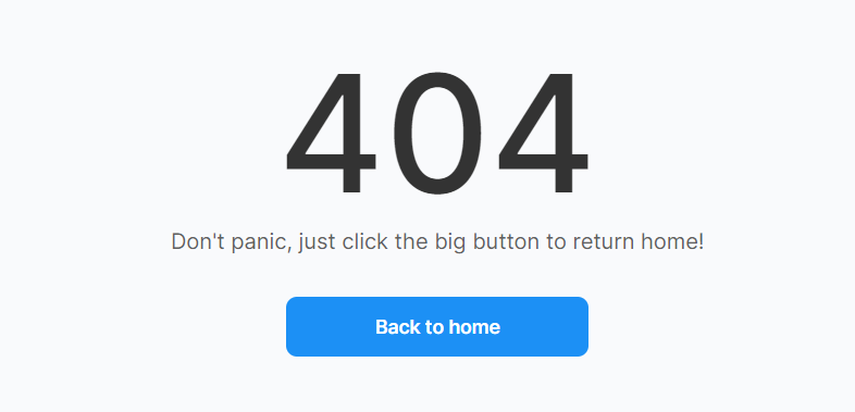
The design for this page consists of the main "Group 404 Content", alongside components like Header and Footer reusable elements on-page.
The main container holds the rest of the content which is roughly text elements and back a button element.
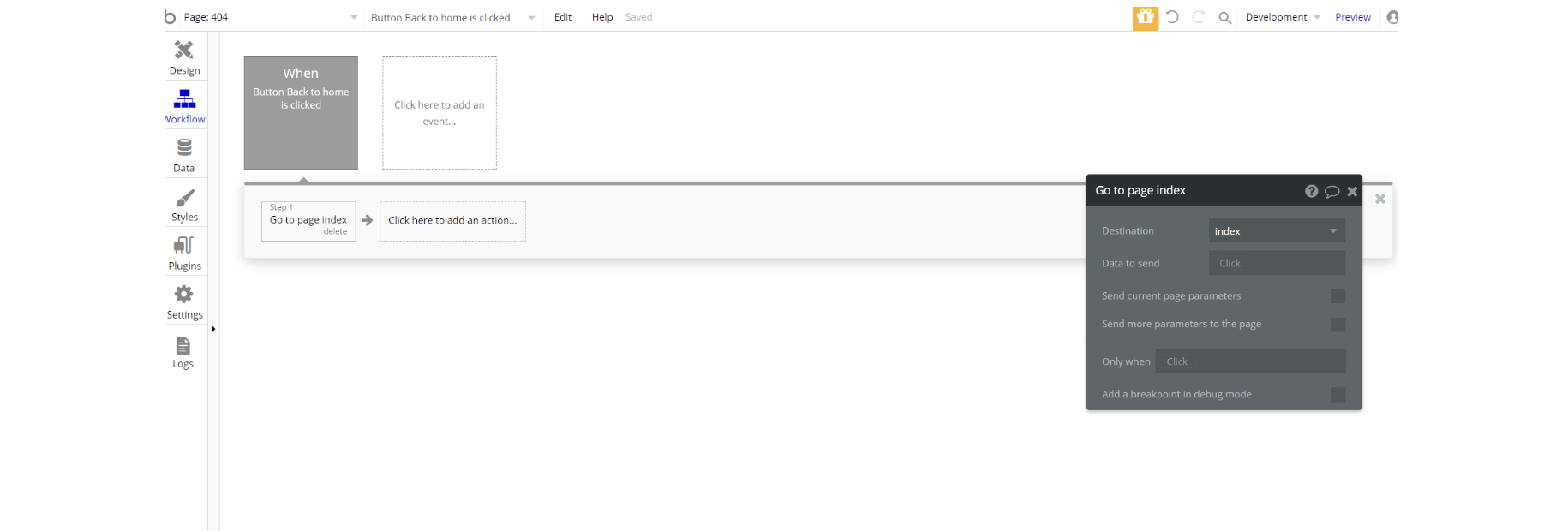
The workflow for this page is set only on a button action to navigate to a page on a button click event.