This section states the purpose of each page.
Introduction
In this summary, we will describe each page and its content. The Page Element is the fundamental one that contains all the other elements.
Tip: See Bubble Reference for more information about Pages element https://bubble.io/reference#Elements.Page 🙂
Pages
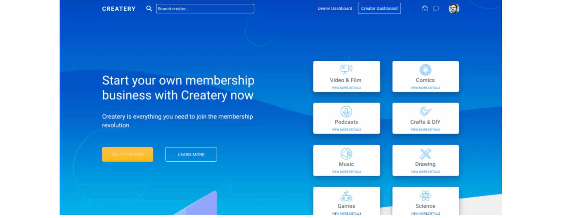
index
This is the main page typically encountered first on the web app that usually contains links to the other pages of the site. A homepage includes a variety of menus that make it easy for users to find the information they need.
Here, users see the landing page with top tier categories, reviews, as well as call to action buttons to start a membership.
Tip: Users with
blocked? = yes status will not be able to access the home page. This can be managed by admin users on the admin page.The listed categories on the top of the page are simply pulled from the
Category object: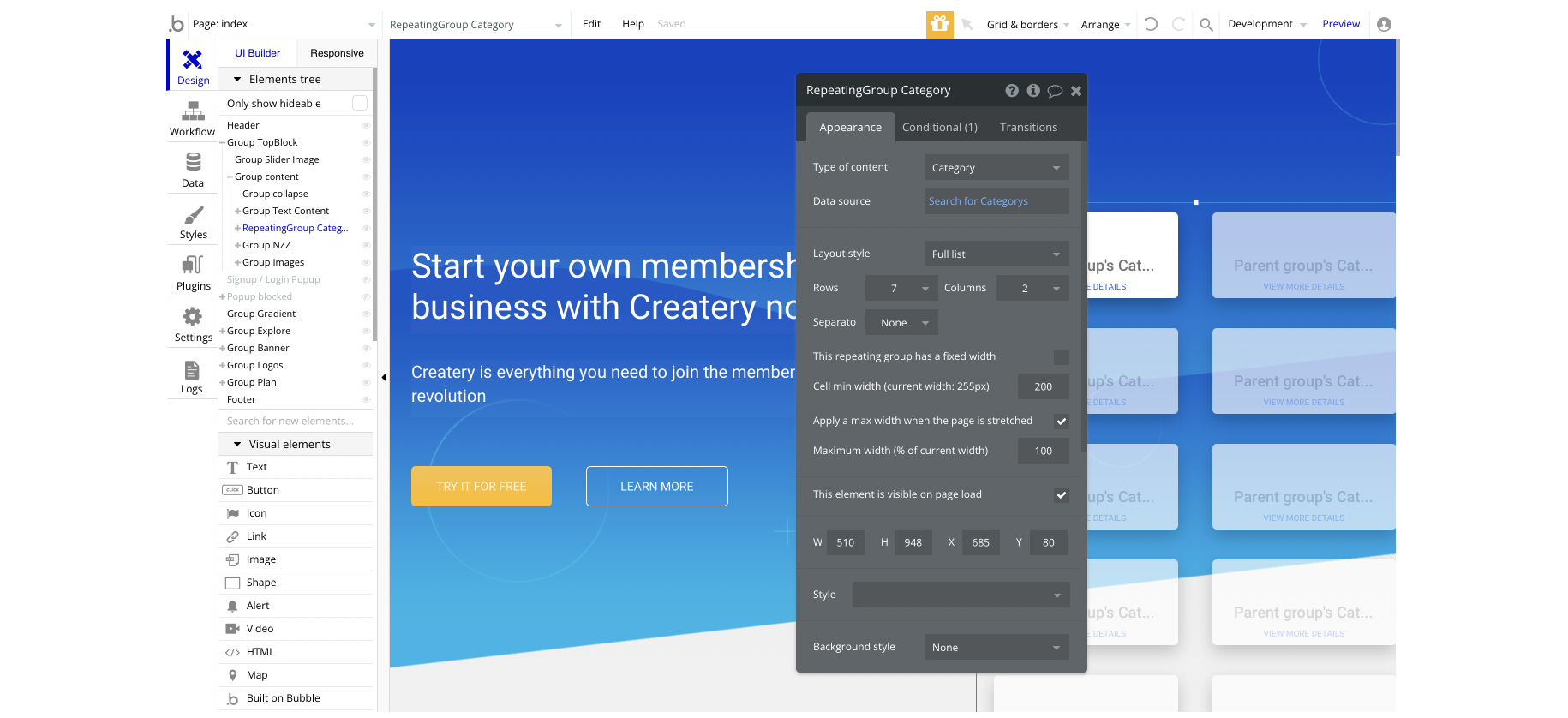
The call-to-action button "TRY IT FOR FREE" is redirecting to the
admin-page and sends the Current User's Creator object: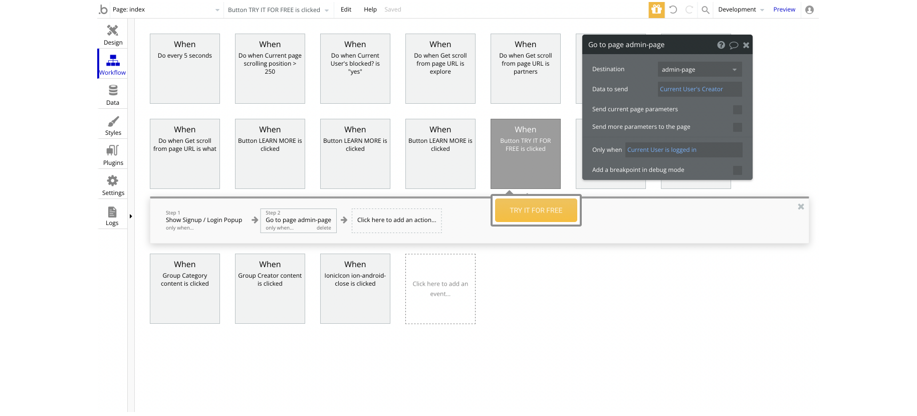
admin
This page is designed to manage platform data, e.g. Users, Items, Payments… and others. Only users with admin rights are able to access this page (in read-only mode), and those users who have access rights can edit or delete anything here.
Here, this page is for the owner of the app where the platform commission can be set. It also contains a chart for payments and a list of app users. The users list can be edited.
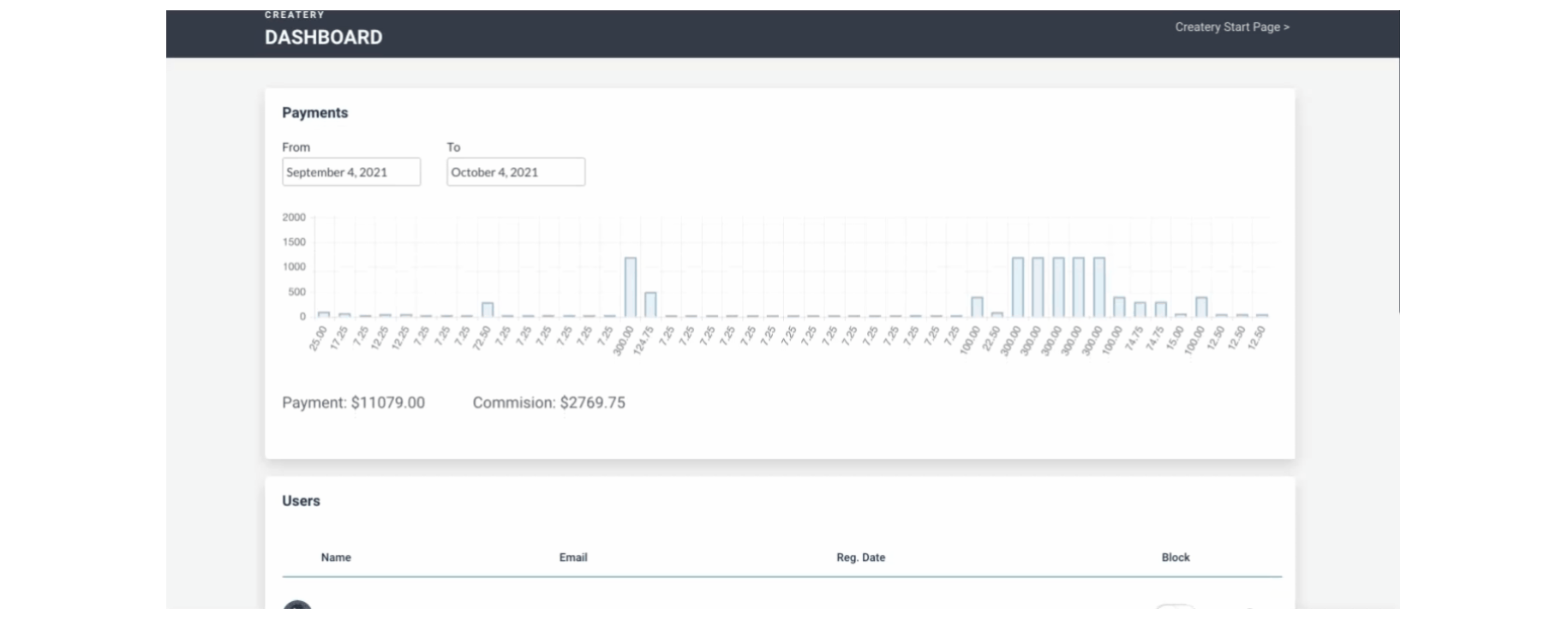
Tip: The platform commission can be set here.
To block users, this template is using the Ionic Toggle element from a free plugin called Ionic Elements. This toggle is named "IonicToggle A" and can be found here:
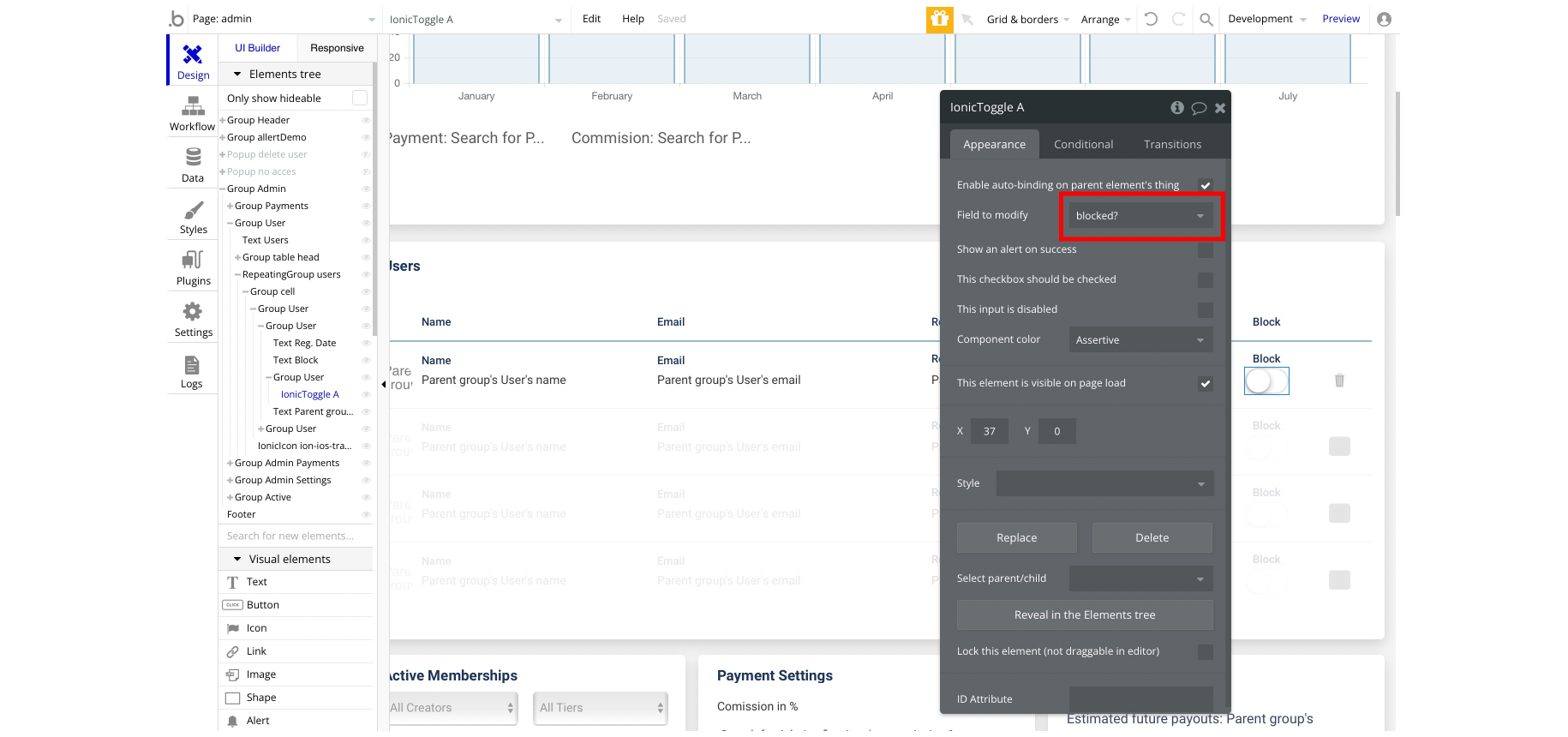
admin-page
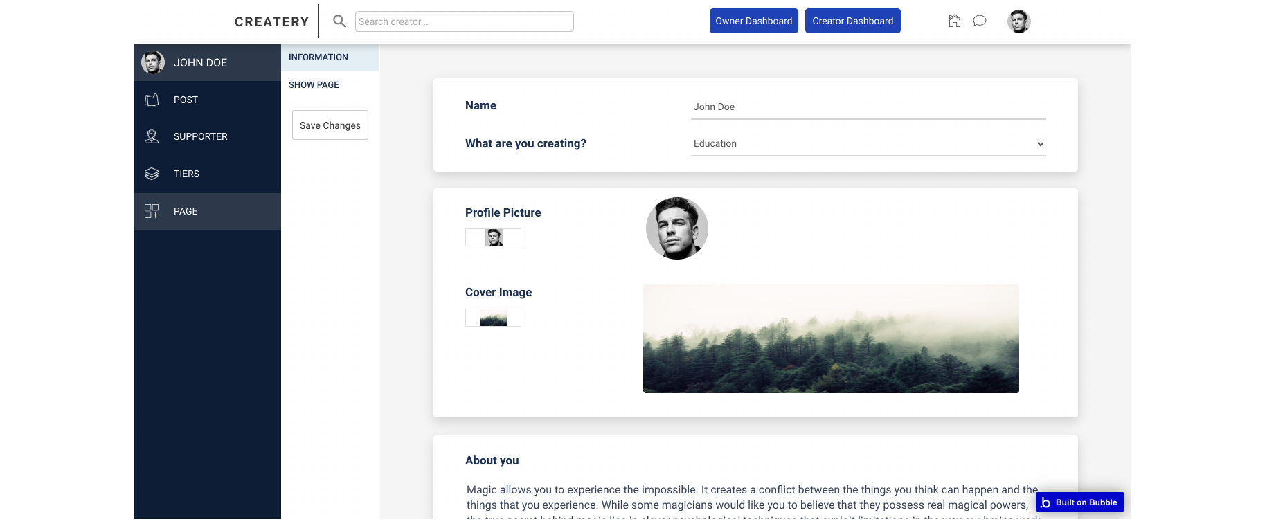
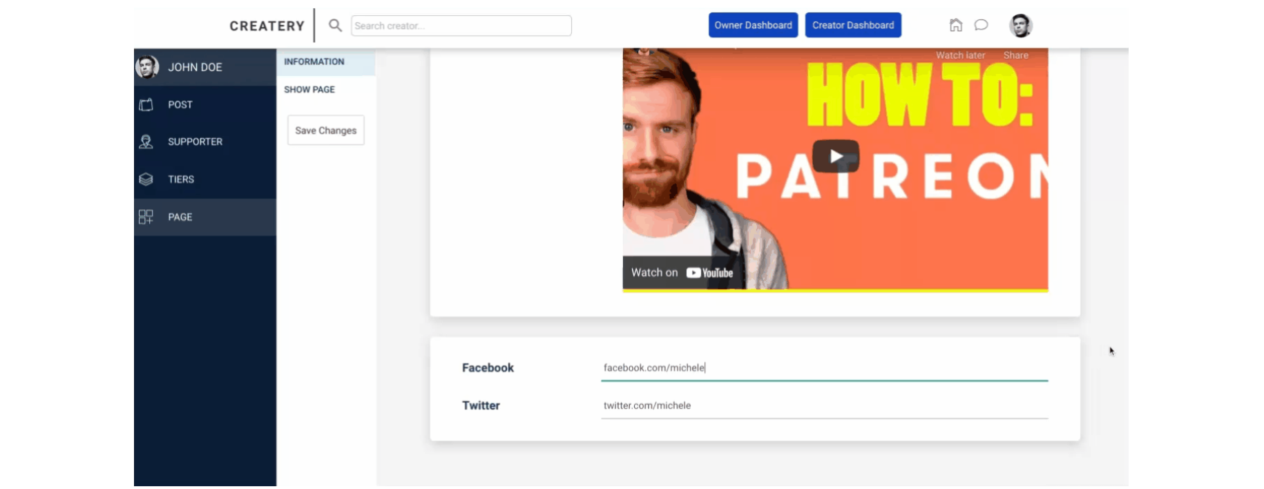
This is the page for editing the profile page of the creator. Here, creators are able to manage multiple tabs: Post, Supporter, Tiers and Page.
Post
Tip: When users click on the "POST" tab, they are actually redirected to the
admin-post page.Supporter
Tip: When users click on the "SUPPORTER" tab, they are actually redirected to the
admin-supporter page.Tiers
Tip: When users click on the "TIERS" tab, they are actually redirected to the
admin-tiers_edit page.Page
In this tab, the creators can edit their account information like name, background poster, bio, social links.
admin-post
In this tab, the creators can manage their existing posts or create new ones.
Tip: There are three types of posts a creator can choose: Text, Image and Video.
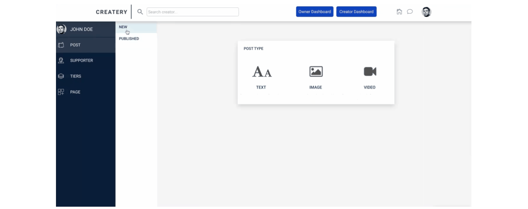
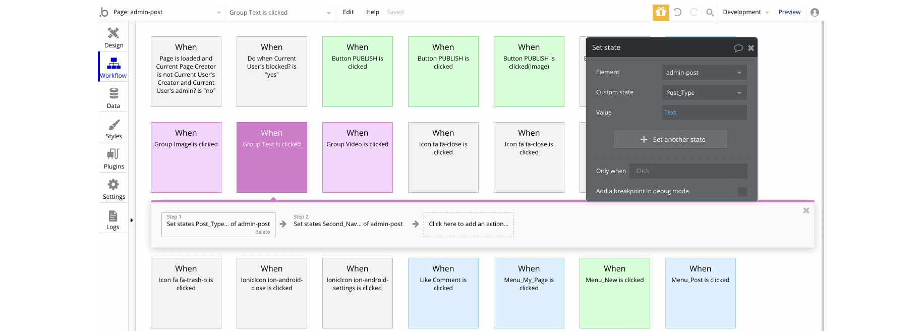
When clicking on one of the post types, the appropriate group will appear based on custom states. So, when the "Group Text" is clicked, the custom state called Post_Type for the page element will get value of Text:
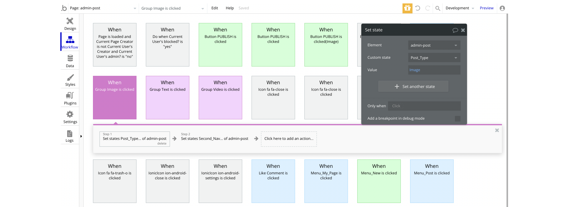
When "Group Image" is clicked, the state value is set to Image:
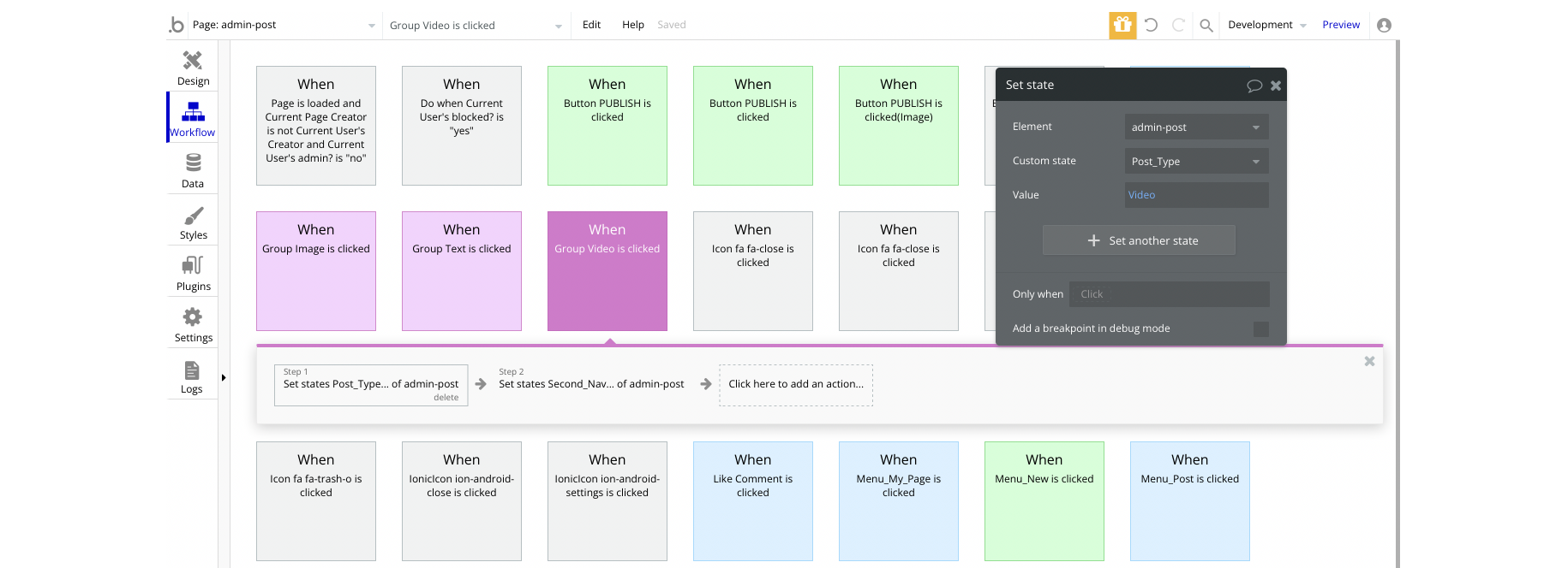
When "Group Video" is clicked, the state value is set to Video:
admin-supporter
This page contains the tier supporters that can be managed.
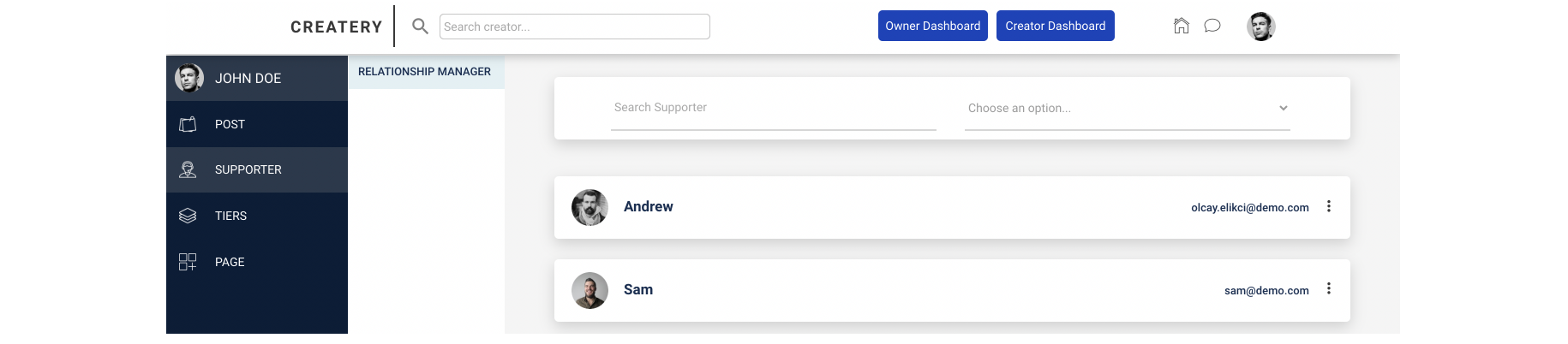
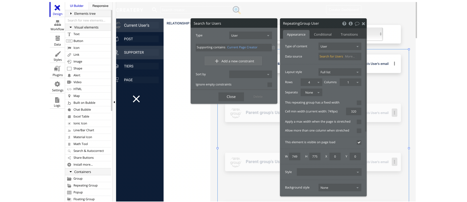
The list of supporters is being pulled from the User object in a simple RepeatingGroup element, but the list is filtered to display the supporting creators only, here:
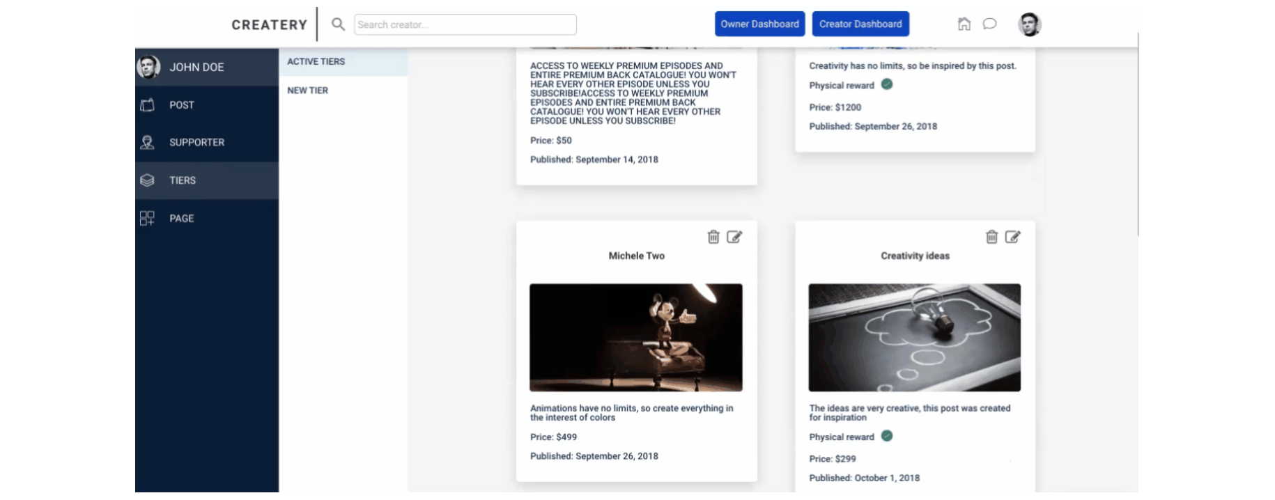
admin-tiers_edit
On this page, the creators can edit their tiers or publish new ones.
chat
This page contains the messaging chat between platform users.
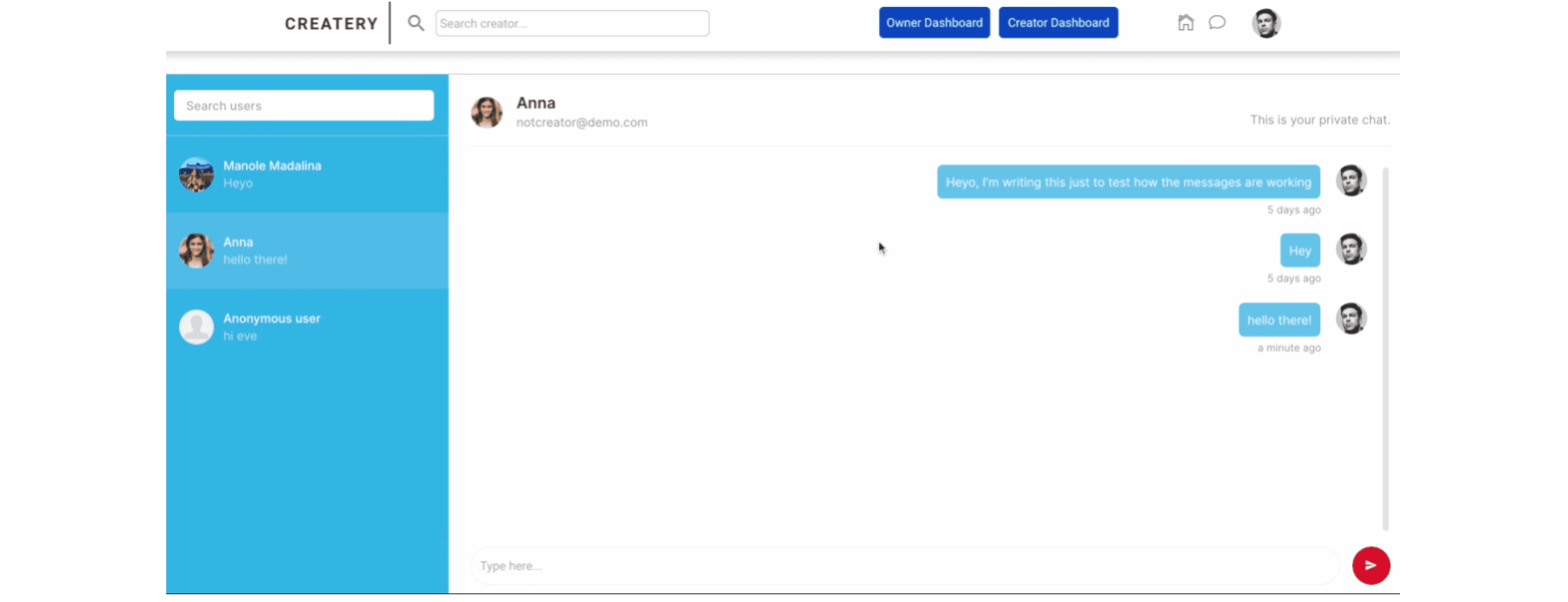
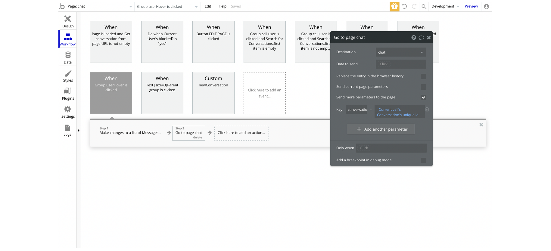
The chat is an actual RepeatingGroup element called "Conversation", where the cell items are
Conversation objects: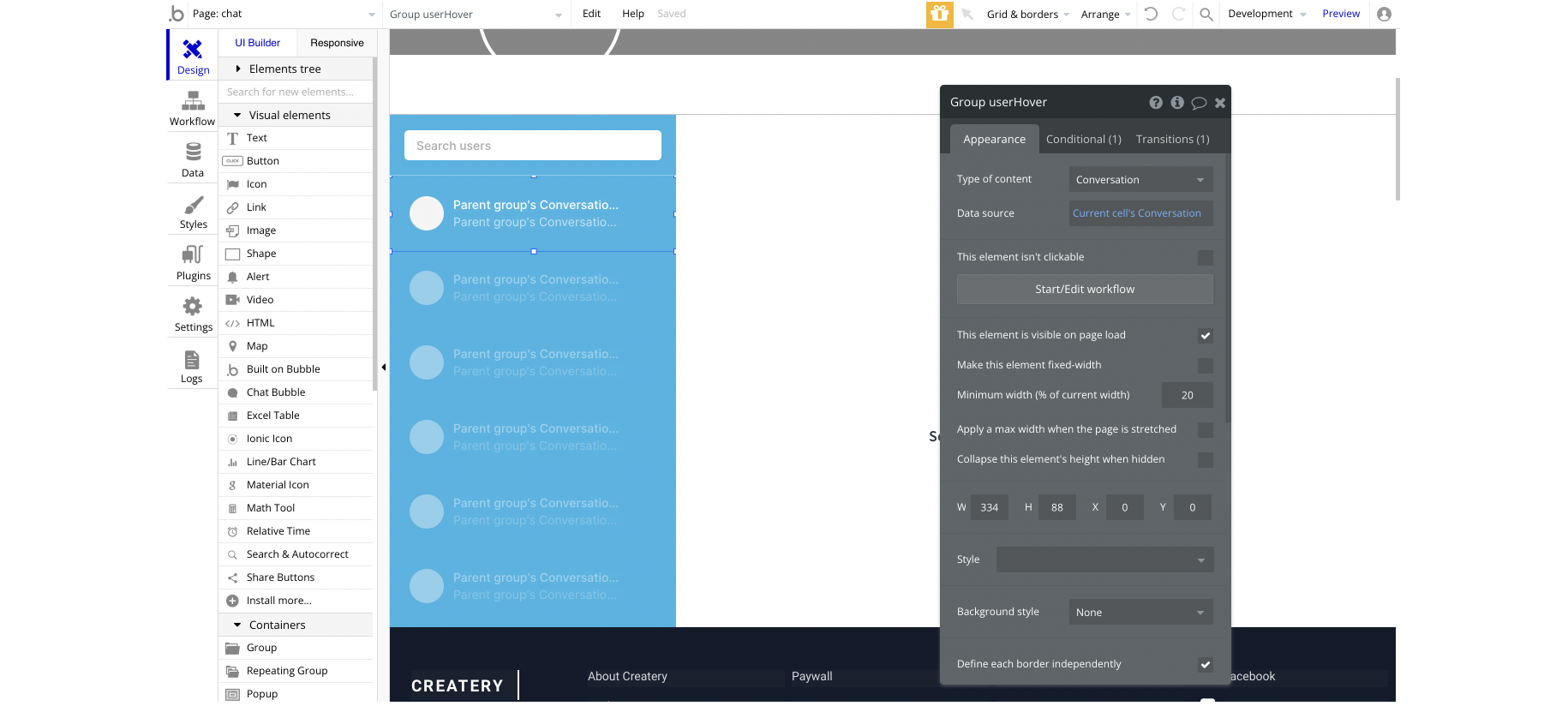
When this cell is being clicked, a URL parameter is sent to the chat with a unique id, to actually open the appropriate discussion:
checkout
This page shows the selected tier from tiers page. It includes all workflows for Stripe payments.
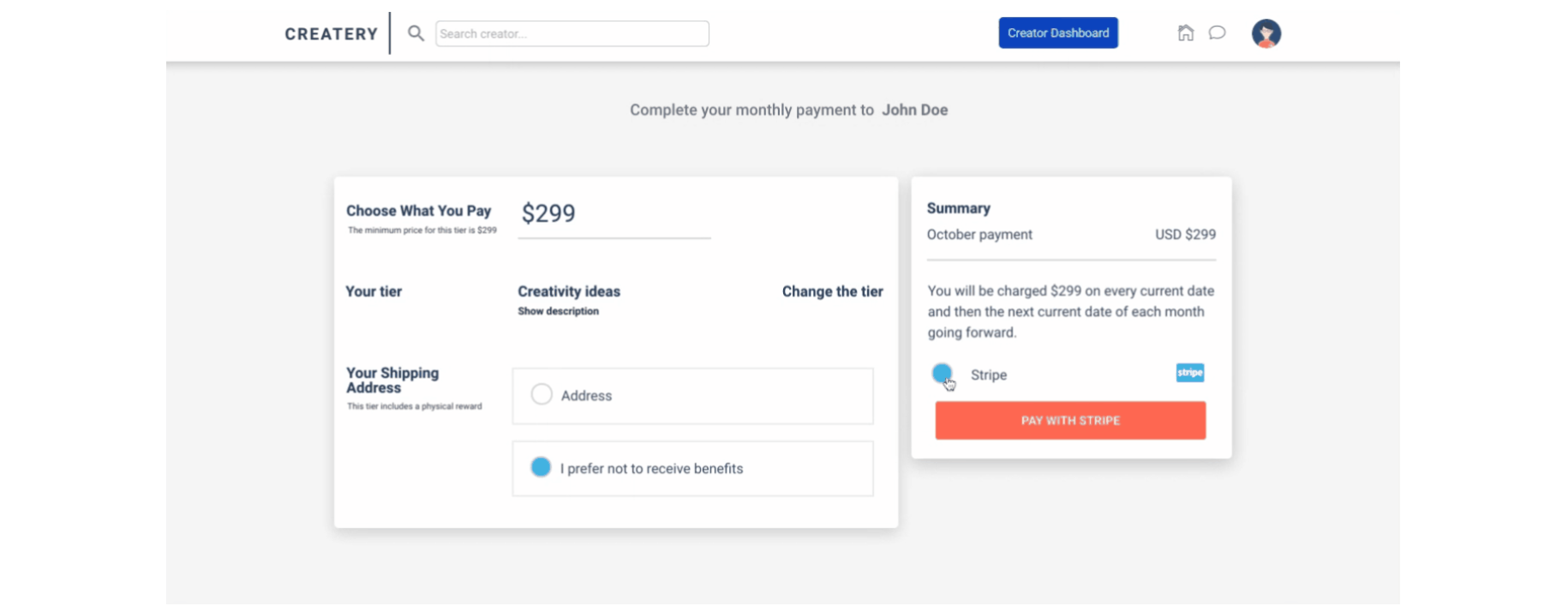
Users are able to change the amount they want to pay, change the tier, select the option to get a physical reward by filling in the address, or refuse to get a physical reward.
Tip: The amount users are about to pay should be equal to at least tier's initial price, or more.
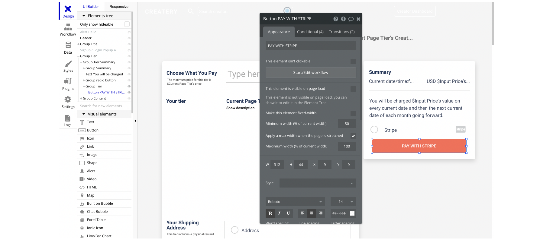
The "PAY WITH STRIPE" button can be located here:
In case the user's name is not empty, the payment will process the transaction by using the user's name to display at checkout:
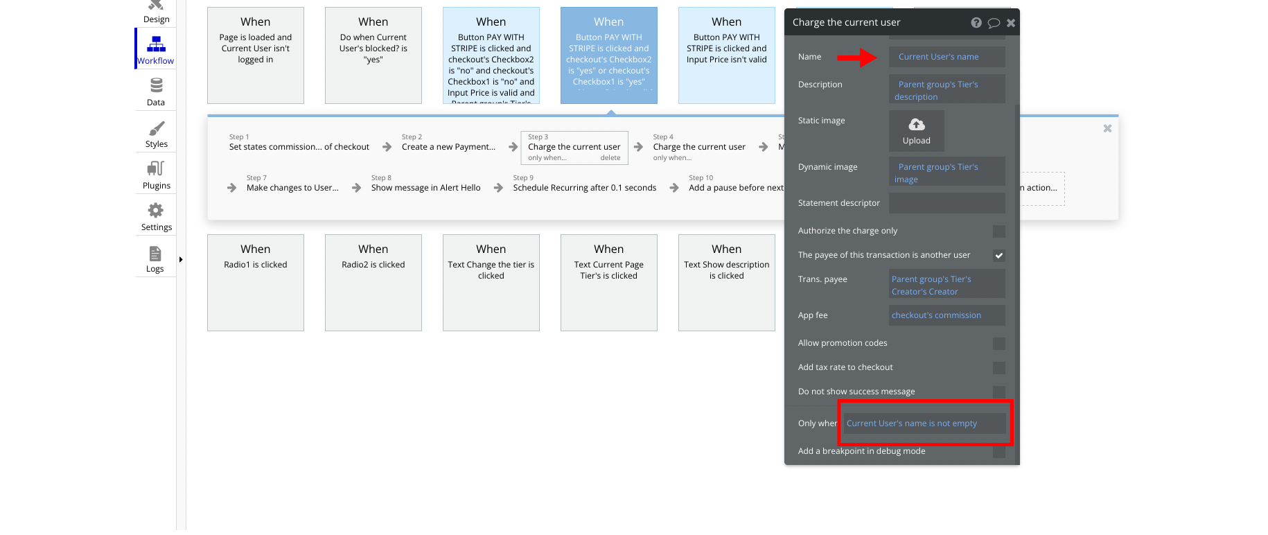
In case the user's name is empty, it will display the user's email instead:

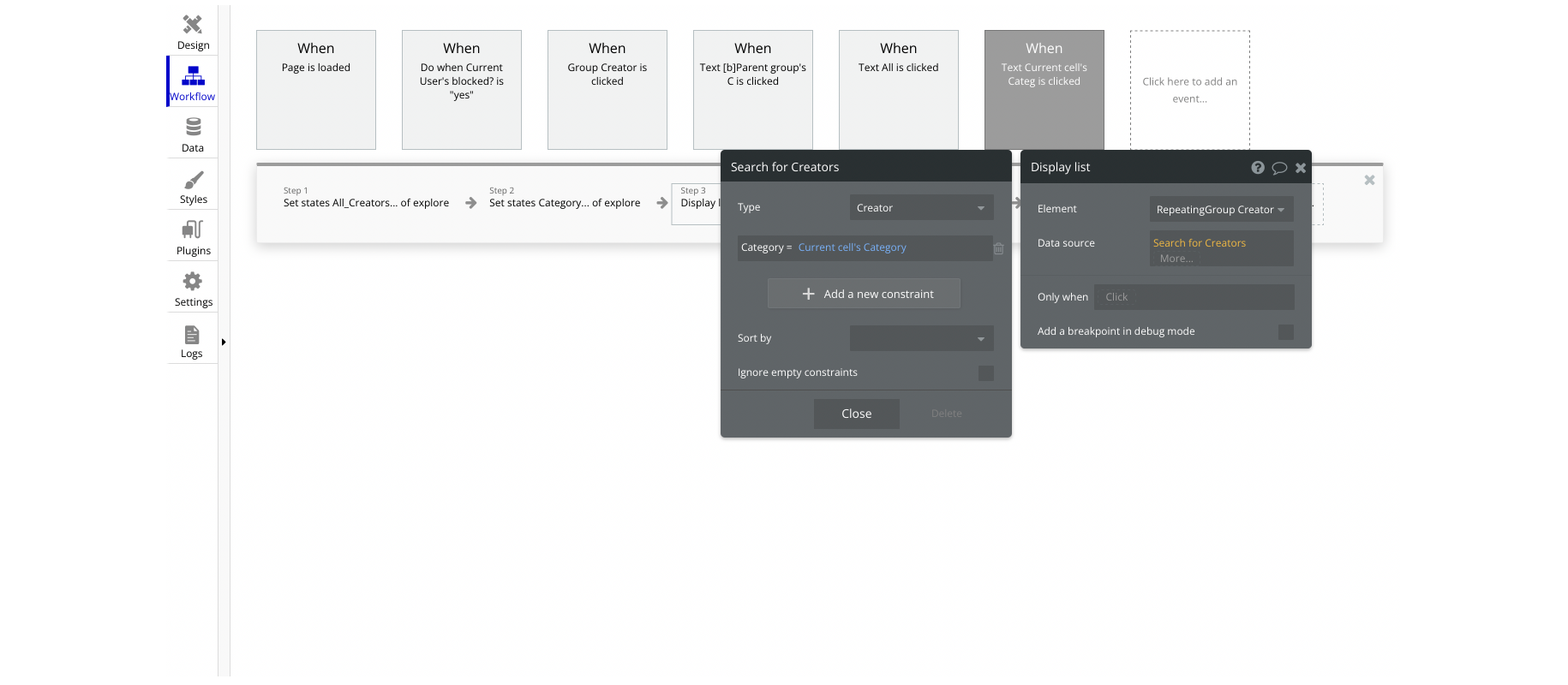
explore
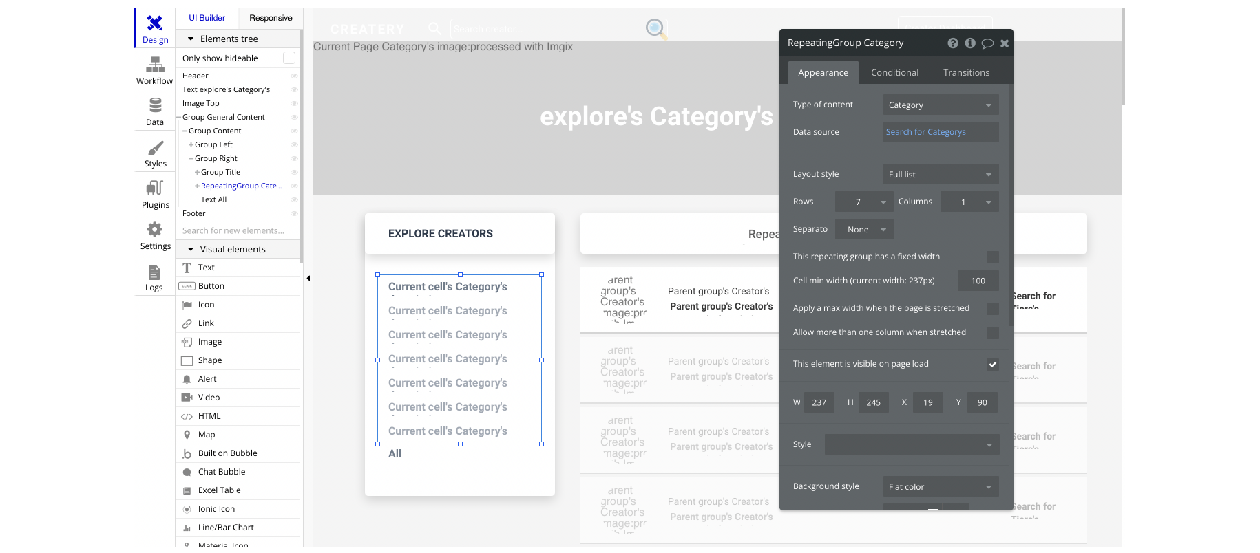
This page is for exploring creators and it has a filter with the categories.
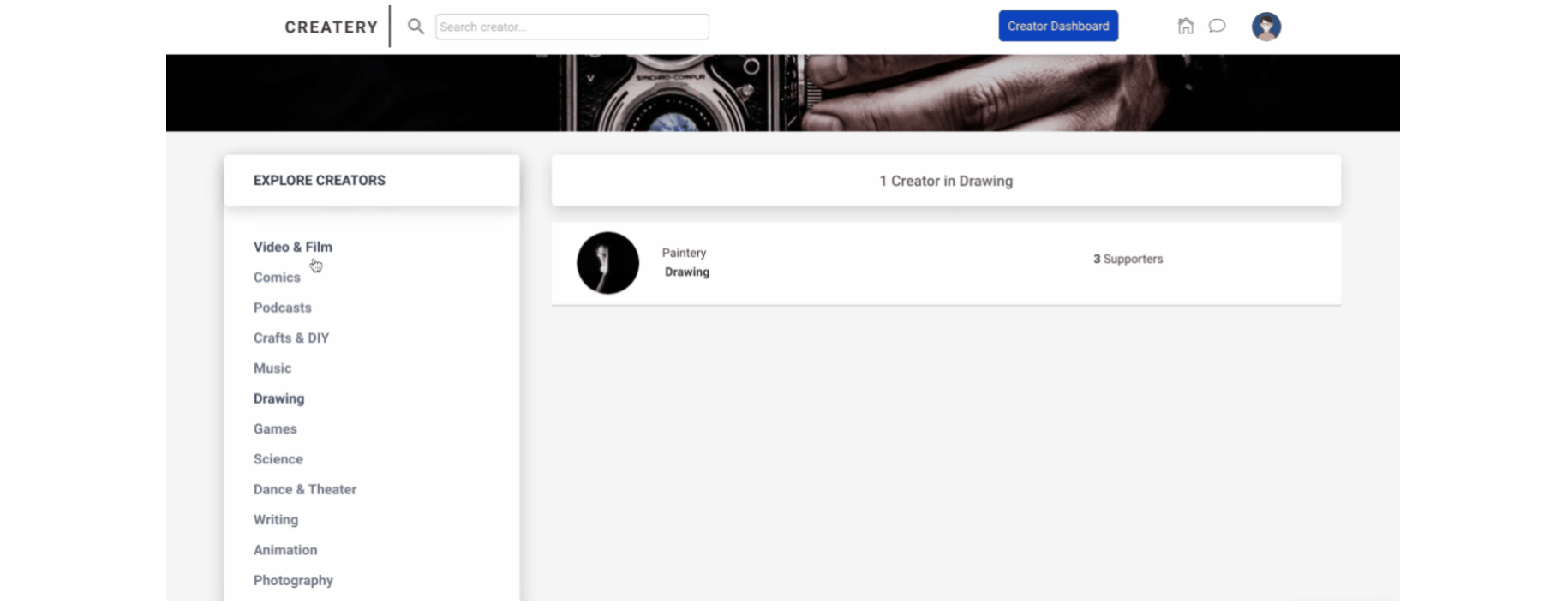
The categories from the left-side menu are being pulled from the Category object, in a simple RepeatingGroup element, here:
The list of creators are filtered based on the current page's object, to display the appropriate creators when users click on the category:
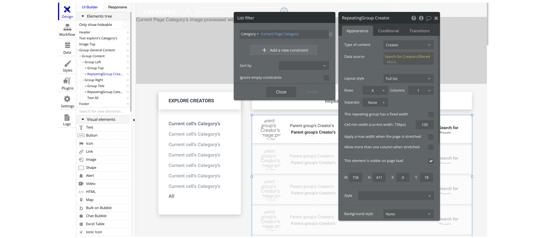
When the repeating group cell is clicked, it will search through the creators based on the selected category:
faq
This page contains the frequently asked questions (FAQs) that may be listed.
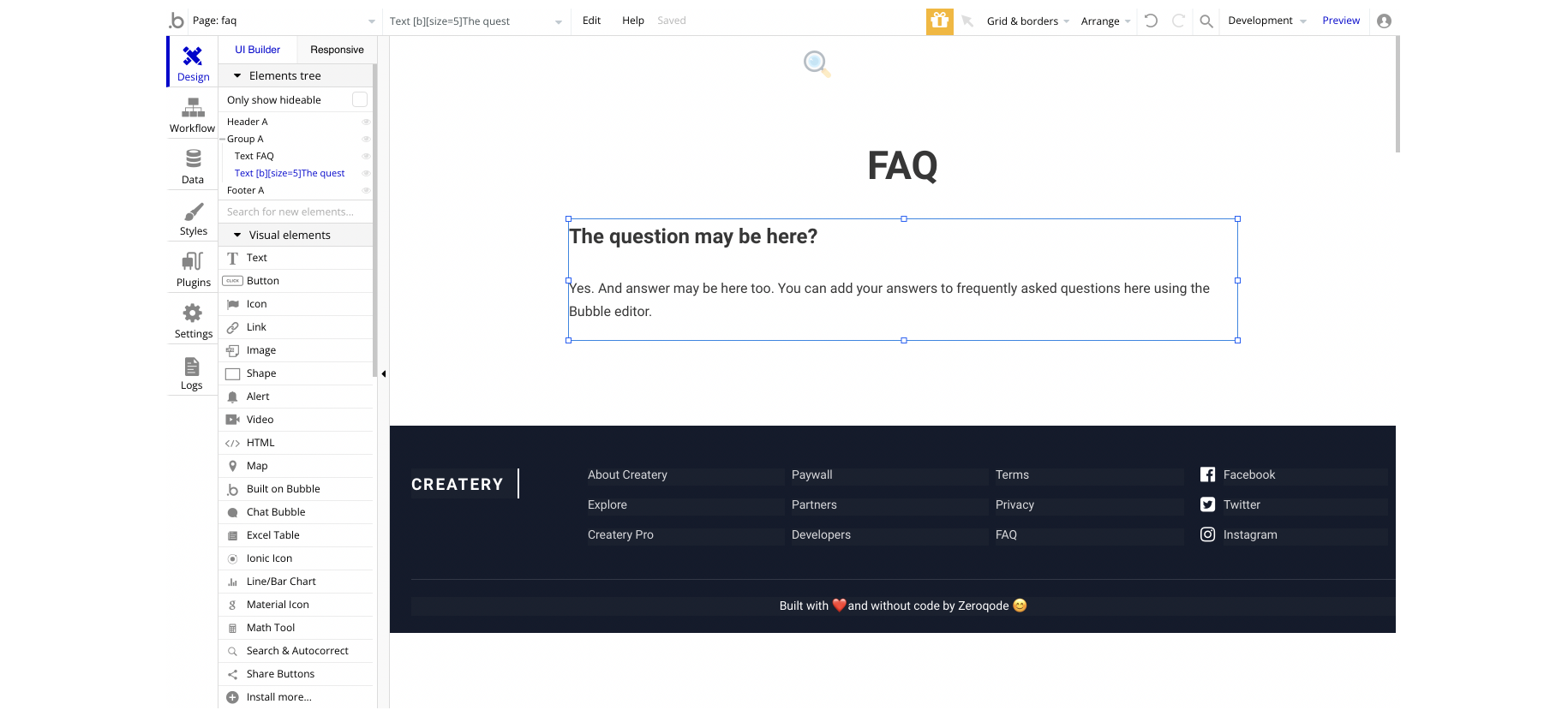
Tip: The FAQs can be created either in as database records (e.g. "FAQ" data type), or option sets, to be easily modified via the admin panel if you will, and displayed in a simple RepeatingGroup element.
home
This page displays the feed. The users are able to scroll through the supported creators' tiers, view the suggested creators, see the following list, etc.
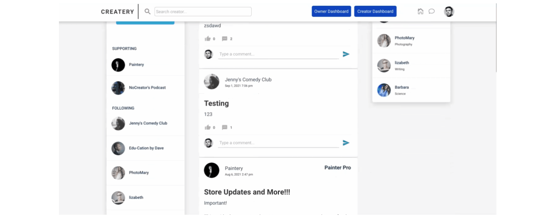
The post items are being pulled from the
Post object, into a simple RepeatingGroup element, here: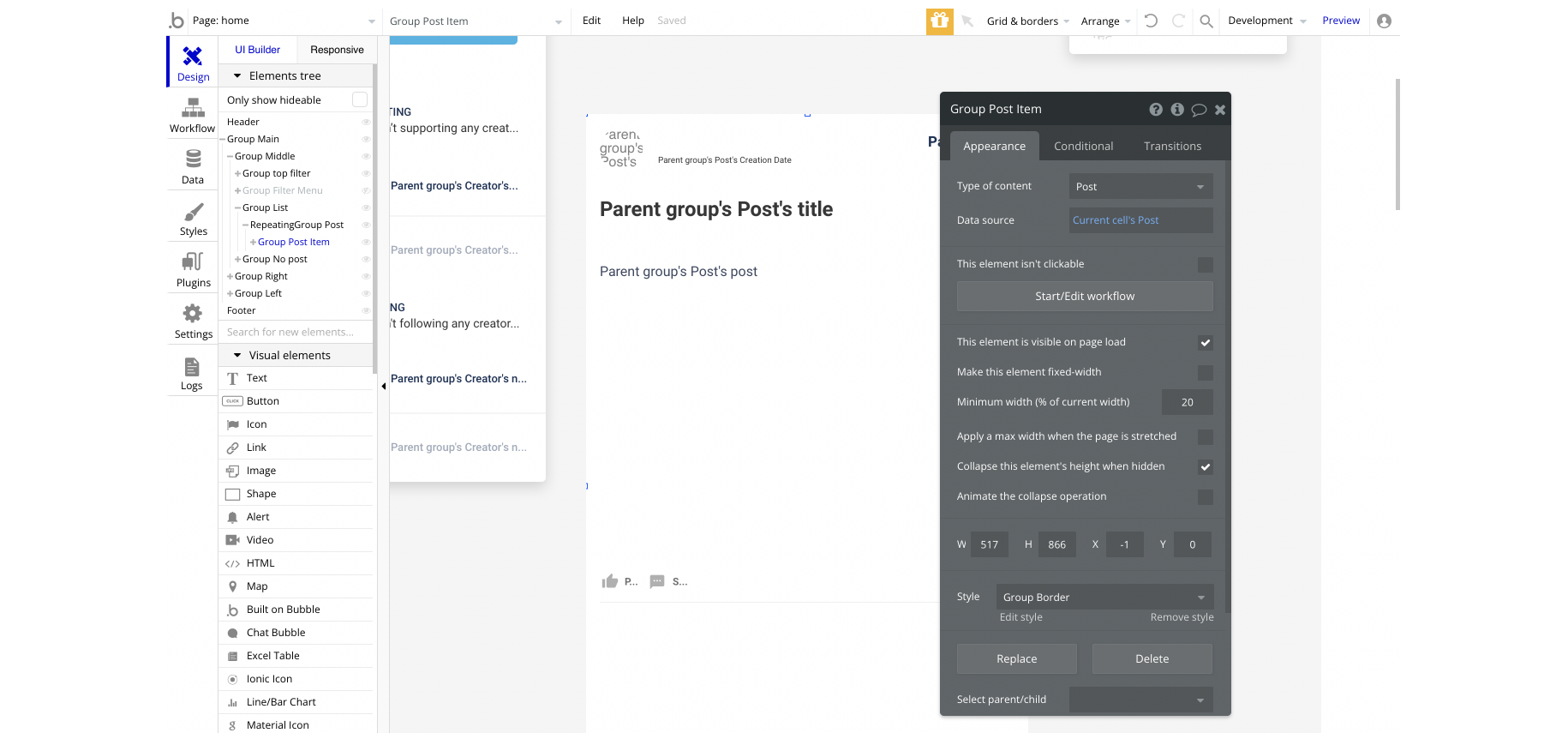
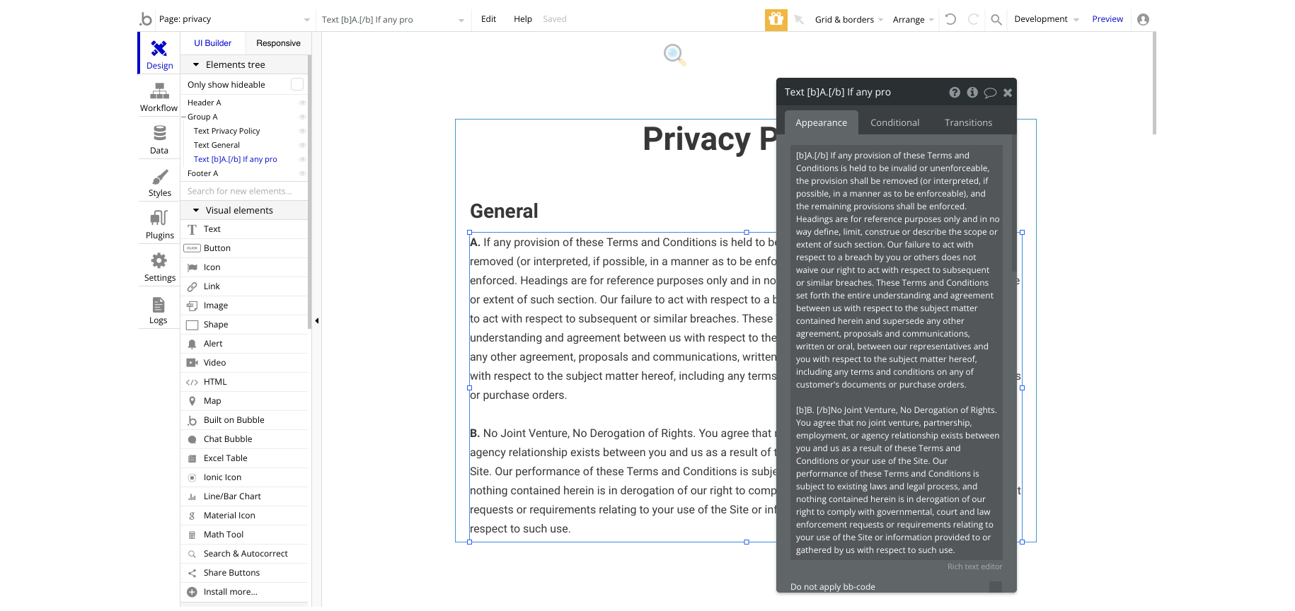
privacy
This is the page where users see the legal statement that specifies how the company manages the collected user data.
Tip: The text on this page is a placeholder and should be modified according to your own privacy policy.
profile
This page contains the profile information about users. This data can be edited.
It comes with multiple tabs as well: Overview, Posts, Community.
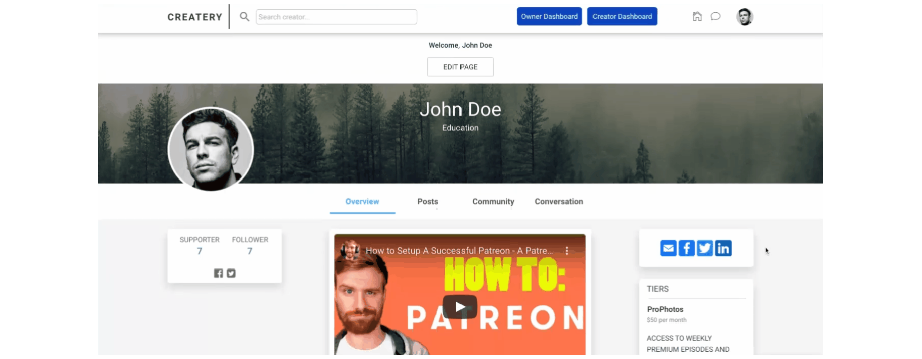
This is the profile tab for the creator that contains the video overview, posts.
Post - This profile tab shows all posts.
Community - This profile tab shows all community posts.
Tip: Only a supporting user can add a post or a comment.
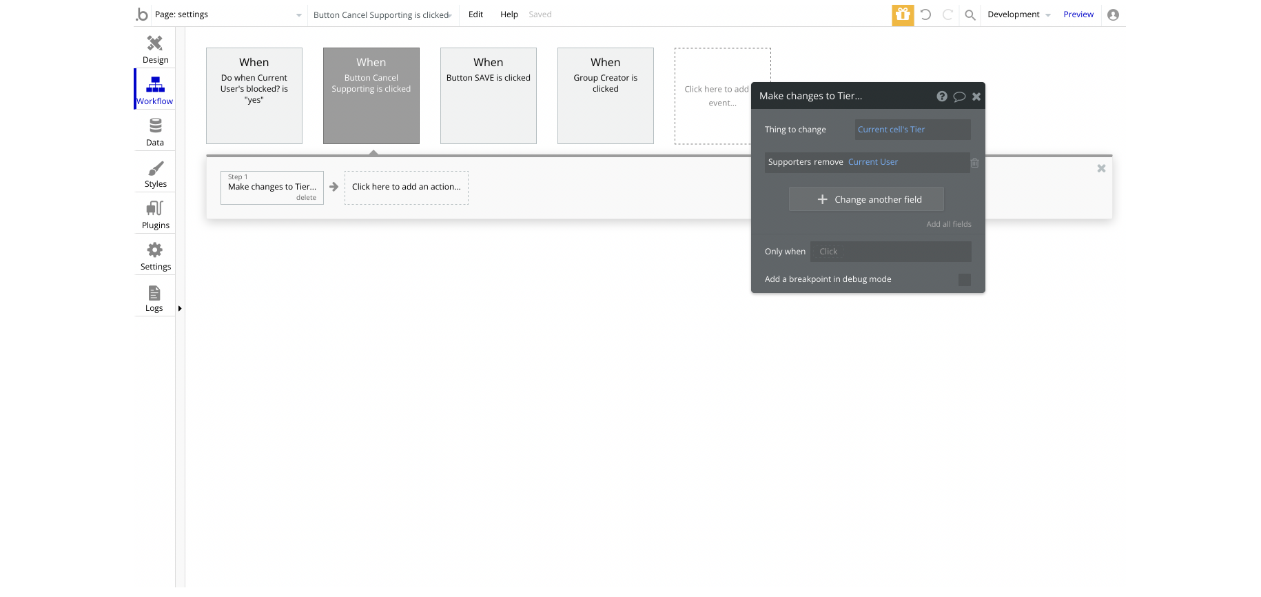
settings
This is the "Settings" page for a standard user. The user can edit the profile information like name, email, address, etc., as well as cancel his supporting tiers.
This page can be accessed from the
home page by clicking the "Settings" button in the left-side menu.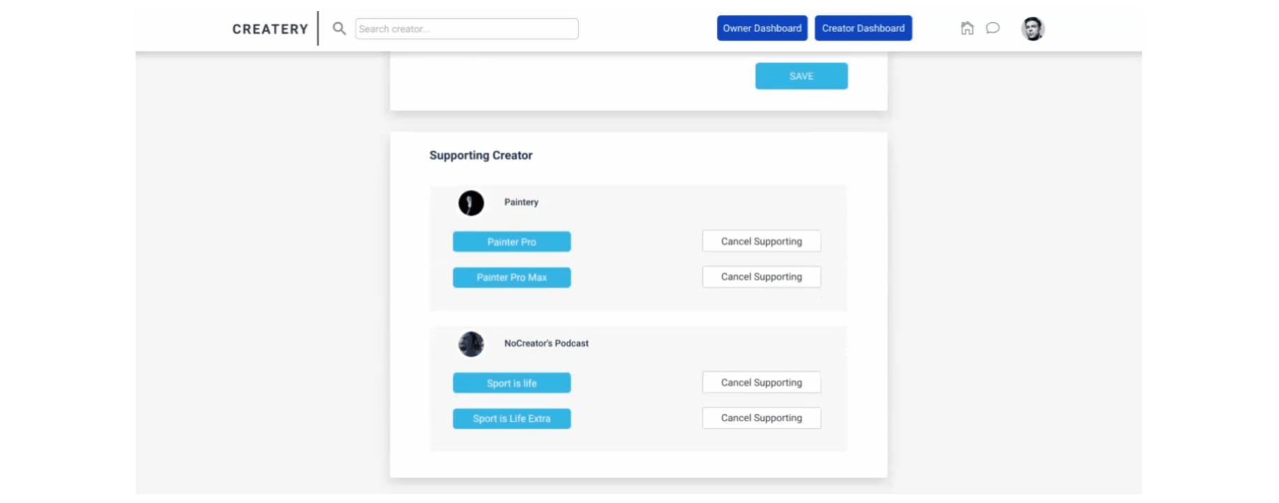
The "Cancel Supporting" button will remove the Current User from the tier's Supporters list:
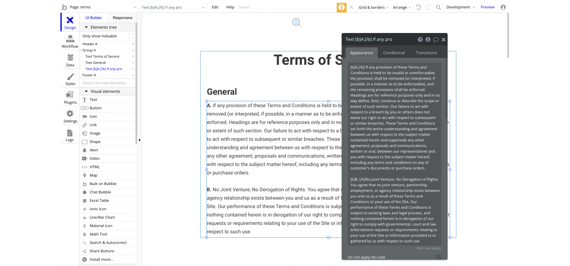
terms
This is the page where users see the agreement act between both sides: the company that has the web application and users who access the web application.
Tip: The text on this page is a placeholder and should be modified according to your own terms of service.
tiers
On this page, a supporter can select a tier from the creator. The users are able to support a new tier and proceed to the
checkout page for payment completion.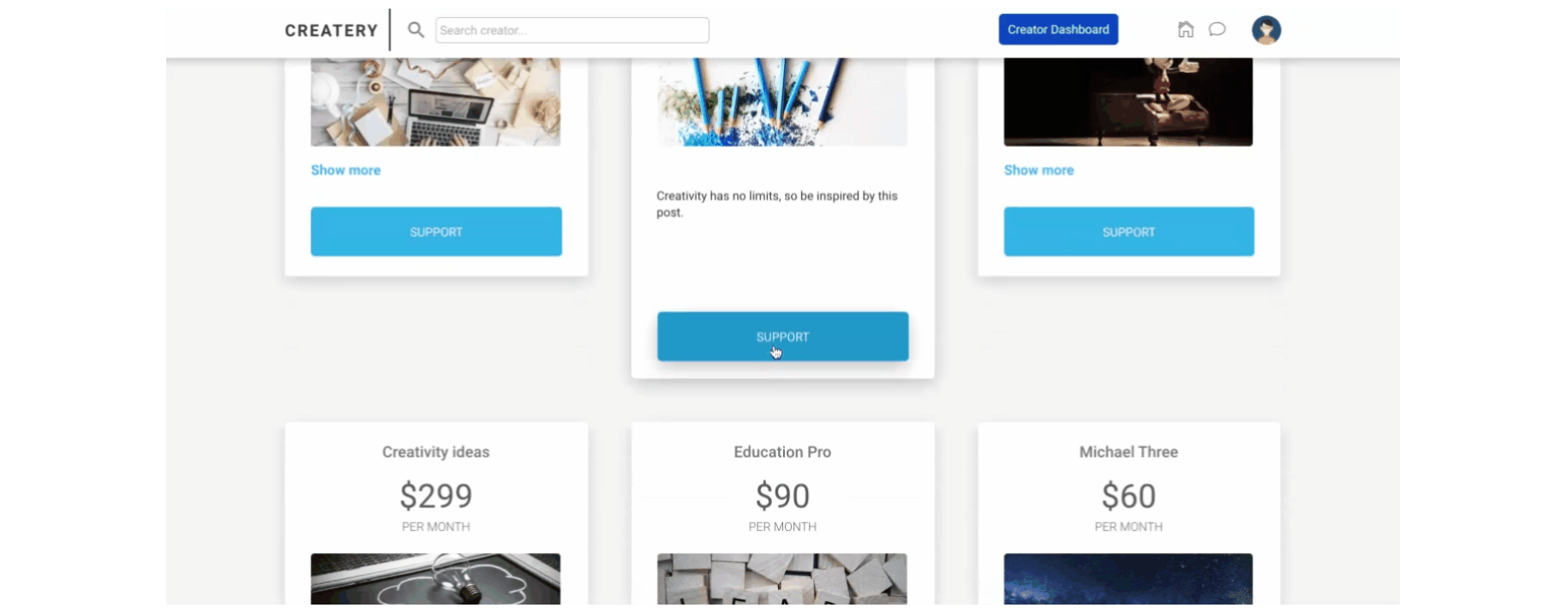
The "SUPPORT" button can be located here:
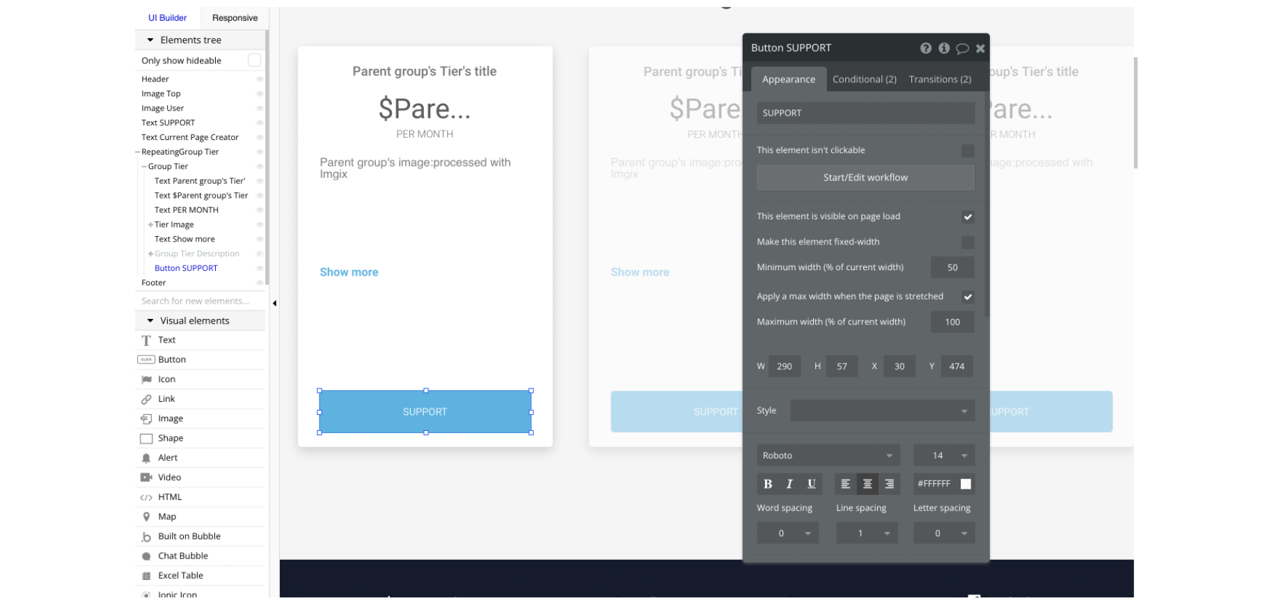
This button will redirect the supporter to checkout by sending the
Tier object in order to display the appropriate tier information: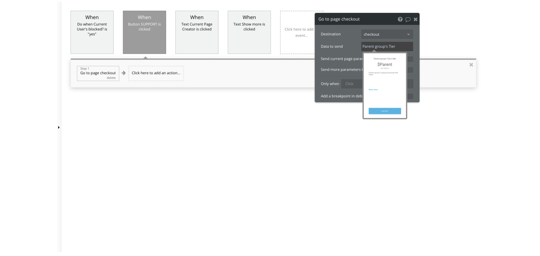
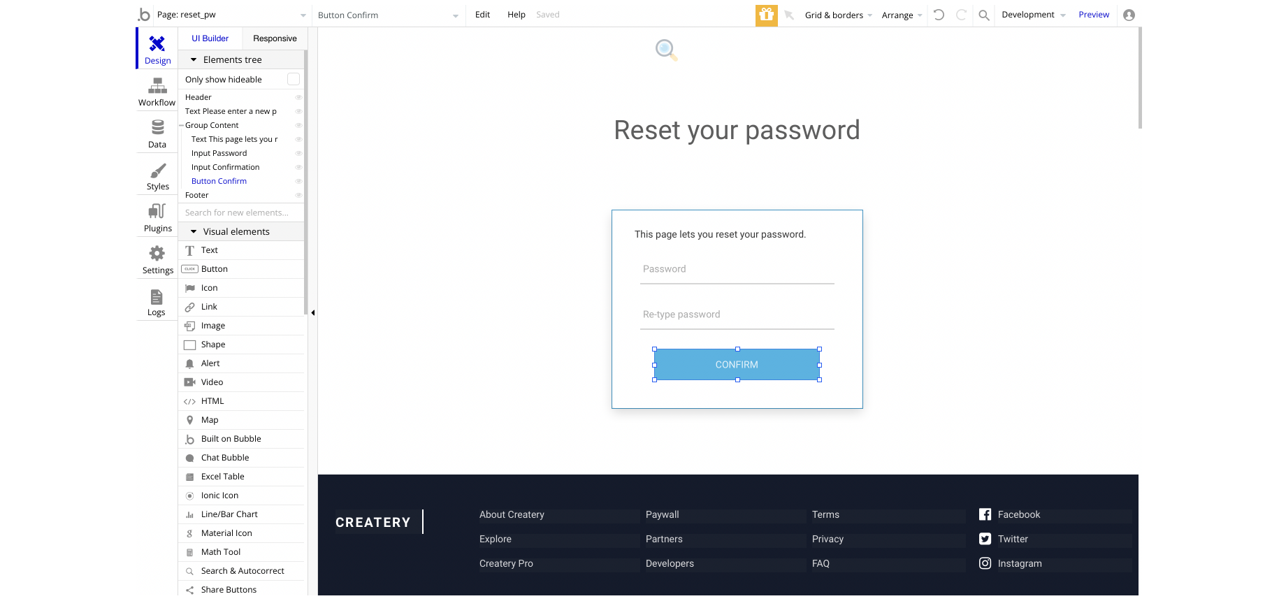
reset_pw
This page is used for resetting the password. It comes with a simple form with two input elements for a new password and confirm it, as well as a submit button.
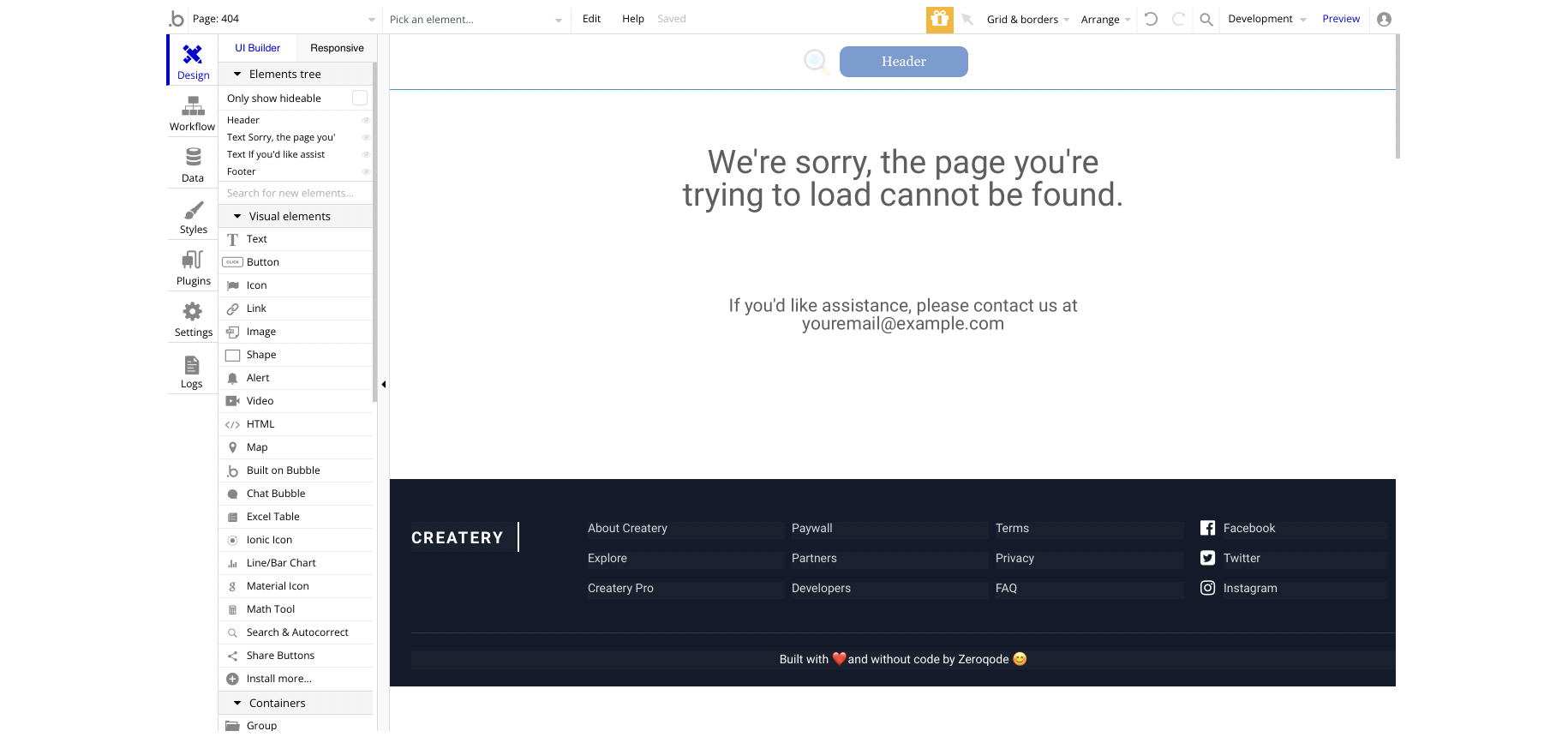
404
This is a custom-designed page for 404 redirect errors, informing a user that the requested web page cannot be found, or it doesn't exist.