This section states the purpose of each page.
Introduction
In this summary, we will describe each page and its content. The Page Element is the fundamental one that contains all the other elements.
Tip: See Bubble Reference for more information about Pages element https://bubble.io/reference#Elements.Page 🙂
Pages
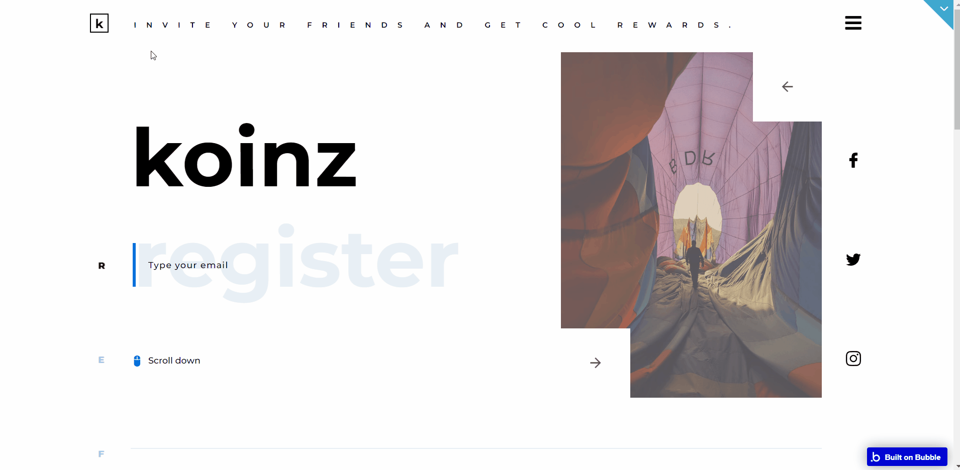
index
This is the main page typically encountered first on the web app that usually contains links to the other pages of the site. A homepage includes a variety of menus that make it easy for users to find the information they need.
Here, it greets the users with a minimalist and modern design and has the navigation necessary to access the other pages.
Inputs
So starting with the index page, the first thing is that the title of the blocks is actually input and when trying to type something inside it will show a predefined text no matter what the user is typing in (try it for yourself to see what happens when you try to type something in).
The predefined text that appears is stored in a state named
DefaultValue which is attached to every input like this (check the image below).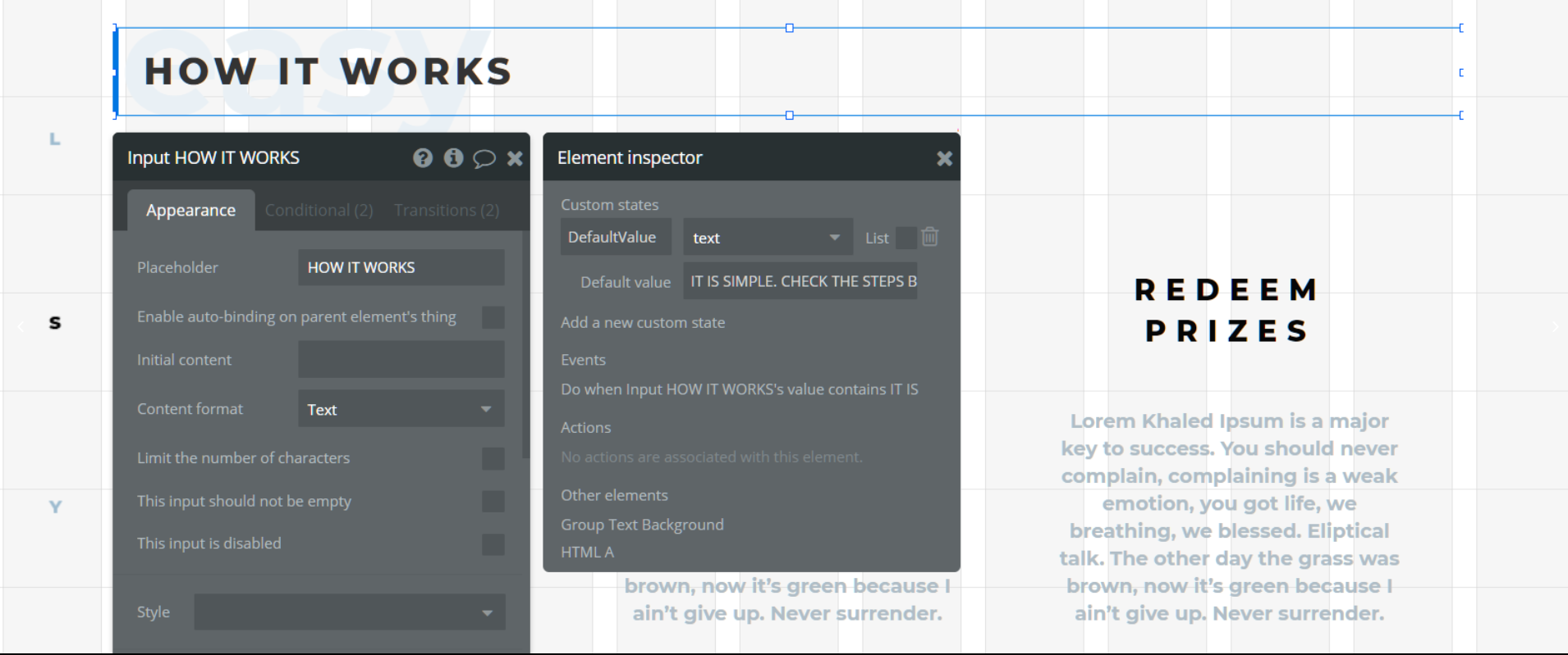
Also, there is a workflow that checks if the input isn't focused and if it contains some text (just the first letter from the
DefaultValue's text). If the condition is true it will reset the input (check the image below).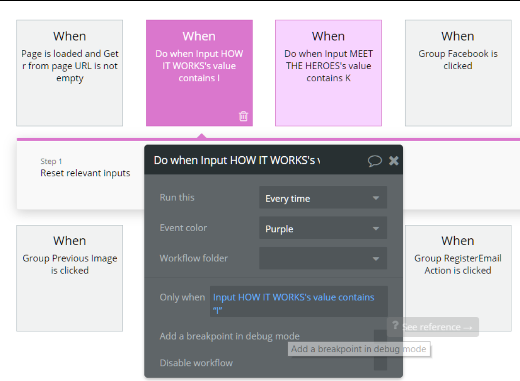
There is also an
HTML Inputs element at a bottom of the page that contains the code for the inputs to work the way they do but you don't have to do anything about it. You can change it's position on the page in case it gets in your way.Note: Find out how input works in the “Thing to Note” page, “Custom Code” section.
So wrapping up to the conclusion, if you want those inputs to display a different text you will have to change the
DefaultValue and the workflow's condition of that specific input.Design
As you've already seen there is vertical text on the left side of the page. This is actually a part of the background and not actually an editable text. This was done in order to be able to make the page responsive.
So changing this text will require you to download the .psd file below and change the text inside. After that save it as a .png file and upload it as the background for the
Group Text Background element on the index page.Some elements in this template are present in 2 versions, like the hero selection text. One of them is designed to be visible on small devices while the other is visible on larger ones.
Also, there are some empty groups that are used just for collapsing. These groups have the "collapse" word in their title.
Adding testimonials should be done only through the
admin page since this feature requires the total number of testimonials to work properly, which is incremented/decremented there. You can add testimonials manually in the database but you will need to change the
TotalTestimonials field from the Variables datatype accordingly.Hero selection images are also stored in the
Variables datatype so if you want to add more pictures or delete some of the existing ones just edit the HeroSelectionPhotos field.app
The
app page is the "user's page" which means it has all the features and elements designed for the user. Its structure consists of blocks like orders, store, referral info, and profile settings.
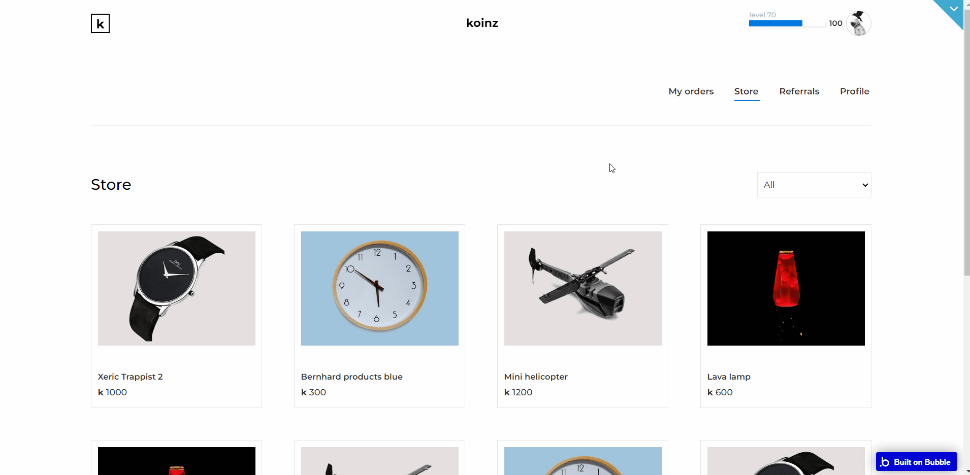
Here the user can buy something, view his orders, change his profile info and share his referral link through social media or by copying his referral link.
Note: Switching between tabs works by changing elements’ custom states.
Custom design & features
One of the design solutions that rely on coding is the share buttons from the Referrals
block. However, unless you want to change the style of the icons (which anyway it's done only through code) you don't have to edit anything.
Just pick what social media icons you want your users to have the ability to share through, from the
AddToAnyShareButtons Aelement found on the page. In case you want to check what code was used to modify the appearance of the icons check the page's properties under the Page HTML Header section (check the image below).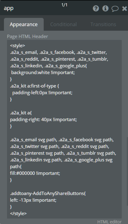
Also, the
Input Referral link element that contains the user's referral link is blocked from editing when accessing the Referrals block through a workflow (check the image below).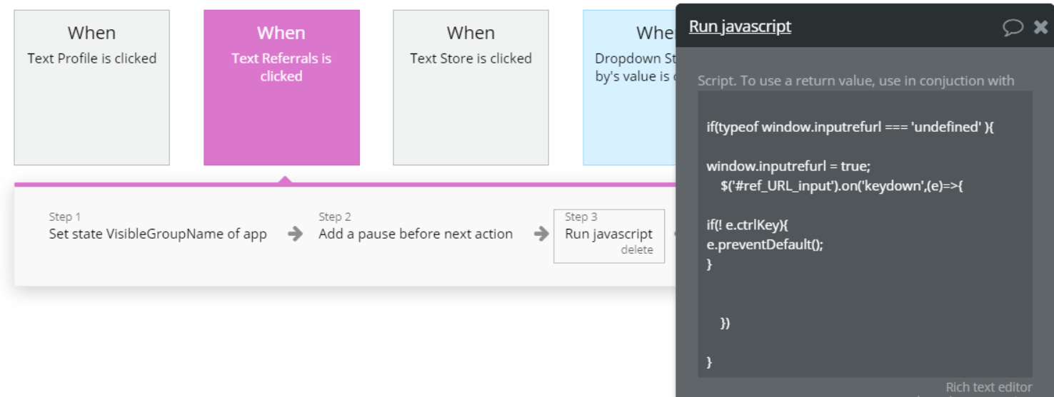
Store
Currently, the store is set to show 8 products at a given time with the option to see the others by clicking the previous/next arrows. If you want to decrease/increase the number of products shown you will have to make a few changes to the workflow.
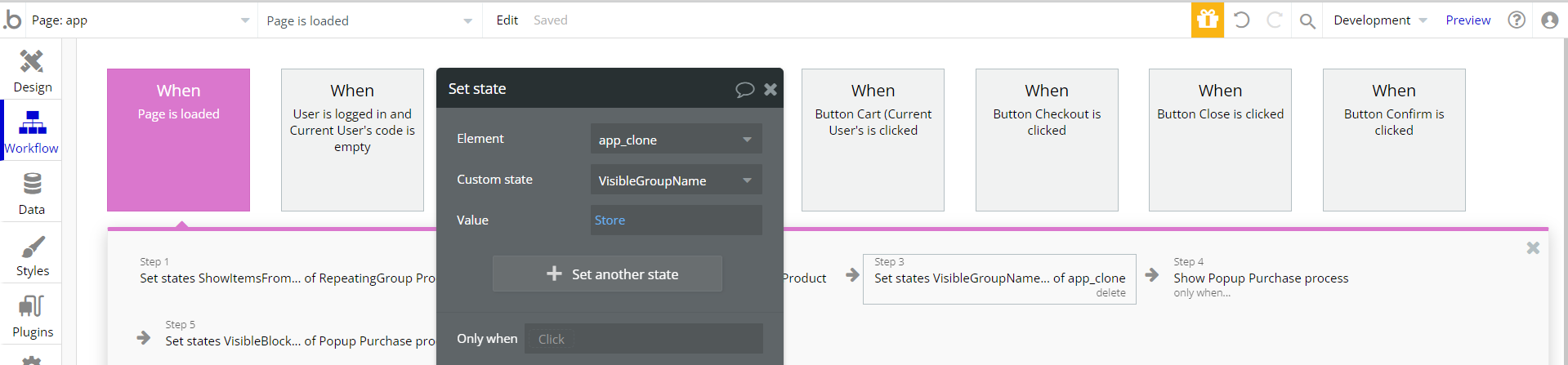
First, find the When Page is loaded workflow and change the state
ShowItemsUntil to the value you desire (check the image below).After that find the
Right arrow and Left arrow elements and in its properties click Start/Edit workflow and change the ShowItemsFrom and ShowItemsUntil increment/decrement accordingly.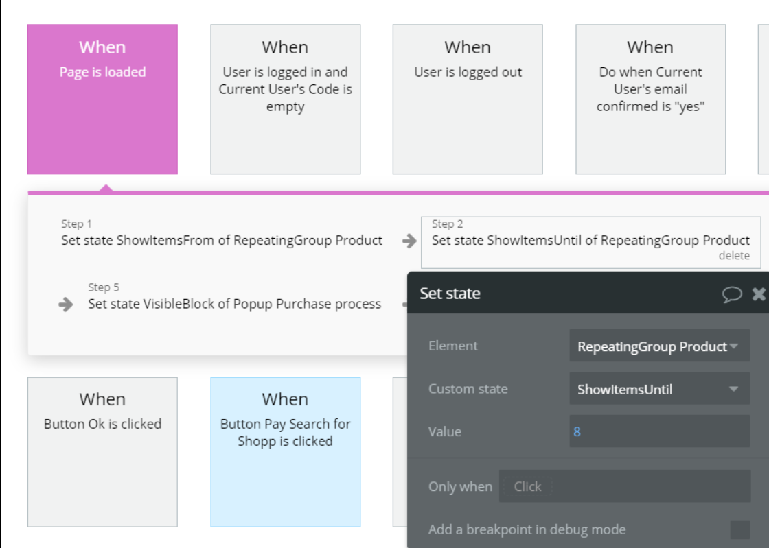
You will also have to find the
Input Page number element and divide its value by the number you have already used to change the states above.Changing the max referral level
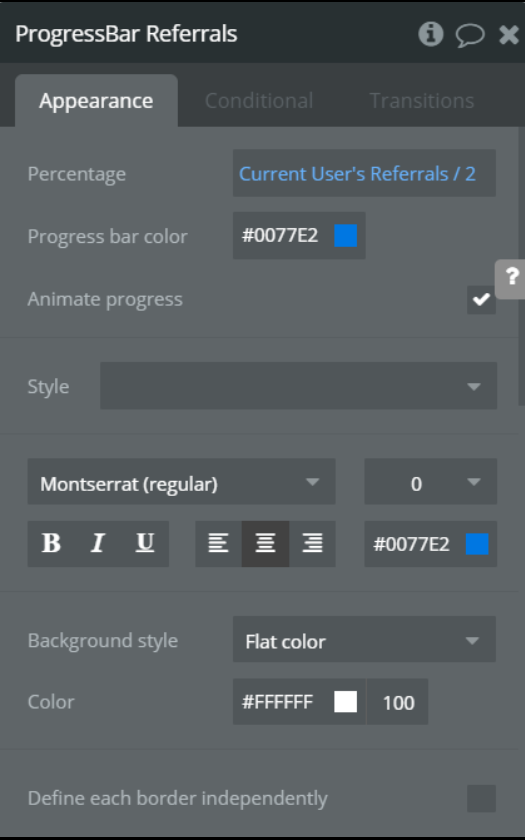
We have used the Progress Bar plugin to show the user his current referral status and his progression.
Currently, the max level is set to 100 but you can easily change it to your desired number. In order to do so just divide
ProgressBar ReferralsPercentage field's value by the number which multiplied by 100 will give you the maximum desired level. For example, if I wanted the max level to be 200 I would simply divide the current value by 2 (check the image below).
admin
The admin page provides the necessary tools for the owner to manage a project based on this template. Here you can add new products, edit existing ones, view statistics, view and deliver orders, contact users, etc.
Only users with admin rights are able to access this page (in read-only mode), and those users who have access rights can edit or delete anything here.
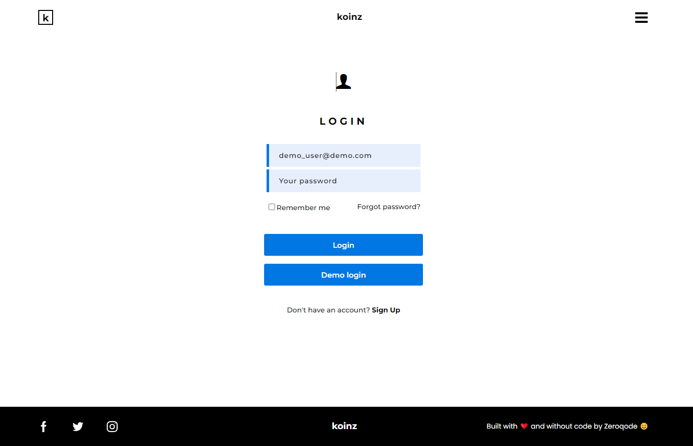
signin
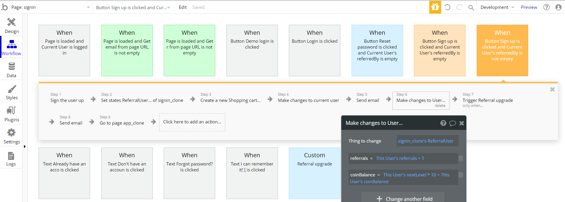
This page is used for login and signup. Also, this is where we check if the user is using a referral link and if so, we add the points to the respective user.
We also upgrade the referral user's account if he invited enough members for that.
There is an IP check in case some users may want to abuse the system and invite themselves.
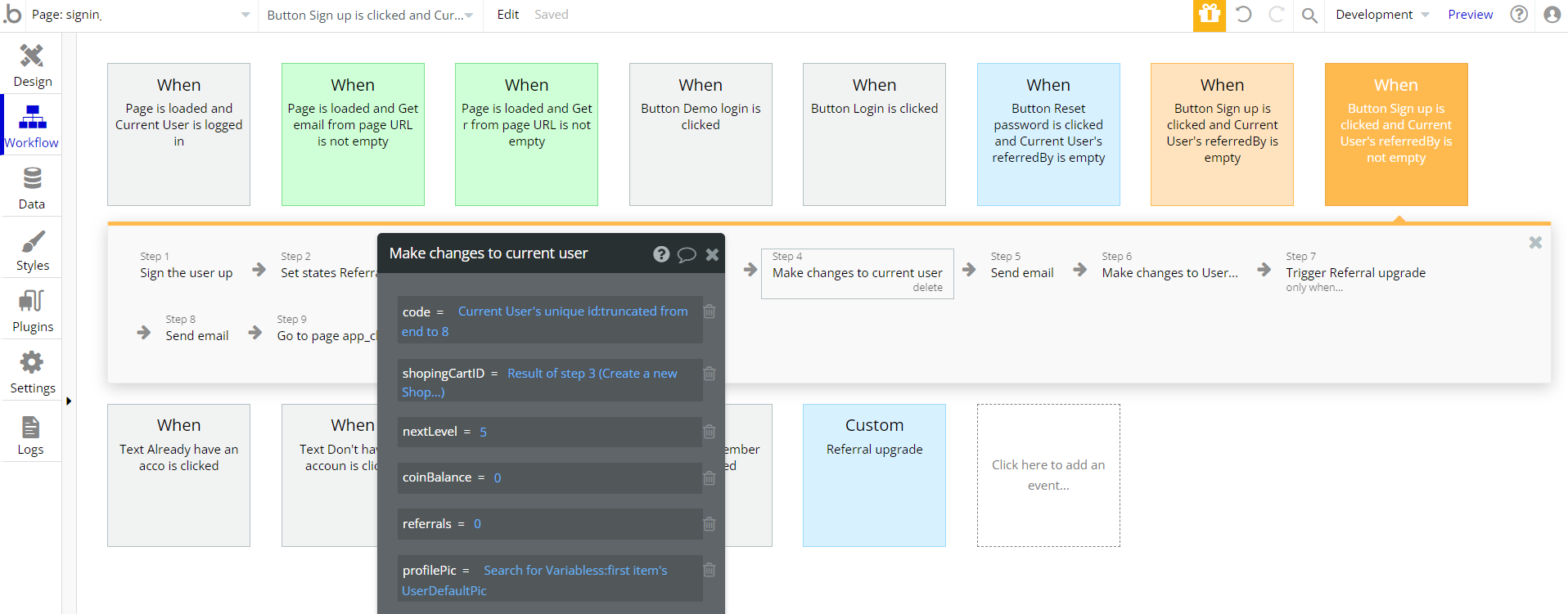
Also on this page, new users are given a default profile pick and a shopping cart.
Referral workflow
So after you made the changes described above you will have to make some on this page too in order to complete the process.
Now if a user hits the maximum level he will still be able to invite other users, but his level will no longer increase. This is done through a condition check before upgrading his level (check the image below).
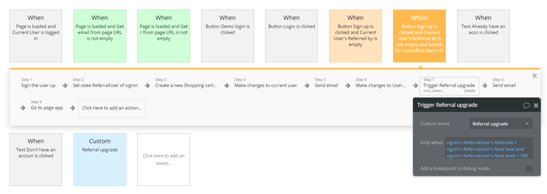
You just have to change the number in the condition shown above (right now that number is 100), and you are done. Tho you might want to change the Custom Referral upgrade workflow which upgrades the user's level which also means he will receive more rewards from his referrals.
Now the progression milestones are set to 5, 10, 25, 50, and 100. So if you want another progression system you will have to change the Custom Referral upgrade workflow and the
Progression Bar design from the app page.You might want to change the number of points users receive from referrals. Right now the user receives an amount equal to his Next level*10 which is done in step 6 of the workflow shown above.
email_confirmation
The
email_confirmationpage is used as a redirect for the confirmation link users receive on the email. By using that link their account's email will become verified.
404
This is a page for 404 redirect errors, informing a user that the web page he or she is looking for cannot be found.
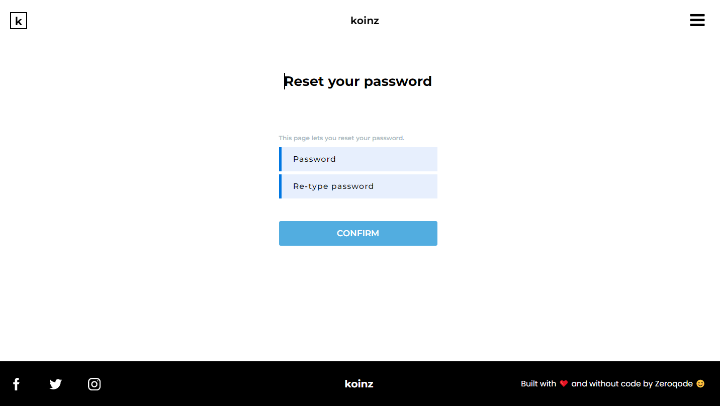
reset_pw
Here, users reset their password after accessing the link in the mail.