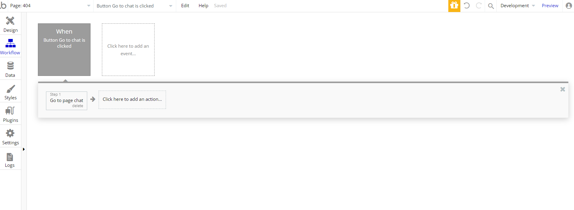
This section states the purpose of each page.
Introduction
In this summary, we will describe each page and its content. The Page Element is the fundamental one that contains all the other elements.
Tip: See Bubble Reference for more information about Pages element https://bubble.io/reference#Elements.Page 🙂
Pages
index
This is the main page typically encountered first on the web app that usually contains links to the other pages of the site. A homepage includes a variety of menus that make it easy for users to find the information they need.
Here, the user can log in to an existing account, log into a Demo account, or Sign up with a new one.
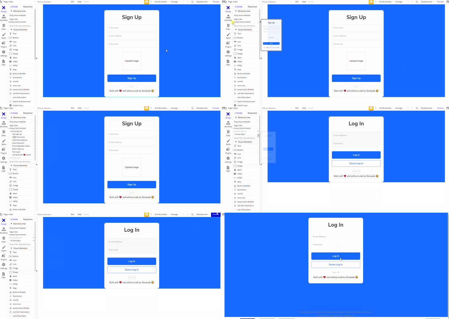
The design for this page consists of the main group "mainContainer" which holds 2 groups designed for displaying 2 groups, which are interchangeable in preview via state actions.
The groups are Group "Sign Up" and Group "Log In", which hold all the elements, texts, buttons, inputs, etc.
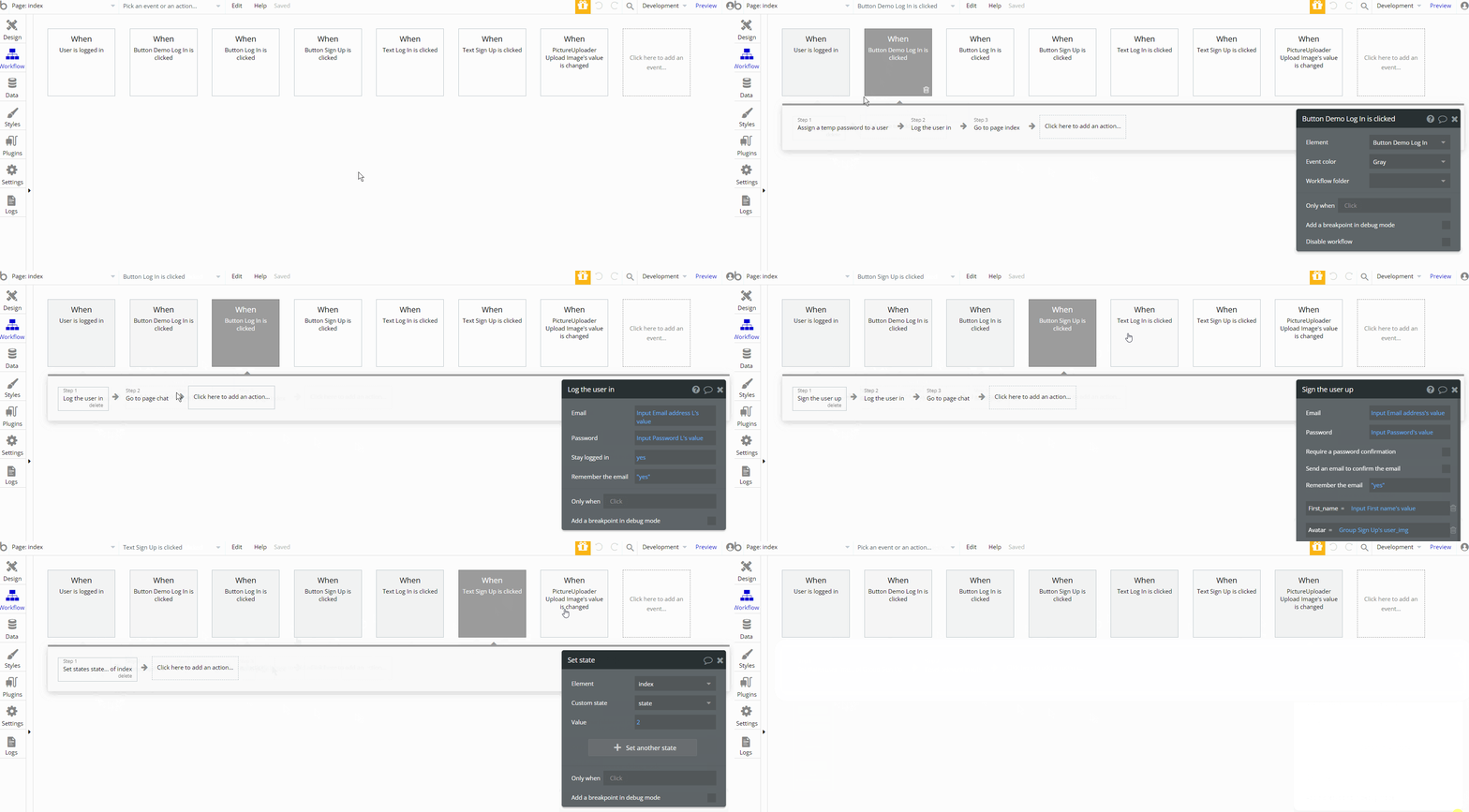
The workflows on this page are navigation actions to a couple of pages. This page also combines actions for setting state values for showing and displaying elements on the page.
Logging in and Signing up a user is a part of
index page functionality while also utilizing Reset Password relevant inputs.admin_panel
This page is designed to manage platform data, e.g. Stickers, Items, … and others. Only users with admin rights are able to access this page (in read-only mode), and those users who have access rights can edit or delete anything here.
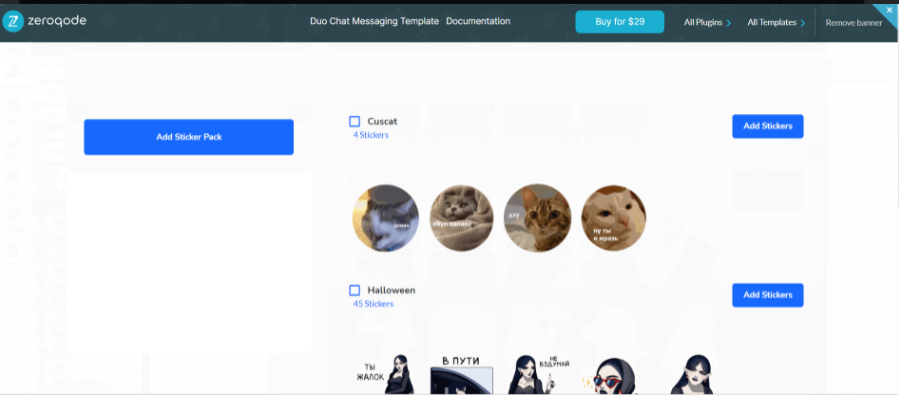
The design for this page consists of main group "main container" which is divided into 2 groups: "Group A add pack" which is used for elements to add images via action on the button "Add Sticker Pack", the second one group "Group all pack&stickers" is designed to hold other elements: groups, repeating groups, buttons, texts, etc.
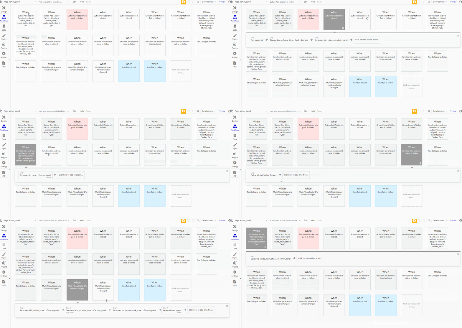
The workflows on this page are actions for setting state values for showing and displaying elements on the page, working with data by creating a new thing in database Sticker_pack type. Also there are scheduling workflow api actions with Run Javascript actions.
Tip: See the Custom Code under the Things to Note section for more details on javascript.
chat
The chat page consists of two active zones:
- On the left side, you see the list of users you've initiated a conversation with, start a conversation/search through conversations.
- On the right side is the area where you're actually chatting with another user. This chat supports image and file attachments.
Also, you can use gifs and emojis as with other popular messengers (Telegram, Whatsup, or Messenger).
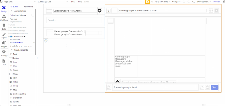
The design for this page consists of main container: Group "Main container" which is split into two sides, the first one on the left being Group "Left-Sidebar" used for displaying left side conversation lists and group lists.
The second part is the right side, where users write down the messages, attach files or add stickers/emojis.
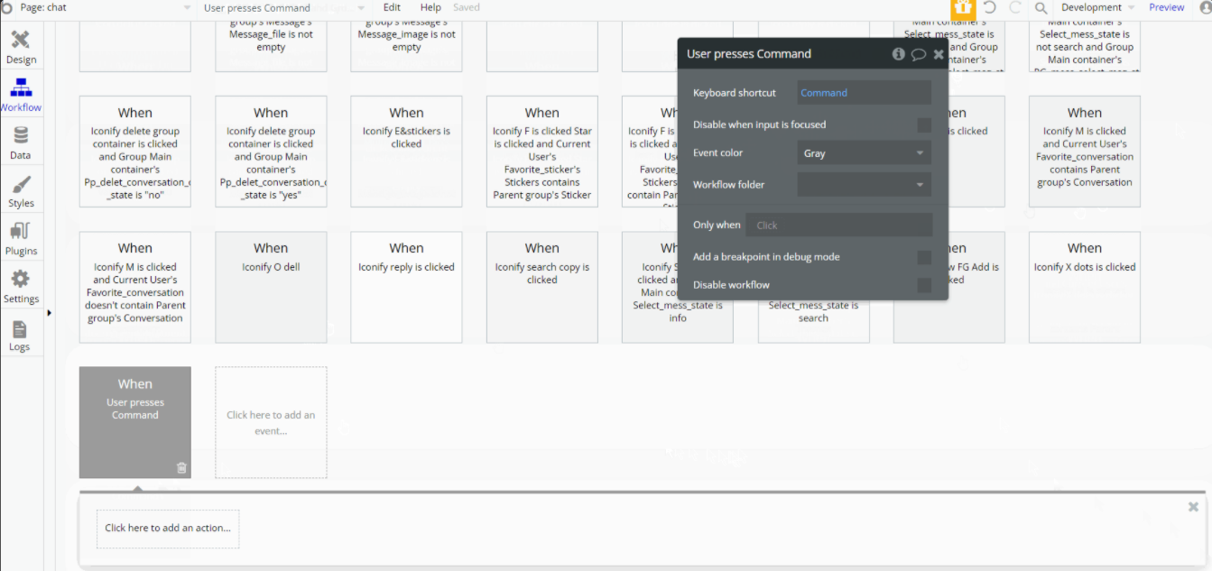
The workflows on this page are actions for setting state values for showing and displaying elements on the page, working with data by creating a new thing in Message, Conversation data type and making changes to User, Message and Conversation.
There are actions designed to show popup/groups and also hide them. Last but not least, a few action are Go To page navigational actions.
reset_pw
This page is for resetting the password.
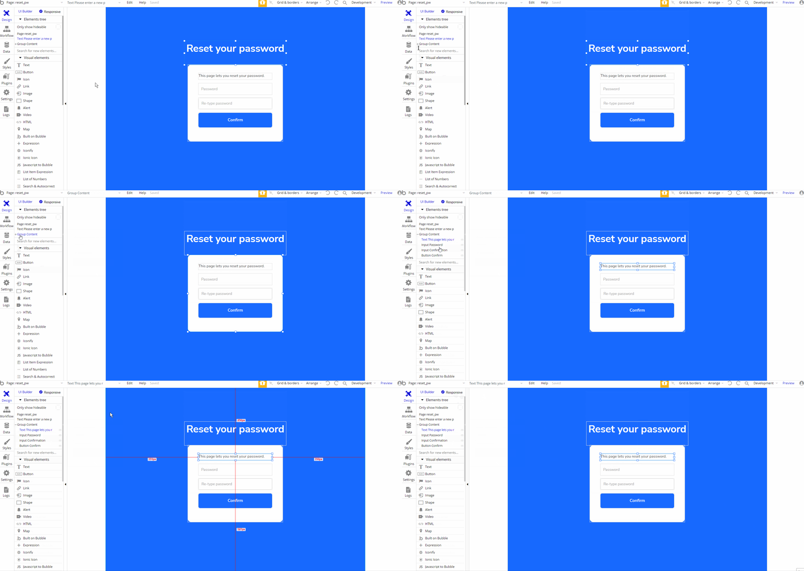
The design for this page consists of one main container Group "Content" used to hold other elements on the page, texts, buttons, and input.

404
This is a custom-designed page for 404 redirect errors, informing a user that the web page he or she is looking for cannot be found.
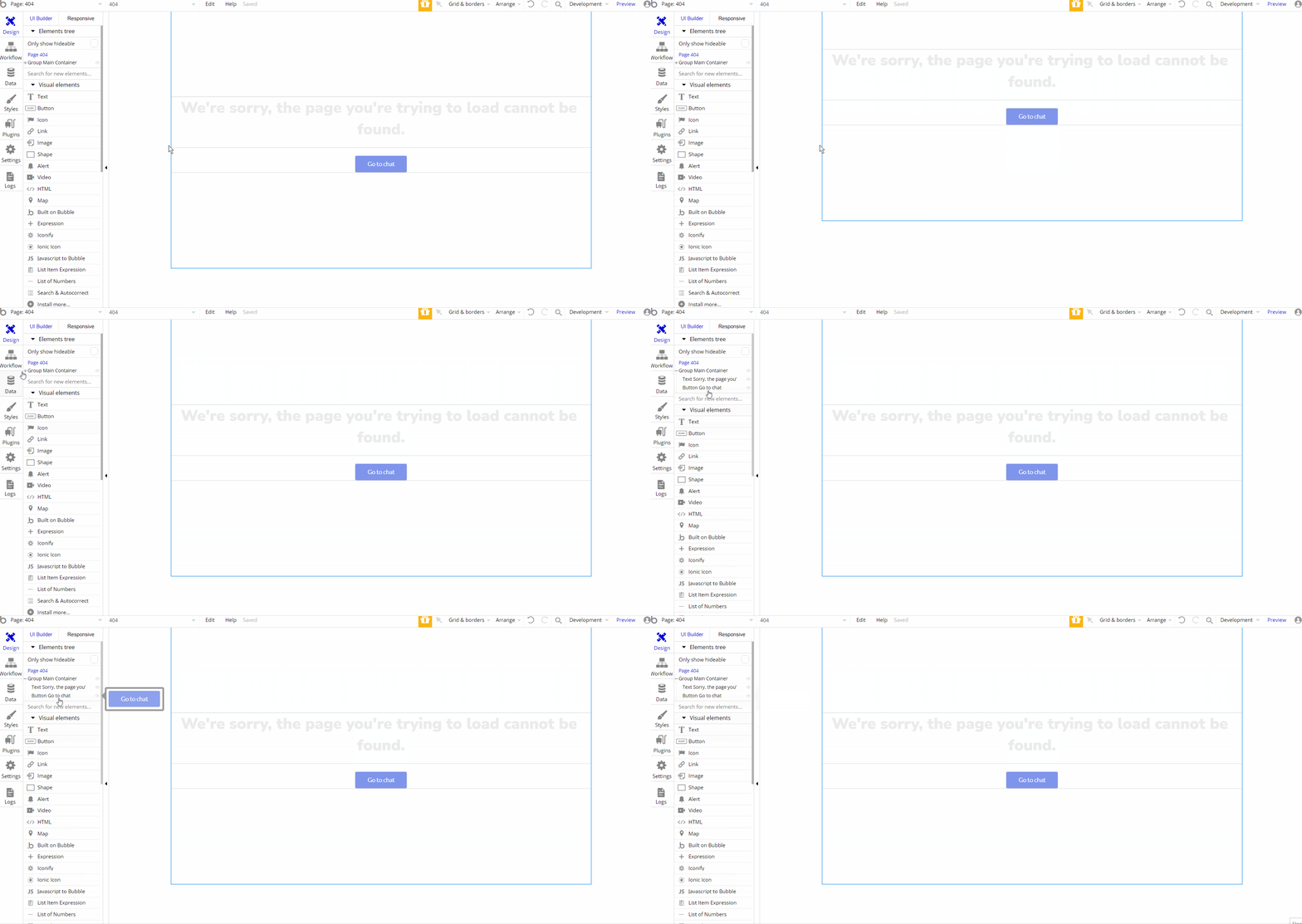
The design for this page consists of one group container Group "Main Container" for two elements of the design text and button.
