This section states the purpose of each page.
Introduction
In this summary, we will describe each page and its content. The Page Element is the fundamental one that contains all the other elements.
Tip: See Bubble Reference for more information about Pages element https://bubble.io/reference#Elements.Page 🙂
Pages
index
This is the main page typically encountered first on the web app that usually contains links to the other pages of the site. A homepage includes a variety of menus that make it easy for users to find the information they need.
Tip: Initially, your design elements might be hidden in your editor.
Here is how to unhide 👀 them:
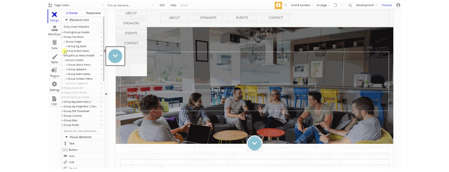
The design of this page consists of different sections of block elements, Group containers that hold all the elements on the page for sections. Floating elements for mobile and desktop viewports, focus groups, and pop-up elements that are not visible on page load. The group containers are used to show the content on page, texts, logos, etc.
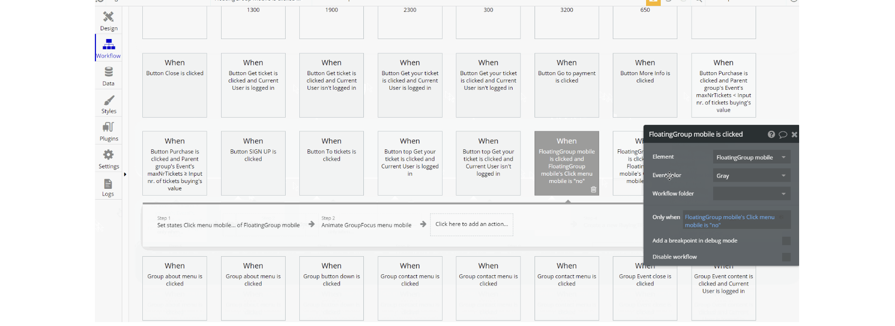
The workflows on this page used for showing and hiding different states of visual elements use, set state value actions, show and hide an element, and some animations with standard animate element actions.
The data in pop-ups is displayed using display data in group/pop-up action. Other actions seen frequently are Go to page navigational actions, and another important workflow is charging a user for event tickets.
admin-page
This page is designed to manage platform data, e.g. Users, Events, … and others. Only users with admin rights are able to access this page (in read-only mode), and those users who have access rights can edit or delete anything here.
Tip: Initially, your design elements might be hidden in your editor.
Here is how to unhide 👀 them:
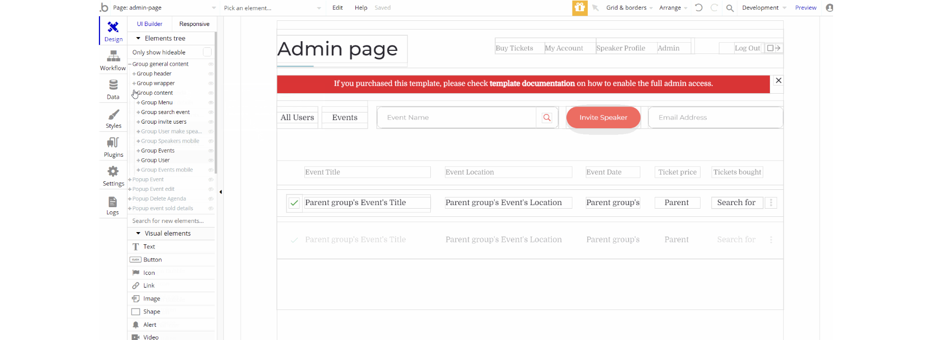
The design of this page consists of one main group container "general content" which is split into three smaller groups: "header", "wrapper" and "content" used to hold all the elements that display the content: repeating groups, texts, images, etc.
The pop-up elements are part of the design which are visible on certain actions/conditions.
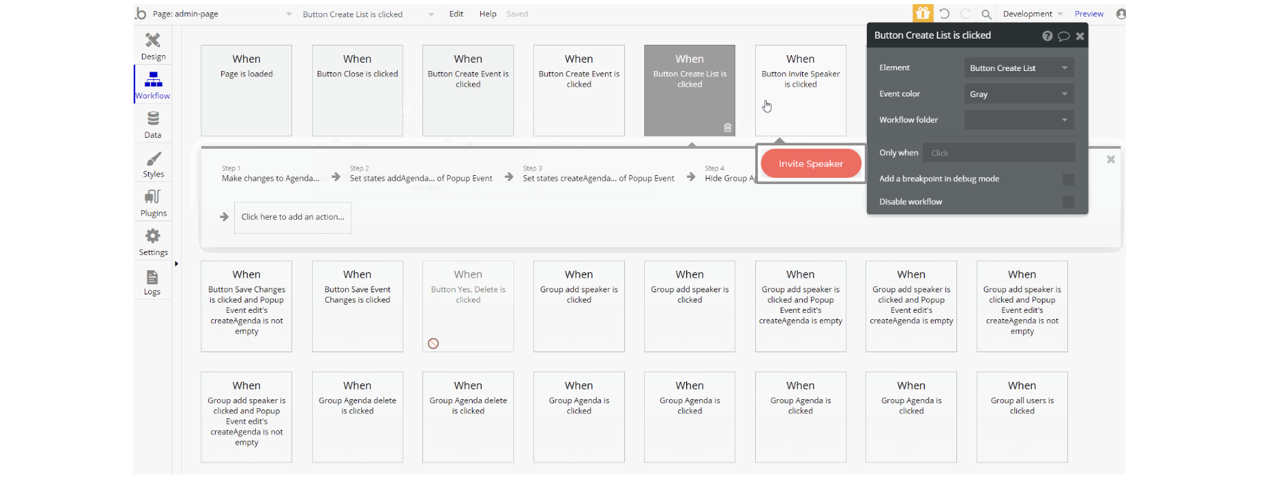
The workflows on this page consist of different actions, including set state value for showing groups on page, with and additional actions for showing and hiding an element, displaying data in pop-up/groups and go to page actions.
Other actions which seen are related to data, working with Agenda, Event, User data types using make changes to a thing, and assign a temp password to a user while creating an account for someone else.
open-event
This page is where the users see the event details, like date of the event, title, ticket price, speakers, and contact details. Additionally, here the user is able to purchase the ticket for the upcoming events.
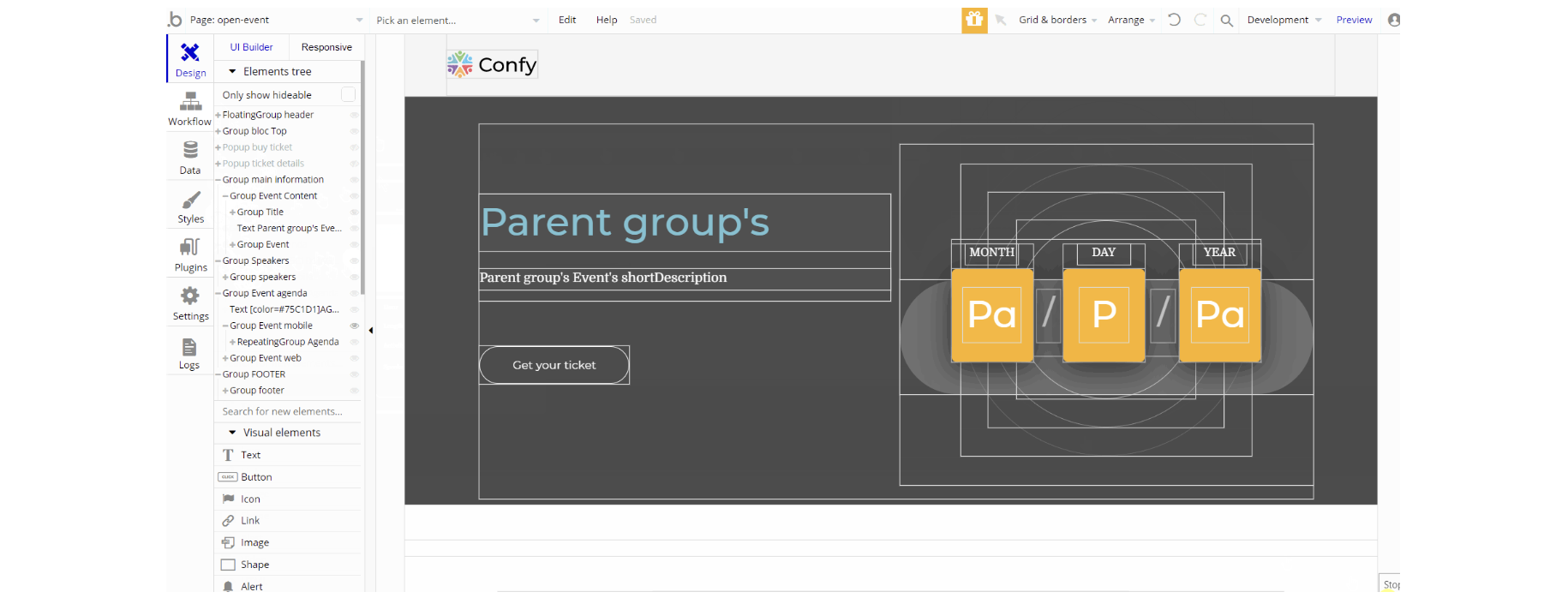
The design of this page consists of different group containers used to hold elements in the different sections on page with pop-up elements which are triggered through actions. The nested elements can be texts, buttons, groups, and repeating groups.
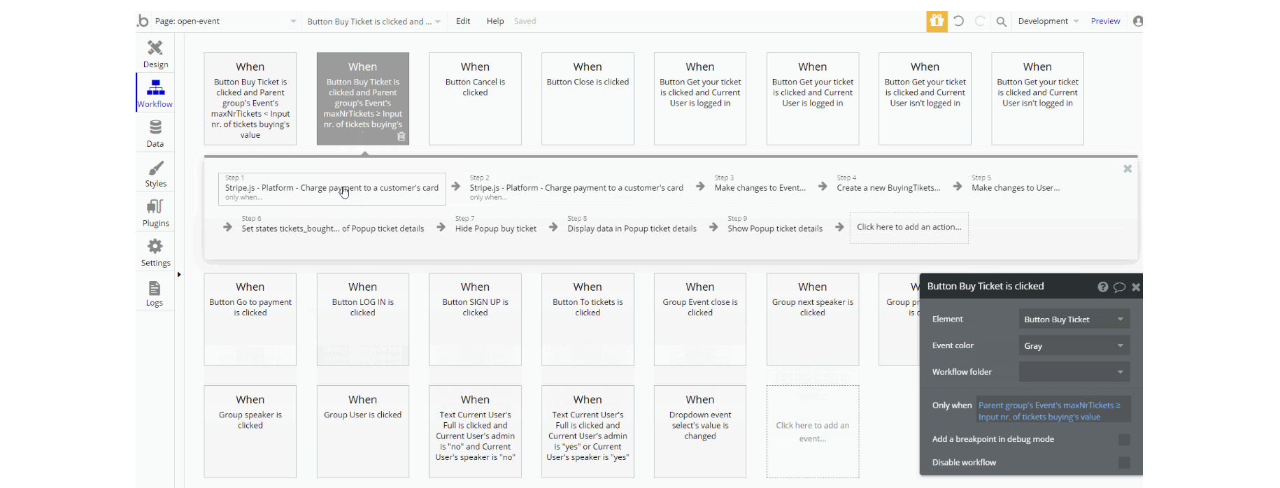
The workflows here are mostly: go to page navigation actions, show and hide an element, and set state value for displaying elements.
Other actions which are seen on page: charge a payment to customer's card and make changes to data: Event and User data types, also create a new thing for ByingTickets data type.
signup
This page is used for creating an account or logging in to an existing one. To access it, users will click on “Signup” button in the header. On this page, users are offered a demo user to log in and test all the template features.
Tip: Initially, your design elements might be hidden in your editor.
Here is how to unhide 👀 them:
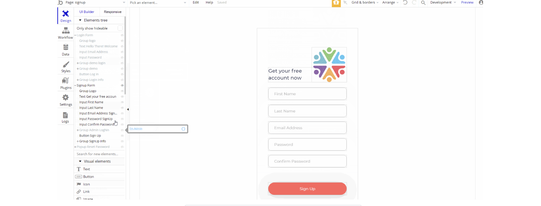
The design of this page consists of two main groups "Login Form" and "signup form" that hold necessary elements (i.e groups, inputs, buttons, texts, images, etc) for respective forms on the page. The pop-up "Reset Password" is part of the design triggered when the user clicks on "Reset it here" text.

The workflows for this page are related to signup and login process with actions which can be seen: log in the user, sign the user up, set state value to show between login and signup forms, and go to page navigational actions.
speaker-profile
This page is used for logged in speakers to add some details that will be public and shared with the platform users. And also this page displays to the platform audience the information added by the speaker.
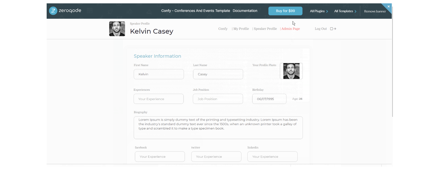
The design of this page consists of two main groups: group "User" and group "User Information" which are used to hold all of the elements on the page (i.e repeating groups, groups, texts, inputs etc.) to display a form for editing the profile information.

The workflows on this page are mostly, go to page actions, with additional actions like update the user's credentials, log the user out and set state values to show elements on page.
Other actions seen on page are, create a new thing and make changes to User data type and socialChannel.
user-profile
This page is used to manage the current user's profile, with a possibility to update user information (i.e First Name, Last Name, Email, Password), update credit card details, and see user's purchased tickets.
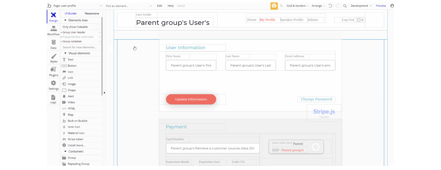
The design consists of two main containers, group "User Header" the group container used as a header for the page, and group "container" which holds all of the elements on page to display the profile information and edit it.
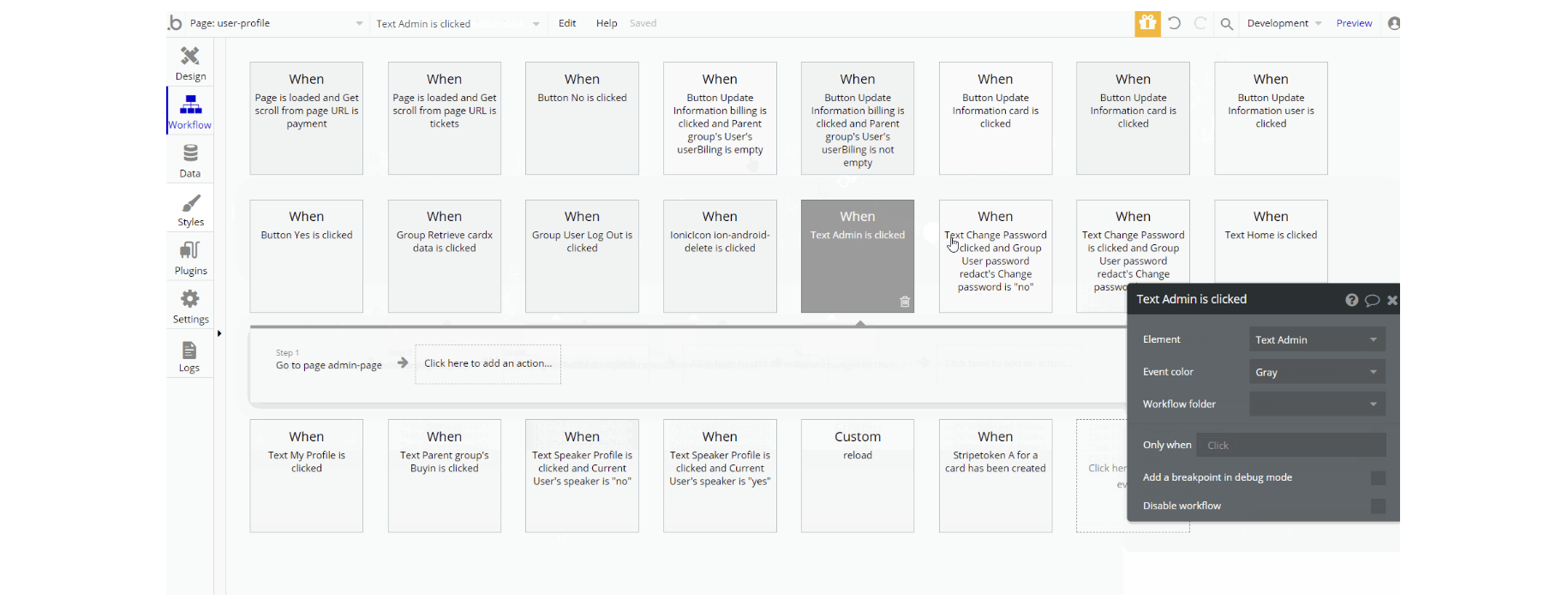
The workflows for this page are mostly, go to page with sending data, set state values to display different states of elements, show and hide elements.
Others are working with data, create a new thing, make changes to a thing for Users, Billing data type and working with card details - update the customer's default card.
reset_pw
This page is used for resetting the password.
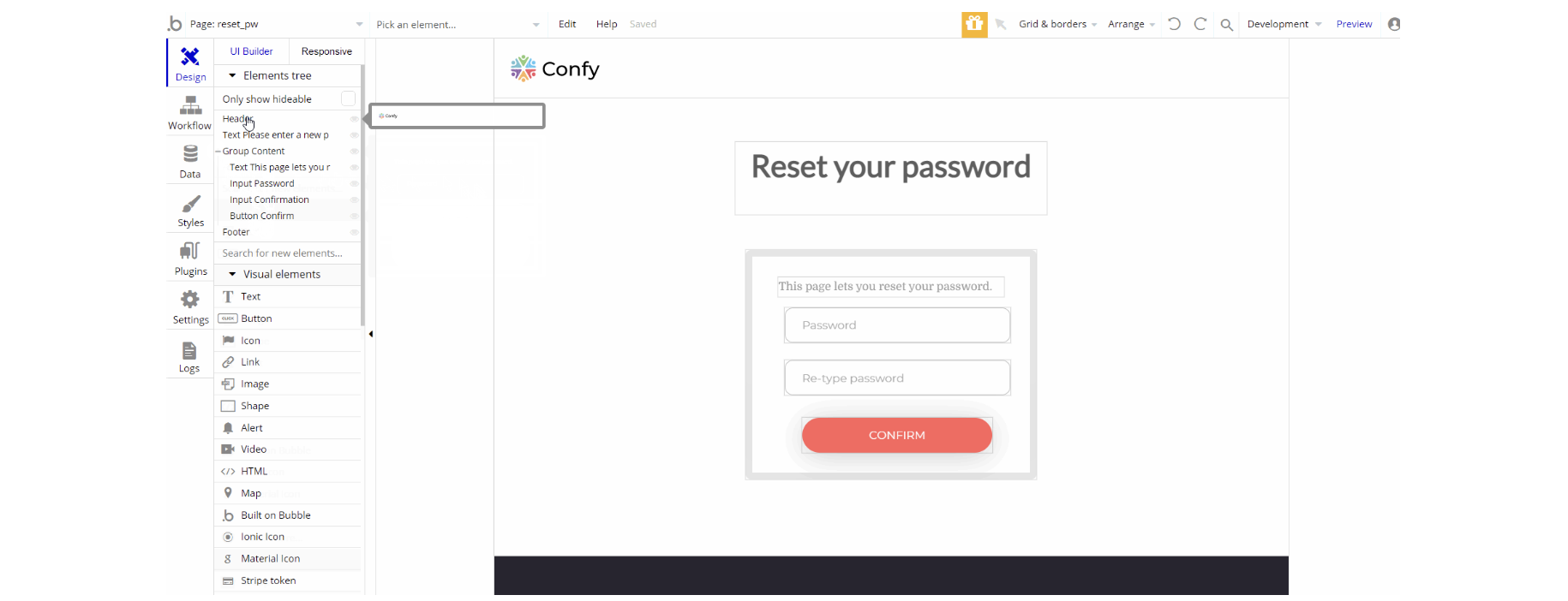
The design of this page consists of the main group "Content" that holds the reset password form elements (i.e texts, button, inputs) and title text element.
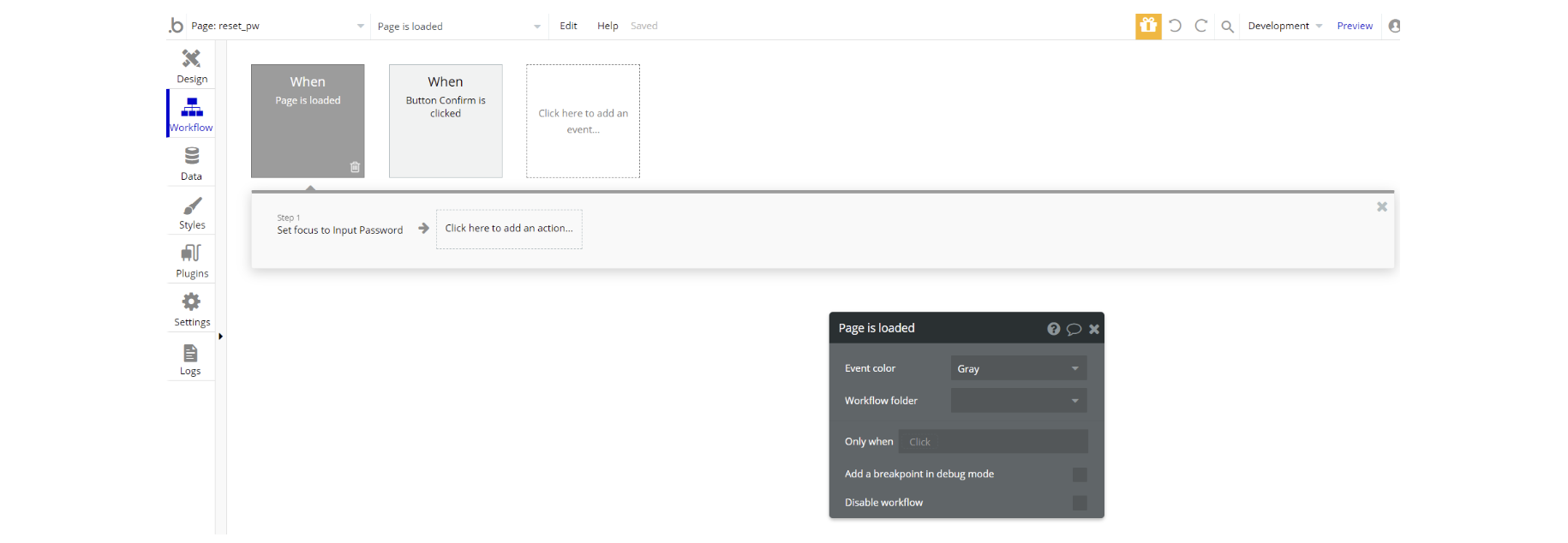
The workflows are quite simple, during the page load set focus of the input element and reset password action when a button is clicked.
404
This is a custom-designed page for 404 redirect errors, informing a user that the requested web page cannot be found, or doesn't exist.
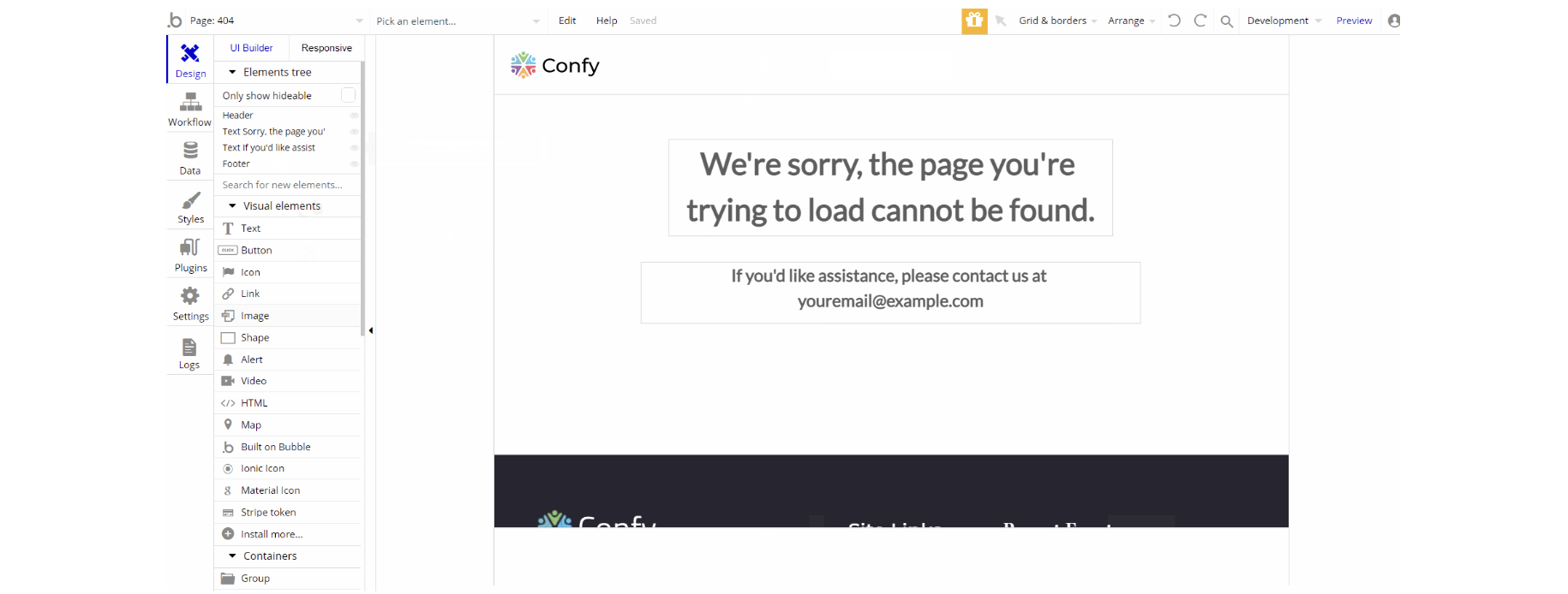
The design of this page consists of a couple of text elements to display the message for the page.
There are no element workflows for this page.