This section states the purpose of each reusable element.
Introduction
Reusable Element - an element that contains other elements, like a group, that can be used in more than one place. This is useful when reusing the same elements often.
Tip: See Bubble Reference for details https://manual.bubble.io/core-resources/elements/reusable-elements 🙂
Reusable Elements
header
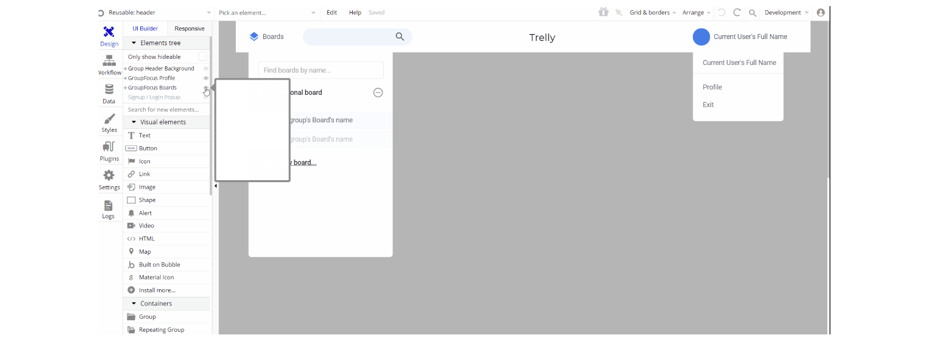
The header reusable element sits at the top of each page and serves a few very important purposes. It does provide a place for the company's logo, navigation and, page title which are part of a consistent user experience that all good websites share.
Other common header features are, search, shopping cart (for ecommerce), login/logout, user profile and notifications (if applicable). The workflows included with this element are pretty straightforward to follow.

This reusable element is customizable, so it is possible to change styles and content of element while keeping workflows or using as inspiration for your own.
Tip: This page comes with demo logins that have been placed for testing purposes. They may be removed from your app.
Some of the Header design elements may be hidden in your Bubble editor 🤫 but this is how you can unhide them (don't tell anyone!)

Signup / Login Popup
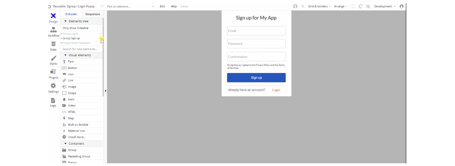
This reusable element is a pop-up element used for simple sign-up and login processes.

Tip: Initially, your design elements might be hidden in your editor.
Here is how to unhide 👀 them

The design of this reusable consists of two main groups: "Log in" and "Sign up". They hold the elements for the signup/login forms like inputs, buttons, and texts.
The "Reset Password" pop-up is visible only when a user triggers the reset action.

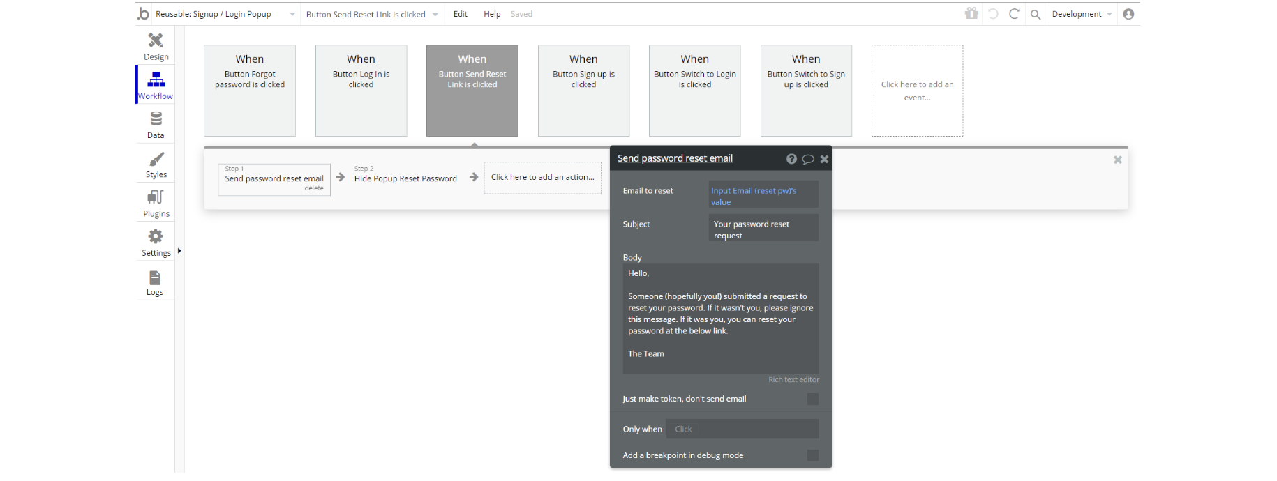
The workflow actions for this element are: show and hide an element, set state values for element visibility depending on the state.
Not without the important actions Log the user in and Sign the user up, as for password reset - the action send password reset email is used. For demo accounts assign a temp password to user action can be seen here.